
Experienced IT Specialist & WordPress Developer
- $5k+
- Earned
- 2x
- Hired
- 5.0
- Rating
- 19
- Followers
Experienced IT Specialist & WordPress Developer



UI UX Designer design responsive and modern designs

Project and Operations Lead | AI Operations Consultant
- 5.0
- Rating
- 5
- Followers
Project and Operations Lead | AI Operations Consultant


Full-Stack Dev | Scalable & High-Performance Apps
Full-Stack Dev | Scalable & High-Performance Apps


View more →

Frontend Engineer | Vue.js Expert | React.js Expert | Open
Frontend Engineer | Vue.js Expert | React.js Expert | Open

HRMaster is a modern Human Resource Management SaaS MVP built with React, TypeScript, and Vite. It features role-based dashboards (Super Admin, HR, Manager, Employee) to manage employees, attendance, payroll, recruitment, and performance. Includes secure authentication, analytics, and full CRUD admin panel. Designed with scalable web application architecture, API integration, and optimized performance. Ideal for SaaS dashboard development, custom CRM development, and MVP web app solutions.
0
78

EVChargePro is a modern EV charging management SaaS MVP built with React, TypeScript, and Vite. It features real-time station discovery, role-based dashboards (driver, operator, admin), secure authentication, and interactive maps with advanced filters. Includes charging history, digital wallet, payments, notifications, and analytics with charts. A full-featured admin panel with CRUD operations ensures control over users, stations, and transactions. Built with scalable architecture, API integration, and optimized performance for SaaS platforms.
0
74

𝐅𝐫𝐨𝐦 𝐚 𝐛𝐚𝐬𝐢𝐜 𝐛𝐮𝐬𝐢𝐧𝐞𝐬𝐬 𝐢𝐝𝐞𝐚 → 𝐩𝐫𝐨𝐝𝐮𝐜𝐭𝐢𝐨𝐧-𝐫𝐞𝐚𝐝𝐲 𝐰𝐞𝐛 𝐚𝐩𝐩.
Recently completed a web application where the main goal was to simplify how users manage their orders and track their status.
I handled the frontend architecture, responsive UI, API integration, authentication, and deployment.
Stack: React + TypeScript + Tailwind CSS + Node.js + PostgreSQL
The result: a cleaner workflow, responsive experience across devices, and a production-ready application.
I'm always interested in projects where I can turn complex requirements into simple, usable products.
Open to: React / Next.js / Vue.js / Full-Stack projects.
0
63

Another project, another valuable client relationship.
Recently, I received some great feedback from a client after working together on a complex e-commerce project.
Throughout the project, we handled evolving requirements, payment gateway approval challenges, implementation changes, and continuous feedback.
What I’m most proud of is that despite the challenges and extended timeline, the client was happy with the development, communication, and overall collaboration.
Their final feedback:
“I’ve been really happy with both your work and the development throughout the whole project.”
And even better:
“I’d definitely love to work with you guys again for my next project.”
For me, this is what successful client work looks like — not just delivering code, but building trust and a relationship that can continue into future projects.
Looking forward to the next one.
0
39

Customer-Driven Product Manager & Analyst 🚀
Customer-Driven Product Manager & Analyst 🚀


View more →

Full-Stack Web Developer + AI Enthusiast
Full-Stack Web Developer + AI Enthusiast


UX-led product design & dev agency for b2b saas and AI

UX-led product design & dev agency for b2b saas and AI

We brought this workforce management landing page to life with a focus on clarity and instant trust.
The concept:
A SaaS HR platform that makes diversity, compliance, and workforce growth feel manageable from day one. Attendance tracking, payroll, performance, scheduling, and time-off all visible in one clean dashboard preview that sells the product before a single feature is clicked.
Built in Figma & animated in Jitter. Every section, stat, and dashboard detail was designed to convert, not just impress.
Really proud of how the soft lavender background, bold blue typography, and the embedded dashboard mockup create a landing page that feels both trustworthy and modern.
Building a SaaS product, HR tool, or workforce platform?
👉 Let's design it together ..
Curious what you think. 👀
UX Design | SaaS UI | HR Tech | Landing Page
Tools: Figma, Jitter
0
364
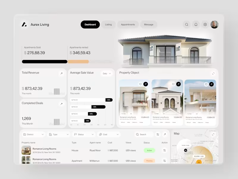
Real estate dashboards are usually built for data entry. Aurex Living was built for decision-making.
$873,42.39 total revenue. 1,269 completed deals this month. $276K sold, $346K rented. Property cards, agent tracking, map view, average sale value trending +10% - every number a real estate operator actually needs, on one clean white canvas.
Check it out (https://dribbble.com/shots/27350201-Aurex-Living-Real-Estate-Dashboard-Design)
12
17
1.9K
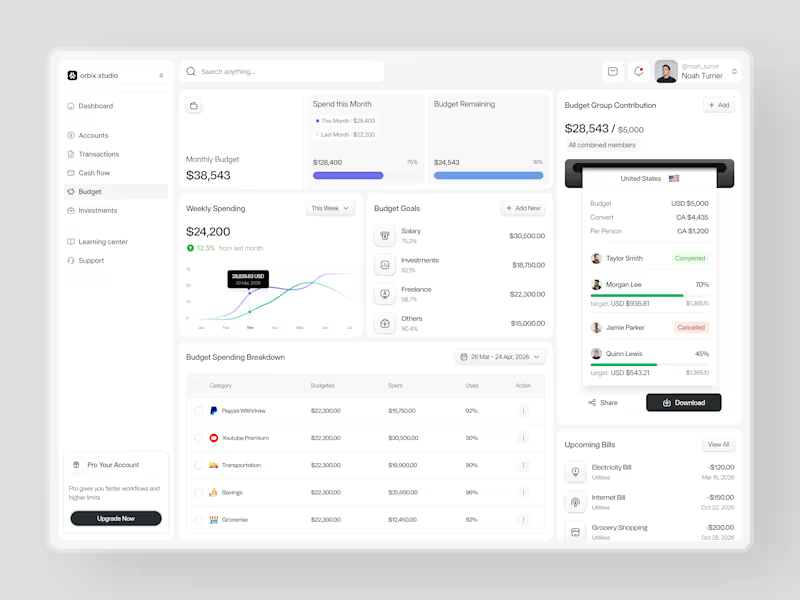
Most people set a budget once and forget it exists until it's too late.
This dashboard was designed to fix that. Weekly spending at $24,200, up 12.5% from last month. Monthly budget at $38,543 with 75% already allocated. Budget goals tracked by category salary, investments, freelance, and others each with a completion percentage and a dollar target that makes progress visible before the month ends.
The group contribution panel takes it further. Four members. One shared budget of $5,000. Taylor completed. Morgan at 70%. Quinn at 45%. Jamie cancelled. A collaborative finance tool that makes shared budgeting feel as clean as personal budgeting should.
Upcoming bills electricity, internet, grocery listed before they hit. A spending breakdown table that shows exactly what was budgeted, what was spent, and how much is left in every category.
This is what budget management looks like when the design treats users like they actually want to be in control of their money.
Does this feel like a dashboard that would change how a team manages their finances together? 👇
Designed by Orbix Studio
Tools: Figma
#DashboardDesign #FintechUI #BudgetApp #UIDesign #WebDesign #ContraFreelance #ProductDesign #SaaSUI
11
31
3.6K
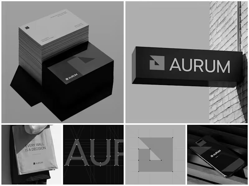
Aurum - Brand Identity System
When Aurum came to me, they had a name and a vision a studio that wanted to feel deliberate, architectural, and unapologetically bold in every space it touched. No logo, no system, just a line that stuck with me from our first conversation: "every wall is a decision."
That phrase became the seed for the entire identity. I started with the simplest possible geometry a square split by a triangle and built the mark from a strict construction grid so it would hold its proportions at any size, from a business card to a building-mounted sign. Once the mark was locked, I stripped the palette down to black, white, and grey. No color to hide behind just contrast, shadow, and negative space doing the work.
From there, the system grew outward: letterpress-style stationery with generous shadow and texture, exterior signage designed to read cleanly against brick and daylight, a minimal mobile app screen, and a tote bag that turned the brand's own tagline into a quiet piece of merchandise. Every touchpoint had to pass the same test does it still feel like Aurum at this scale, in this material, from this distance?
The result is an identity that's confident without shouting restrained enough for a business card, strong enough for a wall.
Curious how I'd approach building out a system like this for your own brand want to talk through it?
9
25
1.7K