
The best café brands don't introduce themselves. They just feel familiar from day one.
Most neighborhood café brands hide behind generic coffee cup icons, overused script fonts, and a color palette that could belong to a yoga studio or a juice bar or literally anything else. The logo promises character. The brand delivers nothing you'd remember by the time you reach the door.
Melo made familiarity the whole brief.
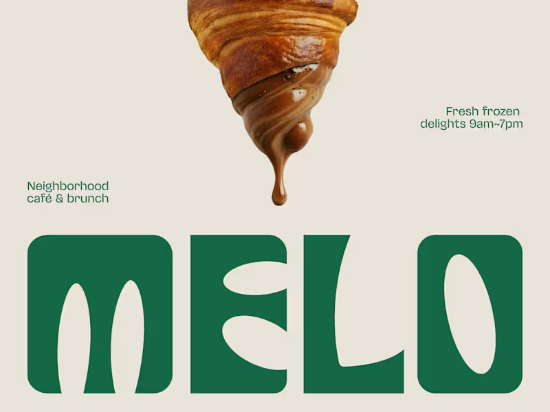
A custom palm tree emblem encircled in a clean oval, organic, architectural, impossible to mistake for anything else. Deep forest green across three environments: cream, burnt green, and dark olive, each one feeling as considered as the last. A rounded wordmark so confident it can fill an entire poster at display scale and still feel warm rather than loud. And right there on the campaign visual, a caramel-dripping croissant melted into the letterforms, like the food and the brand were always the same thing.
That's not just a logo system. That's a place people recognize before they even read the name.
Because a neighborhood spot that earns a place in someone's morning deserves a brand that feels just as inevitable.
What makes a café logo feel like it actually belongs to a place? 👇
2
4
473


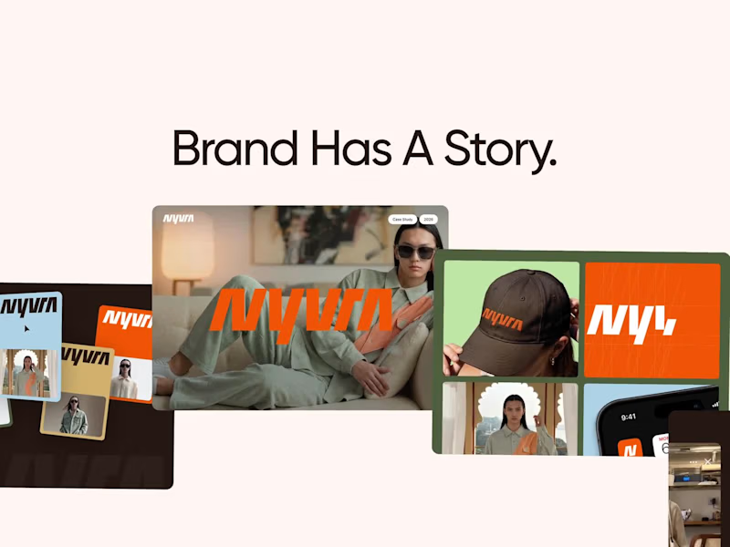
NYVRA — Fashion E-commerce Brand Showreel
NYVRA is a cinematic showreel showcasing the complete design journey of a modern fashion e-commerce brand.
The presentation brings together brand identity, visual systems, UI/UX design, and motion to create a cohesive digital experience that reflects a premium fashion brand.
From establishing a distinctive visual identity to designing an intuitive shopping interface, every element was created to ensure consistency, usability, and engaging visual storytelling across the customer journey.
2
3
298
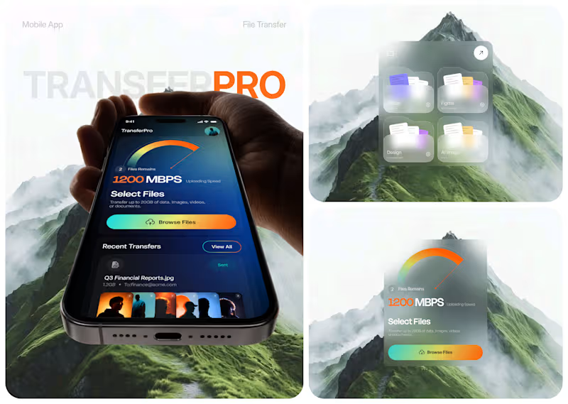
TransferPro - Designing a Faster, Clearer File Transfer Experience
Large-file workflows don't need to feel heavy.
For TransferPro, we explored a mobile product experience that brings file transfer, cloud storage, activity tracking, and content sharing into one focused interface.
The design direction combines:
• High-visibility transfer status
• Clear file organization
• Recent activity tracking
• Centralized cloud storage
• Fast access to shared content
• A futuristic dark visual system
The challenge wasn't simply making a file transfer app look modern.
It was creating an experience where users can immediately understand what is transferring, how fast it is moving, and what happened recently.
That's where thoughtful product UX makes a difference.
Building a SaaS, cloud platform, or mobile product that feels more complicated than it should?
👉 Work with Taqwah to turn complex workflows into clear, scalable product experiences. DM us to start your project.
🌐 taqwah.agency (http://taqwah.agency) | 📩 hello@taqwah.agency (mailto:hello@taqwah.agency)
#ProductDesign #UIUX #MobileAppDesign #SaaSDesign #UXDesign #DigitalProduct #AppDesign #FileSharingApp #FileTransfer #Taqwah
4
7
339
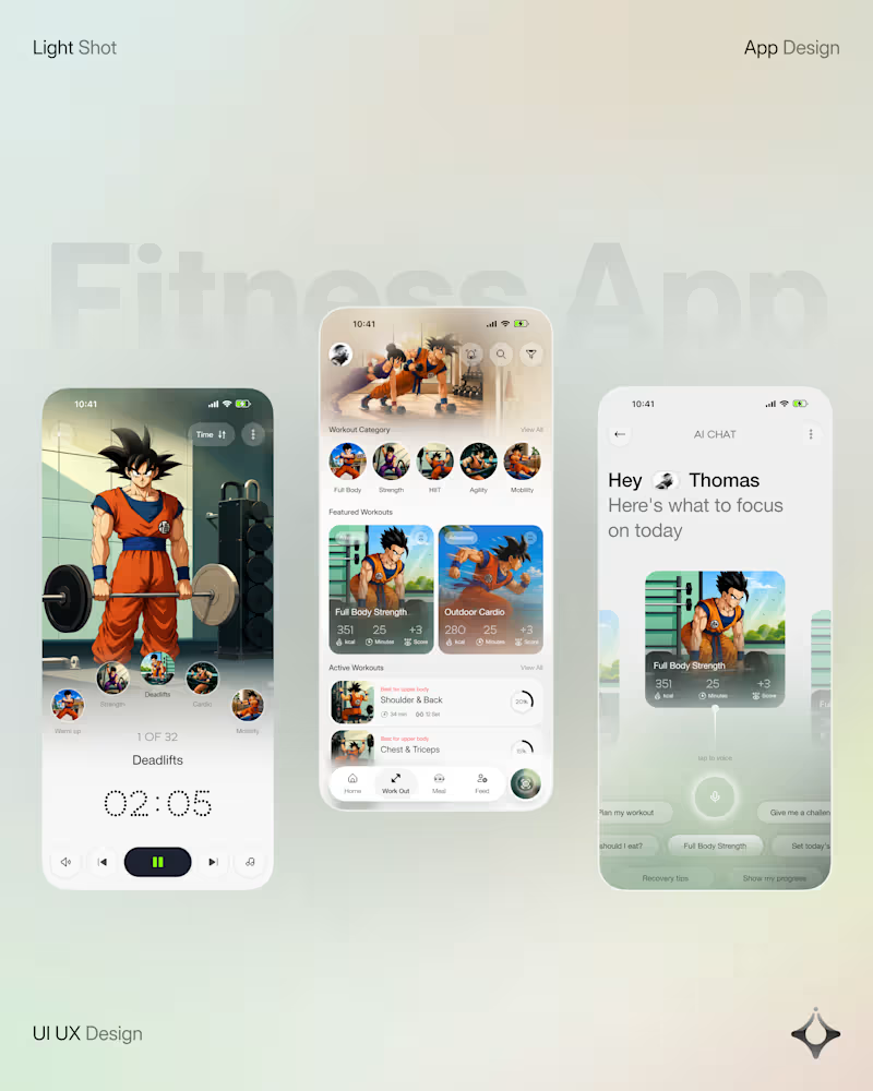
What if your fitness app felt like having a personal trainer in your pocket?
Meet your new workout companion. A bold fitness app concept combining personalized workouts, AI coaching, and a seamless mobile experience to make every session count.
Would you use this to level up your fitness journey?
41
57
3.3K