Freelancers in Daulatpur
Sign Up
Post a job
Sign Up
Log In
Filters
1
Projects
People
Khondokar Likhon
Meherpur, Bangladesh
Multidisciplinary Designer | Ecom & Product Growth @ Moobliy
1x
Hired
5.0
Rating
13
Followers
expert
Follow
Message
Multidisciplinary Designer | Ecom & Product Growth @ Moobliy
2
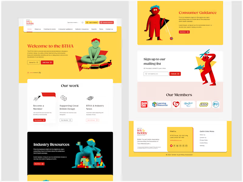
Redesigning BTHA’s Digital Presence
2
18
1
Conversion Optimization for Shopify & Online stores,
1
20
1
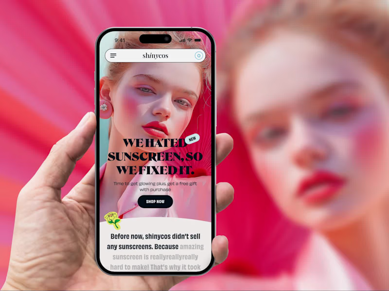
Scalable Shopify Store Development for Suinycos
1
14
2
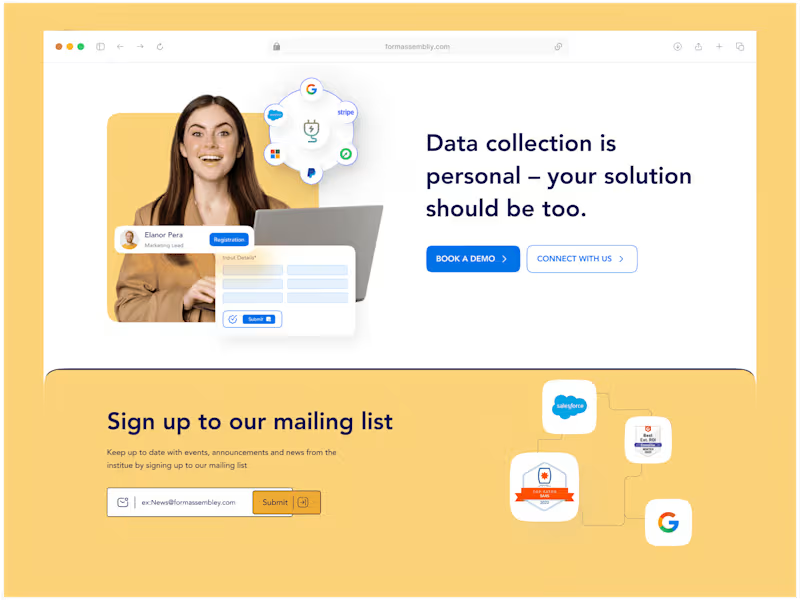
Redesign of FormAssembly's Data Collection Platform
2
15
Follow
Message
MD RAKIBUL ISLAM RAKIB
Kushtia, Bangladesh
Full Stack Developer | AI Specialist
10
Followers
Follow
Message
Full Stack Developer | AI Specialist
0
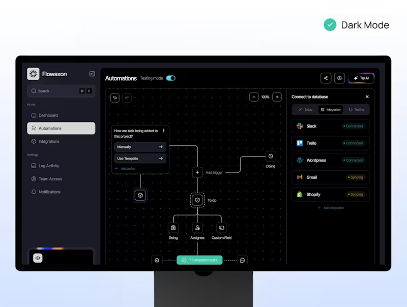
The integration system connects the automation platform with external tools and services such as CRM systems, email platforms, and internal APIs. This enables seamless data flow between systems and ensures automated processes run smoothly across the entire workflow ecosystem.
0
266
0
The AI processing panel displays incoming requests and shows how the system analyzes and classifies them using AI. Based on the results, the platform automatically determines the appropriate action, such as sending responses, updating records, or triggering additional workflows.
0
258
0
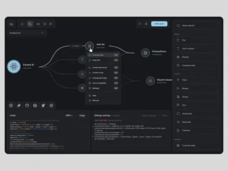
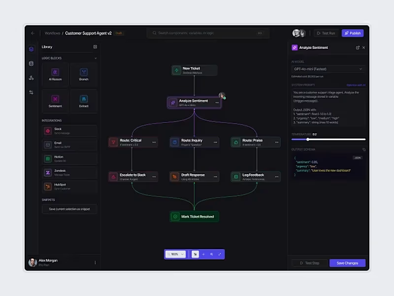
The visual workflow builder allows users to design automation pipelines using a node-based interface. Different steps such as triggers, AI processing, API calls, and integrations can be connected to create powerful automation workflows without complex configuration.
0
258
0
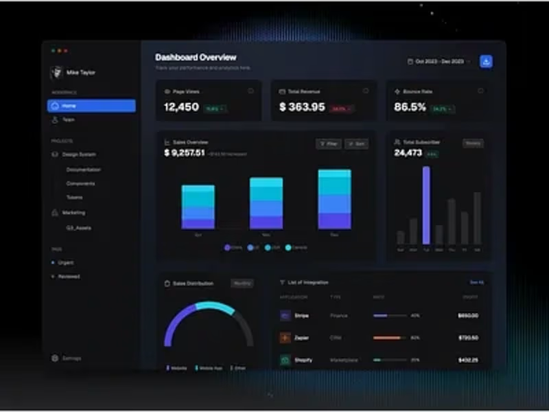
The automation dashboard provides a real-time overview of system activity, including workflow executions, AI classification results, and task processing metrics. It allows users to monitor automation performance, track completed workflows, and analyze operational efficiency through clear visual analytics and status indicators.
0
263
Follow
Message
Sharmin Suraiya
Pabna, Bangladesh
Graphic Designer | Brand Identity & Social Media Design.
7
Followers
Follow
Message
Graphic Designer | Brand Identity & Social Media Design.
1
I create professional and eye-catching designs for restaurants, cafés, and food brands, including social media posts, menus, promotional graphics, and more. https://www.fiverr.com/s/vbQzX7L
1
4
0
Motion Graphic Design for Weblake's Bakery Tools: Adobe After Effects + Illustrator + Photoshop Concept: Sweet, minimalist bakery branding with animated cupcake Services: Social Media Design | Packaging | Branding DM for collaborations
0
28
0
🌱 From a Tiny Seed A tiny seed can become something beautiful with time, patience, and growth. ✨ Created with AI and refined in CapCut. #seedancechallenge #Seedance #AIVideo #AIArt #CreativeChallenge #Contra
0
53
1
A premium social media campaign concept created for a luxury Japanese ceramics and lifestyle brand. The project focuses on elegant visual storytelling, product presentation, brand consistency, and engaging Instagram content inspired by Japanese craftsmanship and minimal aesthetics.
1
86
Follow
Message
MD Abdul Alim
Kushtia, Bangladesh
Logo, Brand & Packaging Designer
26
Followers
Follow
Message
Logo, Brand & Packaging Designer
1
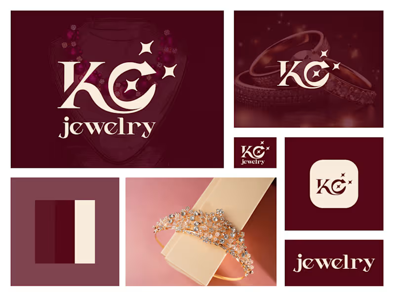
KC Letter Jewelry Logo Design - KC Brand Identity
1
8
2
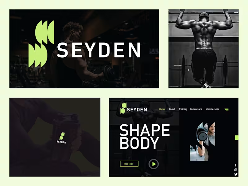
Seyden – Logo Mark & Brand Identity Design Seyden is a modern fitness brand focused on strength, discipline, and transformation. The goal was to create a bold, energetic identity that feels premium yet approachable. The abstract lime-green mark captures movement and power, while the clean sans-serif wordmark delivers confidence. A dark, high-contrast visual system paired with intense training imagery reinforces the “Shape Body” lifestyle across digital and physical touchpoints — from website and social to product applications like shaker bottles.
2
50
3
Ready to dominate? 👉 Say goodbye Unmemorable Logo, Branding, Social Media Post & Packaging Design Hello to memorable and Recognisable design!🌟 📩 Available for new projects
1
3
73
2
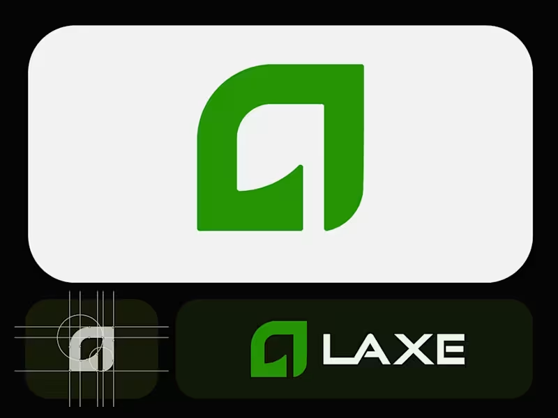
Laxe – Modern Minimalist Logo for an Axe & Tool Brand Crafted a bold yet refined logo for Laxe, a premium axe and outdoor tool brand. The abstract mark combines a strong "L" with a subtle blade-like curve, symbolizing precision, power, and craftsmanship.Clean geometric construction, balanced proportions, and a vibrant yet sophisticated green palette make it versatile across packaging, apparel, digital, and physical products. Focused on minimalism with just enough edge to feel tool-ready.Explored multiple color directions (deep green, red, inverted) before landing on this crisp light-background version for maximum adaptability. What do you think? ready for the workshop or still needs more bite? Ready to dominate? 👉 Say goodbye Unmemorable Logo, Branding, Social Media Post & Packaging Design Hello to memorable and Recognisable design!🌟 📩 Available for new projects
1
2
73
Follow
Message
Md. Abdur Rahman
Pabna, Bangladesh
The designer that you can trust.
6
Followers
Follow
Message
The designer that you can trust.
4
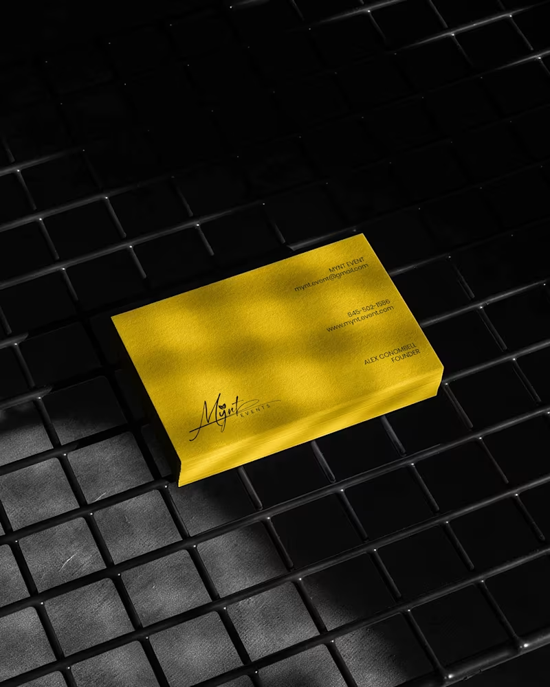
Luxury Brand Identity System for a Premium Event Planning Business PROJECT DESCRIPTION: Mynt Events is a premium event planning business built around moments that matter — proposals, curated celebrations, and experiences where every detail is considered and nothing is left to chance. The founder came to me with a business that had already outgrown its brand. The work was operating at a premium level. The identity wasn't communicating that yet. The brief was clear: build a complete brand identity system that positions Mynt Events as the obvious choice for clients who already know what they want and are deciding who to trust with it. The Strategic Starting Point Every decision in this project started with a single question: what does a client need to feel the moment they encounter this brand for the first time? For Mynt Events, that feeling needed to be confidence. Trust. The quiet certainty that this is a business that handles things properly — that the moment they're planning will be in the right hands. That emotional target shaped every mark, every color choice, and every surface application that followed. The Logo The primary mark is a signature script logo with a leaf detail structurally embedded within the letterforms. The script was chosen deliberately — in the events industry, clients are trusting you with moments that cannot be redone. A signature communicates personal commitment. It feels authored, not assembled. The leaf element does secondary brand work quietly. It signals organic intention, care, and attention to detail without requiring explanation or a separate icon. The underline sweep grounds the composition and gives it the horizontal confidence it needs to hold across wide-format surfaces — packaging lids, signage panels, and environmental applications where a floating mark would lose presence. A monogram M was developed as a secondary mark for applications where the full signature loses legibility at small scale — product labels, cap patches, and interior packaging details. The Palette Gold and black. Not chosen for trend. Chosen for emotional function. Gold carries warmth, occasion, and perceived value — the feeling of something worth celebrating. Black carries authority, precision, and restraint — the feeling of a business that delivers without drama. Together they position Mynt Events exactly where it needs to sit: celebratory but controlled, personal but professional. The palette was tested across matte, gloss, foil, backlit, and fabric applications to confirm it held integrity across every surface in the system without compensation or adjustment. The Full Identity System Every deliverable was designed as part of a single coherent brand expression — not a collection of individual design tasks, but a system where every piece reinforces every other piece: — Primary signature logo and monogram secondary mark — Full brand palette and typography hierarchy — Premium gold foil business card — Luxury magnetic gift box with full interior branding — Ring box and product packaging application — Branded tote bag — Apparel — t-shirt and structured cap with patch application — Backlit environmental signage panel — Digital UI and mobile wallpaper application The Result A brand identity system that closes the gap between what Mynt Events delivers and what a client sees before they ever make contact. The brand now works at a proposal ring box and a storefront signage panel simultaneously — with the same presence, the same authority, and the same unmistakable identity at every scale. That's not styling. That's positioning. And positioning is what turns a great business into the obvious choice. SERVICES INCLUDED IN THIS PROJECT: Brand Strategy, Logo Design, Visual Identity System, Monogram Design, Business Card Design, Luxury Packaging Design, Gift Box Design, Apparel Design, Environmental Signage Design, Digital UI Application, Brand Collateral Design, Full Brand System KEYWORDS: Luxury Event Brand Identity, Signature Logo Design, Event Planner Branding, Gold Brand Identity, Script Logo Design, Visual Identity System, Custom Logo Design, Brand Identity Designer, Luxury Logo Design, Event Brand Design, Handcrafted Logo Design, Premium Brand Identity, Calligraphy Logo Design, Brand Mockup Design, Logo Design Concept, Black And Gold Branding, Event Planner Logo, Signature Brand Identity, Full Brand System, Brand Strategy Design
2
4
87
2
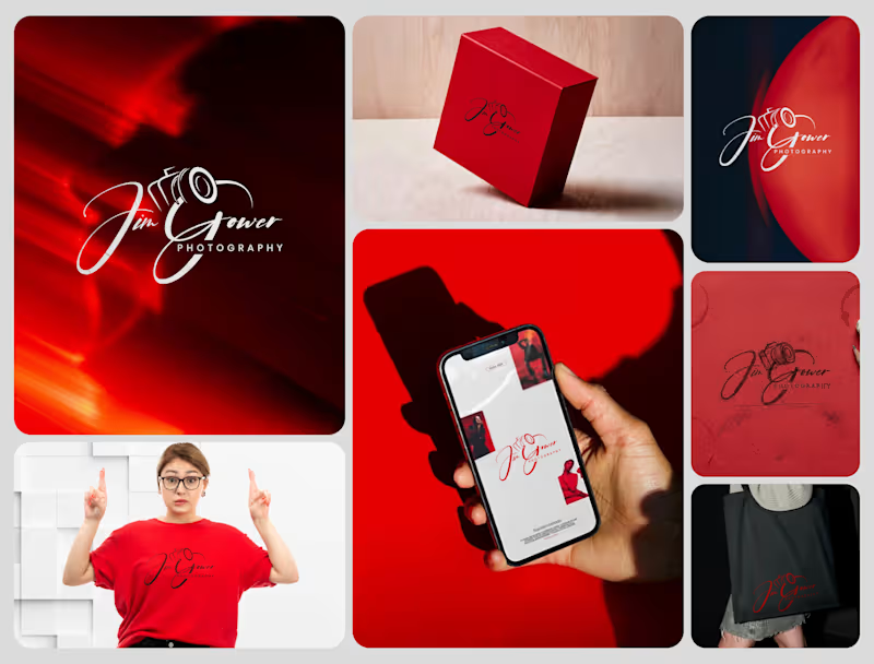
Signature Brand Identity System for a Photography Business PROJECT DESCRIPTION: Jim Gower is a professional photographer who needed more than a logo. He needed a complete brand identity that could represent his work at every level — from a business card handed to a client after a shoot to a lightbox sign above a studio entrance. The brief was clear: build something that feels personal, premium, and immediately recognizable as belonging to one person and one vision. The Approach Every decision in this project started with strategy before it touched aesthetics. Who is Jim Gower to his ideal client? What feeling should someone walk away with after their first encounter with his brand? What does premium mean in the photography space right now — and how do you stand apart from it without alienating it? The answers shaped everything that followed. The Work The primary logo is a signature script with the camera body structurally integrated into the letterforms — the "G" in Gower becomes the lens housing, making the mark read as both a name and a profession without requiring a separate icon. The script carries energy and movement, referencing the intuitive, fast-moving nature of working photographers. The crimson brand palette was selected for emotional weight — confident, warm, and saturated enough to hold presence across both physical and digital surfaces without compromise. The full system was then applied and stress-tested across every client touchpoint: — Primary and secondary logo variations — Brand color palette and typography system — Business card design — Premium gift box packaging — Tote bag and apparel — Digital UI mockup for web and mobile — Environmental signage and lightbox application The Result A brand identity system that positions Jim Gower not as a photographer with a logo, but as a brand with a presence — one that commands attention, communicates quality instantly, and scales from a phone screen to a storefront without losing a single point of its power. SERVICES INCLUDED IN THIS PROJECT: Brand Strategy, Logo Design, Visual Identity System, Brand Collateral Design, Packaging Design, Apparel Mockup, Digital UI Application, Environmental Signage Mockup Photography Logo Design, Signature Logo Design, Brand Identity System, Photographer Branding, Script Logo Design, Visual Identity Design, Custom Logo Design, Brand Identity Designer, Logo Design Process, Creative Brand Design, Handcrafted Logo Design, Photography Brand Kit, Premium Brand Identity, Calligraphy Logo Design, Brand Mockup Design, Logo Design Concept, Red Brand Identity, Photographer Visual Identity, Brand Strategy Design, Full Brand System
2
56
1
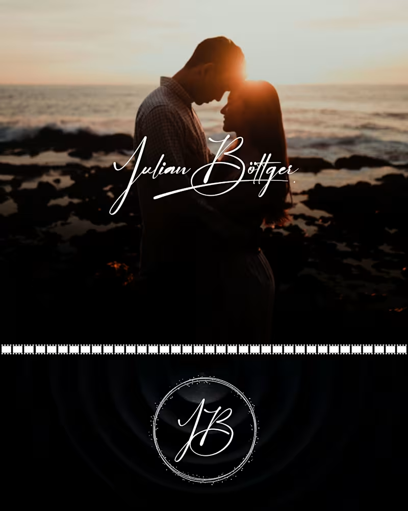
Julian Böttger — Full Brand Identity for a Wedding & Portrait Photographer A photographer's work lives and dies by first impressions. Julian's images were exceptional. His brand wasn't keeping up. We built a complete visual identity from the ground up — designed to feel personal, timeless, and scalable across every surface it would ever touch. What was delivered: → Custom hand-lettered signature logotype (primary mark) → Monogram seal (JB) for watermarks, merch, and secondary use → Business card system — black and white versions → Studio signage mockup → Apparel (t-shirt + tote bag) → Stationery and print collateral → Film-strip and overlay assets for video content The brief was clear: no templates, no stock fonts, nothing generic. Every element was drawn or crafted specifically for this brand. The identity now works at every scale — from a coffee mug to a 6-foot sign — and across every context, from dark editorial photography to bright lifestyle imagery. Available for similar projects. Inquire to discuss scope and timeline. Brand Identity, Logo Design, Visual Identity, Graphic Design, Photography, Creative Services, Wedding Industry, Brand Guidelines, Print Design, Merch Design
1
30
5
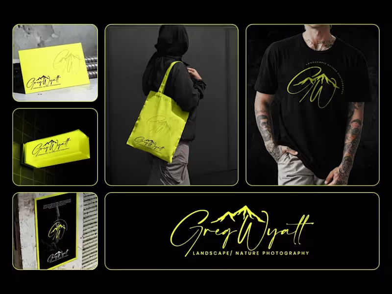
Greg Wyatt — Landscape & Nature Photography | Full Brand Identity System Project Summary: A complete brand identity built for a landscape and nature photographer who needed more than a logo — he needed a visual world that matched the scale of what he shoots. The Brief: Greg Wyatt captures landscapes the way most people only dream of seeing them. The work is cinematic, emotional, and deeply personal. But his brand wasn't reflecting any of that. The goal was to build a cohesive identity system from the ground up — one that could hold its own across every surface it touched. The Approach: Every decision in this project started with one question: does this feel like standing at the edge of something vast? The signature wordmark was hand-lettered in style to feel personal and authorial — because the best landscape photography is never accidental. It carries the photographer's fingerprint. The mountain mark was integrated directly into the initials rather than placed beside them, making the connection between artist and subject inseparable. Color was the most strategic call in this project. Neon yellow on deep black creates the kind of contrast that stops a scroll, but it wasn't chosen for that reason alone. It references the exact quality of light that makes a great outdoor photograph — that electric moment just before or after darkness. The brand lives in that moment. The system was then pressure-tested across real-world applications: a neon illuminated storefront sign, business cards, tote bags, apparel, and a brand pattern — because a logo that only works on a white background isn't a brand system. It's a starting point. What Was Delivered: — Primary signature wordmark — Mountain monogram mark — Circular badge logo — Submark and watermark variations — Brand color and typography system — Business card design — Tote bag design — T-shirt / apparel design — Illuminated signage mockup — Brand pattern / texture — Full brand presentation The Result: A brand identity that works as hard as the photographer behind it. Cohesive across every format. Instantly recognizable. Built to grow with the brand rather than date it. Services Provided: Brand Identity Design · Logo Design · Visual Identity · Brand Strategy · Print Design · Merch Design · Brand Presentation Keywords: Brand Identity, Logo Design, Photography Brand, Signature Logo, Handwritten Logo, Mountain Logo, Nature Photography Branding, Outdoor Brand Identity, Monogram Logo, Visual Identity System, Photographer Branding, Custom Logo Design, Dark Brand Aesthetic, Neon Branding, Apparel Design, Print Collateral, Brand Strategy, Creative Direction, Full Brand System, Freelance Brand Designer
6
5
60
Follow
Message
Sohanur Rahman
Pabna, Bangladesh
UI/UX Designer | CRO Driven e-Commerce Experiences Designer
6
Followers
Follow
Message
UI/UX Designer | CRO Driven e-Commerce Experiences Designer
0
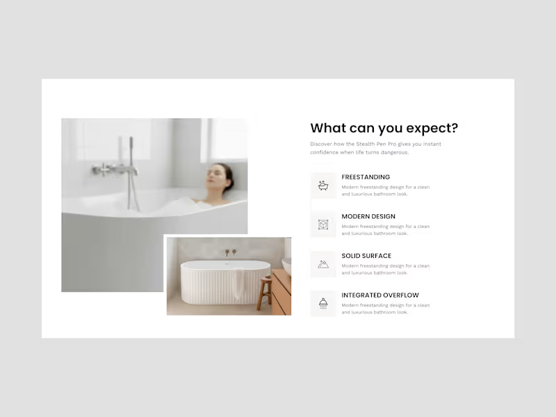
An organized benefit section helps to make decisions easier. Strong hierarchy, Clear points, and visuals help users know exactly what this is for. Less confusion. Better conversions.
0
45
0
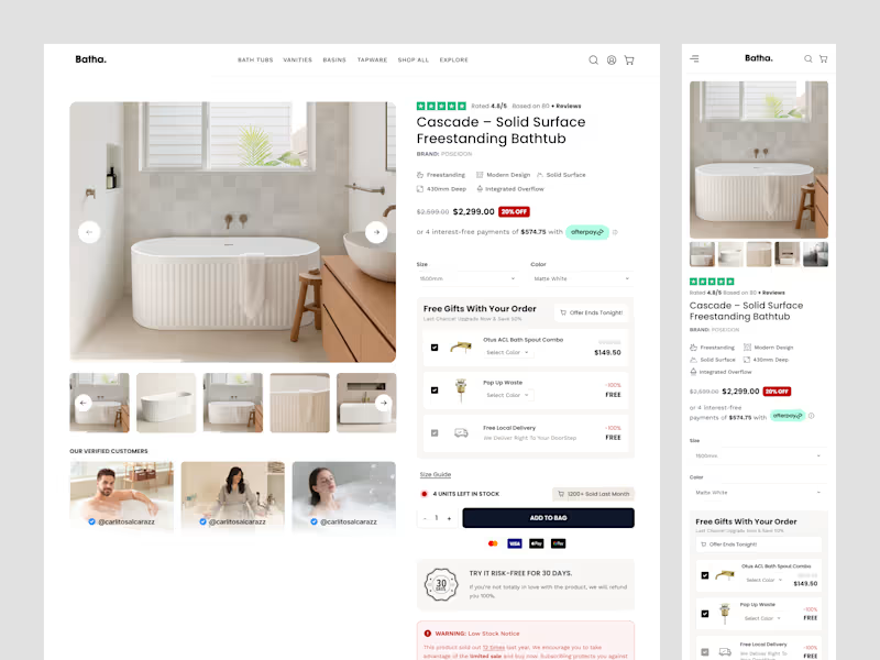
CRO-driven Shopify Product Page UI/UX Design 📌 Most eCommerce visitors decide whether to trust a product page within seconds. If users can't quickly find proof, value, and reasons to buy, they'll leave. ✅ This Shopify Bathroom & Bath Accessories product page applies CRO principles through social proof, benefit-focused content, pricing hierarchy, urgency, gifts, and delivery reassurance to turn more visitors into customers.
0
55
1
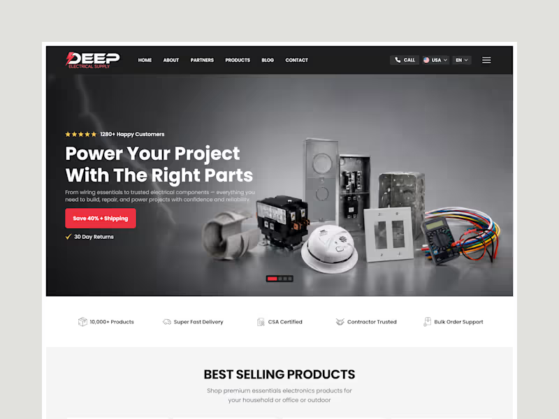
Shopify eCommerce UI/UX Designer | Electrical & Industrial Brands Good design isn't just about looks - it's about turning visitors into customers. If your Shopify store isn't converting, your UI/UX might be the problem. Let's fix that.
2
1
125
1
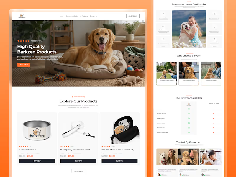
Petcare Product Ecommerce Landing Page UI/UX Design in Figma
2
1
169
Follow
Message
Md Mamun Hossain
Pabna, Bangladesh
Full-Stack Developer | WordPress, MERN & SEO
7
Followers
Follow
Message
Full-Stack Developer | WordPress, MERN & SEO
1
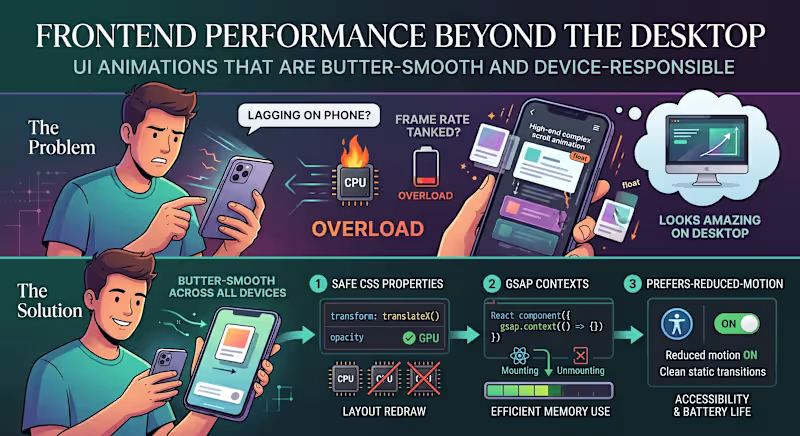
"The animations look amazing, but why is the page lagging on my phone?" The Problem: We’ve all seen modern websites loaded with high-end scroll effects, smooth micro-interactions, and floating cards. On a powerful developer desktop, it looks stunning. But hand it over to a user on a mid-range mobile device or a battery-saving laptop, and the frame rate tanks. The issue is that heavy animations are often tied directly to the browser’s main rendering thread. When your visual effects start competing with data fetching and DOM updates, the entire user experience grinds to a halt. The Solution: Smooth animations shouldn't cost you user performance. If you want high-end motion that stays butter-smooth across all devices, here is the 3-step technical approach to use: Animate Only the "Safe" CSS Properties: Never animate properties that trigger a layout redraw (like width, height, top, or margin). Stick strictly to transform (for moving/scaling) and opacity. These are handled directly by the GPU, bypassing the heavy CPU rendering pipeline. Isolate with GSAP Contexts: If you are building dynamic user interfaces in React or Next.js, use a dedicated animation library like GSAP paired with useGSAP() or explicit context cleanup. Unmounted components with leftover scroll triggers will quietly eat up device memory in the background. Respect prefers-reduced-motion: Always add a media query check for reduced motion. If a user has motion sensitivity or low-power mode enabled on their operating system, serve them clean, static transitions instead of complex scroll triggers. It’s better for accessibility and saves battery life. Visual polish should enhance the user experience, not break it. What’s your go-to strategy for balancing heavy UI animations with real-world website performance? Let’s chat in the comments! 👇
2
1
64
1
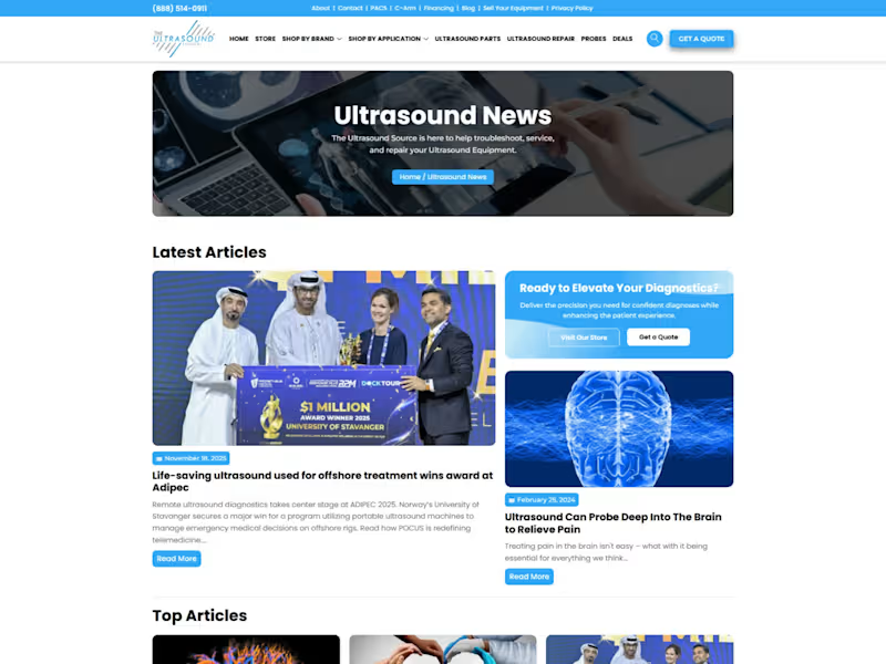
The Ultrasound Source I developed and managed the digital platform for The Ultrasound Source, a premier provider of new and refurbished ultrasound systems. The primary objective was to build a professional, trust-driven interface that caters specifically to hospitals, private clinics, and healthcare practitioners. The website features a complex product catalog that organizes equipment by brand and application, allowing users to easily filter between portable and console units from major manufacturers like GE, Philips, and Mindray.
1
174
0
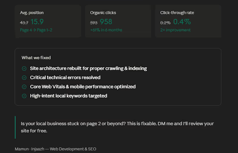
6 months ago, a contractor flooring supplier in Augusta came to me, stuck on page 4 of Google. Average position: 43.7 Monthly clicks: 593 Visibility: almost zero for the keywords that actually bring in customers. Here's what we fixed: — Rebuilt the site architecture so Google could properly crawl and index every page — Resolved critical technical errors that were silently killing rankings — Optimized for high-intent local keywords like "contractor flooring supplier Augusta" and "flooring pros Augusta" — Improved Core Web Vitals and mobile performance — Structured content around the questions real customers search before buying The result after 6 months: Average position moved from 43.7 → 15.9 Organic clicks grew from 593 → 958 CTR doubled from 0.2% → 0.4% The site now ranks on page 1–2 for keywords that bring in actual buyers. No paid ads. No shortcuts. Just technical execution and the right strategy. If you run a local business in the USA and your website is sitting on page 2, 3, or beyond — this is fixable. DM me or drop a comment. I'll take a look at your site and tell you exactly what's holding it back.
0
130
0
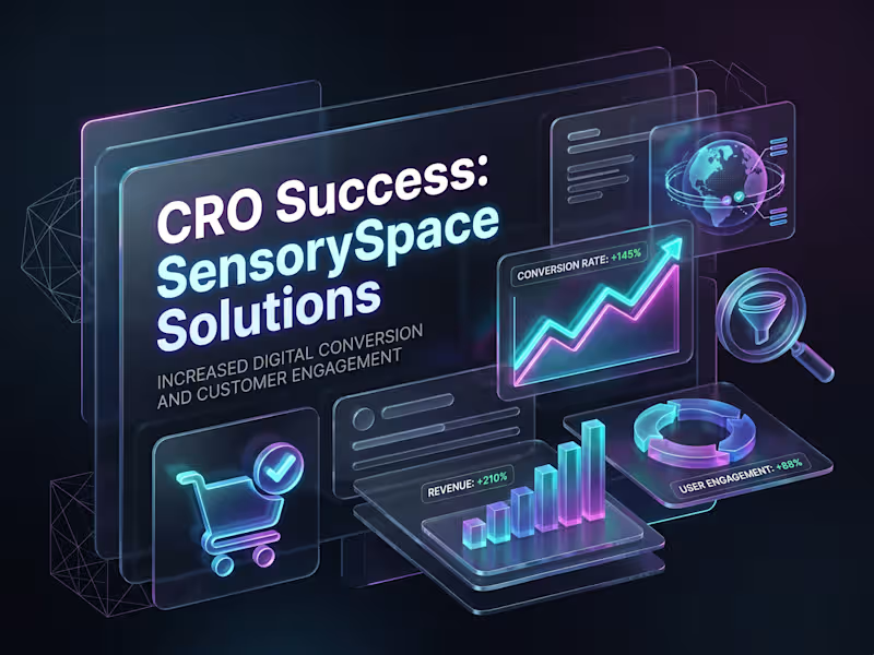
Shopify Conversion Rate Optimization (CRO) for SensorySpace Solutions Project Overview SensorySpace Solutions is a specialized e-commerce store dedicated to selling a variety of sensory products. While the website was generating consistent traffic, the sales and overall conversion rates were falling short of expectations. Operating as a solo freelancer, my primary responsibility was to conduct a comprehensive CRO audit and develop a data-driven framework and presentation to boost their conversions. The Challenge Upon analyzing the store, several key bottlenecks were identified: 1. Navigation Friction: The user experience (UX) and menu navigation were somewhat complex, making it difficult for potential customers to find their desired products quickly. 2. Insufficient Product Information: The product pages lacked compelling descriptions, high-quality visual hierarchy, and adequate social proof (customer reviews) to drive purchasing decisions. 3. Checkout Drop-offs: The process after adding items to the cart was too lengthy, resulting in a significantly high cart abandonment rate. The Solution & Execution To address these issues, I implemented a step-by-step strategic audit and optimization plan: 1. In-Depth CRO Audit: I conducted a deep dive into user behavior and website analytics to create a comprehensive CRO audit report identifying exact drop-off points. 2. UX/UI Optimization Recommendations: I proposed specific changes to modernize the product pages and make them more user-friendly. This included improving visual hierarchy, ensuring Call-to-Action (CTA) buttons were highly visible, and refining product descriptions. 3. Integrating Trust Factors: To build consumer confidence, I recommended the strategic placement of trust badges, secure payment icons, and highlighted customer reviews throughout the buyer's journey. 4. Strategic Presentation: I designed a professional presentation for the client that clearly outlined the audit findings, identified the core problems, and provided direct, actionable solutions. The Result By implementing the recommended framework and optimizations, the store saw several positive shifts: - A noticeable decrease in the website's bounce rate. - A increase in average session duration as users engaged more deeply with the optimized product pages. - A reduction in checkout drop-offs, which directly contributed to an improved overall conversion rate and increased sales. #ShopifyCRO #EcommerceGrowth #ConversionOptimization #UXDesign
0
165
Follow
Message
Nayeem Biswas
Kushtia, Bangladesh
Podcast • Talking Head • Reels Editor
Follow
Message
Podcast • Talking Head • Reels Editor
1
This is an ad campaign video for a study abroad agency that I edited. The campaign performed exceptionally well and generated strong sales results.
1
58
1
This is a talking-head style marketing video created for a study abroad agency. Due to its informative content and engaging structure, the video works effectively as a reel, an educational explainer, and a conversion-focused ad campaign.
1
70
1
This is a testimonial interview video for a study abroad agency, where a representative interviews a student about their visa processing journey and experience. Whatch is video on youtube: Click here (https://www.youtube.com/watch?v=wl-WtzEXctI)
1
55
1
Podcast, Reels & Trailers That Turned a Study Abroad Agency Into a Sales Machine.
1
96
Follow
Message
Explore people