Art Direction Projects in Community of MadridArt Direction Projects in Community of MadridGoal:
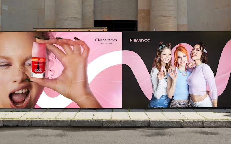
Our goal for Flaminco was to shape the cosmetic product not only as a functional FMCG category, but as a part of everyday self-expression. The main approach of the brand was based on creating a flexible and emotional visual world that adapts to the dynamic lifestyle of a young audience.
The open “M” shape used in the visual system symbolizes the free, changeable and adaptive character of Flaminco. This approach ensures that the brand is distinguished not only through color and aesthetics, but also through behavior and energy.
Target:
The main target audience of the brand is the young generation aged 16–25, who are sensitive to visual trends, value self-expression and seek aesthetic value in the products they use daily. Flaminco was formed with a more open and contemporary approach, aimed not only at a female audience, but also at everyone who cares about their appearance and style. The goal was to create a premium brand experience that is more interactive, flexible and able to build an emotional connection in the FMCG and retail market.
Result:
The result was a unified and flexible visual identity system for Flaminco that stood out in retail environments and could be easily expanded across digital platforms. The resulting visual language more strongly reflected the brand’s energy, flexibility and emotional connection with a young audience. The system was developed to serve as a sustainable and adaptive foundation not only for the current product line, but also for future campaigns, new product categories and communication directions. Seht — Haircare Product Photography
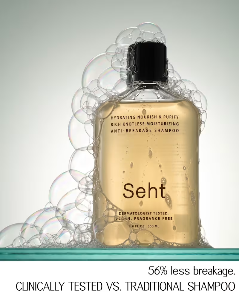
Seht is a dermatologist-tested, fragrance-free haircare brand. The client came to me with a clear vision: a moodboard of minimal, editorial product photography for their shampoo and conditioner, and a request to create images in that spirit without copying any of them.
The brief was clear, but it pulled in several directions: liquid in motion, foam, motion blur, dark still lifes, bright editorial rows. So before shooting anything, I built a short visual guide to hold the series together. It sets a three-tone palette, typography, camera and lighting rules, and one core restriction: only the product, its own formula, water and light in frame.
From that system I produced a set of 10 campaign images, plus extra frames for social. Each one was built from the client's references, then refined through retouching so the bottles, labels and formula textures stay true to the real product.
The result is a set that feels like a single campaign rather than ten separate photos, and a visual language the brand can keep building on.