The network for creativity
Join 1.25M professional creatives like you
Connect with clients, get discovered, and run your business 100% commission-free
Creatives on Contra have earned over $150M and we are just getting started
Back to feedPost

A new visual identity for Reroll.
We turned the O in the name into a die and built the wider brand language around that simple idea.
The project includes:
• Logo design
• Social media identity
• Logo animation
• Custom playing card back
• 3D visual assets
Creative direction: Dmitry Lepisov
Identity design + motion: Arthur Skripnik
Created by Lepisov Branding
Some of the 3D visuals and animation were made in Spline.


wow

Loved it!
best

Insane work, the dice roll transition is simply well done!

Love it!!! 😍


Fantastic work🔥👏👏

Turning the O into a die is such a clean idea to build a whole system on makes the logo animation and card back feel inevitable rather than tacked on. Nice work.


Turning the "O" into a die is such a clever, elegant anchor for the brand system. Using Spline for 3D assets and keeping that motion identity cohesive across cards and social assets is top-tier work!

Love what you did with the animation

You nailed the overall mood here. The details just reinforce it nicely.

This amazingggg
The network for creativity
Join 1.25M professional creatives like you
Connect with clients, get discovered, and run your business 100% commission-free
Creatives on Contra have earned over $150M and we are just getting started







Related posts

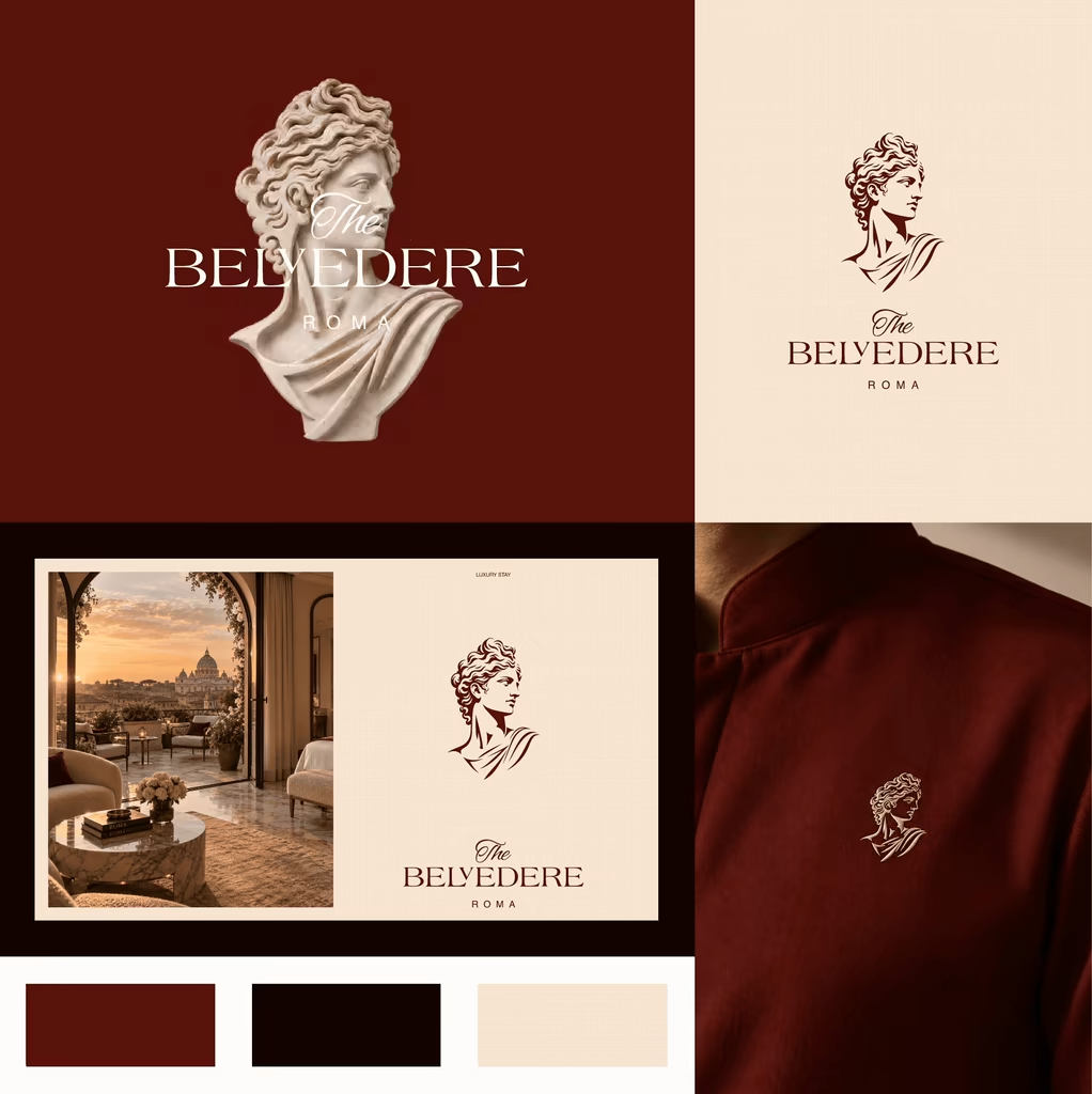
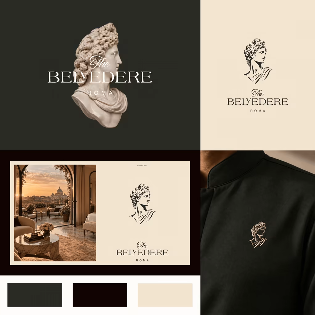
Which color direction feels right for BELVEDERE ROMA?
I’m exploring two visual directions for BELVEDERE ROMA, a luxury Roman hotel identity inspired by classical art, architecture, and contemporary Italian hospitality.
13 voted
46%
15 voted
54%
28 votes
Closed

Burgundy is closer to Rome's own palette — porphyry, cardinal, terracotta — which is exactly why so much classical-luxury hotel work already lives there. The green is the less expected read, and in my experience it holds better against brass and warm lobby light, where burgundy...


PrettyClever designed the Maximize website and hired me to build it 1:1 in Framer. Check it out below.


the maximize site in framer looks so good. how long was the 1:1?
I made two versions of a logo intro animation for my brand, Pixelblue, and can't decide which one's stronger.
To get an idea of the brand → Pixelblue Brand guidelines
Quick context: Pixelblue is a motion design studio focused on SaaS product demos, explainer videos, and social motion content. We've been doing this for 10+ years, mostly white-label, for agencies and marketing teams worldwide.
Would love your eyes on this: which version hits harder for you, and why? Pacing, reveal, timing, anything that stands out.
Drop your pick below (A or B) - genuinely curious what lands better from a fresh perspective.
7 voted
27%
19 voted
73%
26 votes
Closed

Going with B! Great work


