Freelancers using Vercel in CaliforniaFreelancers using Vercel in California
Full-Stack AI/ML Software Engineer

$50k+
Earned
1x
Hired
5.0
Rating
78
Followers
Full-Stack AI/ML Software Engineer
AI & ML Engineer
$1k+
Earned
7x
Hired
30
Followers
AI & ML Engineer
Fast-tracking business growth with intuitive interfaces
$25k+
Earned
3x
Hired
5.0
Rating
25
Followers
Fast-tracking business growth with intuitive interfaces
Product & Visual Designer · Brand Identity · UI/UX
2x
Hired
5.0
Rating
59
Followers
Product & Visual Designer · Brand Identity · UI/UX
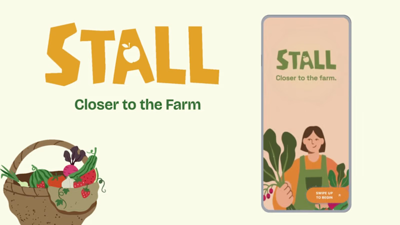
Cover image for Project title
STALL — Your farmers
Project title STALL — Your farmers market, alive. A swipe-to-shop farmers market companion that connects local vendors with regulars before Saturday ever arrives. The problem Every Saturday, the same thing happens. You show up to the farmers market at 10am. The ramp vendor you wanted is sold out by 9. You forgot cash. You walk past a honey stall three times because you can't remember if you already bought some. And that new mushroom farm you heard about? Gone before you spotted them. On the vendor side, it's just as frustrating. Small farmers wake up at 4am, load the truck, drive an hour, and have no lightweight way to tell their regulars — the people who actually want what they grow — "I have asparagus this Saturday. Come find me." STALL fixes both sides of that problem. What STALL does STALL is a two-sided farmers market app built around one weekly ritual: Saturday morning. For shoppers: Follow vendors at your local market Swipe through a weekly produce deck — right to add to your list, left to skip — exactly like Bumble, but for ramps and sourdough Get a Friday evening digest: what your vendors have this week, your auto-built shopping list, and where each stall is on the map Pre-reserve high-demand seasonal items before you leave the house Discover first-of-season arrivals with a "what's new this week" spotlight For vendors: Post a weekly inventory update in 3 taps — what you're bringing, quantities, price Reach your regulars directly before market day Manage pre-reservations without a complicated system The app celebrates the seasonal nature of farmers markets — ramps in April, strawberries in June, squash in October. Every week feels like something worth showing up for. How I built this with Google Stitch STALL was designed and prototyped entirely using Google Stitch as the primary build tool, with Figma used only for initial wireframing. The workflow: Day 1 — Brand and wireframes I started by defining the brand: the name, palette (Pumpkin Spice Forest — a warm amber, fern green, mauve, and cream system), and illustration direction. I wireframed the three core flows — swipe deck, Friday digest, and vendor post — before touching Stitch. Day 2 — Into Stitch I imported my Figma file directly into Stitch using the .fig import feature. From there I used streaming generation to build each screen live on the canvas — watching the splash screen, onboarding flow, and homepage assemble in real time was genuinely remarkable. The HTML-native canvas meant every animation I added — card tilt on swipe, drawer slide-up, bento tile stagger — rendered exactly as it would in production. Key Stitch prompts used: "Add a swipe gesture to the produce card stack — right swipe shows a green Added overlay with 5° card tilt, left swipe shows a mauve Skipped overlay with -5° tilt" "Make the shopping list items stream in one by one with 120ms stagger on page load" "Add a bottom drawer that slides up from the vendor card with spring easing — show the farm bio, full inventory list, and two action buttons" "Build the Friday digest screen — vendor items animate in sequentially, the seasonal spotlight card pulses gently" "Export web assets and deploy to Netlify" In-place edits I used: Swapped the swipe overlay color from red to mauve to match brand Adjusted the bento grid gap from 8px to 6px after seeing it render on canvas Changed the CTA button from outlined to filled after in-place visual comparison Rewrote the seasonal spotlight copy directly on the canvas without regenerating What Stitch made possible that nothing else could: The swipe gesture interaction, the drawer spring animation, and the staggered list streaming — all three of these would have taken days to hand-code. In Stitch, they were prompt-driven and live on the canvas within minutes. The gap between "designed" and "interactive prototype" collapsed entirely. Screens delivered Splash screen — farmer illustration, full-bleed cream background Onboarding screen 1 — market basket illustration, "Your market, every Saturday" Onboarding screen 2 — swipe mechanic explainer with card UI Onboarding screen 3 — Friday digest bento preview Homepage — bento grid with market header, seasonal spotlight, list, map preview, swipe deck, streak tracker Swipe deck — card front, vendor expand drawer, swipe right (added), swipe left (skipped) Friday digest — streaming vendor list, seasonal spotlight, auto-built shopping list Market day map — vendor stall grid, spot numbers, live confirmation states Vendor post flow — 3-tap inventory update screen Design decisions worth noting The swipe mechanic — Borrowing the Bumble swipe pattern for produce discovery was the conceptual breakthrough. It transforms a passive browse into an active, satisfying decision. Every right swipe builds your list. Every left swipe still shows you where the vendor is on the market map — skipping is never permanent. The Friday digest as the hero feature — Most apps make you come to them. The Friday evening push notification with a personalised market brief is the one moment where STALL comes to you. It changes Saturday morning from reactive to intentional. Bento homepage — Instead of a scrolling feed, the homepage gives you everything at a glance: your market, your list, the seasonal moment, your vendors. Seven tiles, seven pieces of information, zero scrolling. The color system — Pumpkin (#E8872A), Fern (#728040), Mauve (#B07090), Cream (#FDFAF6), and Moss (#4A5228). Every color has one job. Pumpkin is interactive. Fern is seasonal and confirmed. Mauve is reserved and streaks. Cream is every surface. Nothing competes. What I learned Stitch genuinely changes the prototyping workflow. The moment I stopped thinking of it as a design tool and started thinking of it as a build tool — one where the canvas is the product, not a picture of the product — everything accelerated. The in-place edit feature is the one I'll keep coming back to: being able to change a color, rewrite copy, or swap a component without regenerating the whole screen is the difference between iteration and rework. STALL started as a hackathon idea. After building it in Stitch, it feels like something real. Live Prototype: https://stitch.withgoogle.com/preview/8229547464152593644?node-id=e53124995cda49808685283be978dc8c
50
44
923
Websites + PWAs | Mobile-First Product Design
39
Followers
Websites + PWAs | Mobile-First Product Design
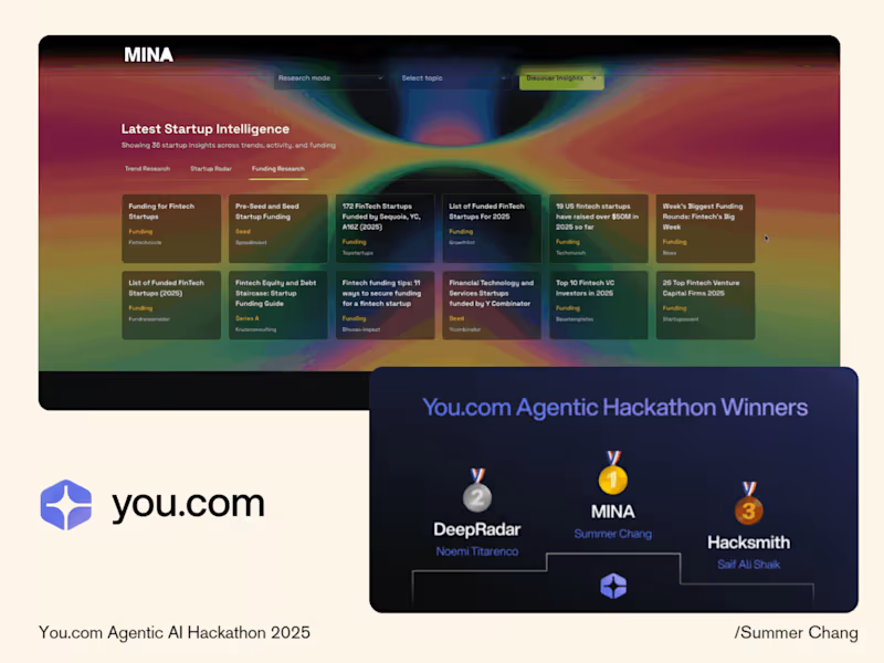
Cover image for The problem it solves
Every freelance
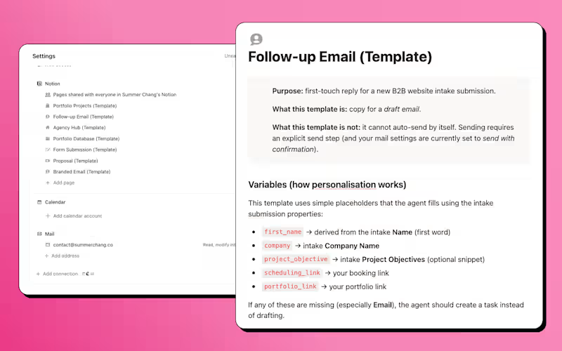
The problem it solves Every freelance designer knows the feeling — someone fills out your intake form, and suddenly you're the bottleneck. Writing follow-ups, sending confirmations, drafting reminders, chasing proposals. The work before the work. I built the Client Intake Agent to handle all of it. What it does A 9-step automated pipeline that runs from the moment a lead submits an inquiry to the moment they receive a proposal — with the right things automated and the right things kept as drafts for human review. → New intake submission → agent drafts a branded Gmail follow-up with portfolio examples matched to the client's service request → Lead books a call → confirmation email auto-sends instantly → Day before the meeting → reminder auto-sends at 7am → After the call → agent drafts the proposal, contract, and deposit invoice when you're ready Why it's reusable The agent is built as a template — not tied to one person's data. Anyone can duplicate it, swap in their booking link, populate their portfolio database, and run the same workflow in under an hour. The instructions include a full constants block, defined status values, and copy-paste prompts to get started immediately. Judging criteria — how this entry maps — Clarity of use case: Freelance designer, client intake, first inquiry to signed proposal — Quality of instructions: Step-by-step pipeline, named triggers, send rules, guardrails, status definitions, and fallback logic — Reliability and safety: Human review on every client-facing email except confirmations and reminders — where timing matters and content never changes — Impact: Eliminates the highest-friction part of freelance ops — the first 72 hours after a lead reaches out — Craft: Branded emails, STAR-format portfolio database, placeholder links for DocuSign and QuickBooks, and a clean setup guide anyone can follow Links — Custom Agent: https://www.notion.so/agent/3352d5cd-4ef4-80a1-a3d6-009263fd916f (https://www.notion.so/agent/3352d5cd-4ef4-80a1-a3d6-009263fd916f)— Marketplace listing: https://www.notion.so/marketplace/custom-agents/client-intake-agent (in review)
1
5
194
Email & Lifecycle for Consumable DTC Brands

New to Contra
Email & Lifecycle for Consumable DTC Brands
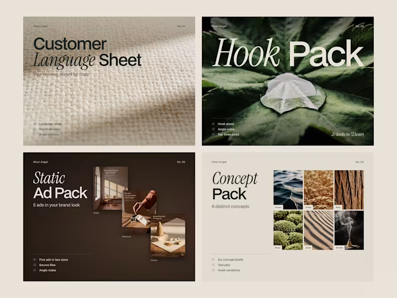
Cover image for Every brand resource tells you
Every brand resource tells you something different. Start with positioning. No — start with audience. No — here's a 40-page template, good luck. I was building my own brand — a handcrafted botanical incense line called Sensori Awakened — and I kept hitting the same wall. The vision was clear. The feeling was precise. I knew exactly what the brand should be before I could explain what it was. The tools I found were built for one side of that problem or the other. The creative tools asked me to feel. The operational tools asked me to execute. Nothing helped me translate between the two. That gap is where most founders lose the thread. I built Theseus because I needed it myself. It is an interactive brand-building tool built in Figma Make. One question at a time. Four stages. Each one deeper than the last. The Horn pulls your founding premise out of the abstract and names it. The Maze maps the sensory and visual world your brand actually inhabits. The Heart confronts what you are selling, to whom, at what price — and writes your positioning statement back to you in a single sentence. The Sword turns everything into an operational playbook for a one-person founder. The system listens. It adapts. It quotes your own words back to you as the questions get sharper. By the end, every decision traces back to the first thing you said was true about your brand. That connective logic is The Thread — borrowed from the myth of Theseus navigating the labyrinth. The founder is Theseus. The complexity of building alone is the labyrinth. The methodology is what gets you out.: That is what the thread does when it holds. You leave with four generated documents and a markdown file ready to build on. 12 to 20 minutes. No account. No onboarding. Just clarity on the other side. Try it: https://drift-net-77953604.figma.site (https://drift-net-77953604.figma.site)Full case study: https://contra.com/p/WoOrlWQl-theseus-or-interactive-brand-building-for-founders Built with Figma Make for the @Figma Config Makeathon. #ConfigMakeathon #Figma #BrandStrategy #CreativeFounders #FigmaMake
2
160