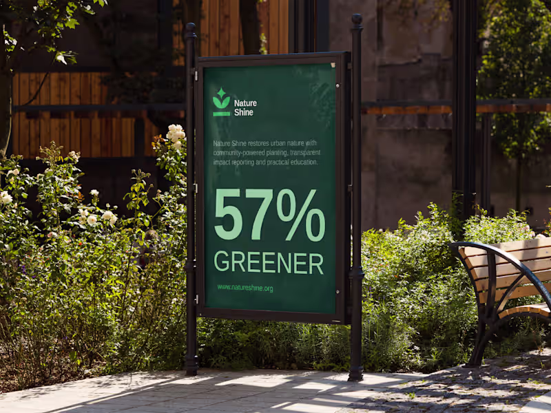
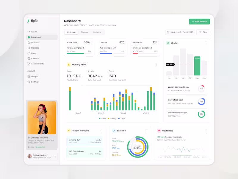
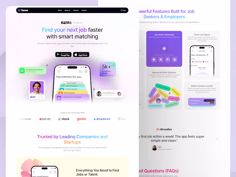
UI UX designer | UI/UX Design | Webflow | Figma | Framer
- 5.0
- Rating
- 132
- Followers
UI UX designer | UI/UX Design | Webflow | Figma | Framer
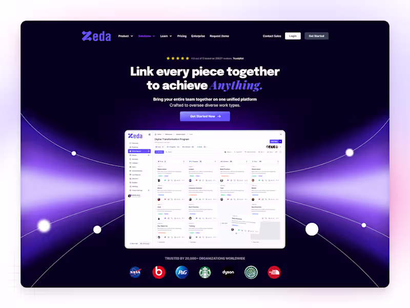
Sr. Product Designer
Sr. Product Designer
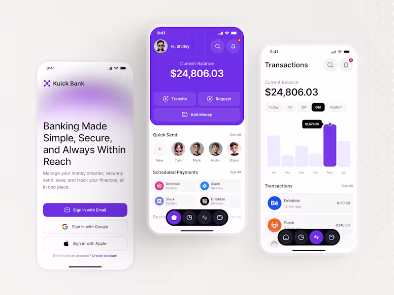
UI/UX Designer building for humans, not just for screens.
- 21
- Followers
UI/UX Designer building for humans, not just for screens.
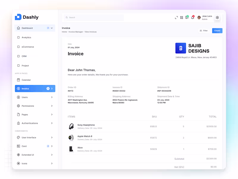
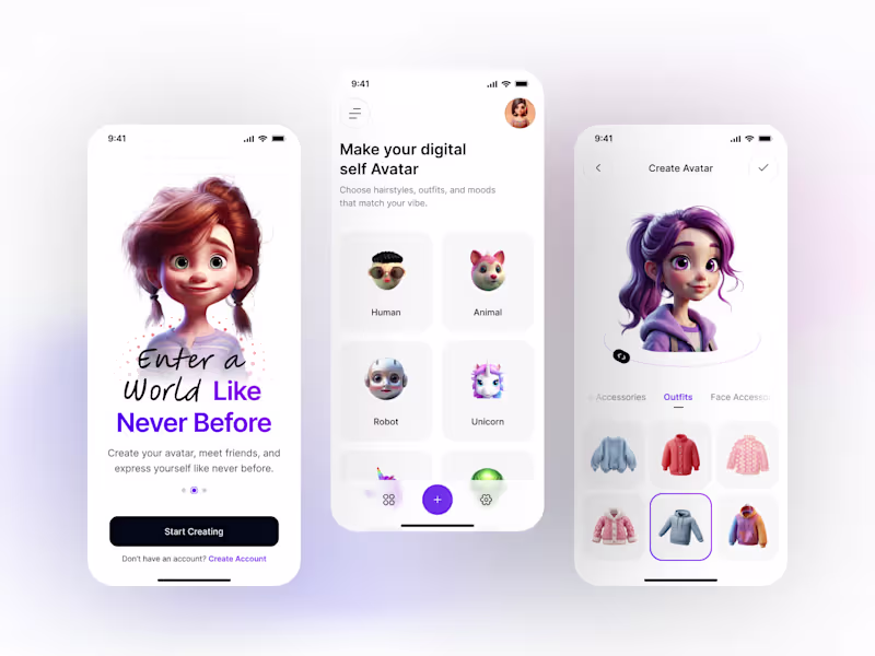
Senior UX/UI Designer | SaaS , Mobile App, Website Designer
- 10
- Followers
Senior UX/UI Designer | SaaS , Mobile App, Website Designer
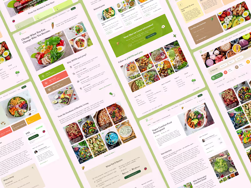
Experienced & Business Oriented UI/UX Designer
Experienced & Business Oriented UI/UX Designer
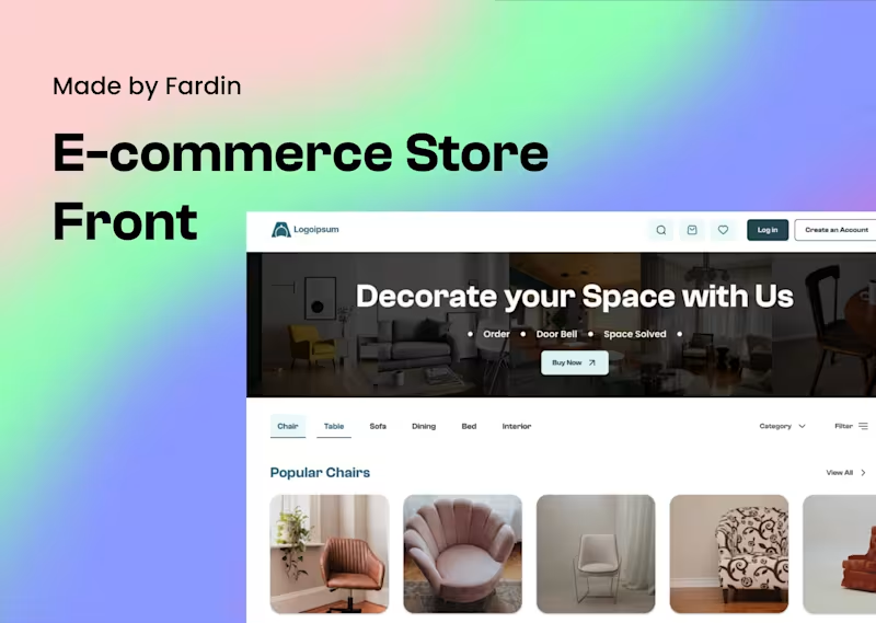
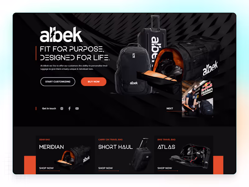
Web Designer & Developer with Visual Lead
Web Designer & Developer with Visual Lead

Creative Brand & UI/UX Designer 🎨✨
- $1k+
- Earned
- 1x
- Hired
- 5.0
- Rating
- 10
- Followers
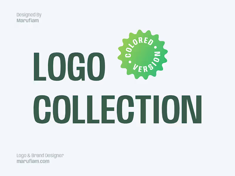
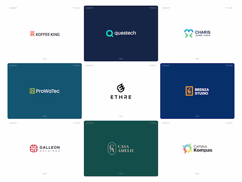
Creative Brand & UI/UX Designer 🎨✨

Logo & Brand Identity Designer - Top 5% on Contra
- 5.0
- Rating
- 347
- Followers
Logo & Brand Identity Designer - Top 5% on Contra