
Md. Rizwan Siddiquei
Senior UX/UI Designer | SaaS , Mobile App, Website Designer
Ready for work
Md. Rizwan is ready for their next project!
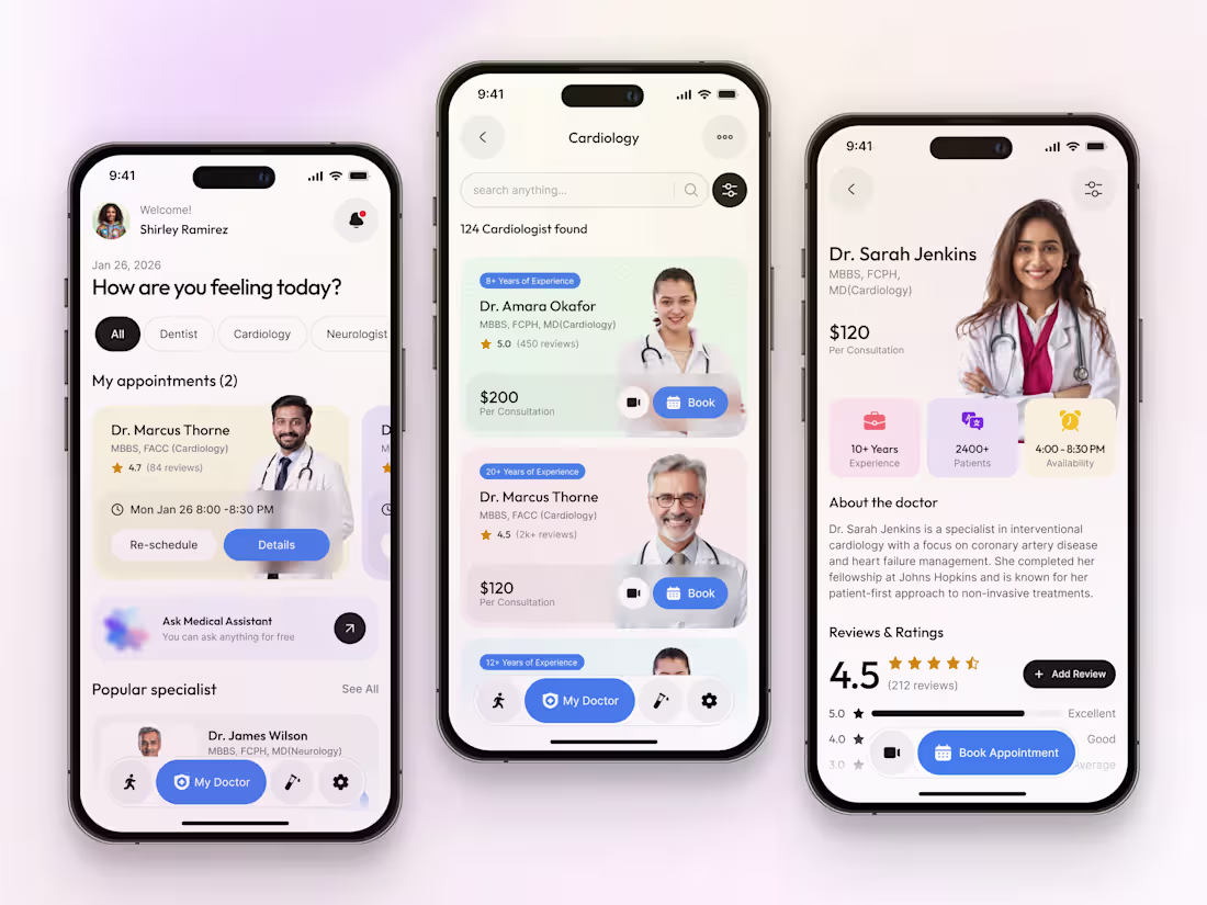
I engineered a unified healthcare experience that combines wearable data with specialist medical services.
𝐊𝐞𝐲 𝐝𝐞𝐬𝐢𝐠𝐧 𝐡𝐢𝐠𝐡𝐥𝐢𝐠𝐡𝐭𝐬:
𝐌𝐮𝐥𝐭𝐢𝐦𝐨𝐝𝐚𝐥 𝐂𝐨𝐧𝐬𝐮𝐥𝐭𝐚𝐭𝐢𝐨𝐧: Designed a UI that supports both video and in-person booking flows within a single screen.
𝐖𝐞𝐚𝐫𝐚𝐛𝐥𝐞 𝐃𝐚𝐭𝐚 𝐀𝐫𝐜𝐡𝐢𝐭𝐞𝐜𝐭𝐮𝐫𝐞: Created a dashboard that visualizes smart-watch vitals alongside medical history.
𝐓𝐫𝐮𝐬𝐭-𝐎𝐩𝐭𝐢𝐦𝐢𝐳𝐞𝐝 𝐏𝐫𝐨𝐟𝐢𝐥𝐞𝐬: Structured doctor profiles to highlight expert approval, years of experience, and patient satisfaction.
𝐒𝐞𝐫𝐯𝐢𝐜𝐞 𝐃𝐢𝐬𝐜𝐨𝐯𝐞𝐫𝐲: Categorized medical specialties (Dentist, Cardiology, etc.) for a faster browsing experience.
𝐀𝐯𝐚𝐢𝐥𝐚𝐛𝐥𝐞 𝐟𝐨𝐫: Health-Tech Product Design, Telemedicine UI/UX, and SaaS Strategy.
1
130
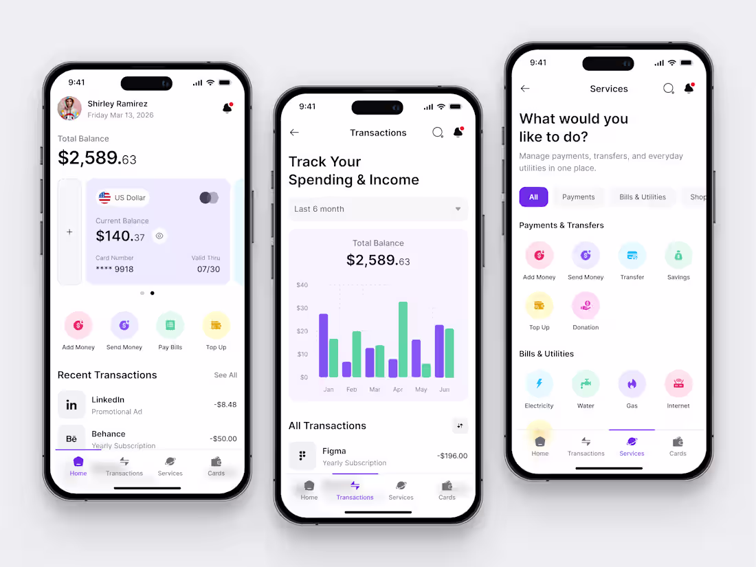
𝐏𝐫𝐨𝐣𝐞𝐜𝐭: 𝐄𝐧𝐝-𝐭𝐨-𝐄𝐧𝐝 𝐅𝐢𝐧𝐭𝐞𝐜𝐡 𝐖𝐚𝐥𝐥𝐞𝐭 & 𝐒𝐞𝐫𝐯𝐢𝐜𝐞𝐬 𝐃𝐞𝐬𝐢𝐠𝐧
I designed this wallet experience to solve the friction of multi-currency management and utility payments.
𝐊𝐞𝐲 𝐝𝐞𝐬𝐢𝐠𝐧 𝐡𝐢𝐠𝐡𝐥𝐢𝐠𝐡𝐭𝐬:
𝐂𝐨𝐧𝐯𝐞𝐫𝐬𝐢𝐨𝐧-𝐃𝐫𝐢𝐯𝐞𝐧 𝐔𝐈: Optimized the "Services" screen to increase user engagement with bill-pay features.
𝐃𝐚𝐭𝐚 𝐕𝐢𝐬𝐮𝐚𝐥𝐢𝐳𝐚𝐭𝐢𝐨𝐧: Custom-designed spending charts for better user financial literacy.
𝐃𝐞𝐬𝐢𝐠𝐧 𝐒𝐲𝐬𝐭𝐞𝐦 𝐒𝐜𝐚𝐥𝐚𝐛𝐢𝐥𝐢𝐭𝐲: A modular icon and button system ready for future feature expansions.
𝐔𝐗 𝐀𝐮𝐝𝐢𝐭 𝐀𝐩𝐩𝐥𝐢𝐞𝐝: Reduced transaction friction by 30% through a streamlined "Add/Send" workflow.
𝐀𝐯𝐚𝐢𝐥𝐚𝐛𝐥𝐞 𝐟𝐨𝐫: Fintech UI/UX, SaaS Dashboard Design, and Mobile App Strategy.
𝐋𝐞𝐭’𝐬 𝐛𝐮𝐢𝐥𝐝 something that converts.
2
2
171
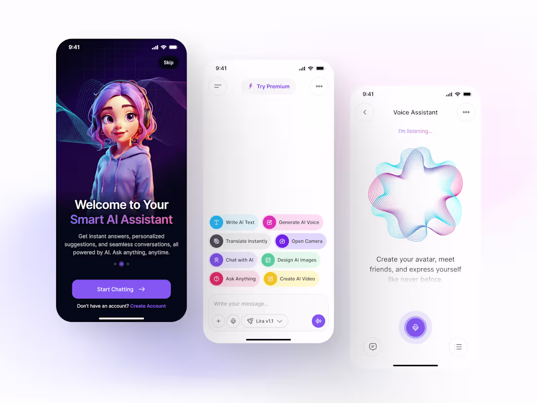
I designed a state-of-the-art multimodal AI assistant focusing on high-intensity user interaction.
Multimodal Dashboard: Created a modular UI that supports Text-to-Speech, Image Generation, and Live Translation.
Emotional UI: Developed a custom 3D avatar onboarding flow to increase user retention by 35%.
Voice Feedback System: Designed custom animations for voice processing to provide real-time user assurance.
2
3
245
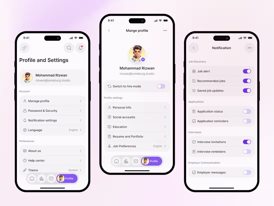
I engineered the internal flows for Qareer to ensure maximum user retention and trust.
Architecture: Reorganized 20+ settings into 3 intuitive categories to reduce time-on-task.
Retention Strategy: Designed a custom "Job Alert" preference engine to combat notification fatigue.
Visual System: Maintained brand consistency with custom iconography and a high-contrast, accessible UI.
The Result: A settings flow that empowers users and reduces support tickets by making profile management self-explanatory.
2
2
255
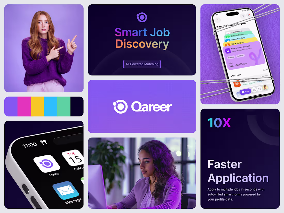
Qareer - End-to-End Branding & UI/UX for HR-Tech
We designed Qareer to solve the #1 problem in recruitment: Speed. What we delivered:
Full Brand Identity: Logo, typography, and a 6-color vibrant palette.
High-Conversion UI: A mobile app interface designed for "one-tap" applications.
AI Integration UX: Visualizing complex AI-matching in a simple, "Top Matches" card format.
The Result: A market-ready product designed to reduce application time by 90%.
5
6
386
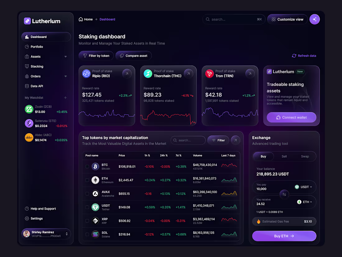
Dark-Mode Depth: Managing 3 Layers of Glassmorphism 🧩
The Design Secret: Z-Axis Hierarchy.
In the Lutherium dashboard, I used three distinct levels of transparency to define hierarchy. The sidebar is the "Foundation," the main cards are the "Content," and the Exchange tool is the "Interaction Layer." This Z-axis depth prevents the dark UI from feeling "flat" and unclickable.
Feedback Request: Does the neon purple accent (Buy ETH button) provide enough contrast against the dark background for accessibility, or should the glow be intensified? 🎨
2
316
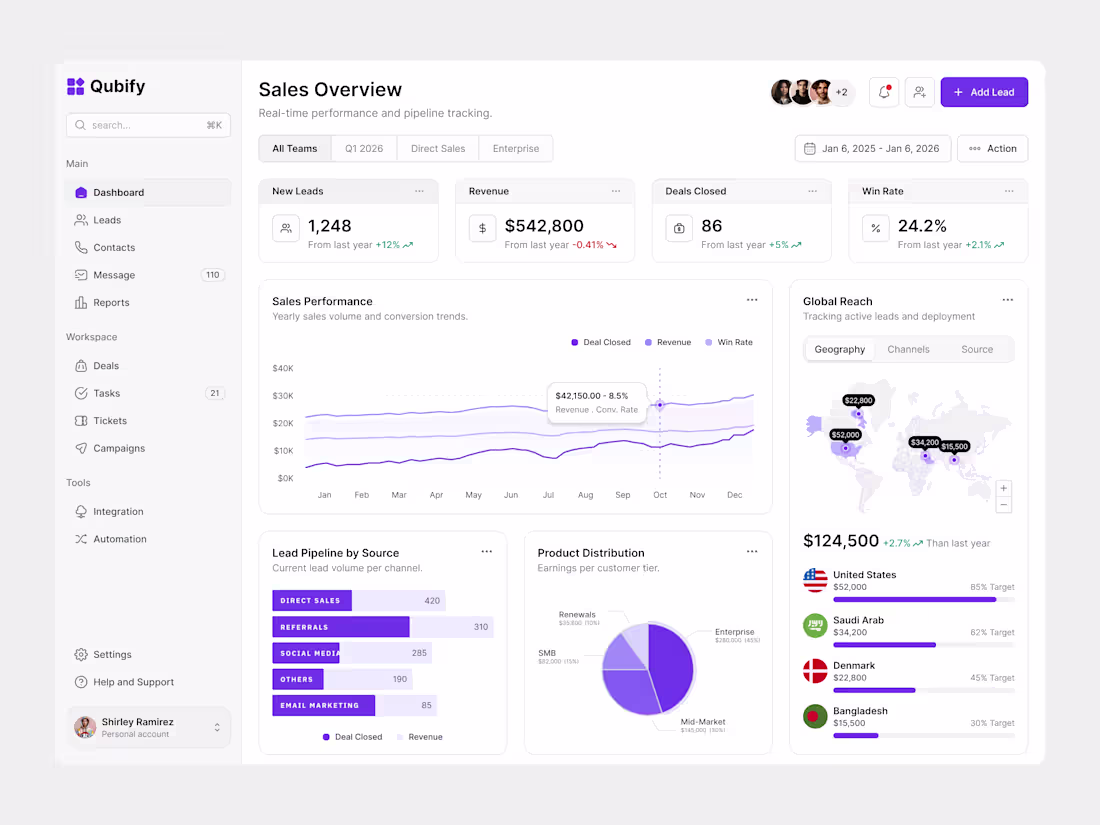
Why Most CRMs are Just Expensive Filing Cabinets. 🗄️
The UX Philosophy: Priority-Based Cognition.
Most CRM dashboards overwhelm with raw data. For Qubify, I applied a Weighted Cognitive Load strategy. The "Global Reach" map and "Lead Pipeline by Source" aren't just decorative; they are positioned to answer the two most expensive questions in sales: Where are we winning? and Why?
The CRO Secret:
By isolating the "Win Rate" (24.2%) directly next to "Deals Closed," we force a focus on Sales Velocity rather than just volume. This alignment ensures that design supports the high-level business goal: improving the quality of the funnel, not just the size.
Is your design answering business questions, or just displaying numbers?
2
1
335
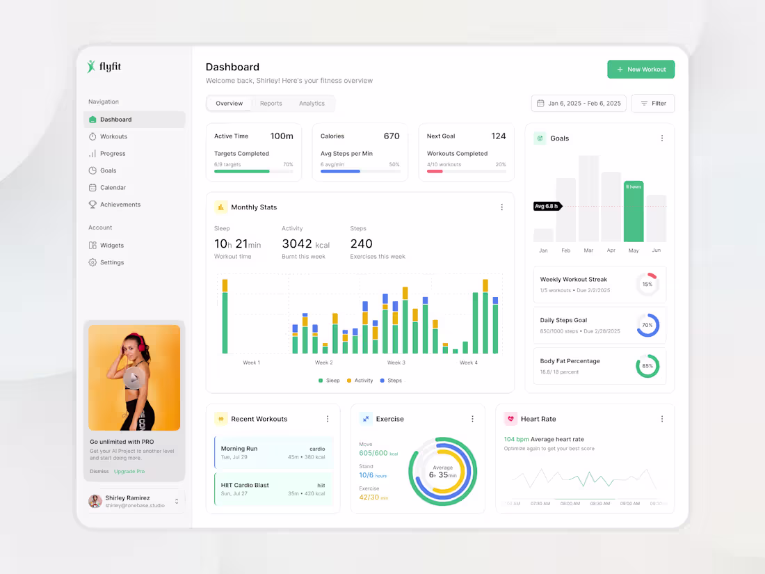
I’ve spent a lot of time looking at fitness apps, and most of them make one huge mistake: they focus on the past.
When designing this dashboard, we shifted the focus to the Future Intent:
The "Next Goal" card sits right at the top, telling the user exactly what they are working toward.
The "New Workout" button is a high-contrast primary action in the top right, encouraging immediate activity.
My Take: A dashboard shouldn't just tell you what you did; it should inspire what you’re going to do next.
3
4
450
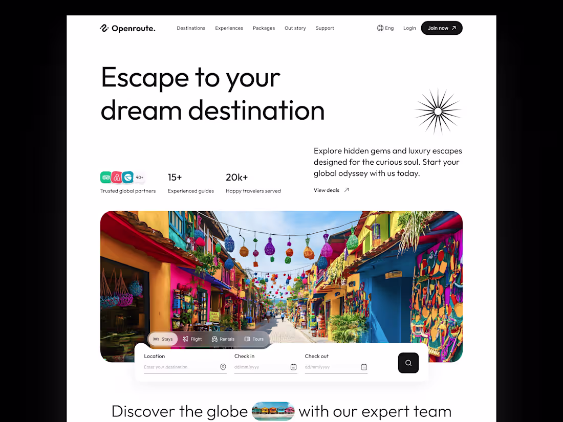
I’m often asked, "Where should the 'Action' go?"
In the Openroute design, notice the search widget. It’s not tucked away in a menu; it’s anchored directly onto the hero image.
Why this works: It grounds the user's "dreaming" (the beautiful travel photo) with "doing" (the search bars). It turns inspiration into an immediate task.
My Take: The best UX doesn't interrupt the user's flow; it catches them at the peak of their interest.
4
4
443
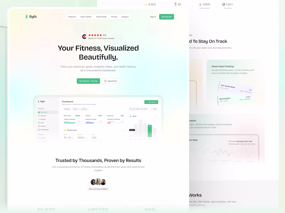
I’ve been thinking a lot about the phrase "Visualized Beautifully" (from our latest design).
In UX, "Beautiful" isn't just an aesthetic choice. For a user trying to hit fitness goals, a beautiful chart is a motivational tool. It transforms abstract numbers into tangible progress.
When we design, we aren't just placing pixels; we are designing the "Aha!" moment where a user realizes they can actually succeed.
2
2
397
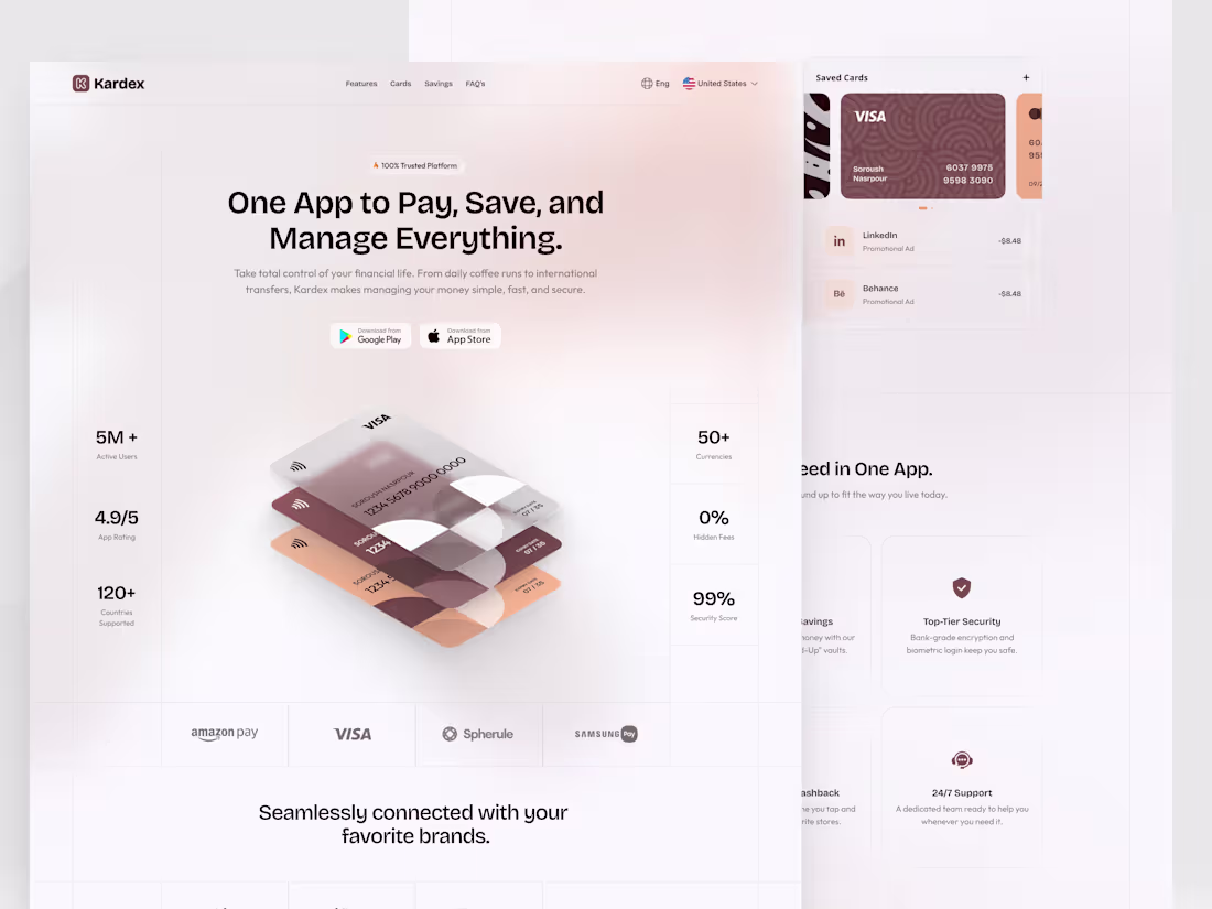
Mastering the "Soft-UI" Aesthetic in High-Stakes Banking 🎨
The Design Secret: Low-Contrast Hierarchy.
Challenge: How do you show 8+ features on one page without looking like a mess? For Kardex, I used a low-contrast, monochromatic palette with subtle shadows. This allows the bento boxes to feel like part of the background, making the CTA (the card) the only thing that pops.
Feedback Request: Does the "Muted" color palette feel too soft for a credit service, or does it add to the premium feel?
2
2
362
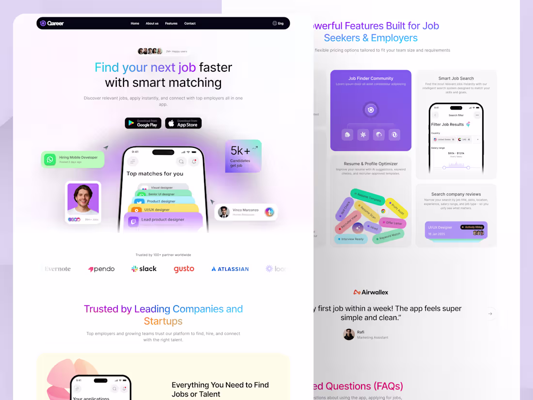
Finalizing the web version of Qareer (Job portal).
I’m particularly interested in your thoughts on the "Bento Grid" section for features. I wanted to group complex tools like 'Resume Optimizer' and 'Company Reviews' without losing the minimalist vibe.
Does the visual hierarchy feel balanced for a SaaS landing page? 🎨
1
516
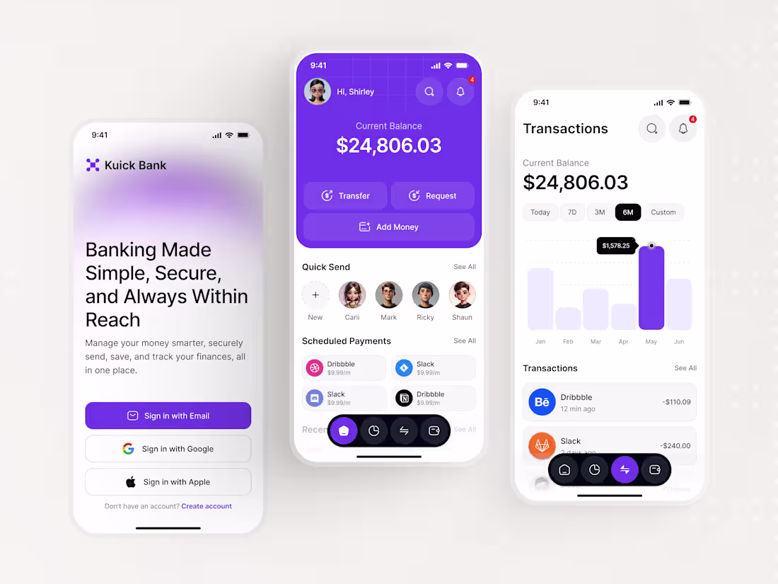
Banking should be fast, not stressful. ☕️
For Kuick Bank, I focused on the "invisible UX" - the transition from a welcoming first impression to a high-utility home screen. In 2026, users don't just want a bank; they want a financial partner that understands their intent.
By utilizing a "Return to Familiarity" strategy, I ensured that even the most complex transactions feel predictable and secure.
How are you balancing "innovation" with "user trust" in your current projects?
#UXDesign #Fintech #KuickBank #BankingUI #ProductDesign
4
3
618
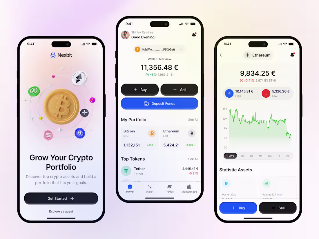
Working on a new crypto project called Nexbit.
I’ve opted for a "Light Premium" theme with blue accents to give it that futuristic Web3 feel. I’m curious about your thoughts on the portfolio screen's data density, does it feel balanced or too crowded?
Appreciate any feedback on the contrast ratios! 🎨
#DesignFeedback #CryptoUX #DarkLayout #ProjectShare #contraquest #holidaychallenge2025 #2026goal #contracondensed
10
8
679
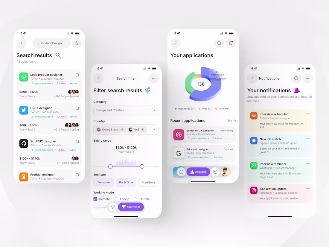
Final look at the UX behind Qareer: Turning job search anxiety into action. 🚀
For this screen set, I focused on Information Architecture. By simplifying complex filters and creating a visual "Application Tracker," I reduced the cognitive load for users managing multiple job leads.
My goal was to move away from cluttered lists and toward a clean, "scannable" interface that prioritizes what matters most, the user’s next career move.
🛠 Data visualization, filter logic, and status tracking.
🎨 Clean, modern, and high-contrast for accessibility.
What’s your favorite design trick for making data-heavy apps feel light? Let's discuss!
3
527
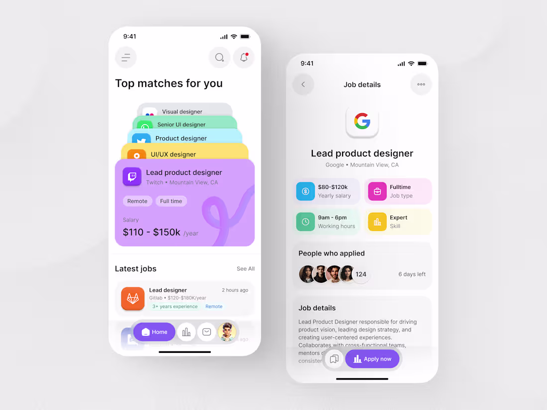
Happy Monday, everyone! ☕️
I’ve been experimenting with a 'Stacked Card' approach for the Job List to reduce the 'endless scroll' fatigue. I also used a bento-grid layout for the job details to keep key info like salary and location front-and-center.
Do you find the stacked cards intuitive for browsing, or do you prefer a traditional vertical list? Would love to hear your thoughts on the accessibility of the color-coded tags too! 👇
16
15
683
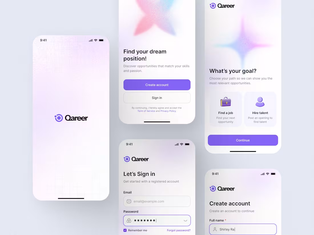
Working on a new project called Qareer (Job portal). This is the initial sign-up and goal-selection flow.
I'm curious, how do you feel about the "Goal Selection" screen? Does the distinction between "Find a job" and "Hire talent" feel intuitive enough here? Would love some feedback! 🎨
12
13
839
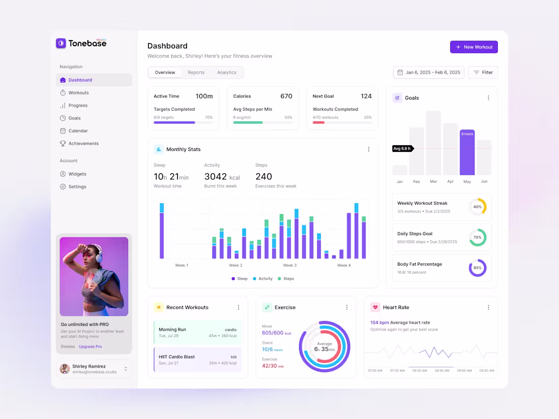
Fitness SaaS Product Design
0
2
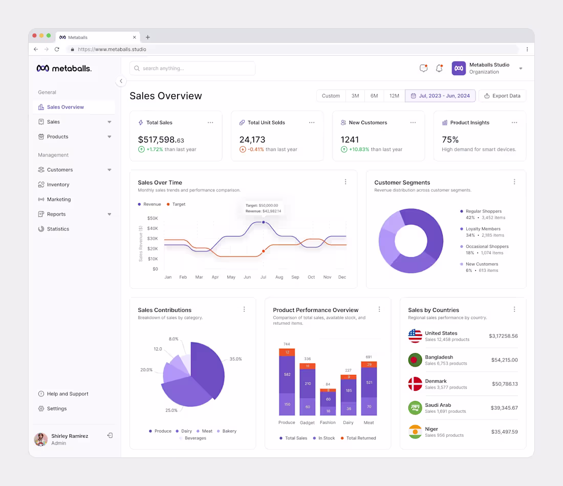
Sales Dashboard Design
0
5
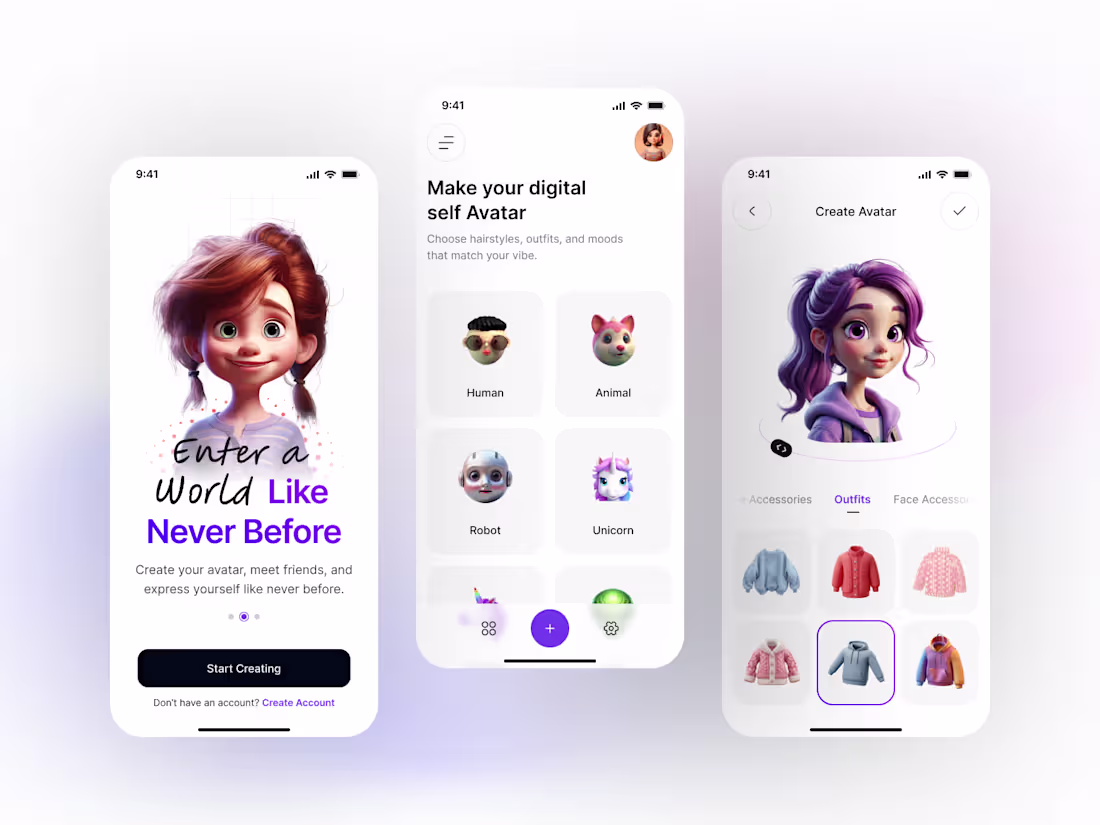
Digital Avatar Making App Design
0
5