A Real-time AQI App (Air Quality Index) with Weather Forecast
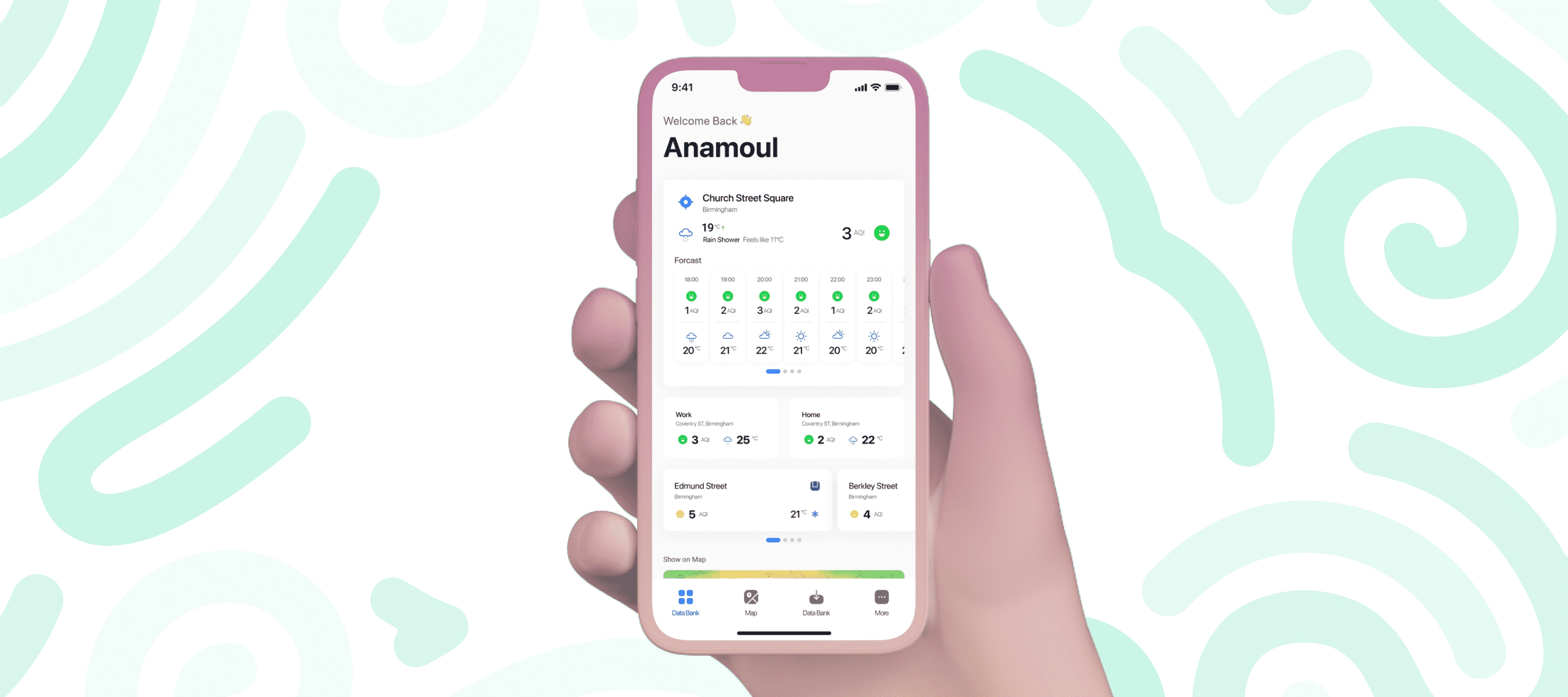
Product: AirAQ App
Timeline: June 2021 – September 2021
My Role: UX Research, UI/UX Design
Tools: Figma, FigJam, Notion.
Platform: Hybrid App.
Team Collaboration: Product, Business, and Tech.
Background
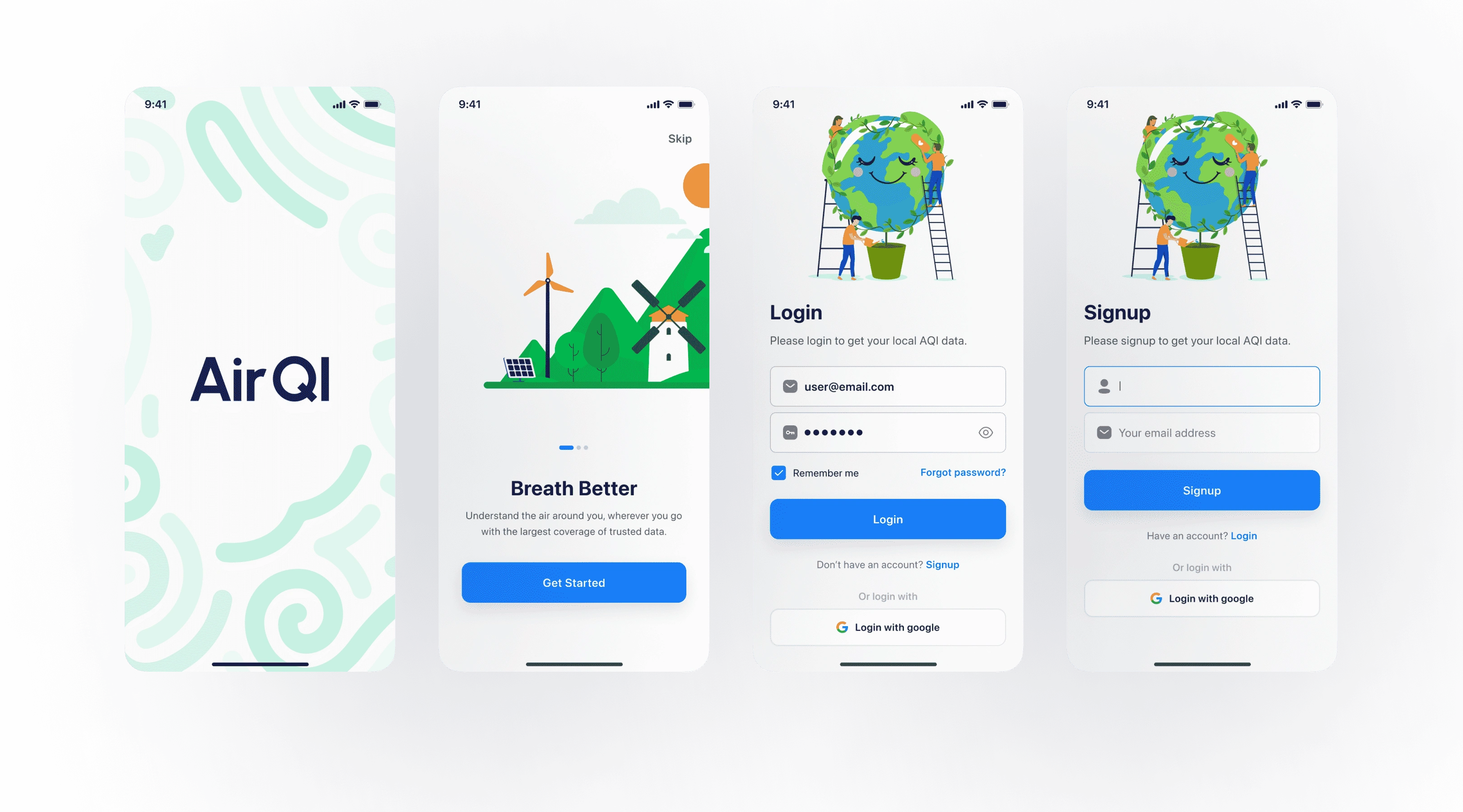
AirQI provides real-time and forecast air pollution and weather data. Our main challenge is to design a hybrid app that provides users an intuitive customized experience.
Goal
Design a conversion-friendly user flow.
Get more efficient, functional, and scalable apps with more efficient, and functional.
Design Challenge
Design Candidate Panel from Scratch
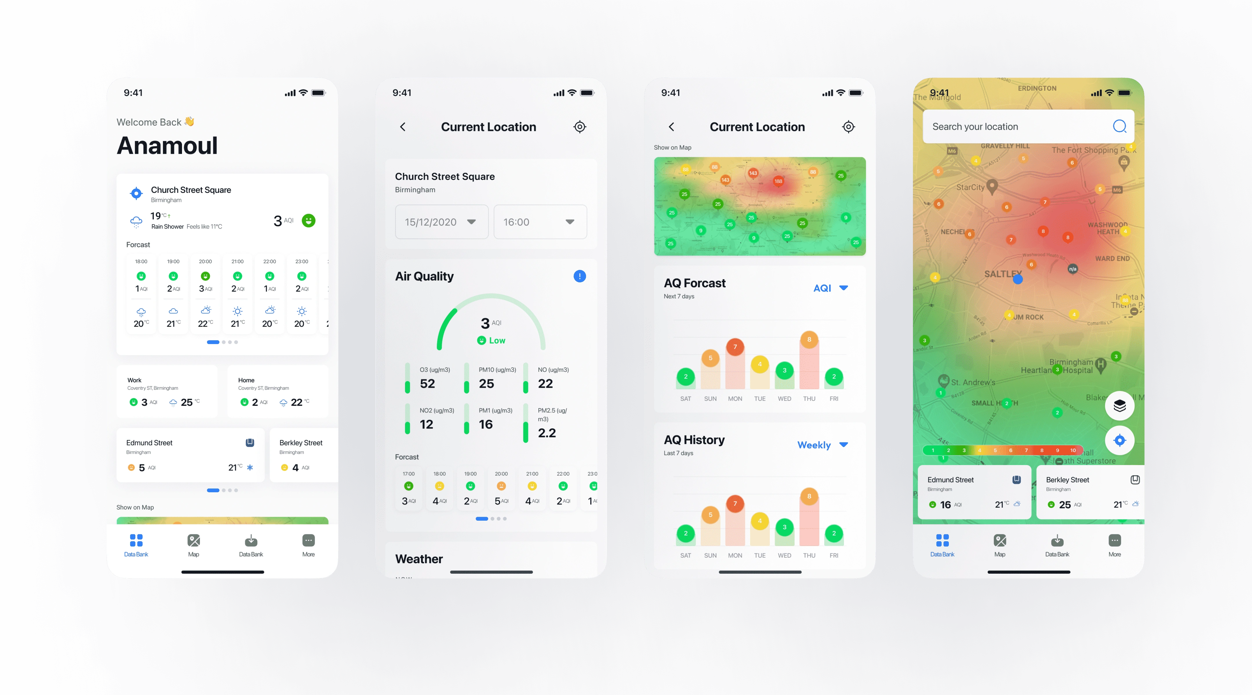
Our main challenge was designing a web app that lets its users know about air quality and weather information.
It has to be easily used by non-tech people.
Users can get air quality and weather updates through notifications for saved & current locations.
Users can get air quality and weather forecasts.
Users can also request air quality information data.
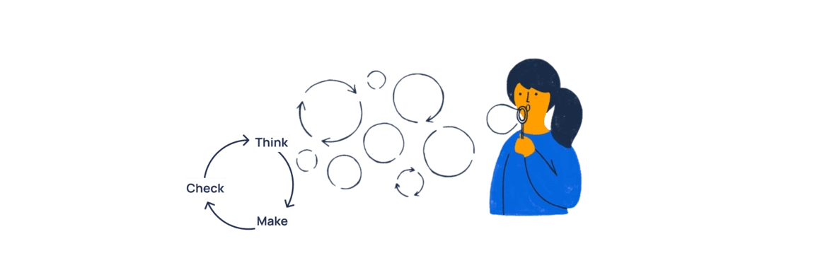
The Lean UX process to move forward
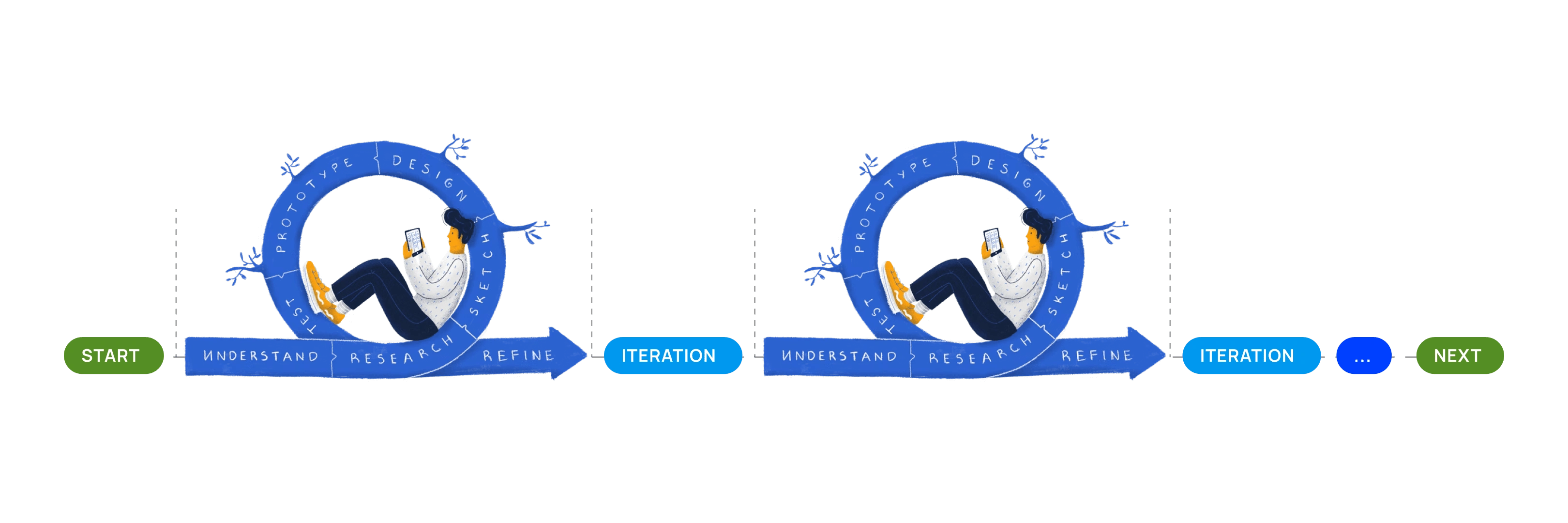
When we have minimal time and resources, selecting an efficient, sustainable, and flexible design process is always challenging. I have chosen the approach to the Lean UX process. It is an iterative process with three simple steps.
Think
Make
Check
...and keep repeating the steps.
The discovery phase was a quick, high‐intensity effort
The discovery phase was a quick, high‐intensity effort that allowed us to -
Define project goals and milestones
Review the existing solutions by other similar products
Understand business visions
Empathize the users' needs, behaviors, and pain‐points
Understand technological feasibility and constraints.
Here are three considerations that help me to understand and prioritize the issues.
How satisfying is the solution for users?
How well is this solution for users' problem solving and also good for business?
How challenging would it be to build from the technical feasibilities and limitations?
We visited our targetted users
We have sessions with 10 targeted users. We also had brainstorming discussion sessions with our internal cross-functional team members. So what we found-
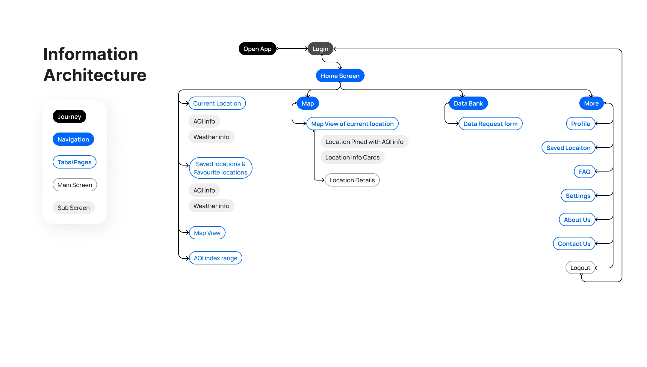
I analyzed IQAir, BreezoMeter, Plume Labs, Airveda, and other popular air quality information provider apps. I analyzed their user journey flows, information architecture, and information presentation flow.
Sketches, Wireframing, and Testing
The following steps were to sketch wireframes based on the user flow maps and build the flow and low-fidelity prototype for a series of testing sessions.
Creating wireframes helped me visualize the ideas and gave us the basic structure for how users would use the app.
When creating these wireframes, we kept the user needs from the earlier findings and research in mind.
I have done several testing sessions with a close group of users.
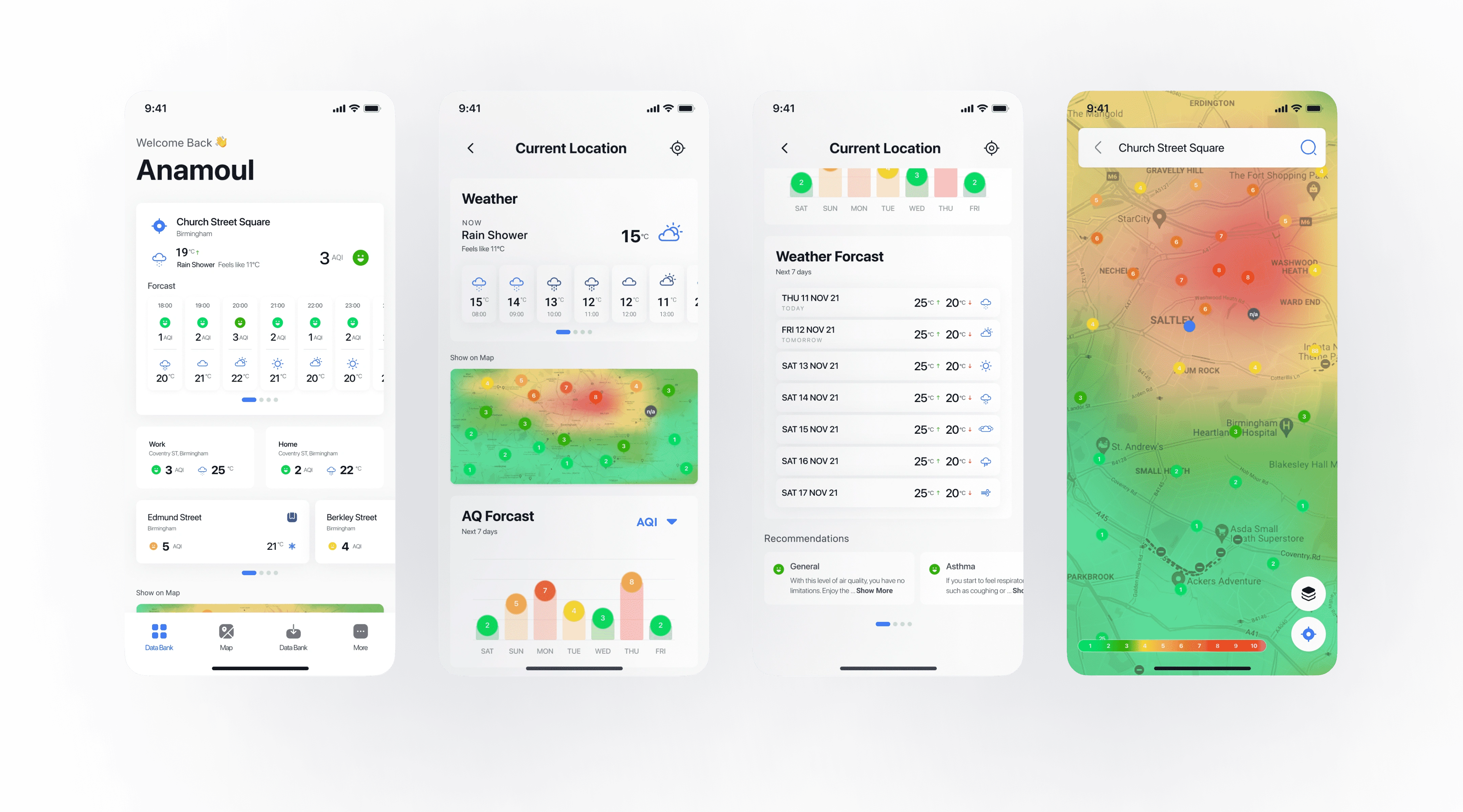
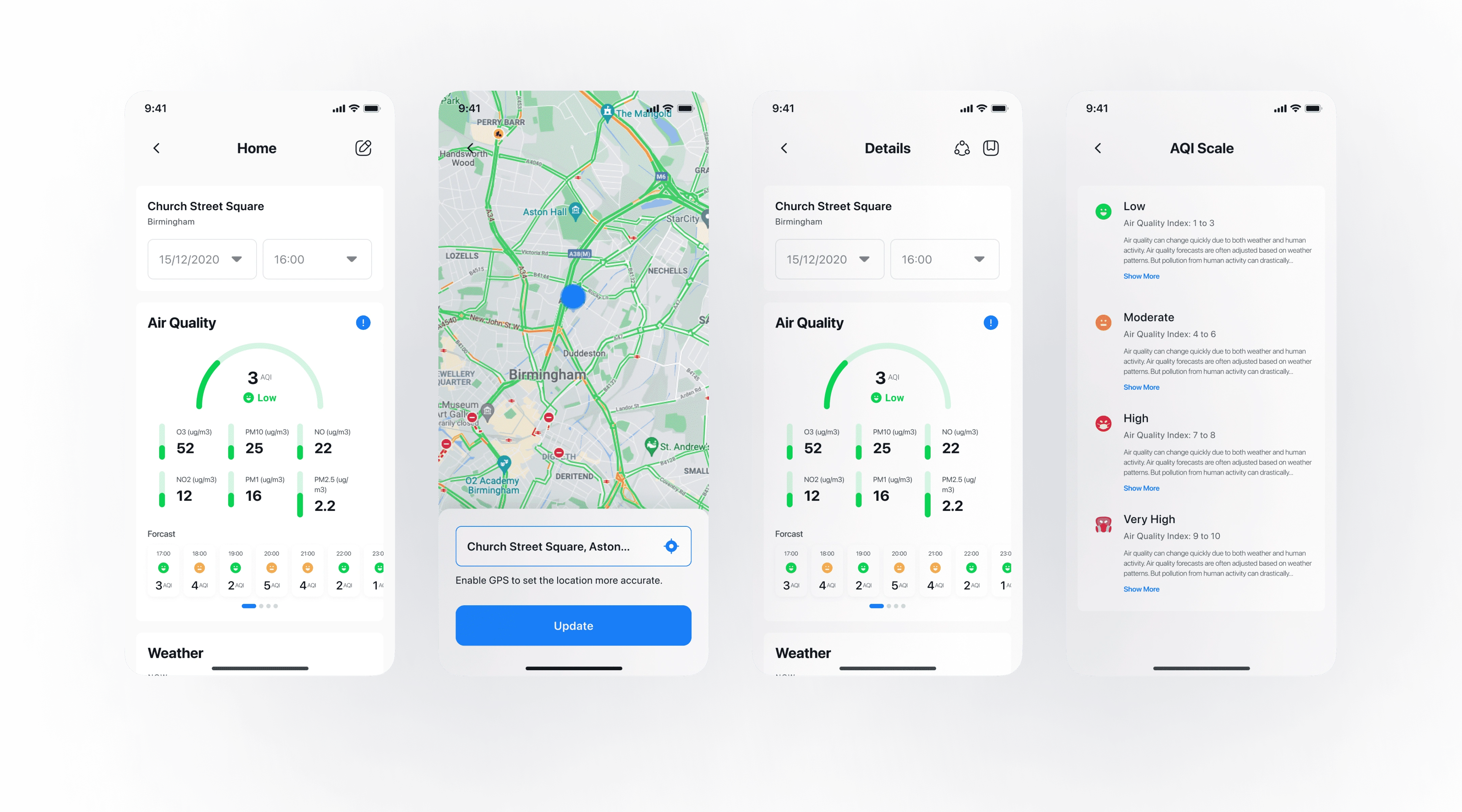
User Interface Design
Initially, we built basic style guidelines. Afterward, we built a highly customisable design system to create a design language. Based on it, we move forward to designing high fedality design screens.
I have designed a design style guideline and reusable components.
Usability Testing
The goal was to assess the app's overall usability and identify areas for improvements that could facilitate the completion of the tasks. The participants were given the same set of jobs.
Due to the NDA issue, I've only shared the information authorized by the authority.
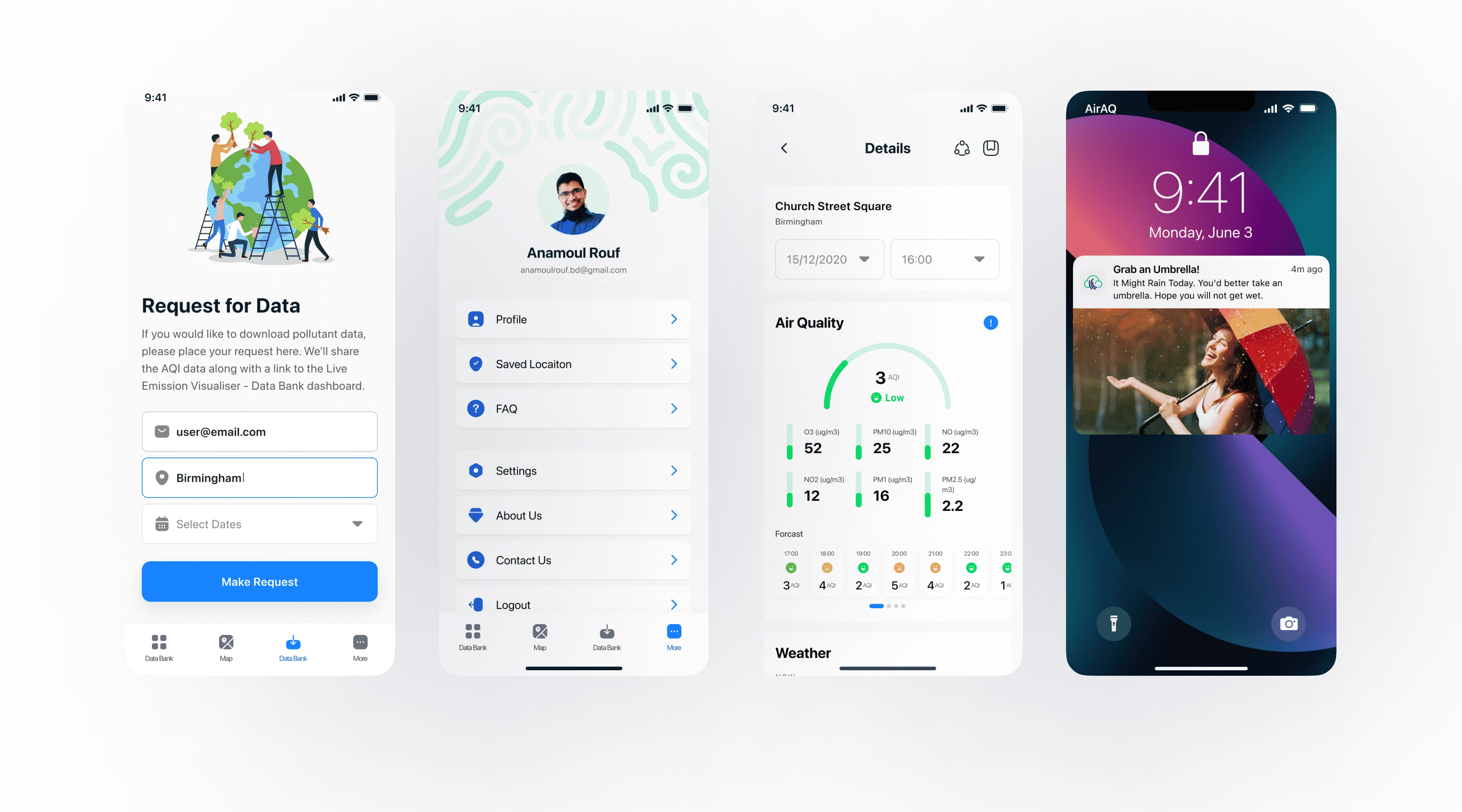
We refined and updated the design & deploy for development
Based on the usability testing sessions, we refined and updated the design. Then, we created deliverables for development handover. I maintained continuous communication with the developers during the development period.
After the successful deployment, it is time to collect feedback from the user.
It is a One-time Project
As it was a one-time client project, I didn’t have the opportunity to measure the results.
However, I always prefer to follow a mixed approach of Design Thinking and the Lean UX design process for continuous product development.
Like this project
Posted Oct 5, 2023
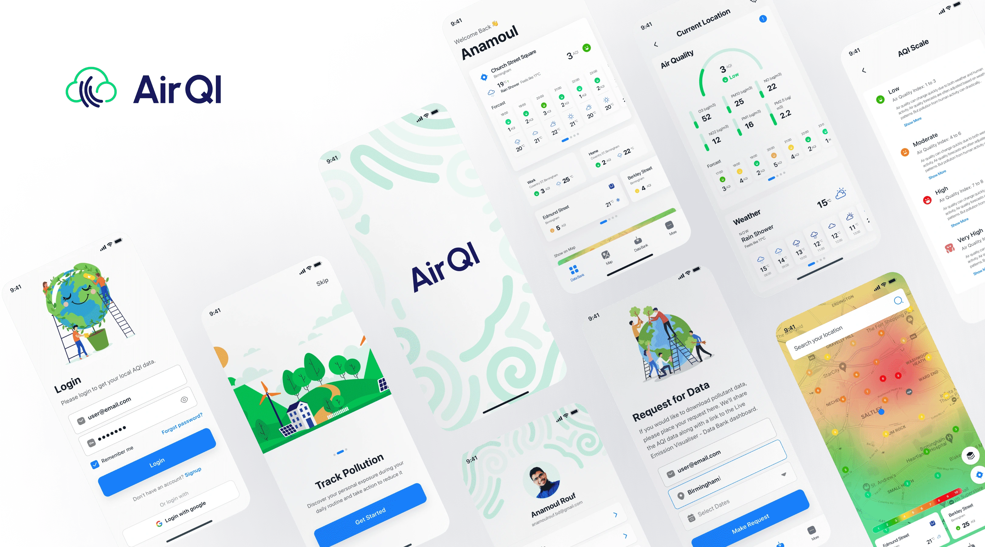
AirQI provides real-time and forecast air pollution and weather data. We design a hybrid app that provides an intuitive customized experience to the users.
Likes
0
Views
217

