Sick.ORG: Simplify Patient Communications
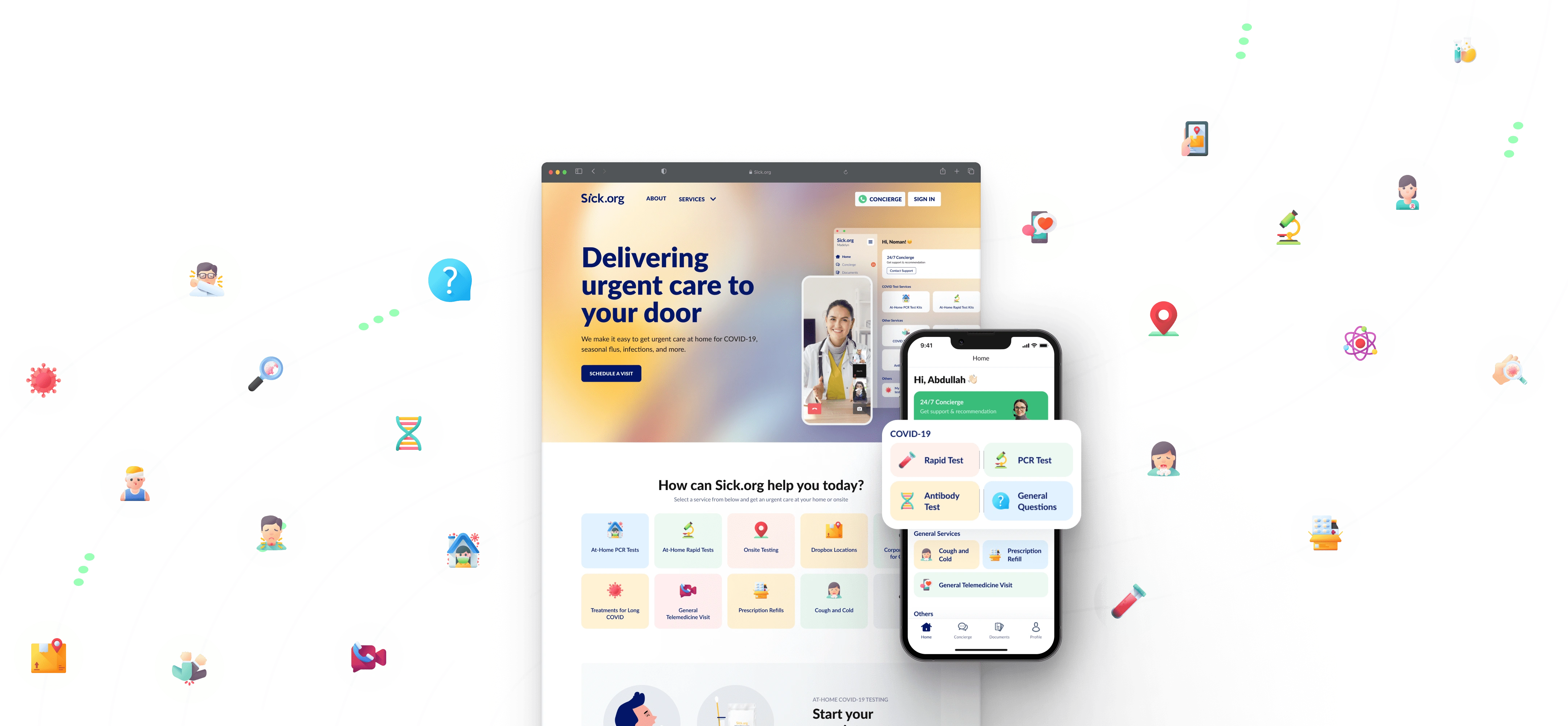
Product: A Mobile-First Health Care Platform for Sick.org Users
Timeline: August 2022 – January 2023
My Role: UX Research, UI/UX Design
Tools: Figma, FigJam, Notion.
Platform: Mobile & Web application.
Team Collaboration: Product, Support, and Tech.
Background
Sick.org is a nationwide digital care platform aiming to make healthcare simple and accessible. It provides telemedicine services and at-home COVID-19 testing, tackling the gaps in affordable, convenient healthcare, especially during the pandemic. The goal? Bring care directly to users in a way that’s easy, affordable, and effective.
Problem
Accessing affordable and convenient healthcare has always been a challenge, but the COVID-19 pandemic amplified these difficulties, leaving many individuals and families struggling to find safe and accessible options for their health needs.
Goal
Create a platform that provides direct access to telemedicine and COVID-19 testing, ensuring affordability, convenience, and a user-friendly experience for individuals with diverse healthcare needs.
My Role
As a Product Designer, I contributed to product scoping, user flows, wireframes, prototypes, and usability testing. I also conducted user research, facilitated workshops, and turned insights into actionable designs, ensuring the platform met user needs.
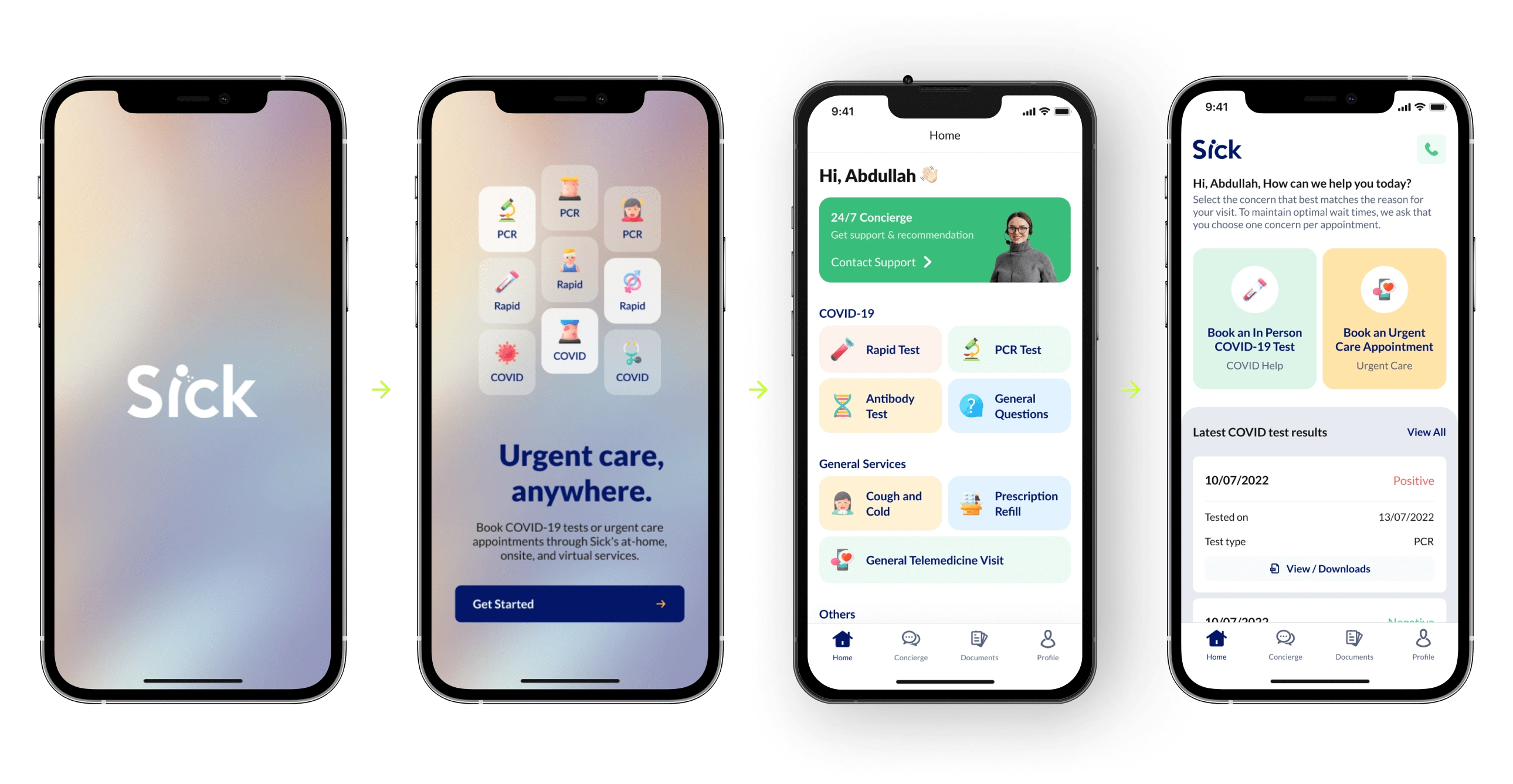
Mobile App.
Design Process
The design process for Sick.org's digital care platform includes research to understand user needs, ideation to generate ideas, and prototyping to test and validate design concepts.
Understanding the Problem
Research: The team conducted user interviews and market analysis to uncover the main pain points and opportunities, laying the groundwork for informed design solutions.
Crafting Solutions
Ideation: Ideas were brainstormed and mapped, focusing on addressing user needs effectively.
Iteration: Wireframes and mockups were created in Figma to visually represent the platform and test early concepts with stakeholders or users.
Testing and Refinement
User Testing: Prototypes were tested with target users to observe interactions and gather feedback, ensuring the designs resonated with real-world scenarios.
Prototyping: Feedback from testing was used to refine and improve the designs, leading to a high-fidelity prototype that matched user expectations.
Bringing the Vision to Life
Implementation: Collaboration with the development team ensured the final product stayed true to the design specifications and met user needs.
Key Design Decisions
Sick.org's platforms are designed to be clean, modern, and highly legible, with a focus on readability and accessibility. Sick.org's design system is based on the Atomic Design methodology, which breaks down the design elements into smaller, more manageable components. This approach allows for greater flexibility, consistency, and scalability in the design process.
The color palettes are designed to be clean, modern, and calming, with a focus on conveying trust, safety, and wellbeing. The primary colors are navy blue and yellow. The typefaces used are sans-serif fonts, which are simple, geometric, and easy to read on digital screens.
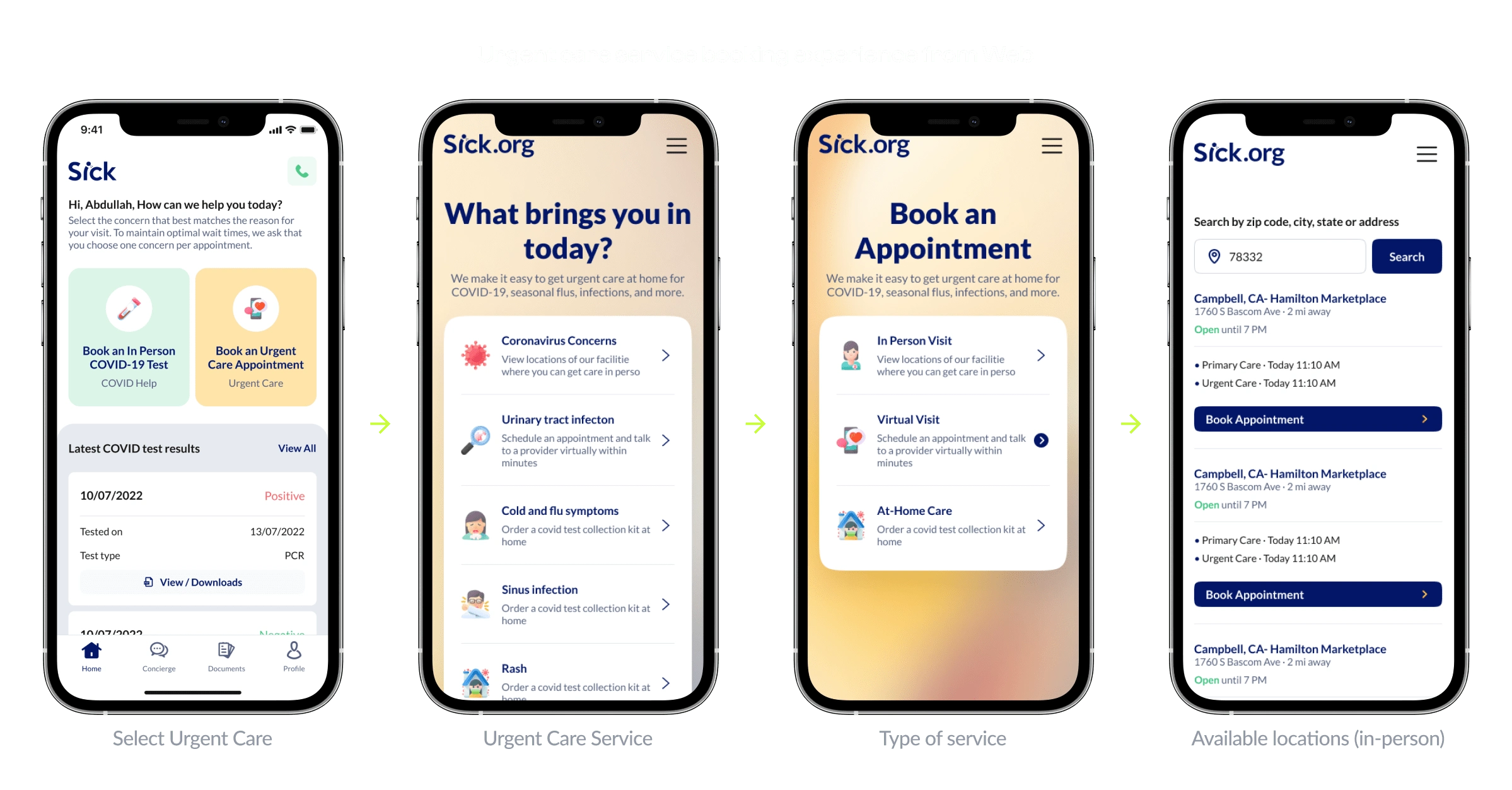
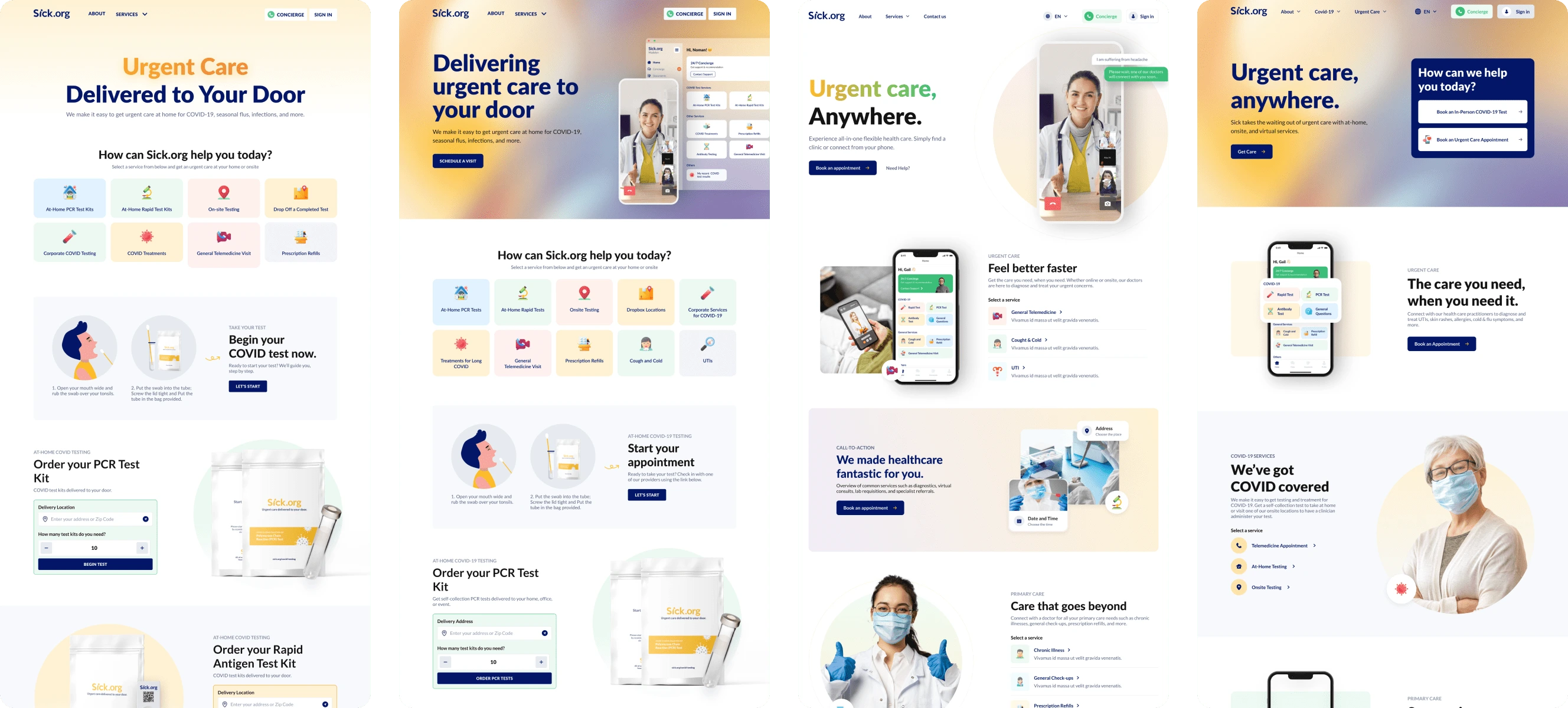
Urgent care service booking experience from web app.
Simple Navigation
By streamlining the interface, users can quickly find what they need, reducing frustration and improving the overall experience. Simplicity is key to retaining users and encouraging them to utilize the services consistently.
Clear Language
Ensures that users, regardless of their familiarity with medical terms, can easily understand the information and navigate the platform. This is crucial in a healthcare setting where clarity can directly impact user outcomes.
Consistency
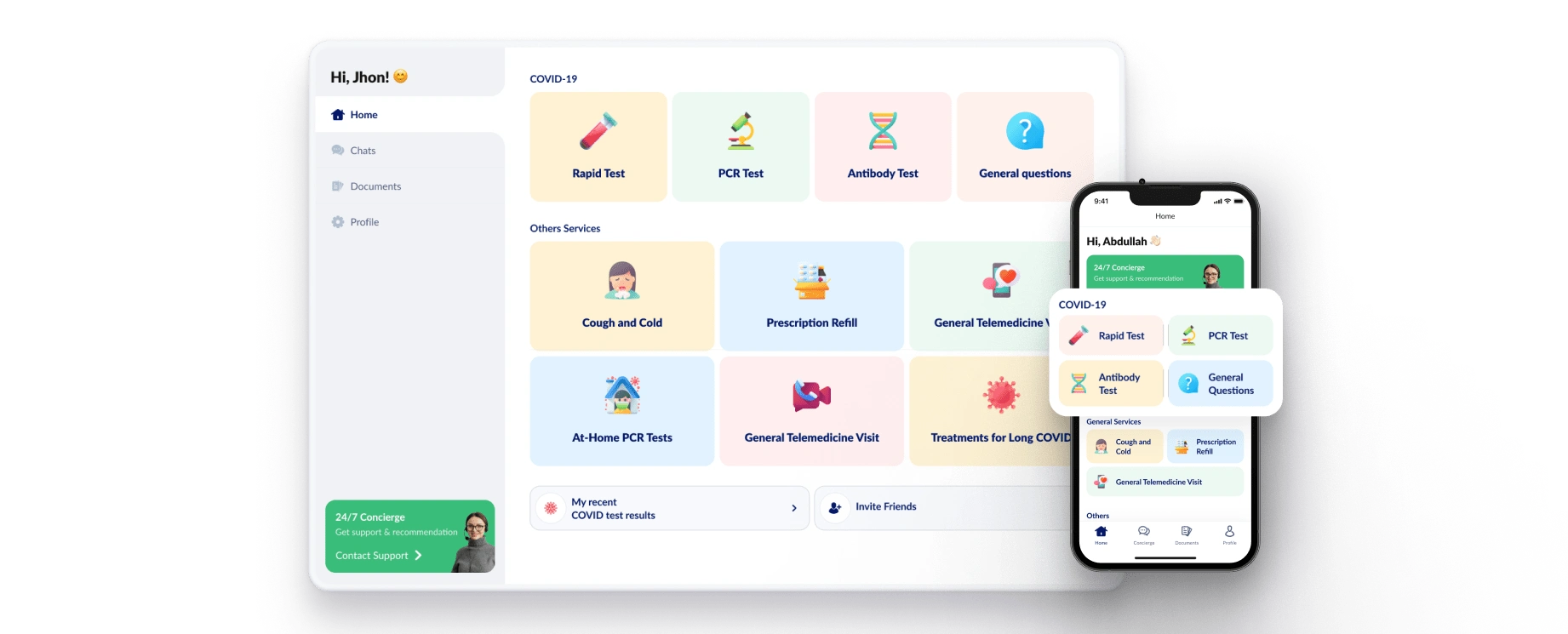
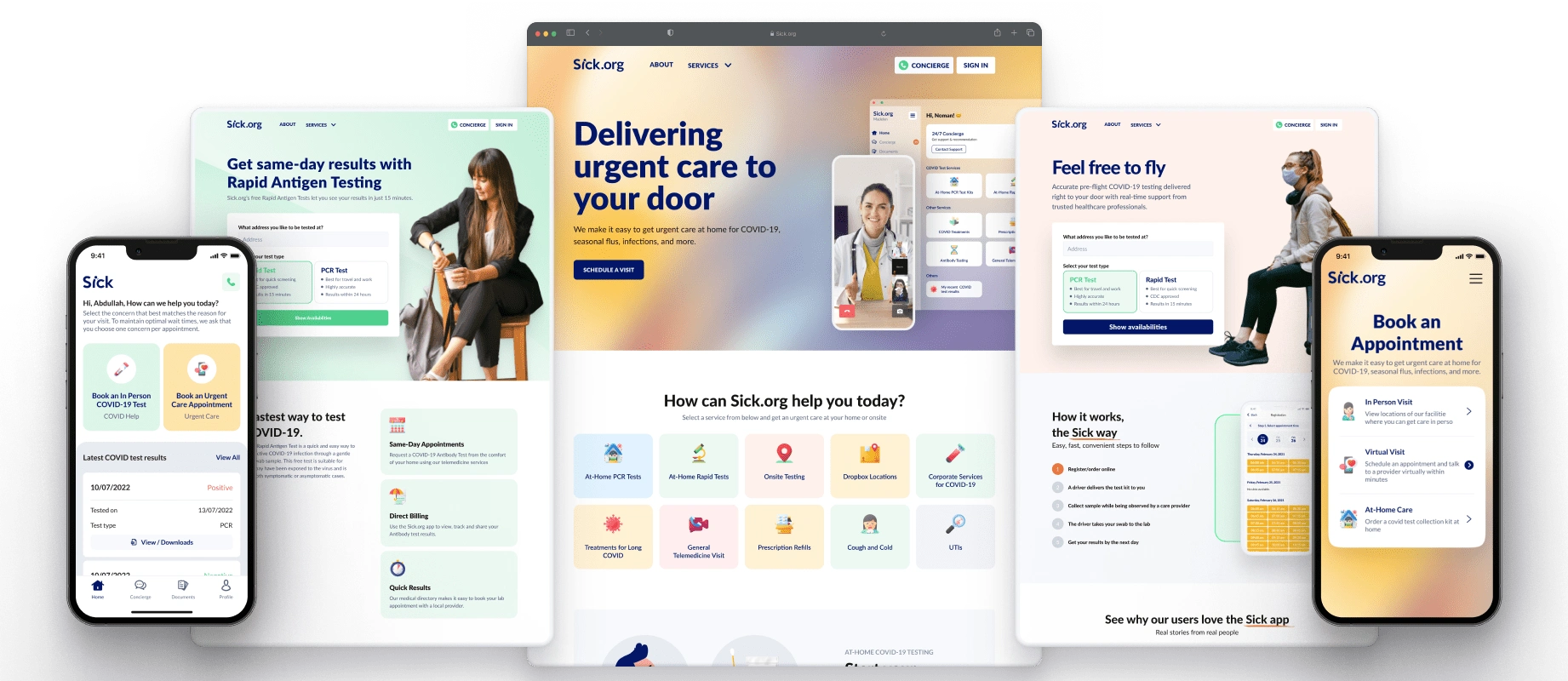
Maintaining a unified design across the app and website fosters trust and makes it easier for users to switch between platforms without confusion.
Accessibility
Features like high-contrast text and alt text accommodate users with disabilities, ensuring inclusivity. This not only complies with accessibility standards but also demonstrates a commitment to serving all users equally.
Personalization
Tailoring the user experience based on health history and preferences makes the platform feel intuitive and relevant, enhancing user satisfaction and engagement.
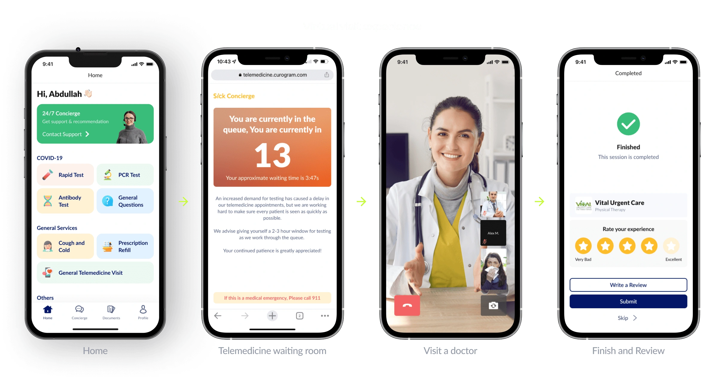
Virtula Visit Experience.
Highlights
Each point highlights strategic efforts to enhance user experience, engagement, and the overall impact of the platform. These efforts show how thoughtful design and testing can drive tangible improvements in a product.
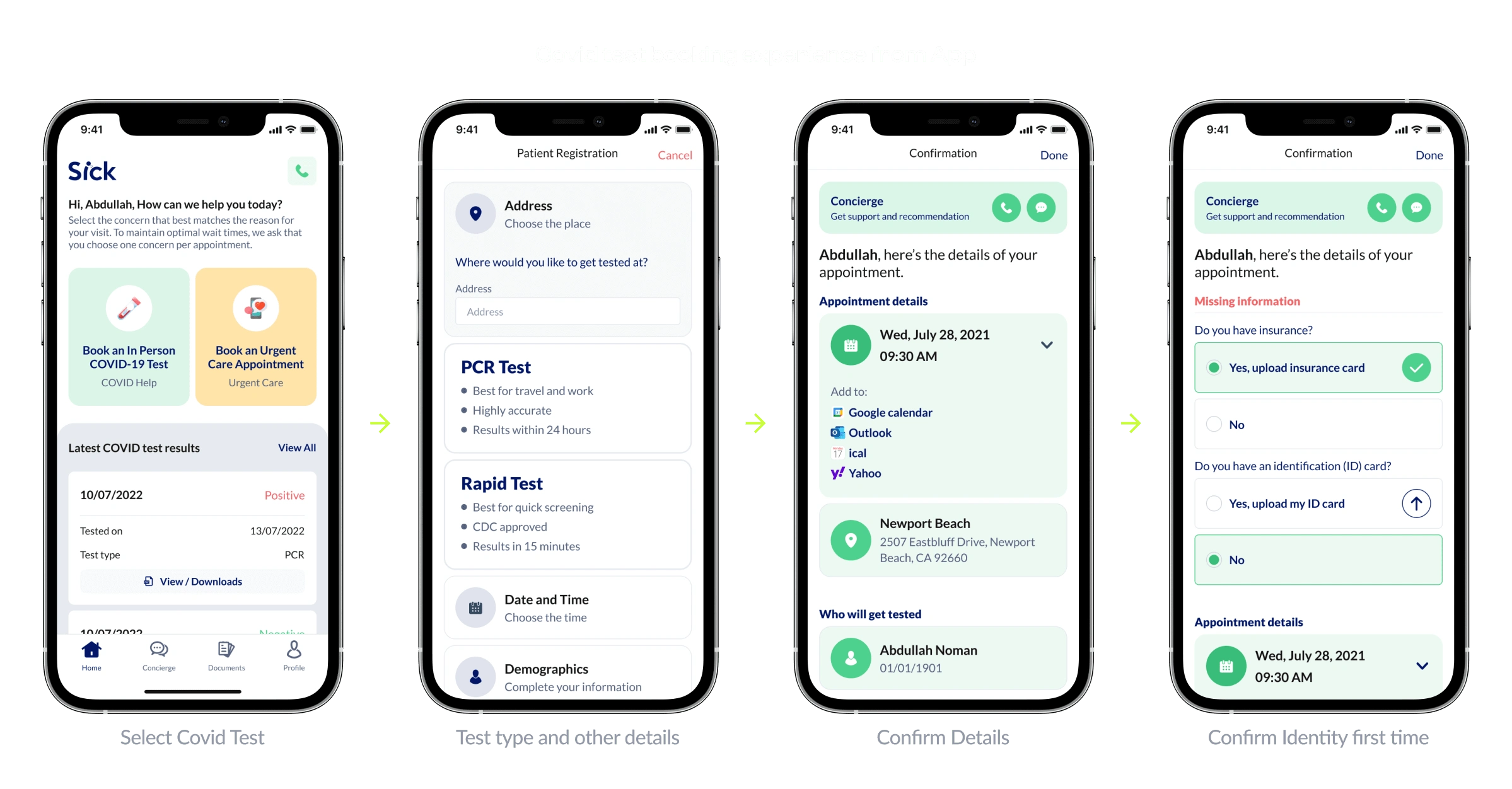
Covid test booking experience from App.
Unified Branding
This refers to harmonizing the design of both the app and website. It ensures that users transitioning between the two platforms experience consistency in visual elements, functionality, and branding, building trust and recognition.
Optimized Home Screen
This update aimed to streamline the user experience by focusing on essential features. By eliminating unnecessary elements and prioritizing core functionalities, the home screen becomes more intuitive and user-friendly, reducing friction in accessing key services.

A/B Testing
Testing six landing page designs allowed the team to experiment with different layouts, messages, and design elements. The winning design significantly improved critical metrics like user engagement, sign-ups, and reduced bounce rates, demonstrating data-driven design choices.
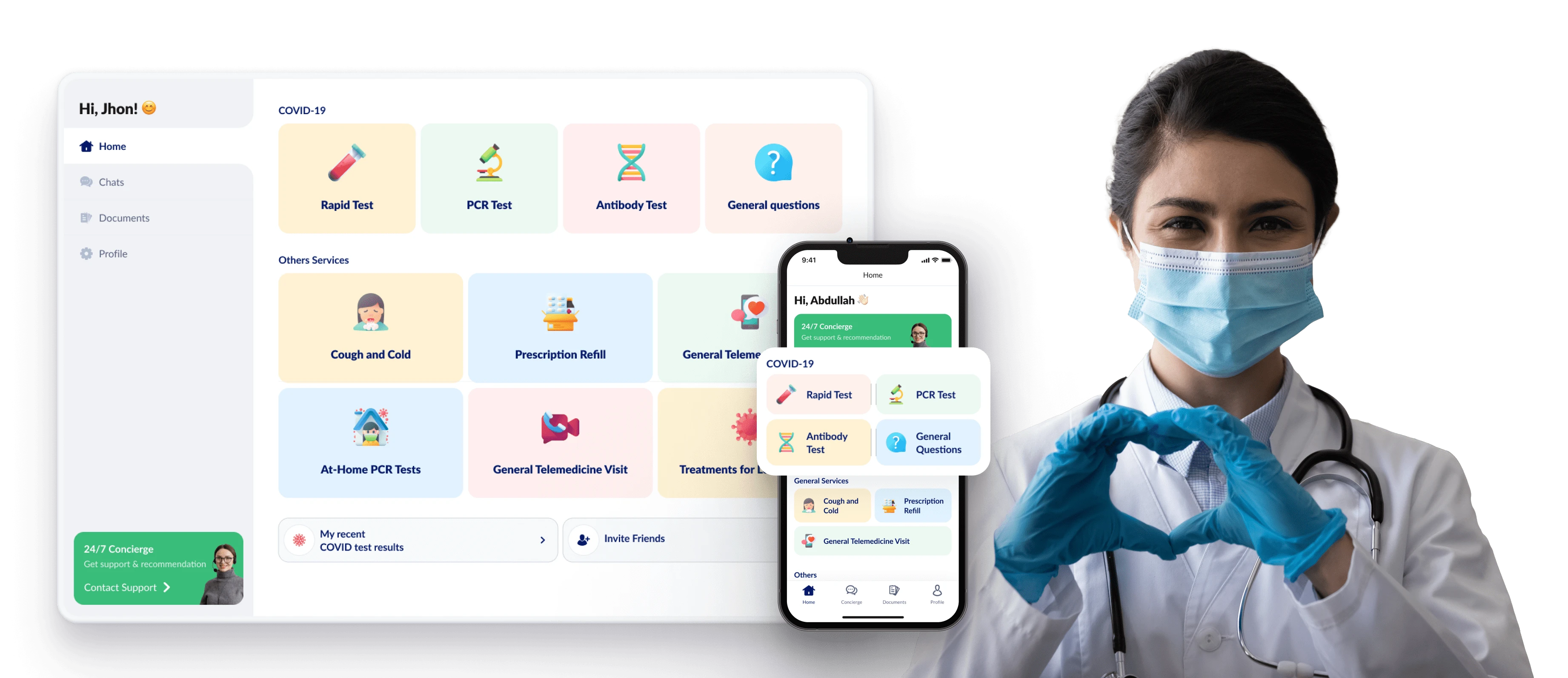
Final Product
The result was a user-friendly, mobile-first platform that empowers users to manage their health effortlessly. By focusing on clarity, accessibility, and personalization, Sick.org delivers a seamless healthcare experience, helping users stay healthier and more in control.
Like this project
Posted Jan 4, 2025
Sick.org is a nationwide digital care platform aiming to make healthcare simple and accessible.
Likes
0
Views
8
Clients

Curogram
Sick

