A Solution for the Job Seekers to Connect with Opportunities
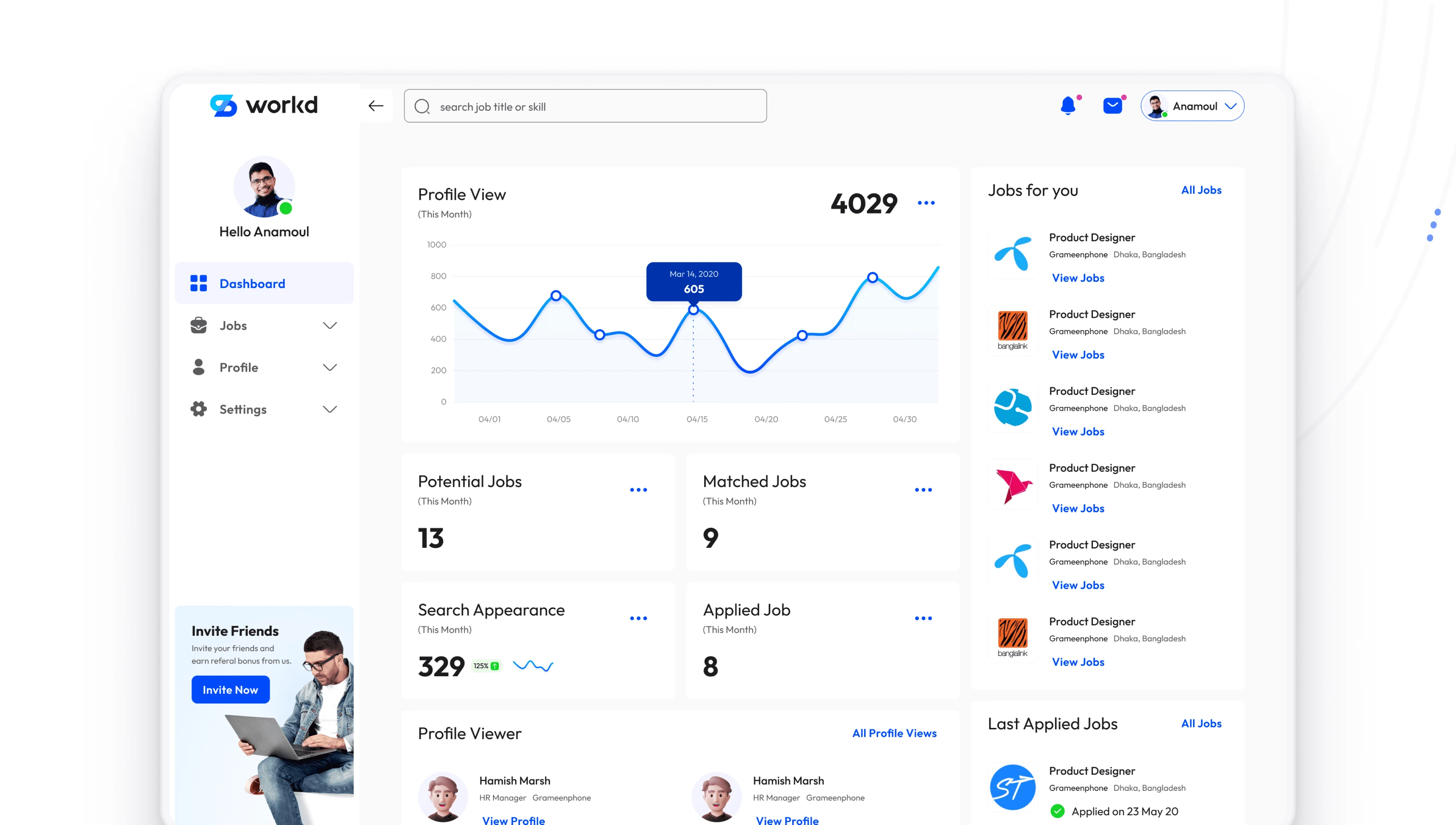
Product: Workd Candidate Panel.
Timeline: March 2020 – May 2020.
My Role: UX Research, UI/UX Design.
Tools: Figma, FigJam, Notion.
Platform: Web application.
Team Collaboration: Product, Marketing, Support, and Tech.
Background
Workd is also a doorway to connecting job seekers with employers. Our main challenge is to design a portal that helps job seekers with career-changing opportunities.
Goal
Design a conversion-friendly user flow.
Get a more efficient, functional, and scalable job application process with more efficient, functional and scalable.
Outcome
The number of job applications increased by 45%.
A job portal with more efficiency and functionality for job search experience.
Design Challenge
Design Candidate Panel from Scratch
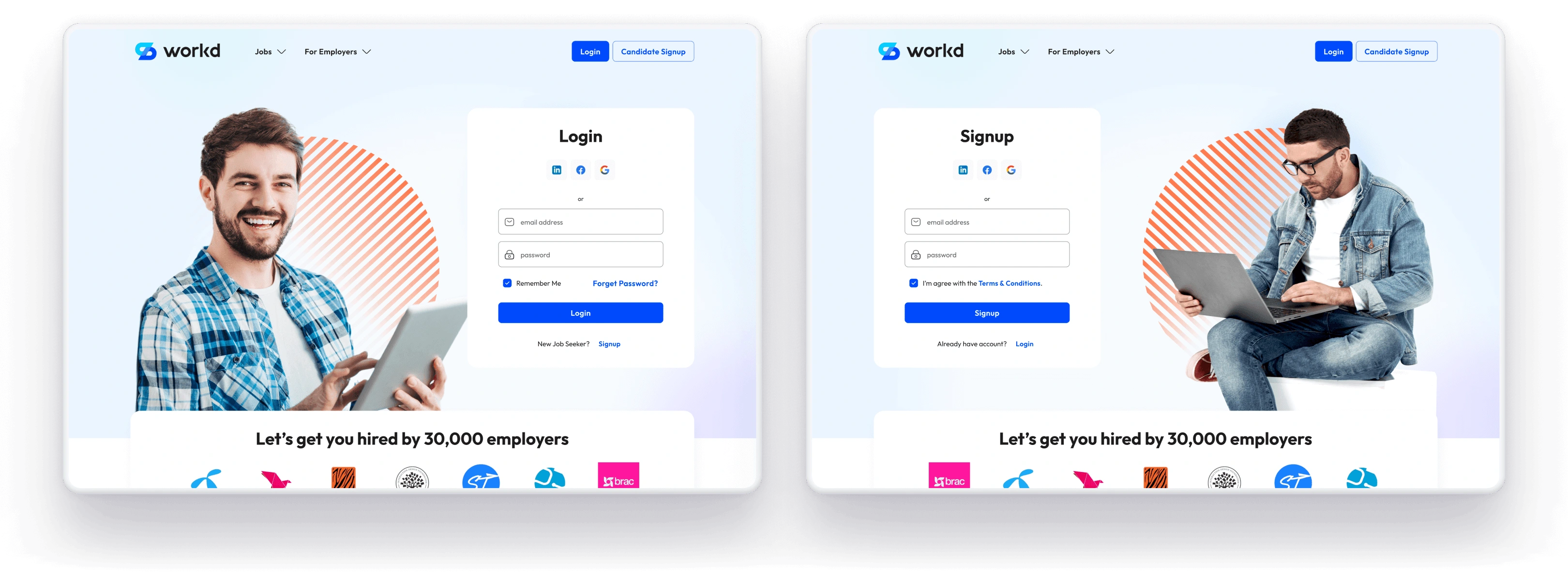
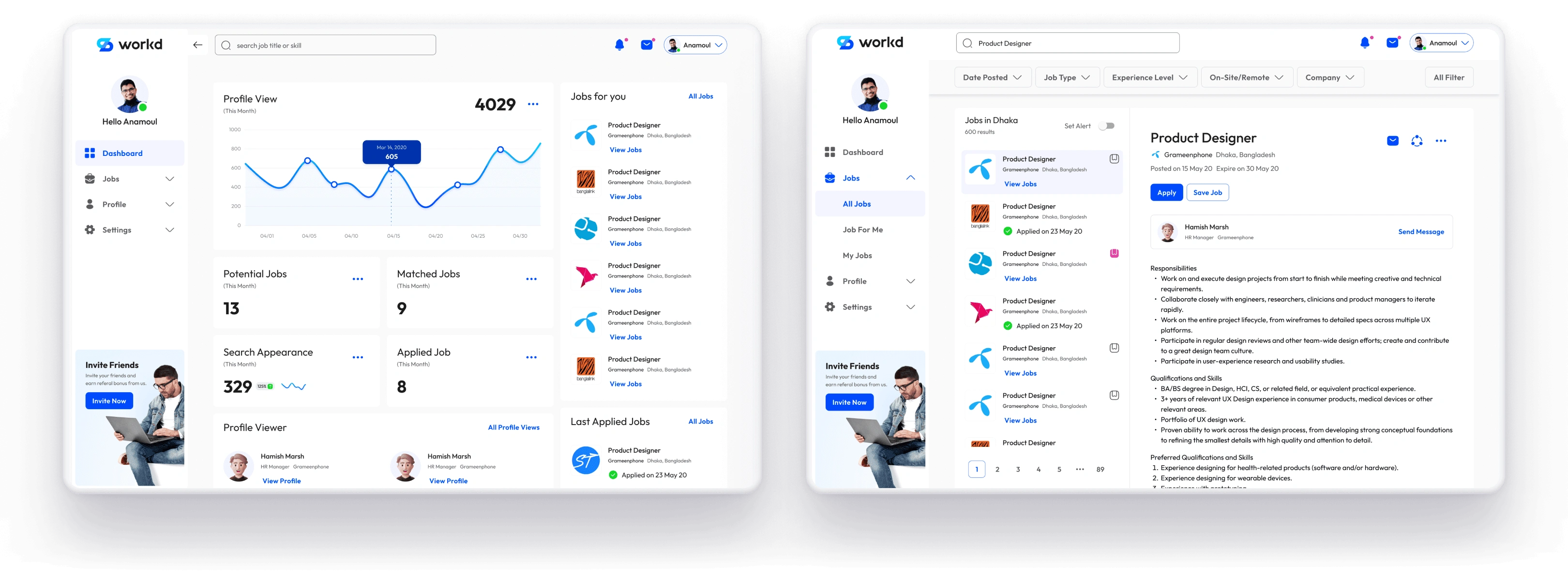
Our main challenge was to design a portal for the candidates, where they could explore new opportunities, apply for them, and get hired by the employer.
It has to be easily used by non-tech people.
Candidates can get new relevant job post notifications.
Candidates can get connected with the employer.
Candidates can go through the hiring process and also get hired by the employer.

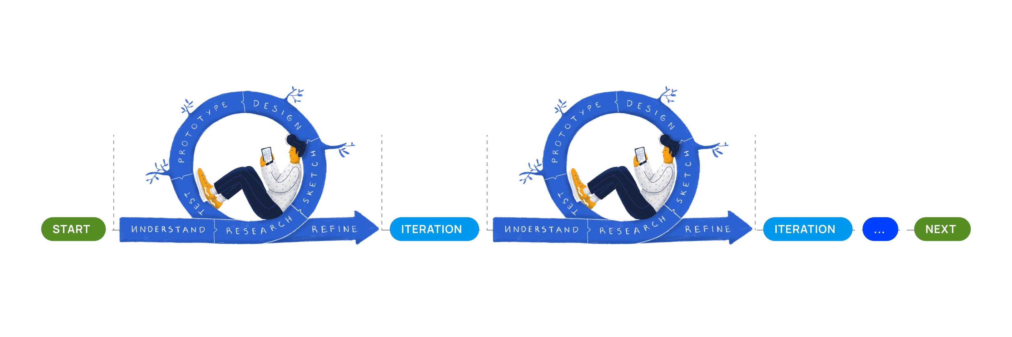
The Lean UX process to move forward
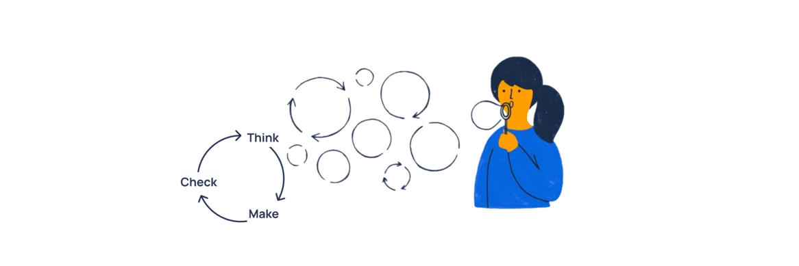
When we have minimal time and resources, selecting an efficient, sustainable, and flexible design process is always challenging. I have chosen the approach to the Lean UX process. It is an iterative process with three simple steps.
Think
Make
Check
...and keep repeating the steps.
The discovery phase was a quick, high‐intensity effort
The discovery phase was a quick, high‐intensity effort that allowed us to -
Define project goals and milestones
Audit the existing process faults
Review the existing solutions by other similar products
Understand business visions
Empathize the users' needs, behaviors, and pain‐points
Understand technological feasibility and constraints.
Here are three considerations that help me to understand and prioritize the issues.
How satisfying is the solution for users?
How well is this solution for users' problem solving and also good for business?
How challenging would it be to build from the technical feasibilities and limitations?
We visited Job Seekers and Employers
We have sessions with 10 job seekers and 3 employers. We also had brainstorming discussion sessions with our internal cross-functional team members. So what we found-
The job seekers used different platforms to apply for jobs but 75-80% time they don’t get a response.
It is a hassle to fill up a lot of input fields when applying for a job.
Uploading relevant attachments is time-consuming and very hassling for low-speed internet connectivity.
It is hard to reach the hiring team or company and also get informed on the hiring process.
The employers get the applications from different platforms and 80-85% time they get irrelevant candidates.
It hassles to sort out and organize the best candidates from a huge number of applicants. Also, automate the hiring process.
The Competitive Analysis
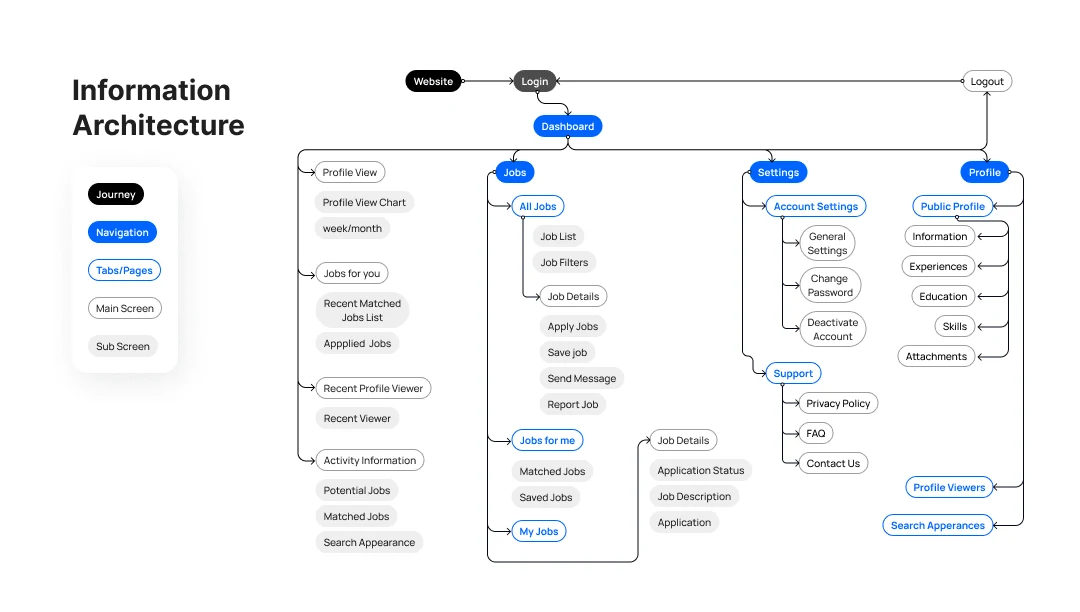
I analyzed BDJobs, LinkedIn, Glassdoor, Indeed, and other popular hiring platforms. I analyzed their user journey flows, job application process and the hiring process.
Sketches, Wireframing, and Testing
The following steps were to sketch wireframes based on the user flow maps and build the flow and low-fidelity prototype for a series of testing sessions.
Creating wireframes helped me visualize the ideas and gave us the basic structure for how users would use the app.
When creating these wireframes, we kept the user needs from the earlier findings and research in mind.
I have done several testing sessions with a close group of users.
User Interface Design
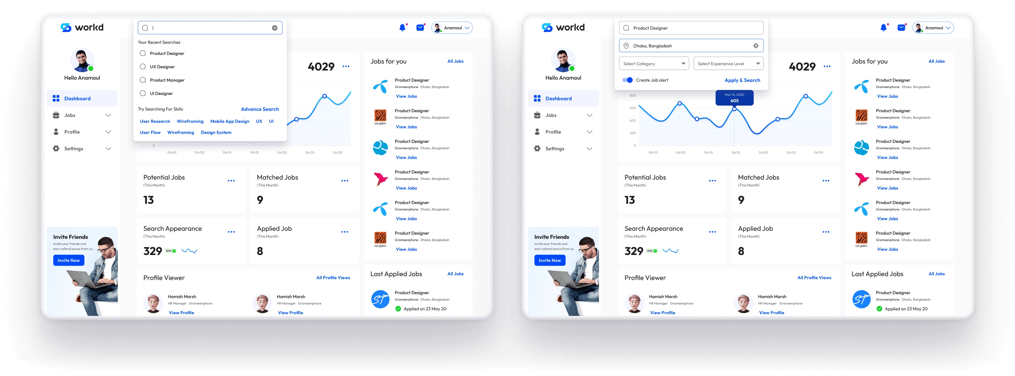
Before starting the UI design process, I always built a highly customizable design style guideline and reusable components.
I have designed a design style guideline and reusable components.
Usability Testing
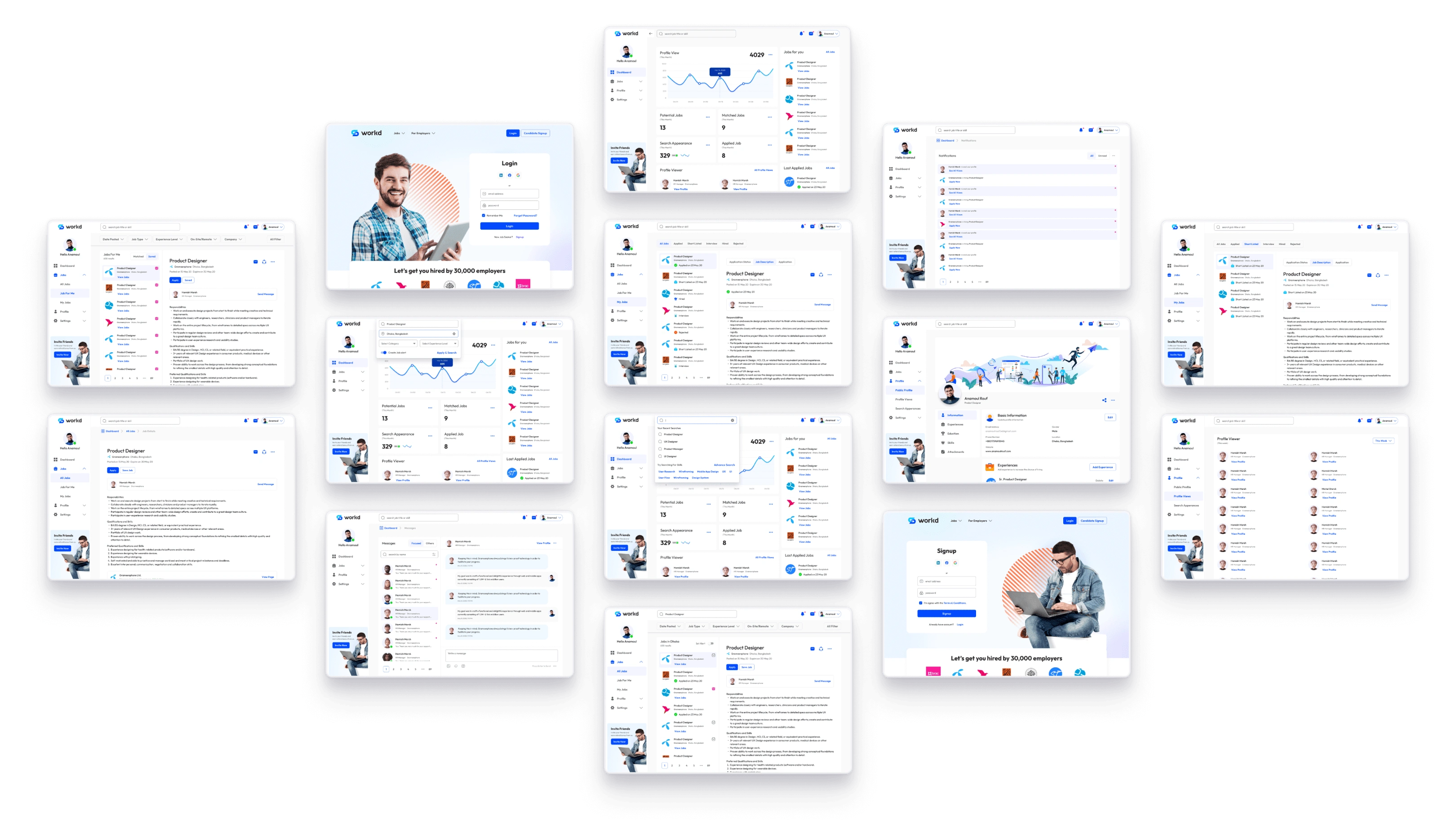
The goal was to assess the app's overall usability and identify areas for improvements that could facilitate the completion of the tasks. The participants were given the same set of jobs.
Due to the NDA issue, I've only shared the information authorized by the authority.
We refined and updated the design & deployed it for development
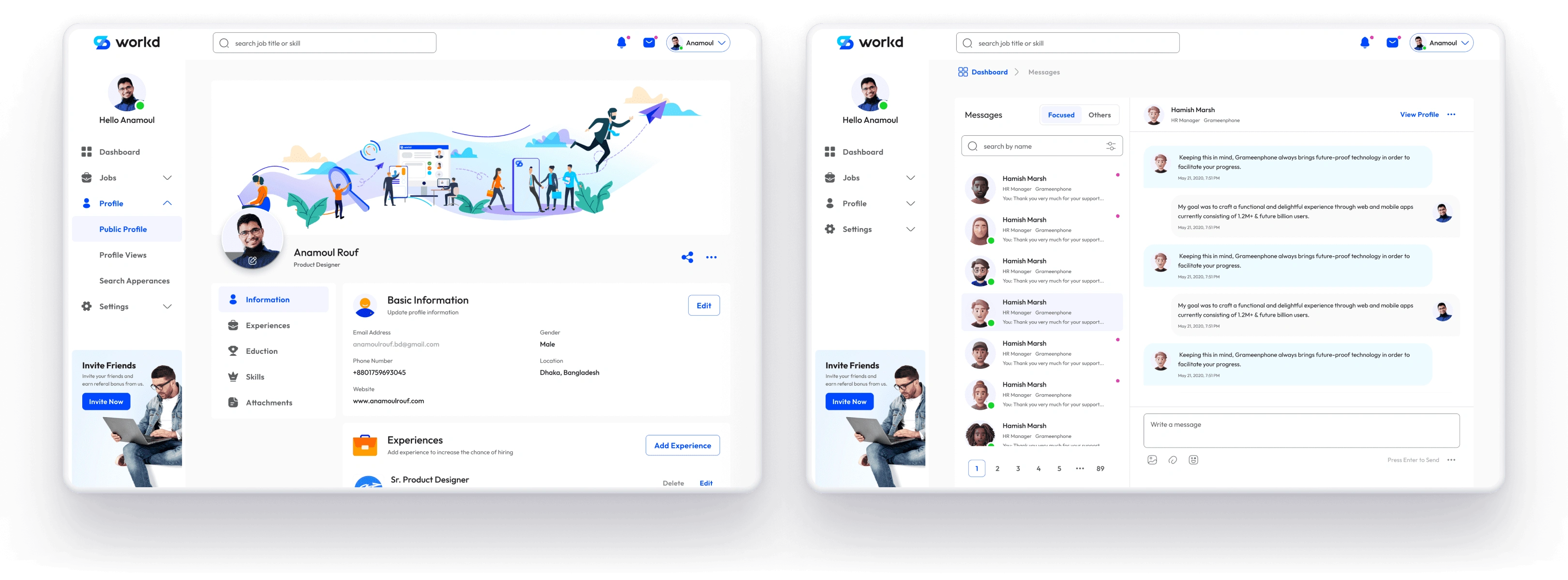
Based on the usability testing sessions, we refined and updated the design. Then, we created deliverables for development handover. I maintained continuous communication with the developers during the development period.
After the successful deployment, it is time to collect feedback from the user.
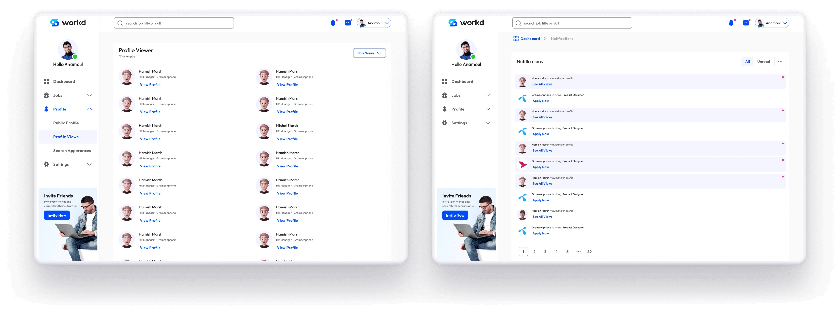
We've monitored and measured the results for the first 6 months.
The number of job applications success rate increased by 35%.
A job portal with more efficiency and functionality for job search experience.
Like this project
Posted Oct 3, 2023
Our main challenge was to design a portal for the candidates, where they can explore new opportunities, apply for them, and get hired by the employer.
Likes
0
Views
15

