Redefine the ad network experience for Advertisers & Publishers
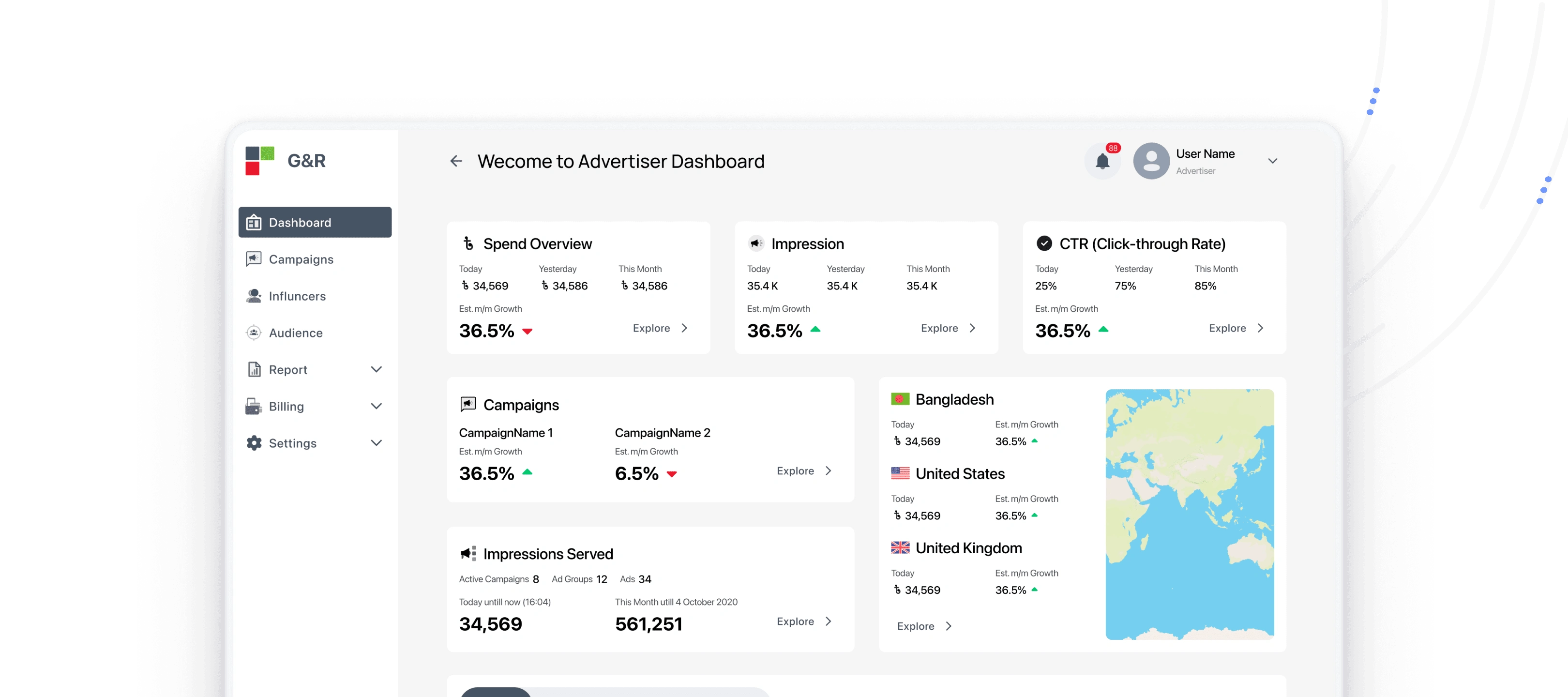
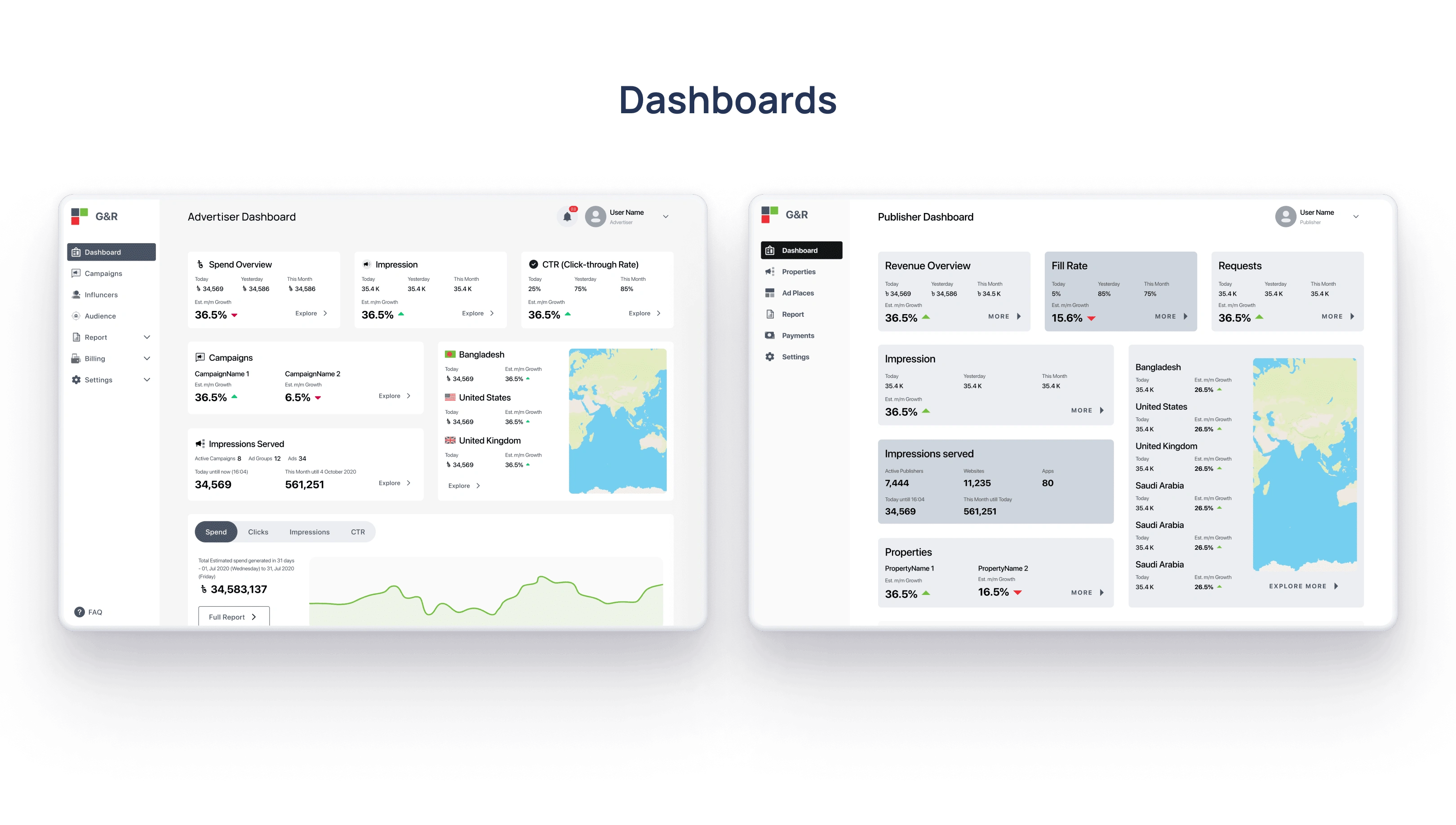
Product: G&R Dashboard Wireframe Design
Timeline: January 2021 – March 2021
My Role: UX Research, UI/UX Design
Tools: Figma, FigJam, Notion.
Platform: Web App.
Team Collaboration: Product, Marketing & Customer Support, and Tech.
Background
G&R Ad Network is a platform advertisement network. It has types of customers- advertisers and publishers. I was requested to help the G&R Product team to design a mid-fidelity wireframe.
Goal
Design a more friendly and simple user journey flow.
Get a more efficient, functional, and scalable web app.
Design Challenge
The G&R team planned to restructure and redesign the existing platform for their customers. Our challenge was to define the user role and to design functional, simple, intuitive, innovative, easy-to-use, user-friendly, and frictionless wireframes.
It has to be easily used by non-tech people.
Users can easily navigate through the web app.
Users with multiple roles can easily switch their respective dashboards.
Users can easily launch a campaign and track its progress.
Design Thinking & Lean UX Design
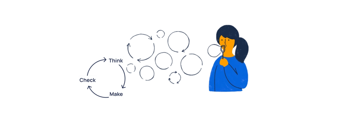
It is always challenging to select an efficient, sustainable, and flexible design process when we have very limited time and resources. I selected the approach to the Lean UX process. It is an iterative process with three simple steps.
Think
Make
Check
...and keep repeating the steps.
I have no idea about the ad network industry!
It is crucial to understand the end goal from users' and business perspectives. So I started seeking answers to my questions.
What does the product do?
What are the business goals?
Who is the audience? How they are related to it?
Where they live, what they think, like & do?
Why/How often do they use it?
Do there are similar products in the market? How their users are using the services?

We started with a UX Audit of the existing system
To gain insight, we explored the existing user journey to find the UX problems.
There are 2 types of user roles in the system - Advertisers and Publishers.
A customer can have one role in the system. A customer can also have both roles if it is permitted by the System Admin.
Only the G&R authority will have the System Admin access.
The customers who have both roles, It is hard and confusing for them to do all the activities of both roles. Examples - switching user roles, generating and exporting custom reporting, getting live data and forecast, and using publisher credits to launch ad in the advertiser dashboard.

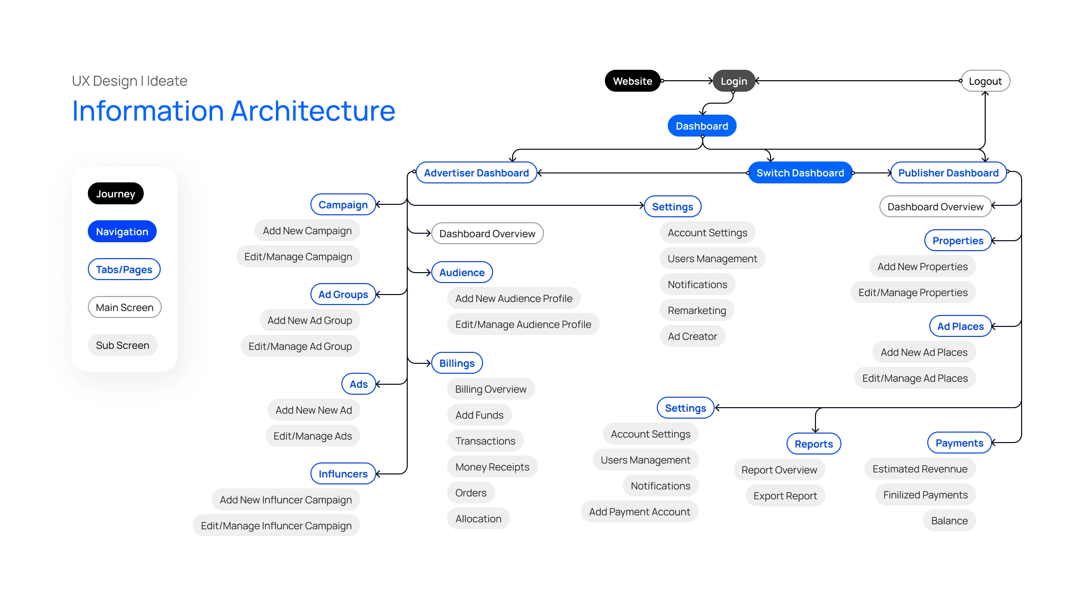
We created digital wireframes and built a low-fidelity prototype. Also, we conducted a series of sessions for usability testing.
The following steps were to sketch wireframes based on the user flow maps and build the flow and low-fidelity prototype for a series of testing sessions.
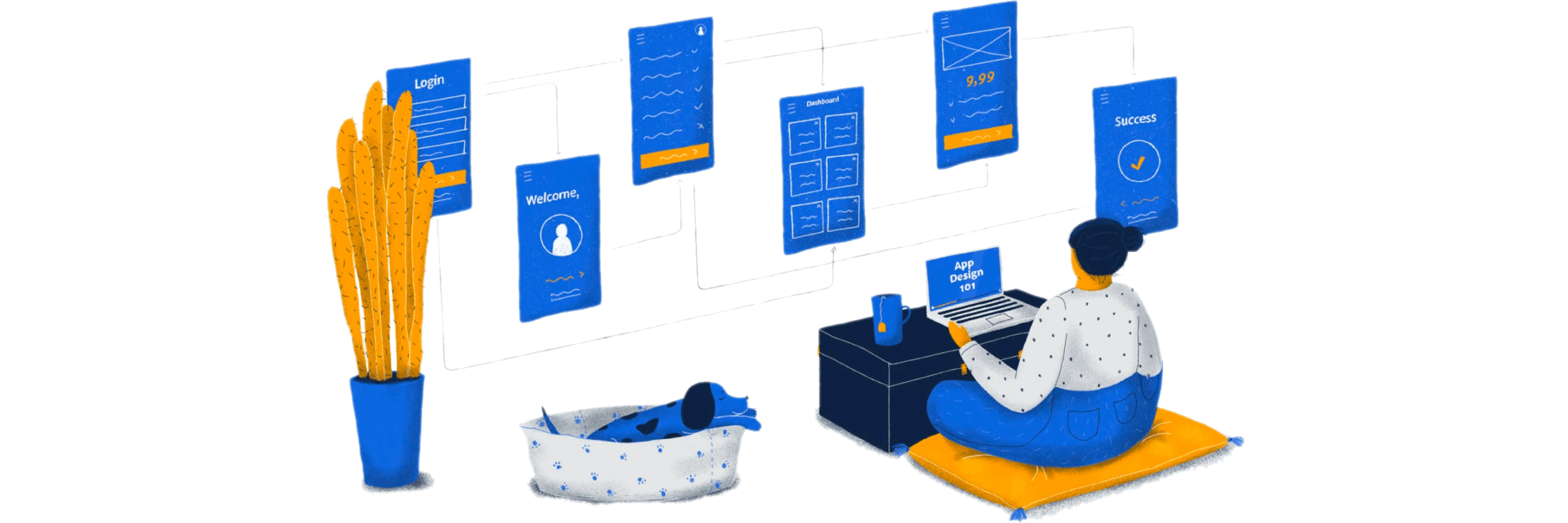
User Interface Design
We invited some focus group users for testing sessions.
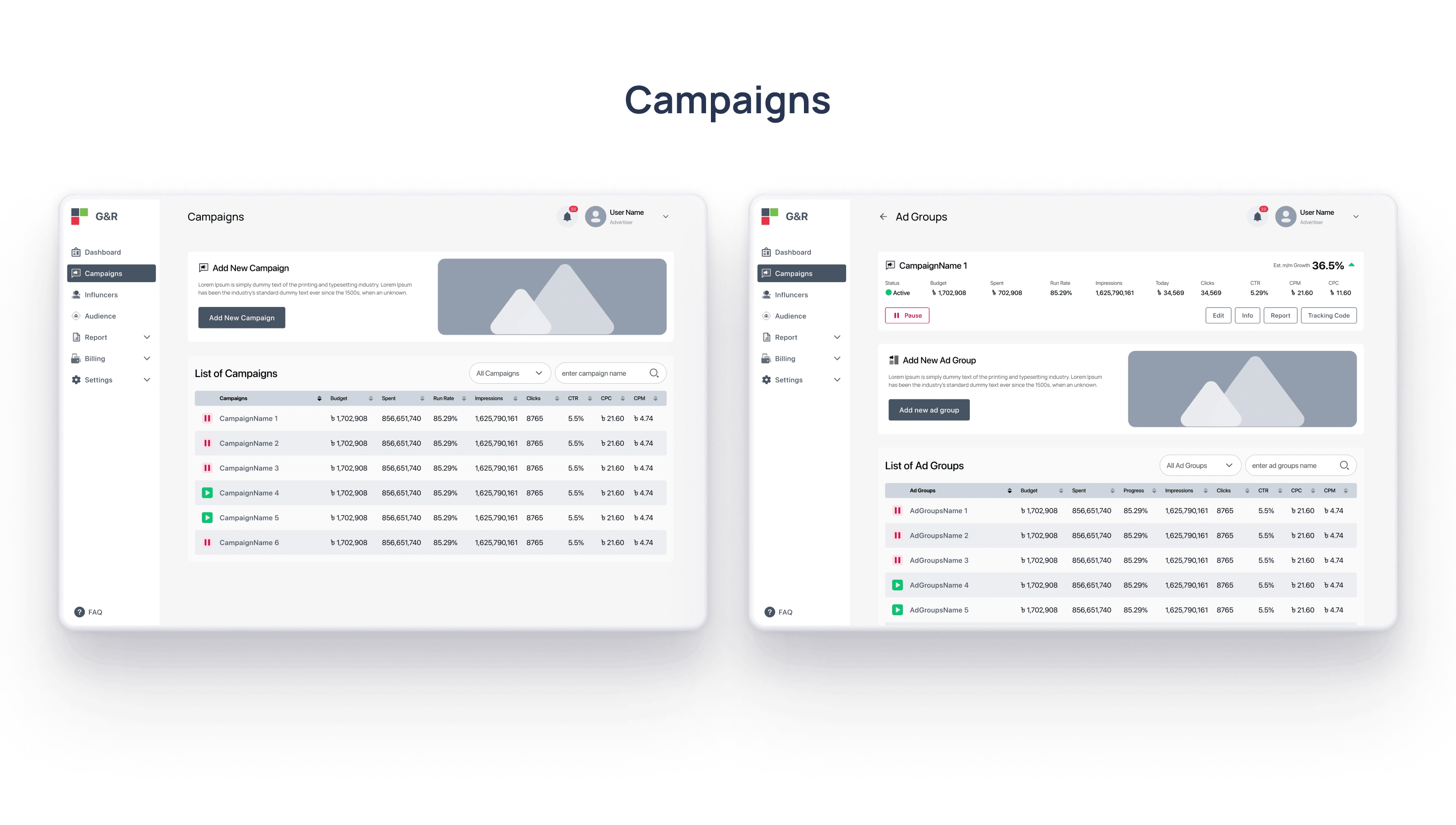
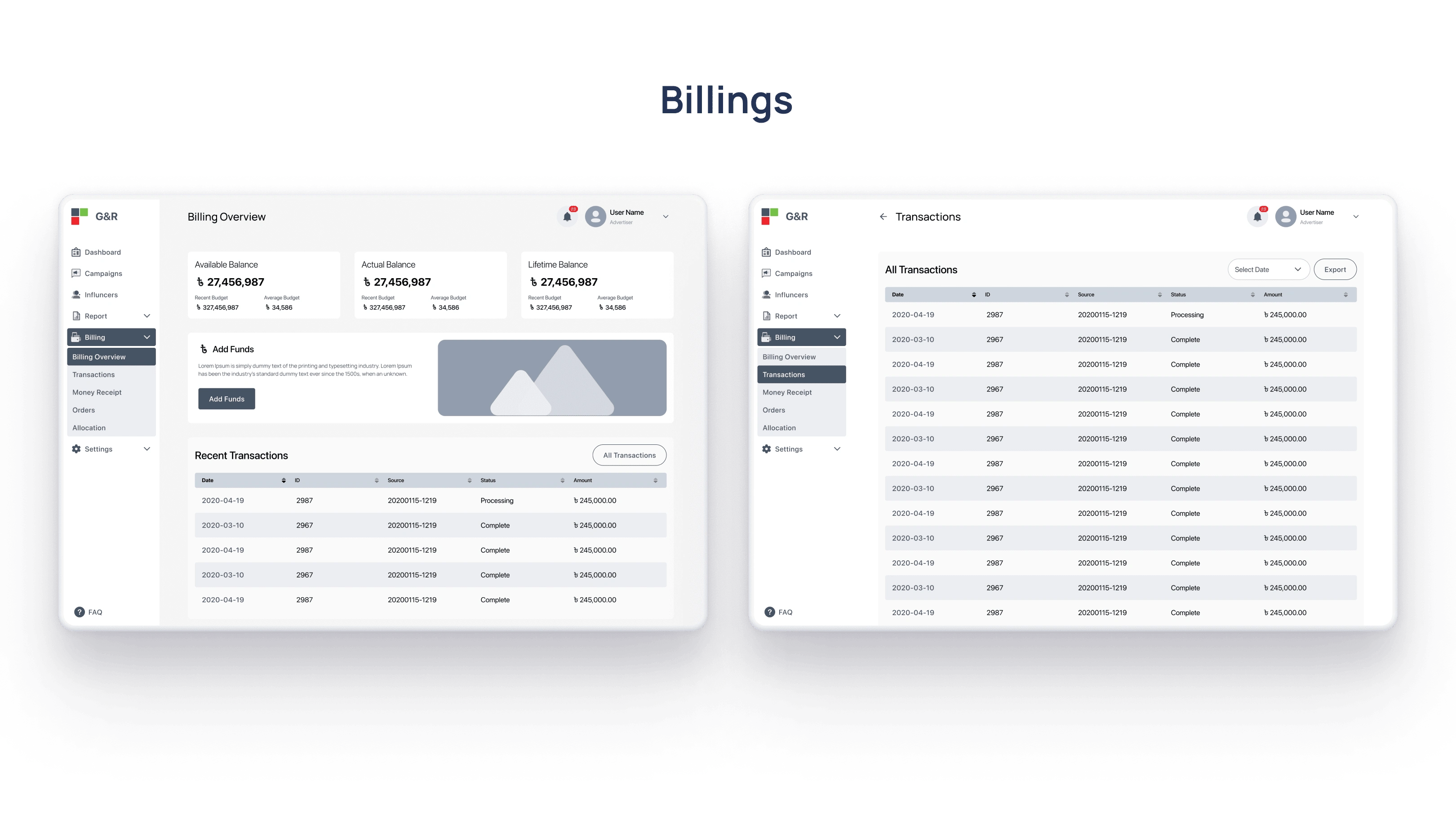
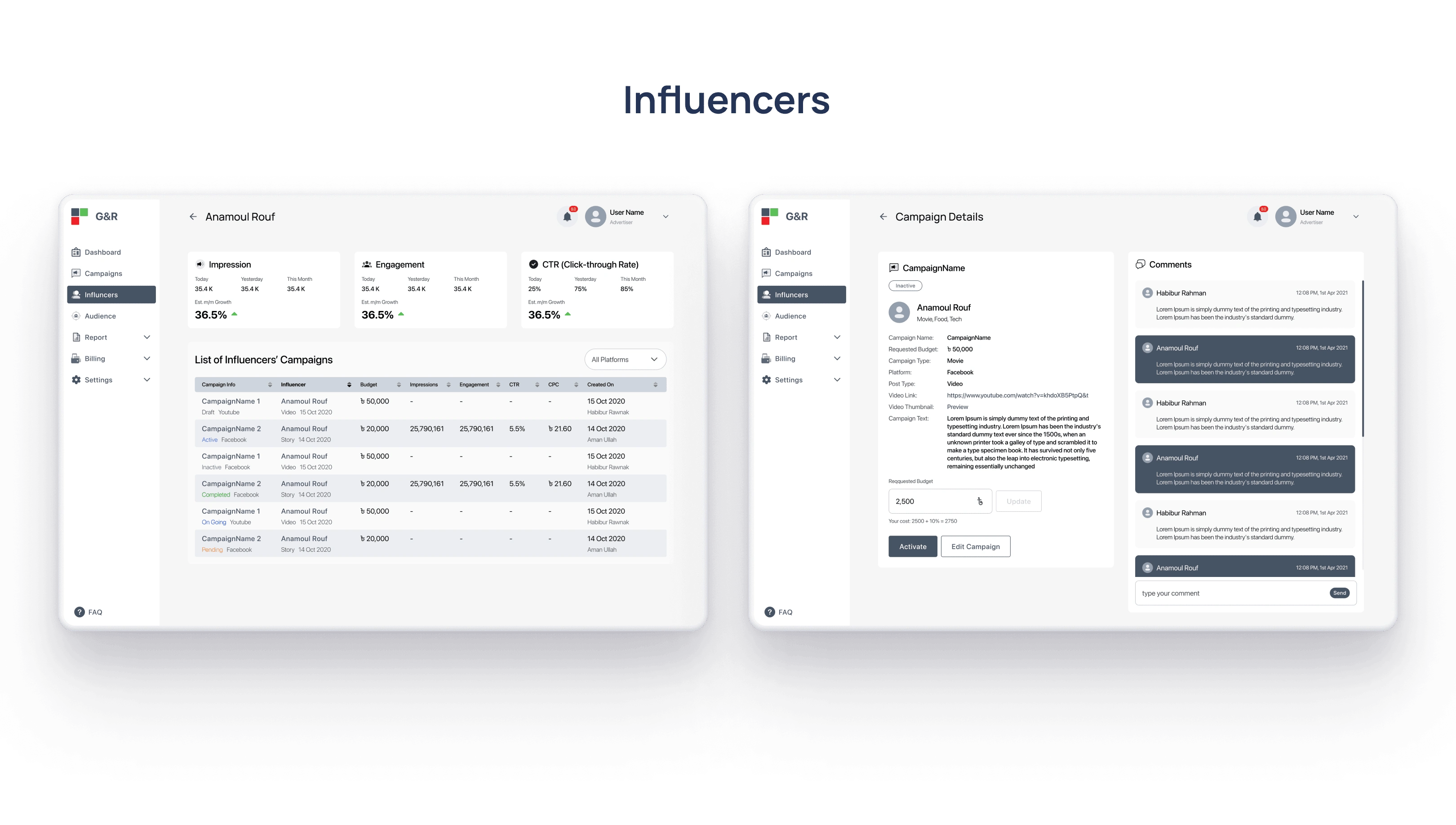
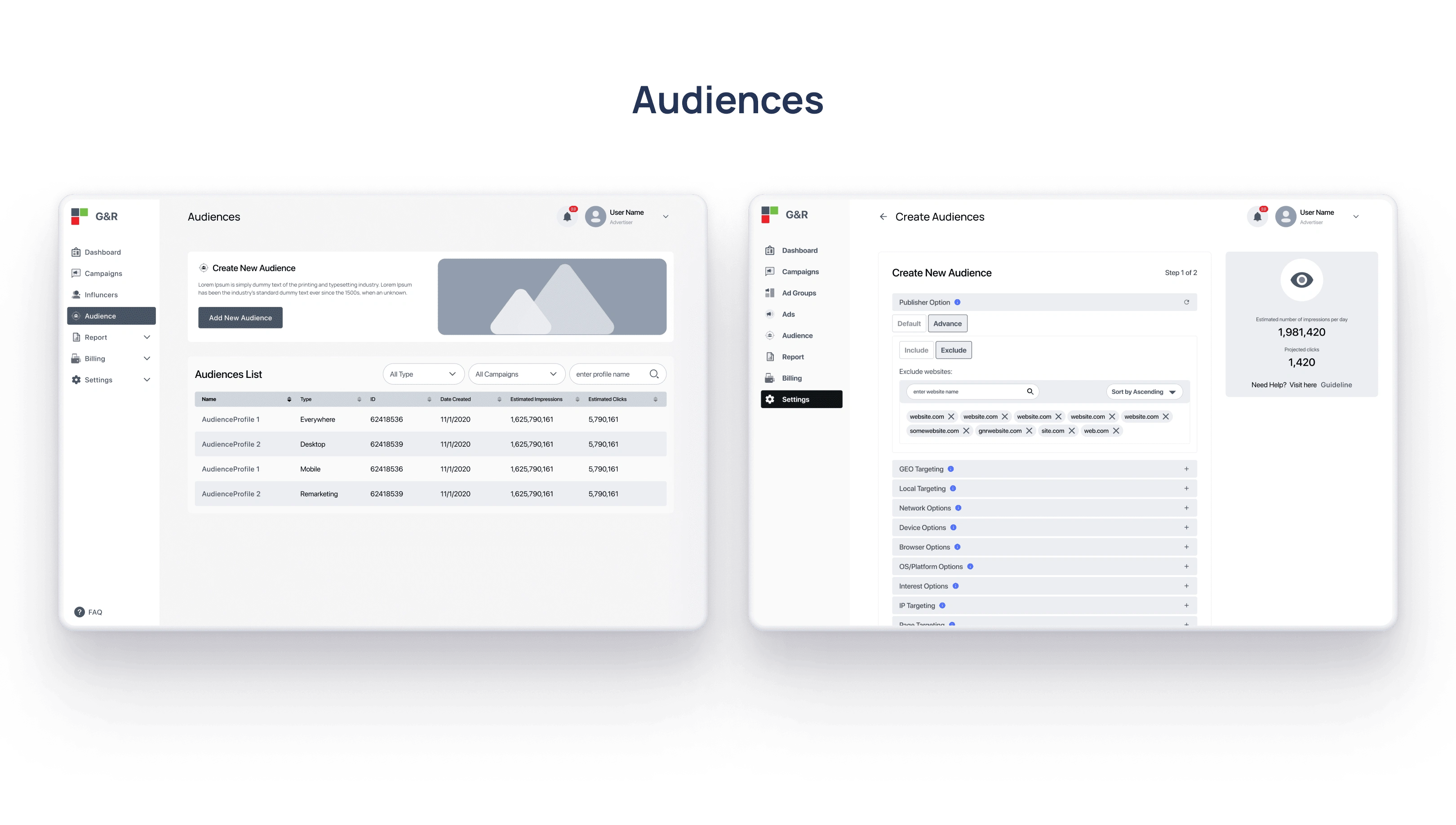
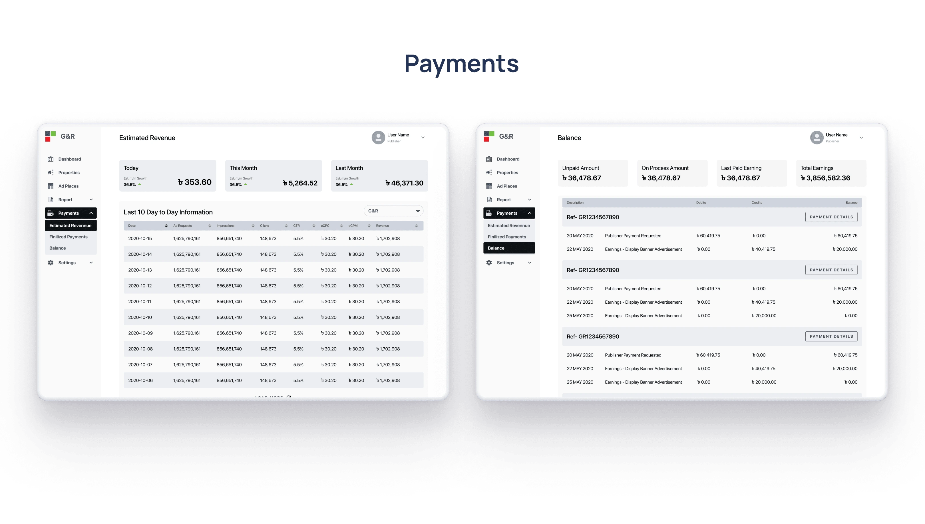
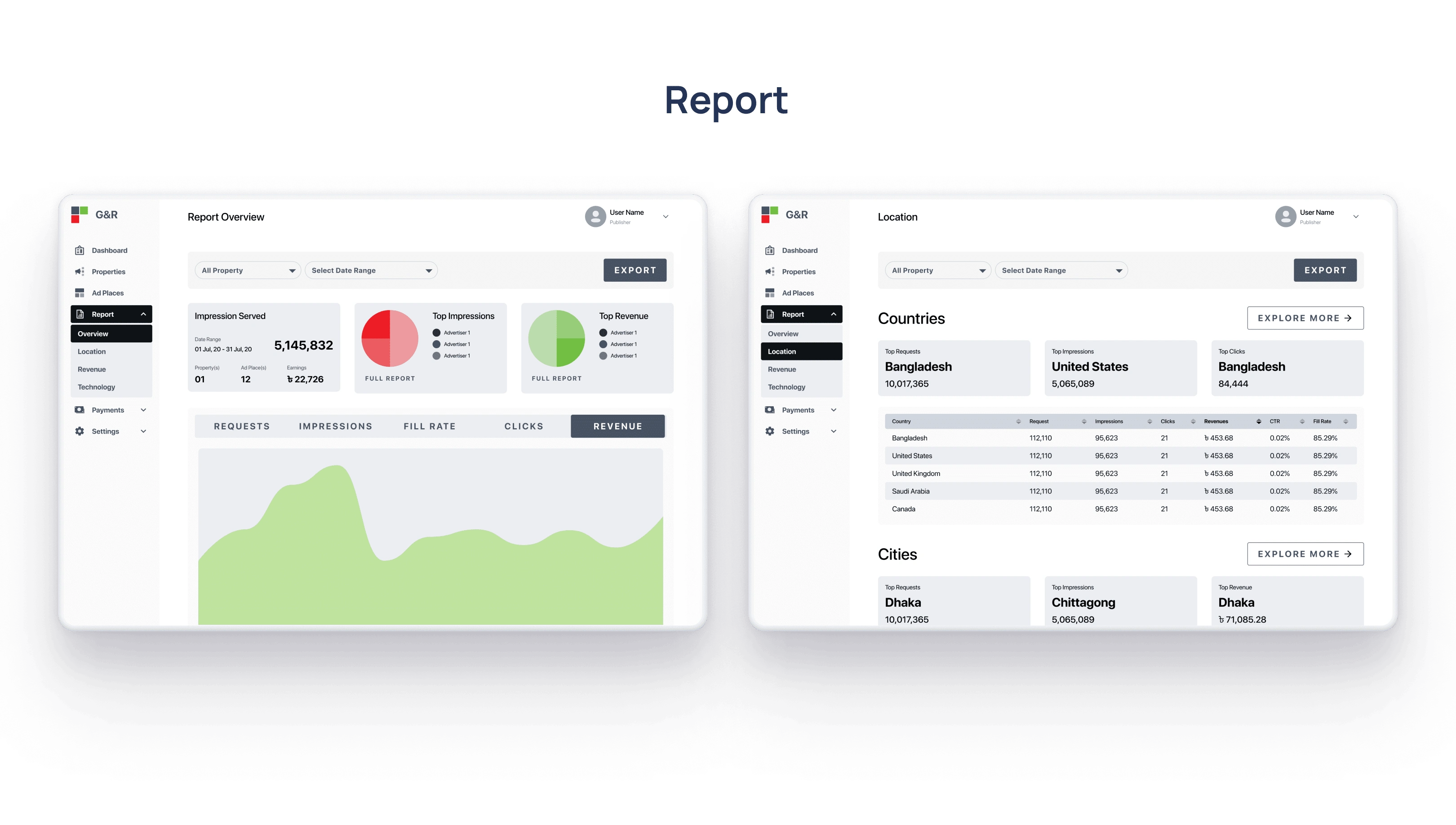
Creating wireframes helped me visualize the ideas and gave us the basic structure for how users would use the app.
When creating these wireframes, we kept the user needs from the earlier findings and research in mind.
We have done several testing sessions with a close group of users.
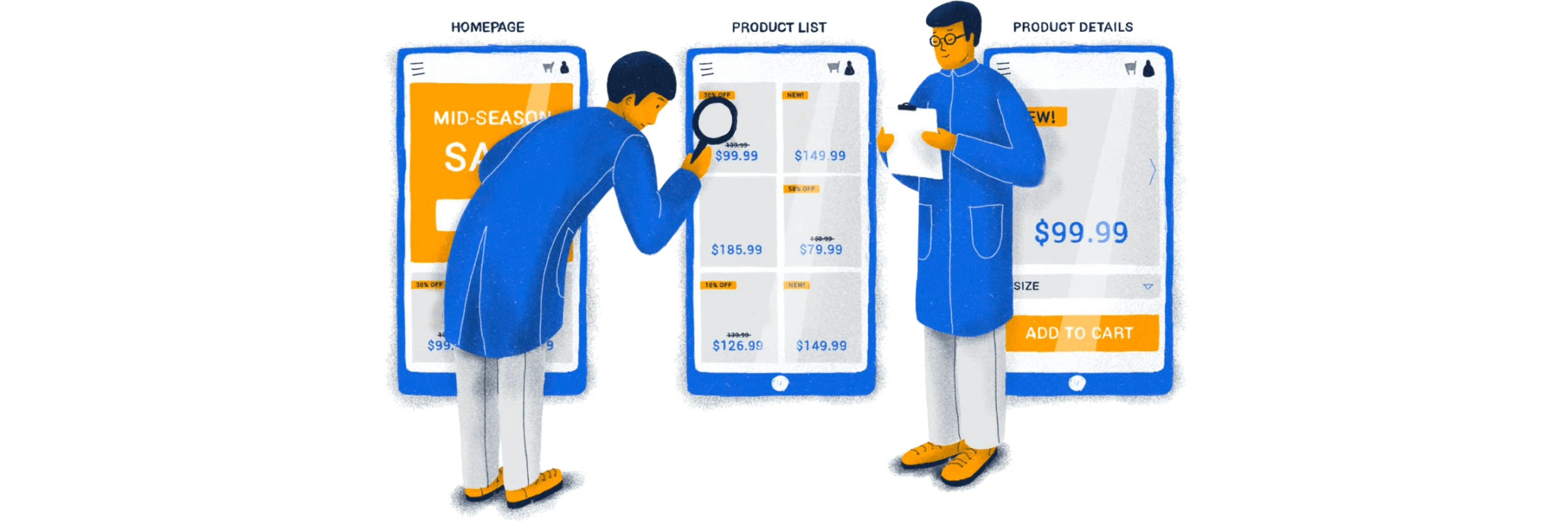
Based on the usability testing sessions, we refined and updated the Wireframes.
We created deliverables for the handover. I maintained continuous communication with the team during the development period.
Prepared design documentation.
Write user stories.
Maintained close communication with the team.
Unit testing sessions with the demos.
It’s a one-time project.
So, I don’t have the opportunity to measure the success of it.
Like this project
Posted Oct 5, 2023
Our challenge was to define the user role and to design functional, simple, intuitive, innovative, easy-to-use, user-friendly, and frictionless wireframes.
Likes
0
Views
26

