
Building Brand Systems That Evolve Across Every Touchpoint


Building Brand Systems That Evolve Across Every Touchpoint



Brand & Packaging Designer for F&B, Skincare & Beauty


Brand & Packaging Designer for F&B, Skincare & Beauty





Product/Website Designer. Framer Expert
Product/Website Designer. Framer Expert


Web Designer for SaaS & AI Startups | Figma + Framer
- 5.0
- Rating
- 35
- Followers
Web Designer for SaaS & AI Startups | Figma + Framer



AI-Powered UI/UX Designer | Apps, SaaS & Website

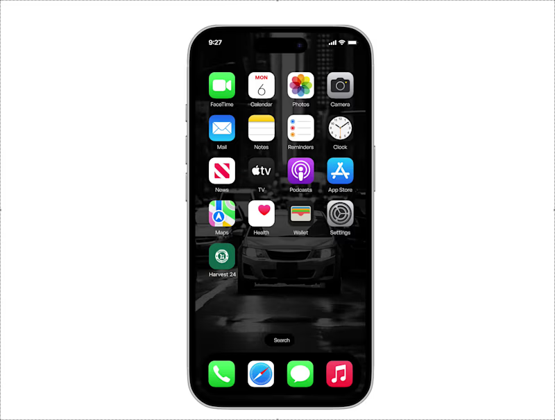
Turning ideas into a fully interactive UI prototype ✨📱
Designed with a modern visual style, smooth user experience, and clean interface flow, this prototype is all about creating digital experiences that feel effortless and engaging. Every screen is carefully crafted to balance aesthetics with usability — making the product not only visually appealing but also intuitive to navigate.
From the first interaction to the final screen, the focus was on delivering a seamless and realistic app experience that brings the concept to life. 🚀
Good UI isn’t just about beautiful screens.
It’s about creating experiences users remember.
12
1.3K
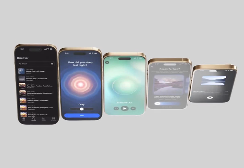
Designed a premium mobile experience that blends elegance, clarity, and functionality. Every screen is crafted to create seamless interactions while maintaining a modern and visually refined aesthetic.
✨ Clean UI
📱 User-Centered Design
⚡ Smooth Experience
🎯 Built for Engagement
Available for freelance projects and collaborations.
👉 Book a call: https://calendly.com/gopi-uiux/30min
(https://calendly.com/gopi-uiux/30min)👉 Dribble: https://dribbble.com/OptimityLogics
(https://dribbble.com/OptimityLogics)👉 Behance: https://www.behance.net/optimitylogics
(https://www.behance.net/optimitylogics)👉 Portfolio: https://gopi-prajapati-portfolio.vercel.app
8
16
2K

Visual Designer & Framer Developer for Web3 Teams
- 5.0
- Rating
- 35
- Followers
Visual Designer & Framer Developer for Web3 Teams

Packaging & Brand Designer for Food, Beverage & Wellness
- 5.0
- Rating
- 19
- Followers
Packaging & Brand Designer for Food, Beverage & Wellness





Product Designer • Mobile & Web • Framer Designer • AI
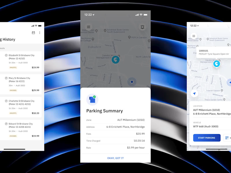
ParKiwi is a smart parking app for New Zealand that lets drivers start and stop parking from their phone — and only pay for the time they actually use. The challenge was making something inherently annoying — paying for parking — feel effortless. We mapped how drivers actually park, then designed flows that remove the friction at every step: quick payment setup, live parking sessions, clear history, and transparent summaries showing zone, rate, and fees with no guesswork. By making the experience genuinely easy, we helped ParKiwi drive better payment compliance and a smoother experience for both drivers and operators. Handled end to end: user flows, high-fidelity UI, a scalable design system, and developer-ready handoff.
4
2
217


Design isn’t about adding more.
It’s about removing friction.
In this Shoppy dashboard exploration,
we used a Bento grid system to:
→ Break complex workflows into digestible modules
→ Improve visual hierarchy
→ Reduce cognitive load
Each card represents a function, but together they create a seamless experience.
This is where SaaS design is heading: modular, flexible, and human-friendly.
#UXDesign #SaaSDesign #MinimalUI #ProductThinking #DesignSystems
2
1
188