Built with Framer
Premium Branding for SharpHill & Co.
Swayam Goswami
Verified
Premium identity for an operational real estate investment firm
Client: Sharphill & Co.
Scope: Brand Identity Design and Landing Page Development
Services: Strategy, Logo Design, Visual Language, Social Assets, Brand Guidelines, Landing Page
About the Client
SharpHill & Co. is a real estate investment and asset management firm founded by the team behind LAGERBOX, Germany's third-largest self-storage operator. They came to me with a vision and landing page copy, but nothing else: no brand identity, no visual system, no website. The job was to build the entire brand from the ground up and deliver a live landing page that could stand next to institutional competitors.
Strategy & Approach
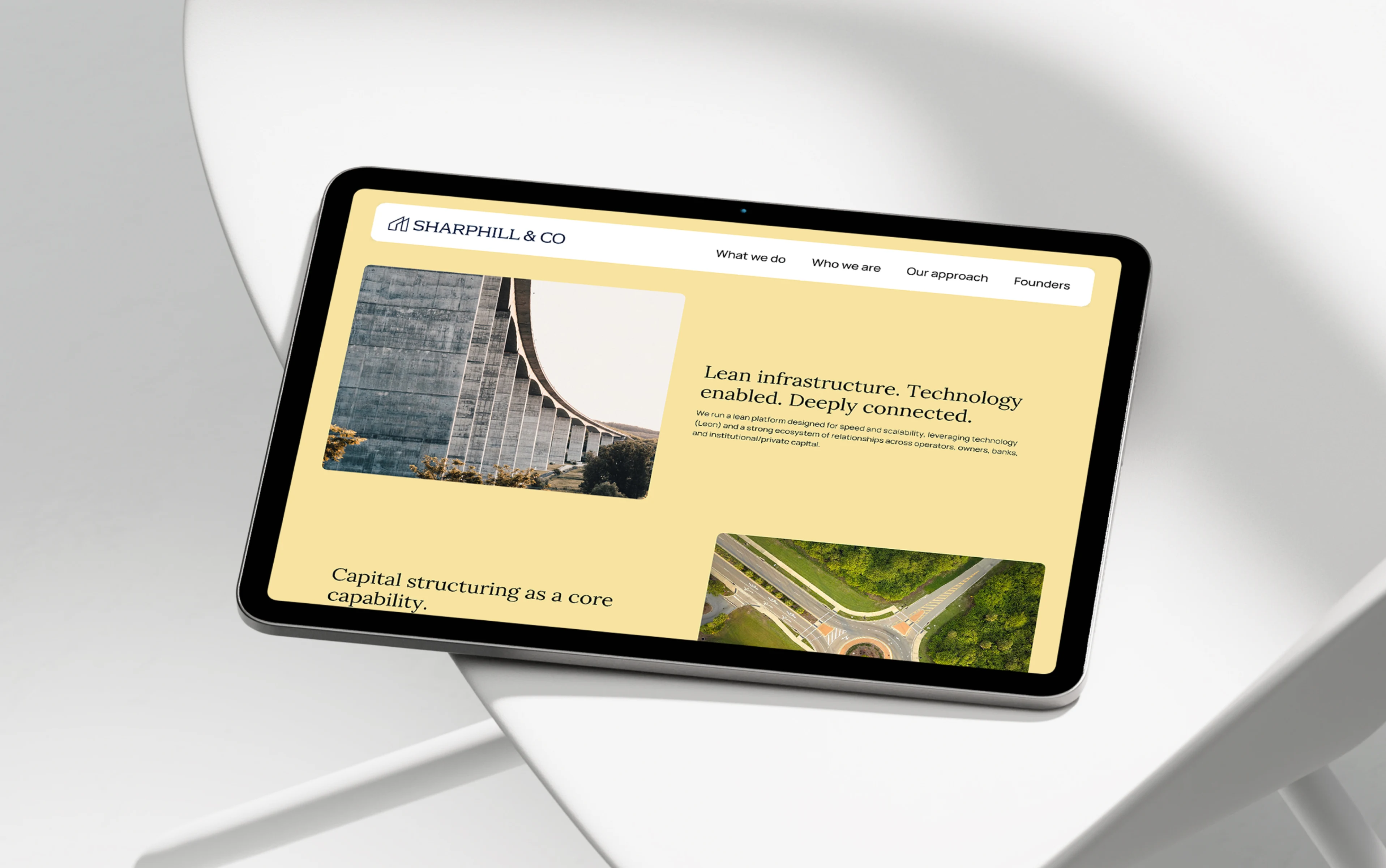
The visual direction is editorial, muted, and photography-heavy, designed to set SharpHill apart from the usual crowd and position it as a firm that prioritizes substance over flash. That direction was a collaborative decision between the founding team and me.
What I Delivered
Brand strategy and positioning
Complete brand identity designed in Figma
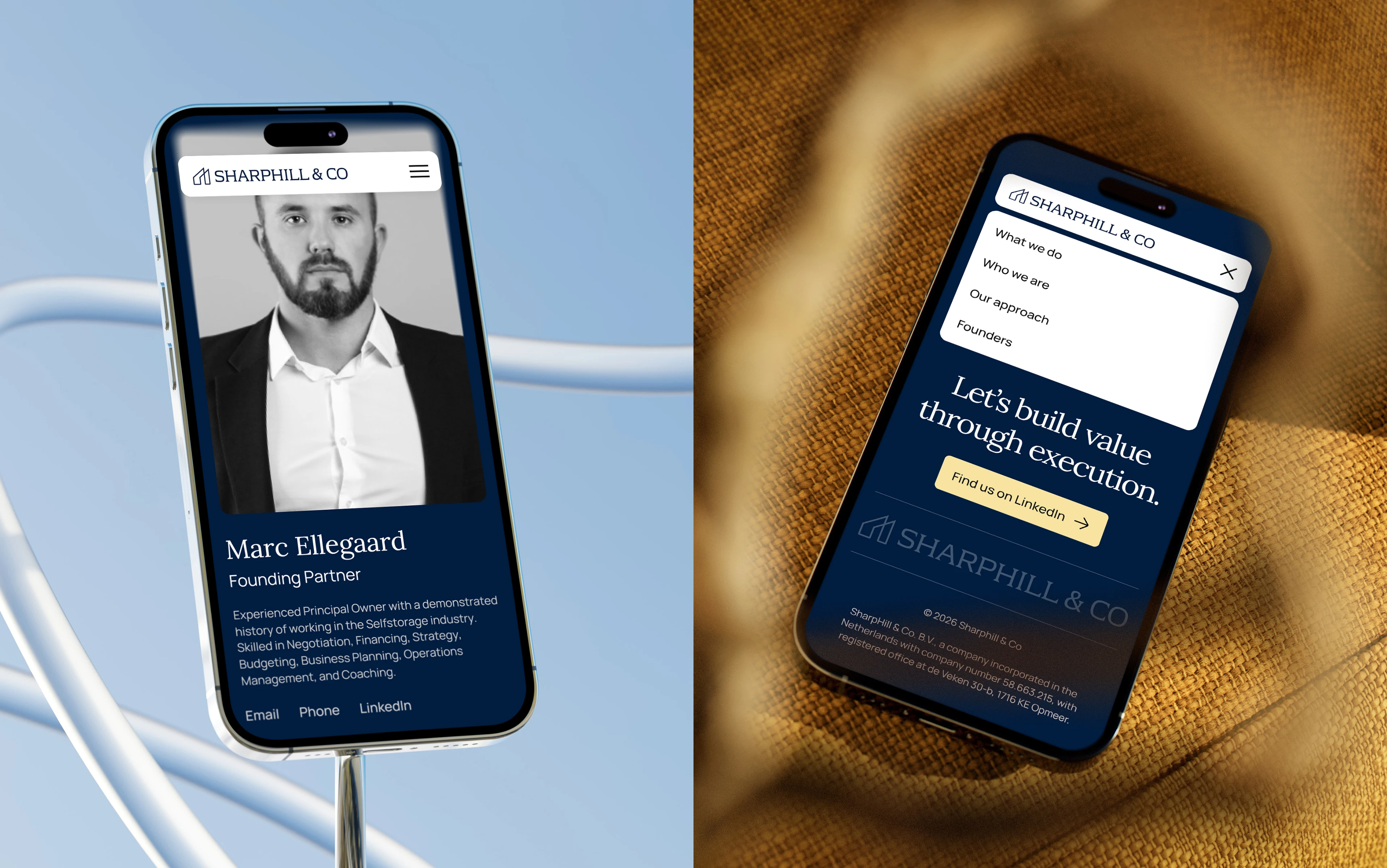
Fully responsive landing page built in Framer
A visual system built around restraint: limited color palette, strong typography hierarchy, layout grids for visual balance in documentation and print assets, and architectural photography over regular stock buildings imagery
Phased Process
Phase 1: Logo Exploration
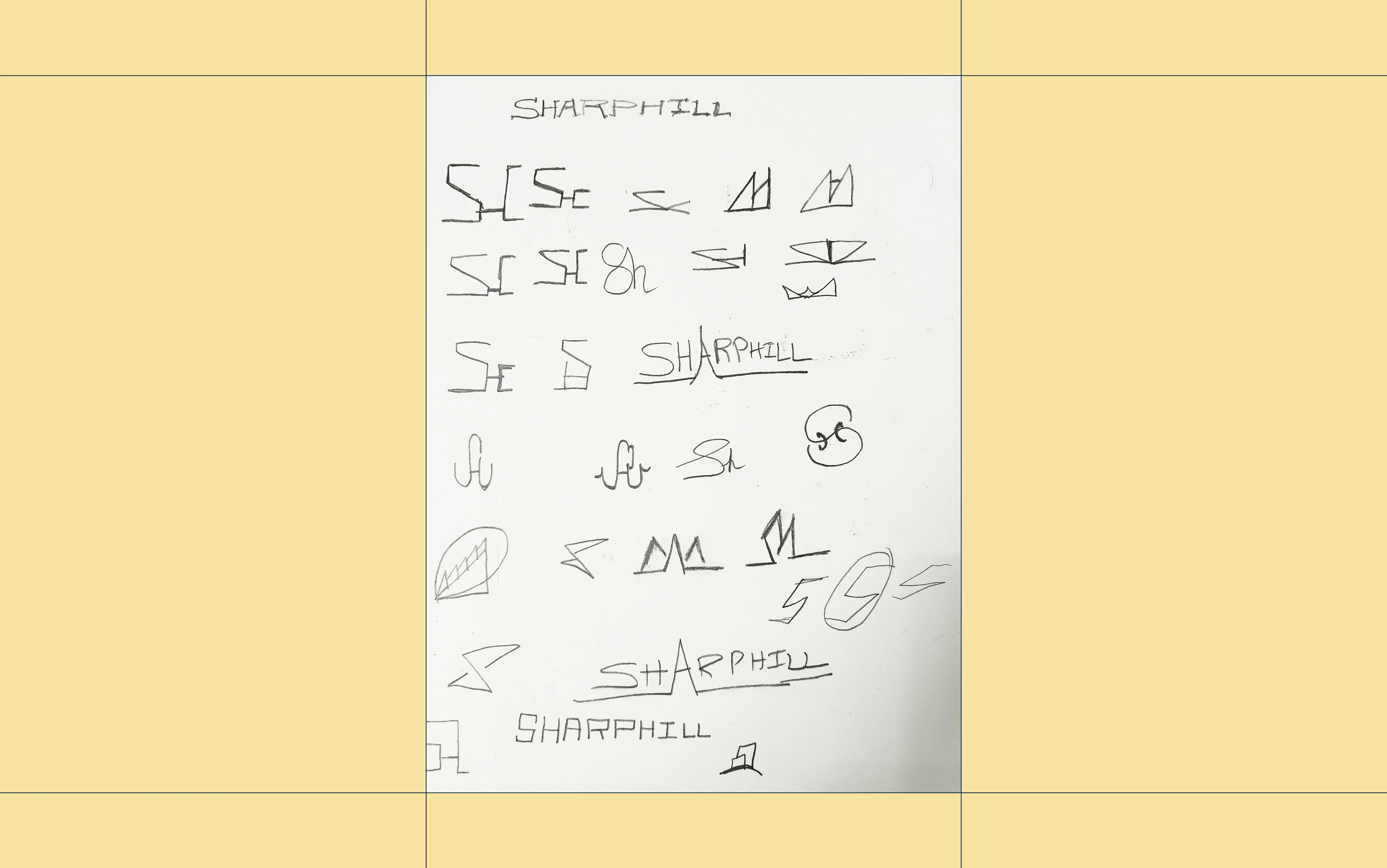
Logomark Exploration
Wordmark Exploration
Phase 2: Moodboard Exploration
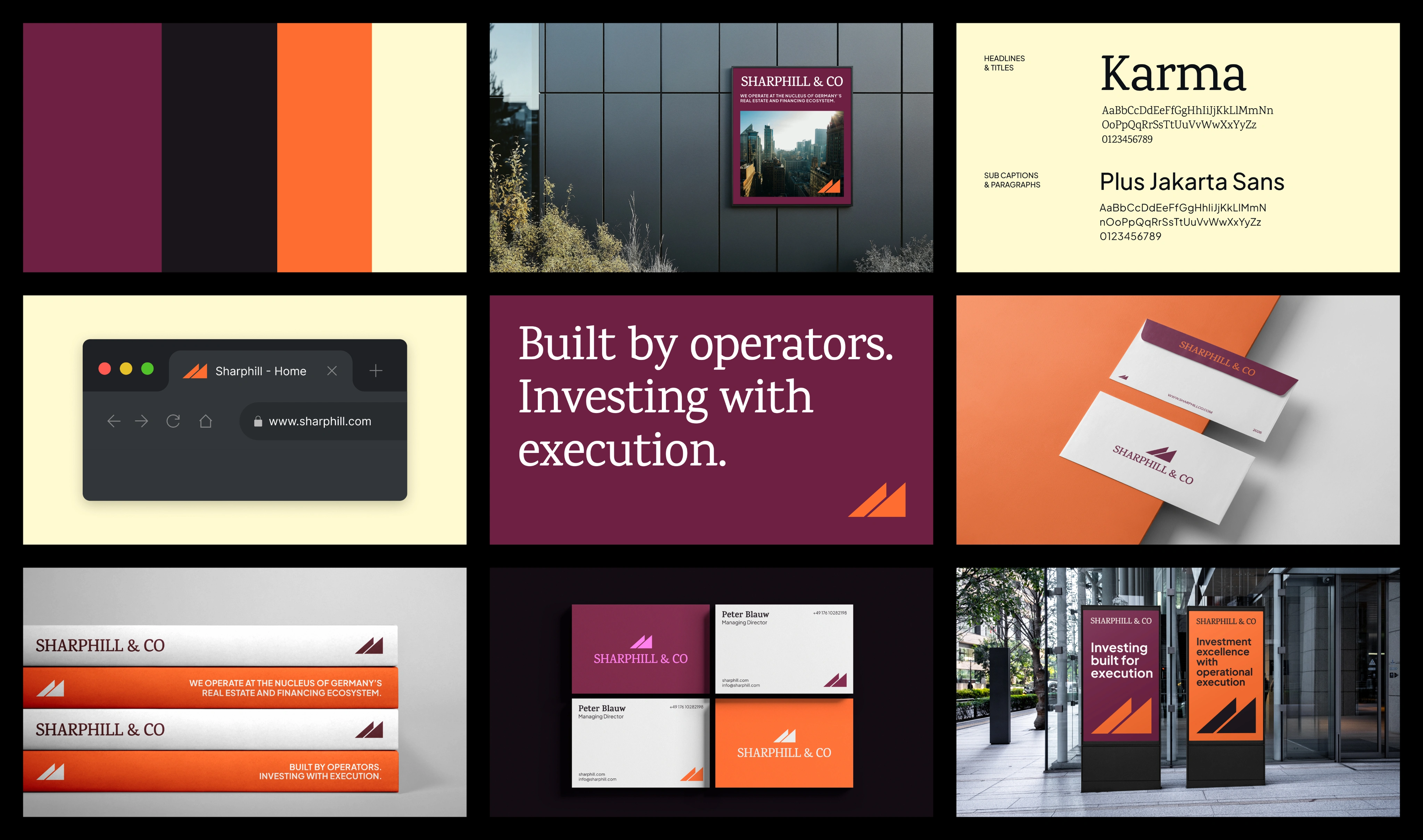
Initially, two distinct visual directions were provided. The one with the dark blue and yellow felt closer to the brand rather than the vibrant magenta and orange one.
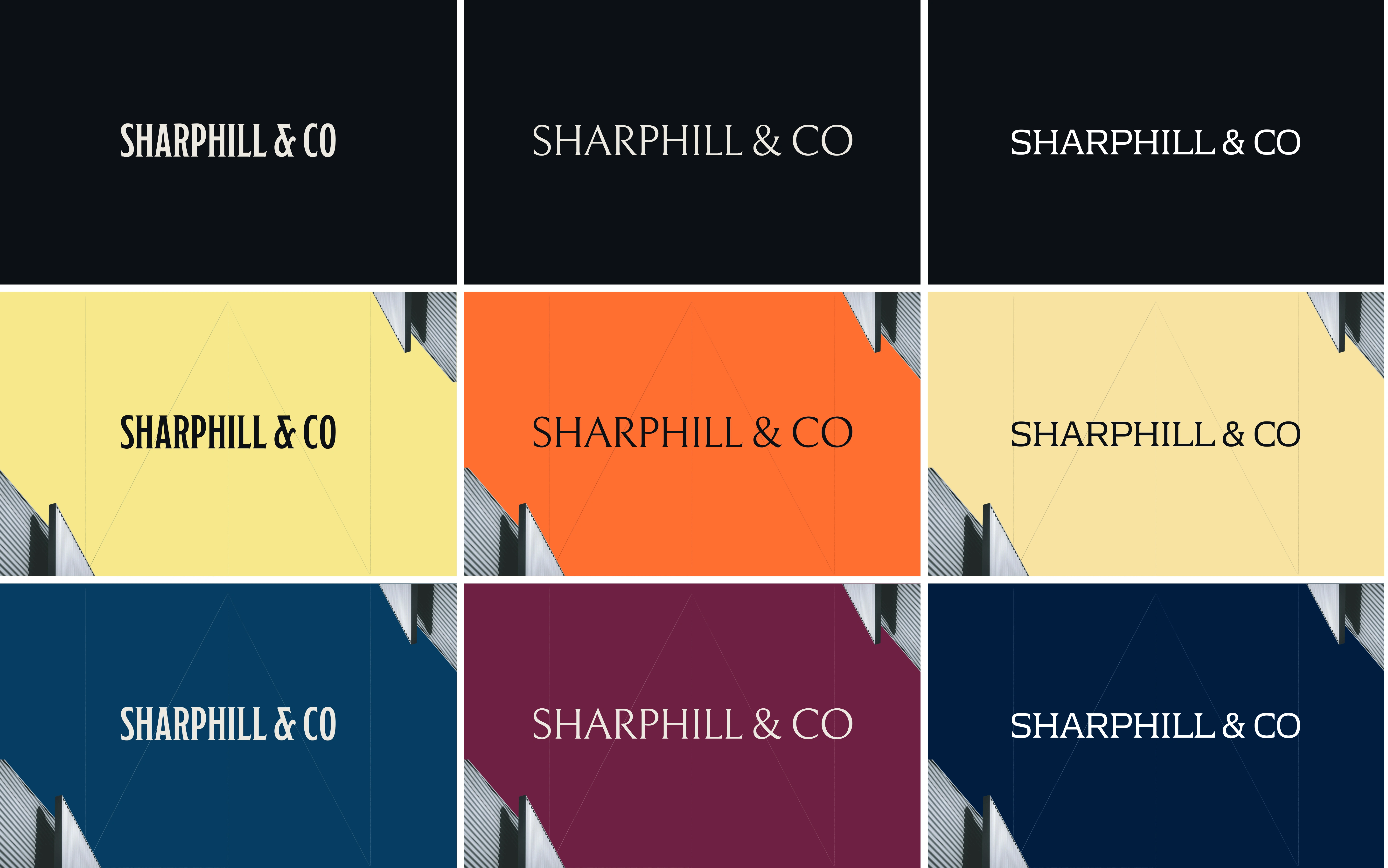
Phase 3: Theme finalization with the top 3 logos
The color palette is finalized. We chose even darker navy blue and butter yellow to soften the yellow shade. Now it's time to finalize the logo.
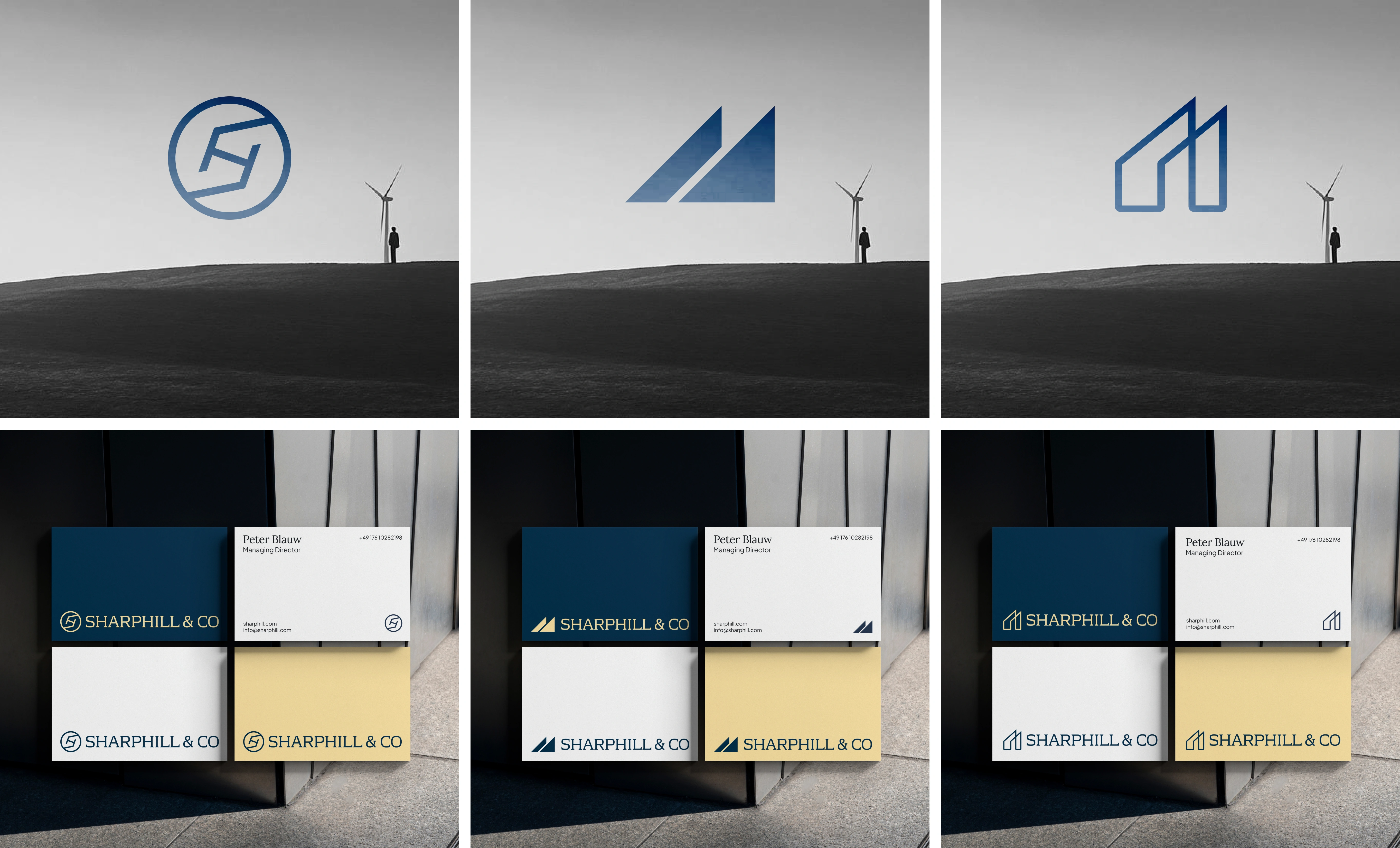
Top 3 logos
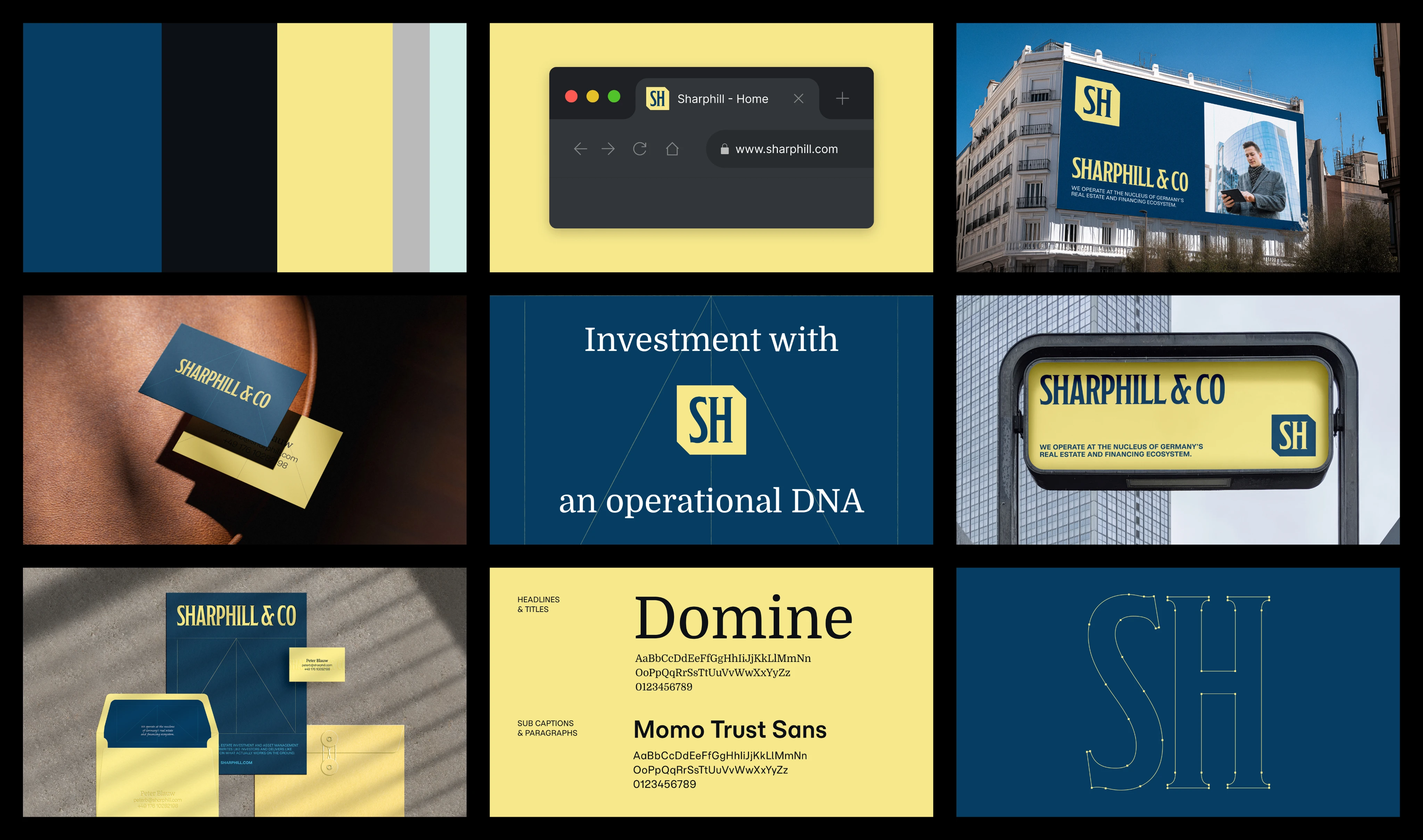
Phase 4: Final Branding
Logo Design
The logo suite includes:
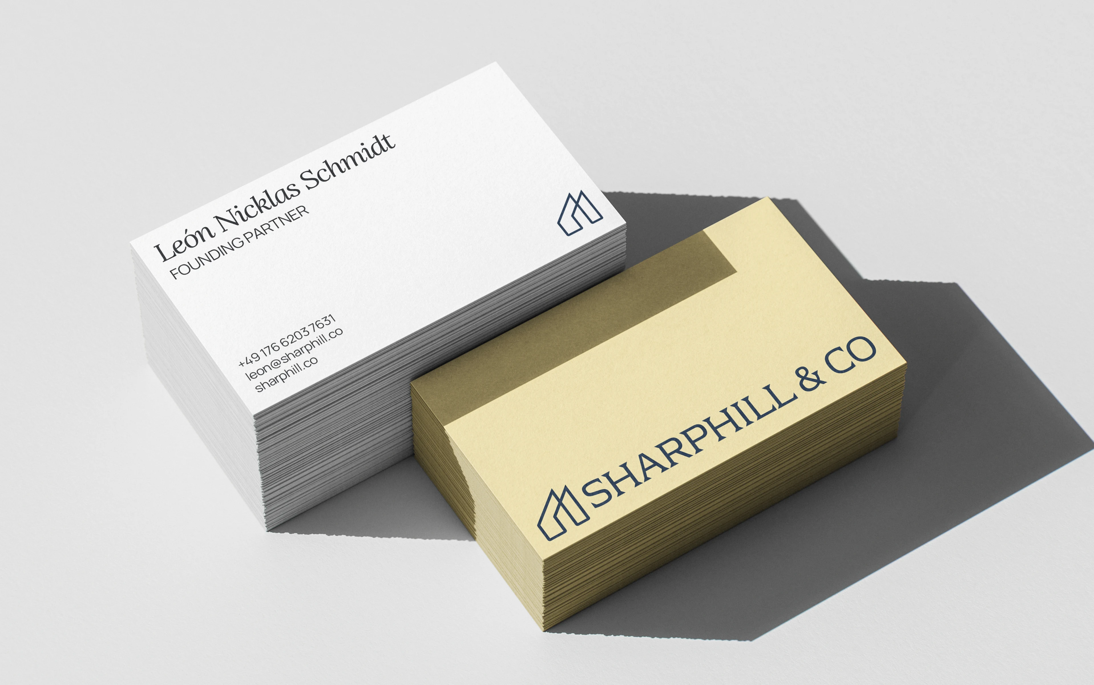
Primary Logo: A horizontal lockup that reflects growth and operation.
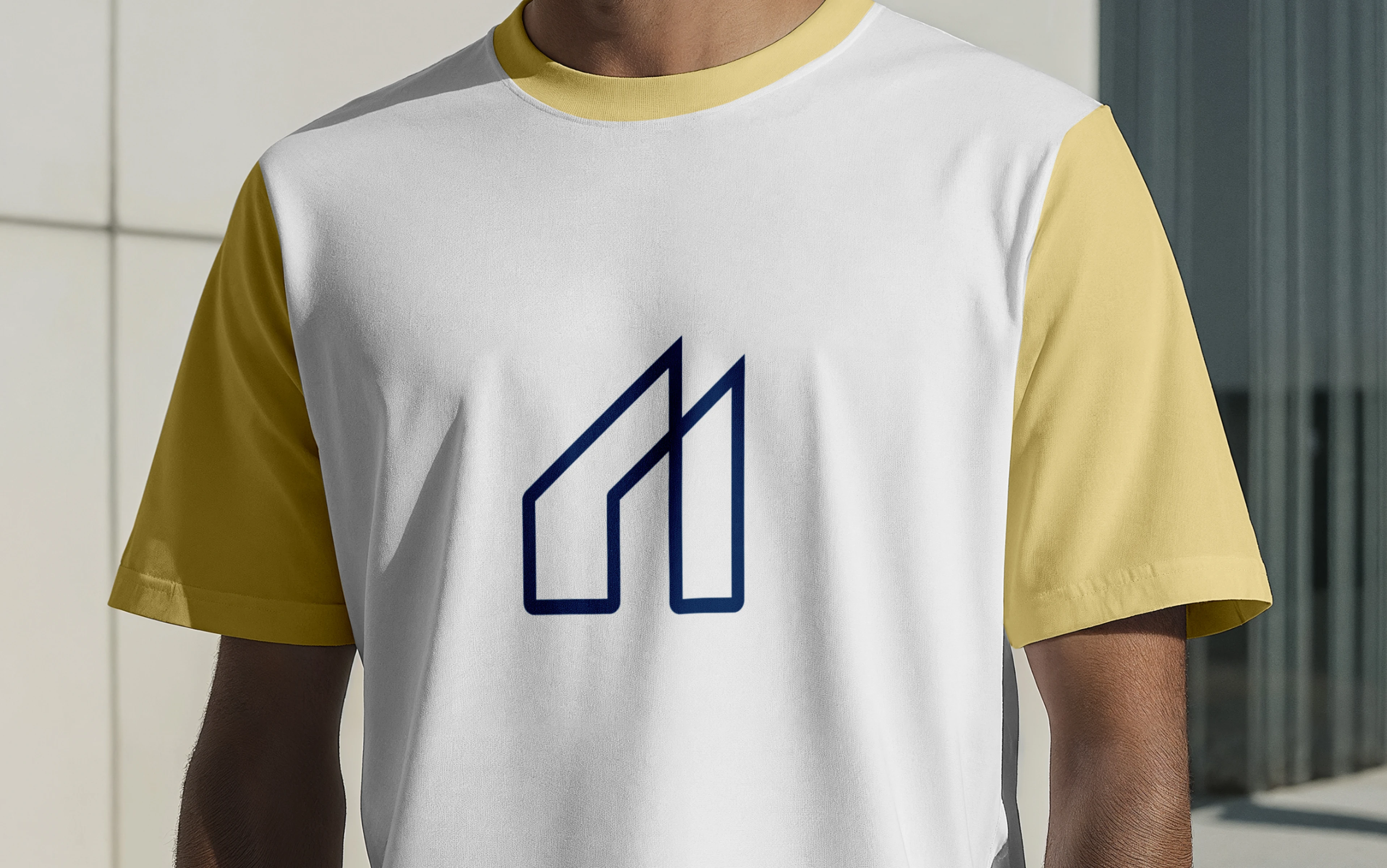
Monogram: A sharp, architectural monogram built from clean geometric lines, symbolizing structure and forward momentum. The ascending form subtly echoes skylines, investment graphs, and interconnected pathways, reflecting Sharphill & Co.’s operational precision and long-term real estate vision.
Wordmark: A modern, premium, serif wordmark that truly supports the main icon.
Primary Logo
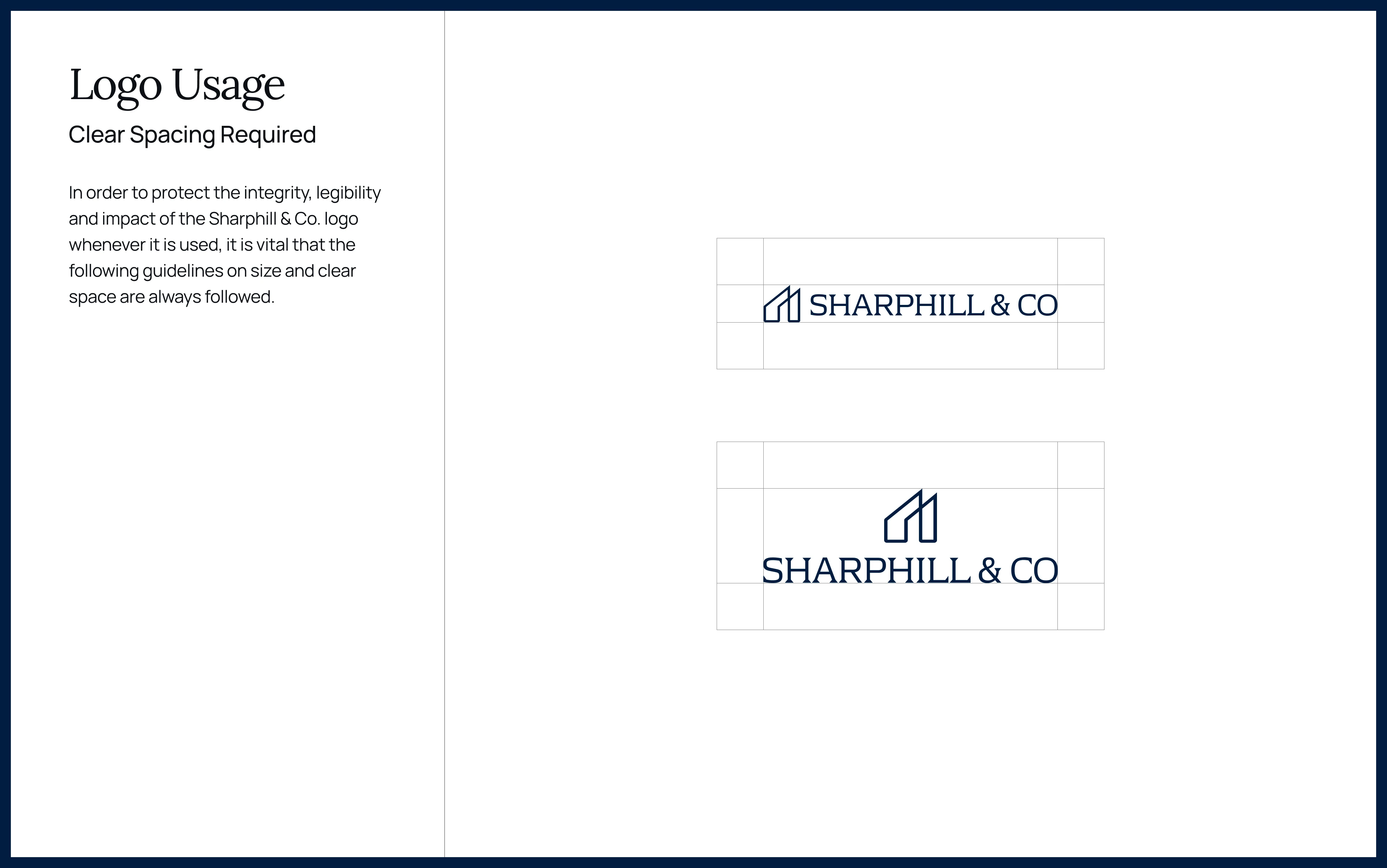
Logo Usage
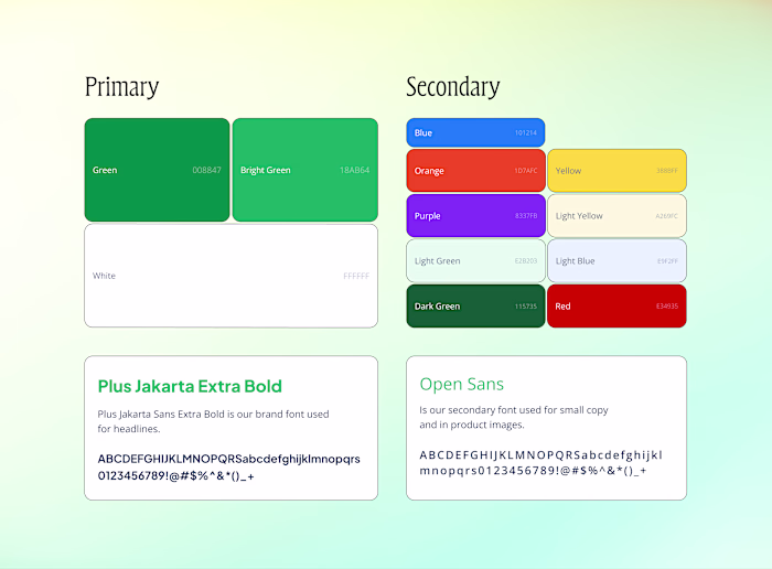
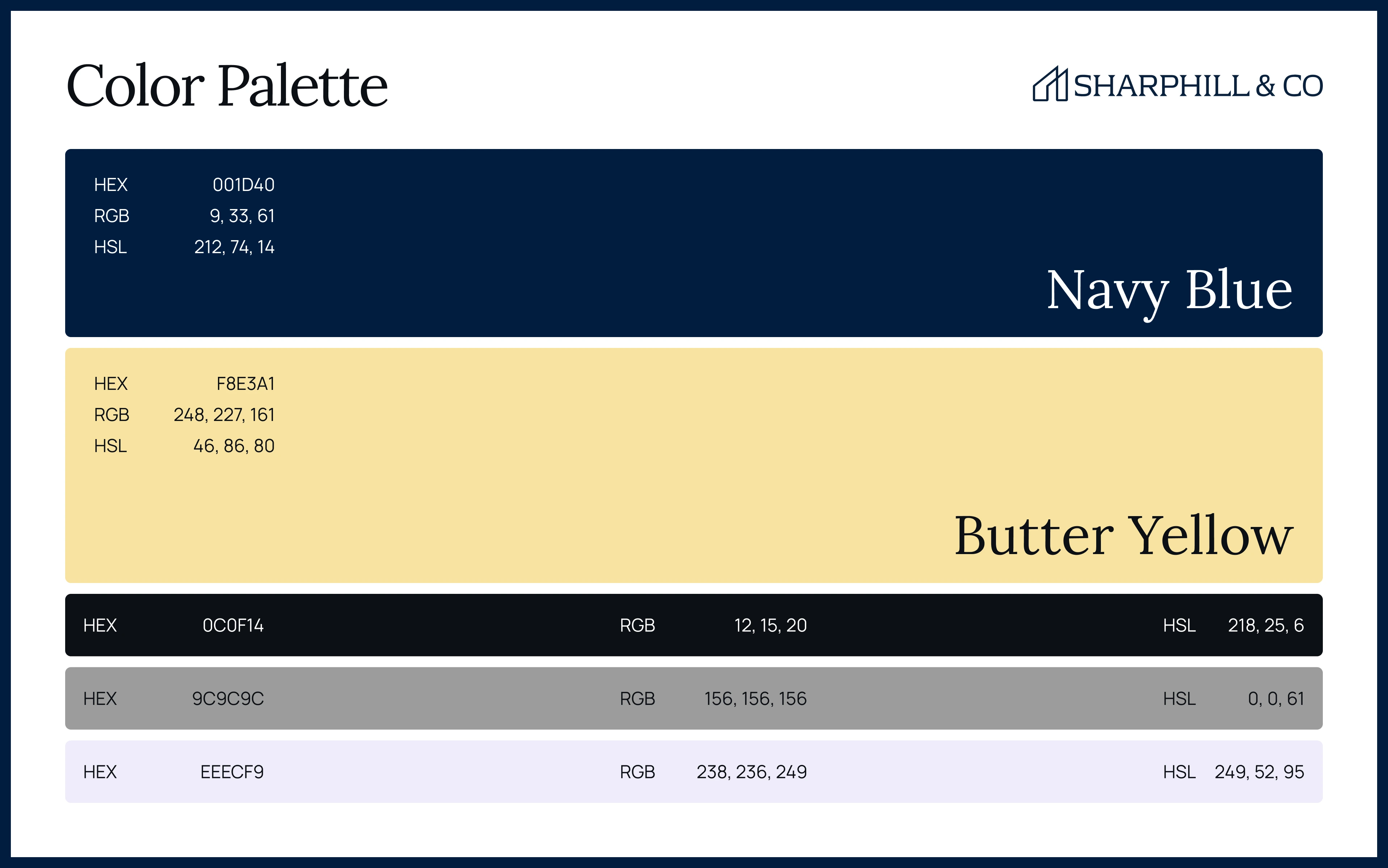
Colors & Fonts
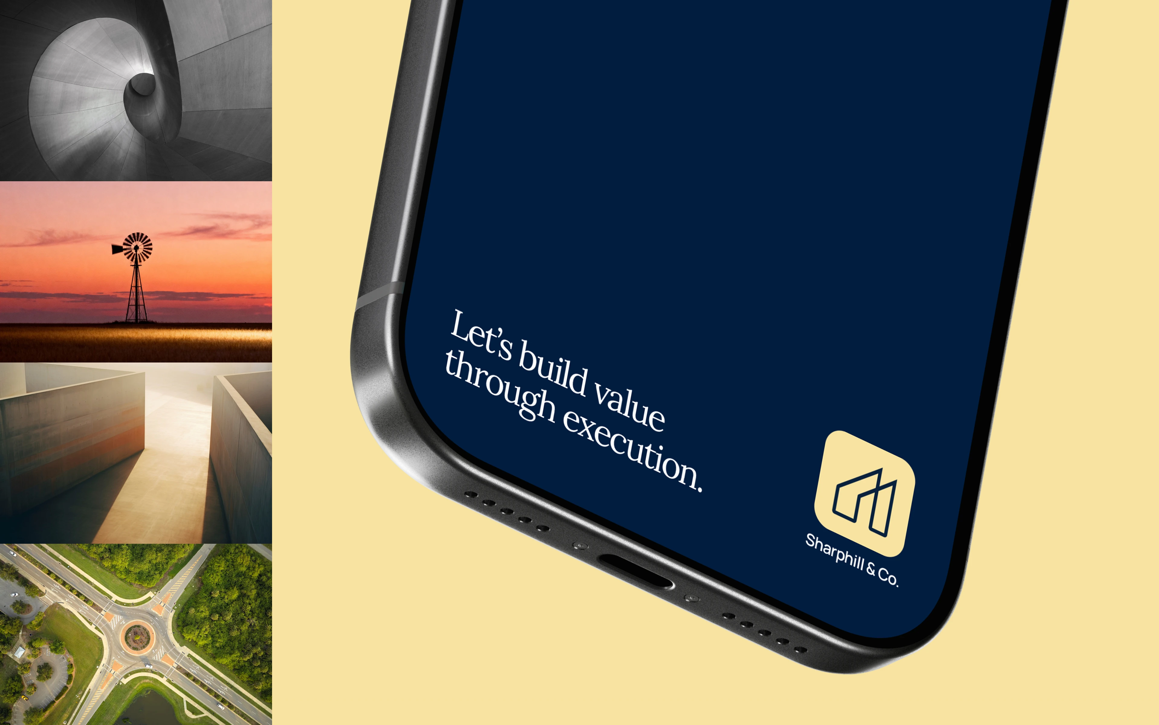
The colour palette balances bold sophistication with subtle warmth, anchored by deep navy blue and soft butter yellow to create a clean, timeless foundation. Its versatility allows the brand to feel refined yet expressive across digital, print, and environmental applications.
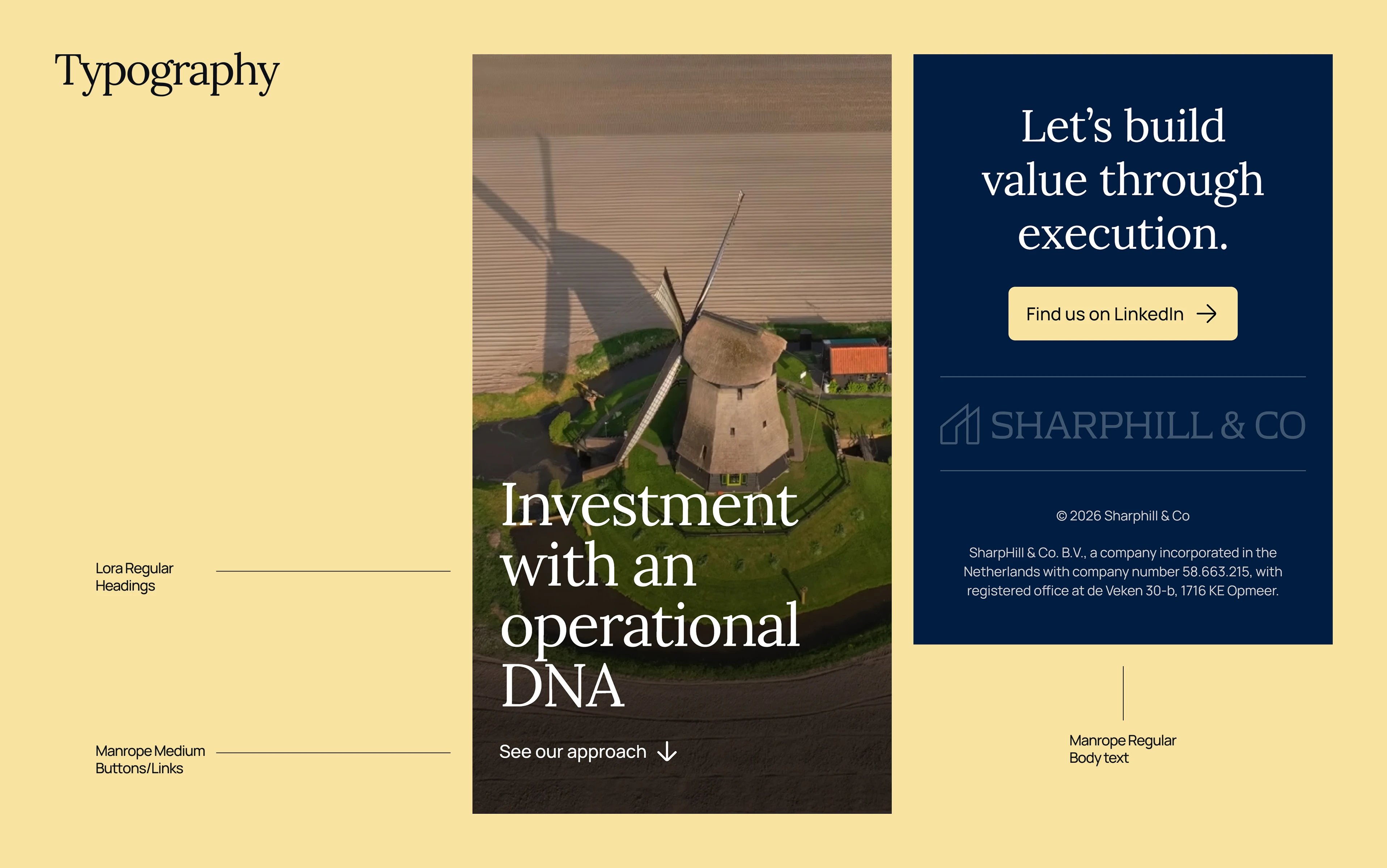
Typography pairs the clean, contemporary feel of Manrope with the timeless editorial character of Lora. Together, they create a balance of clarity and warmth, shaping a brand voice that feels both trustworthy and human while maintaining strong hierarchy, readability, and visual depth.
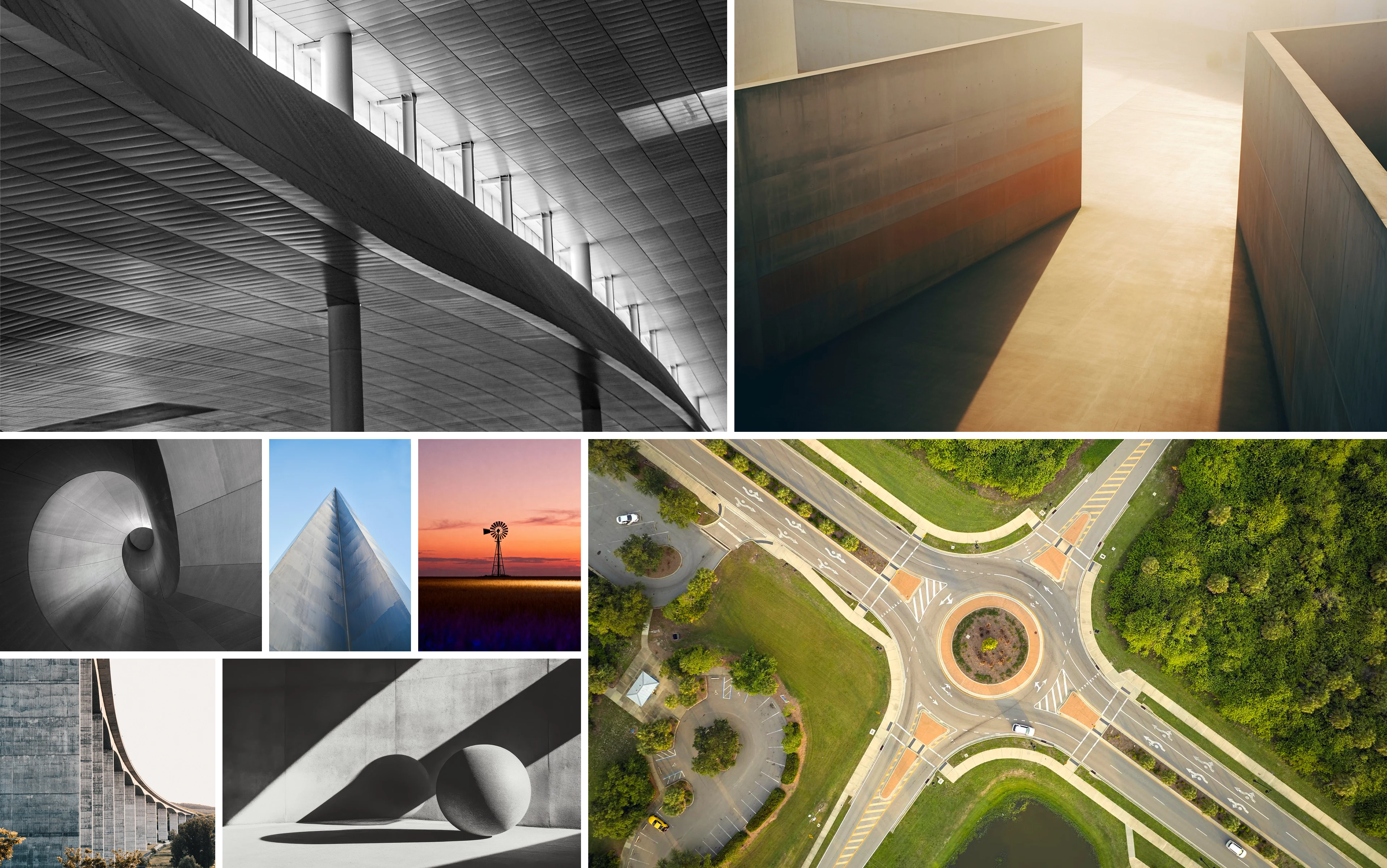
Photography & Brand Elements
Photography was deliberately kept architectural, modern, and to some extent abstract to provide the brand with its operational identity.
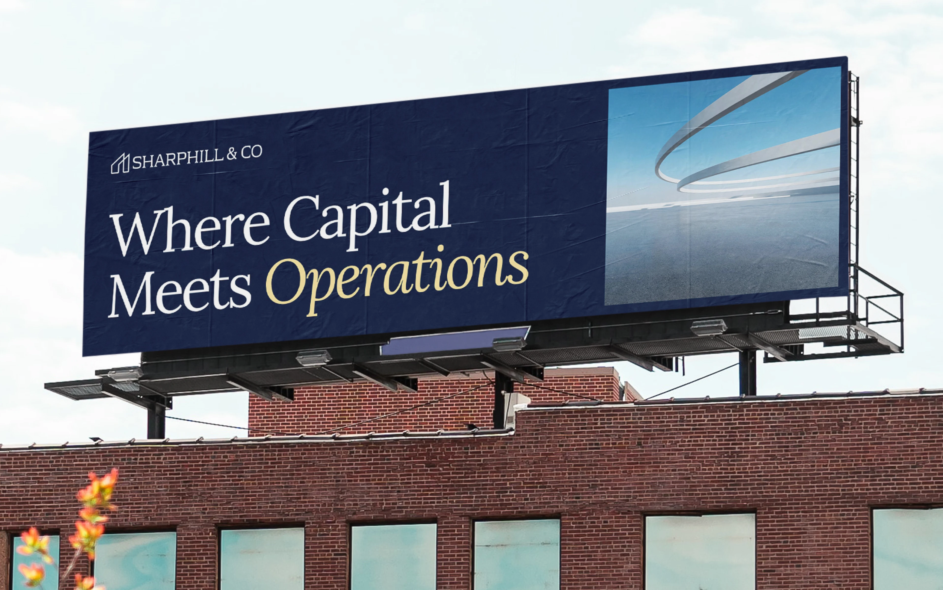
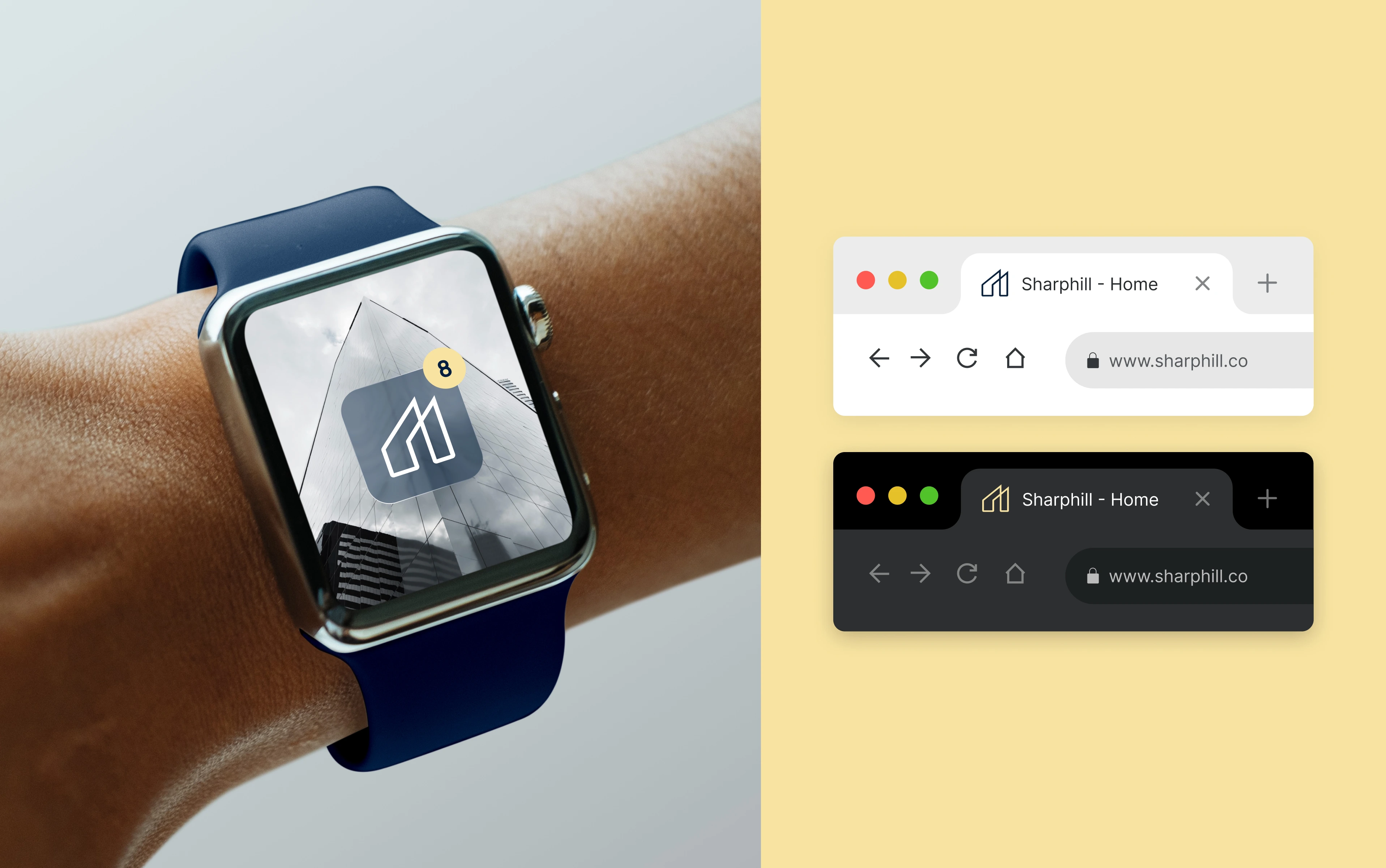
Brand Executions
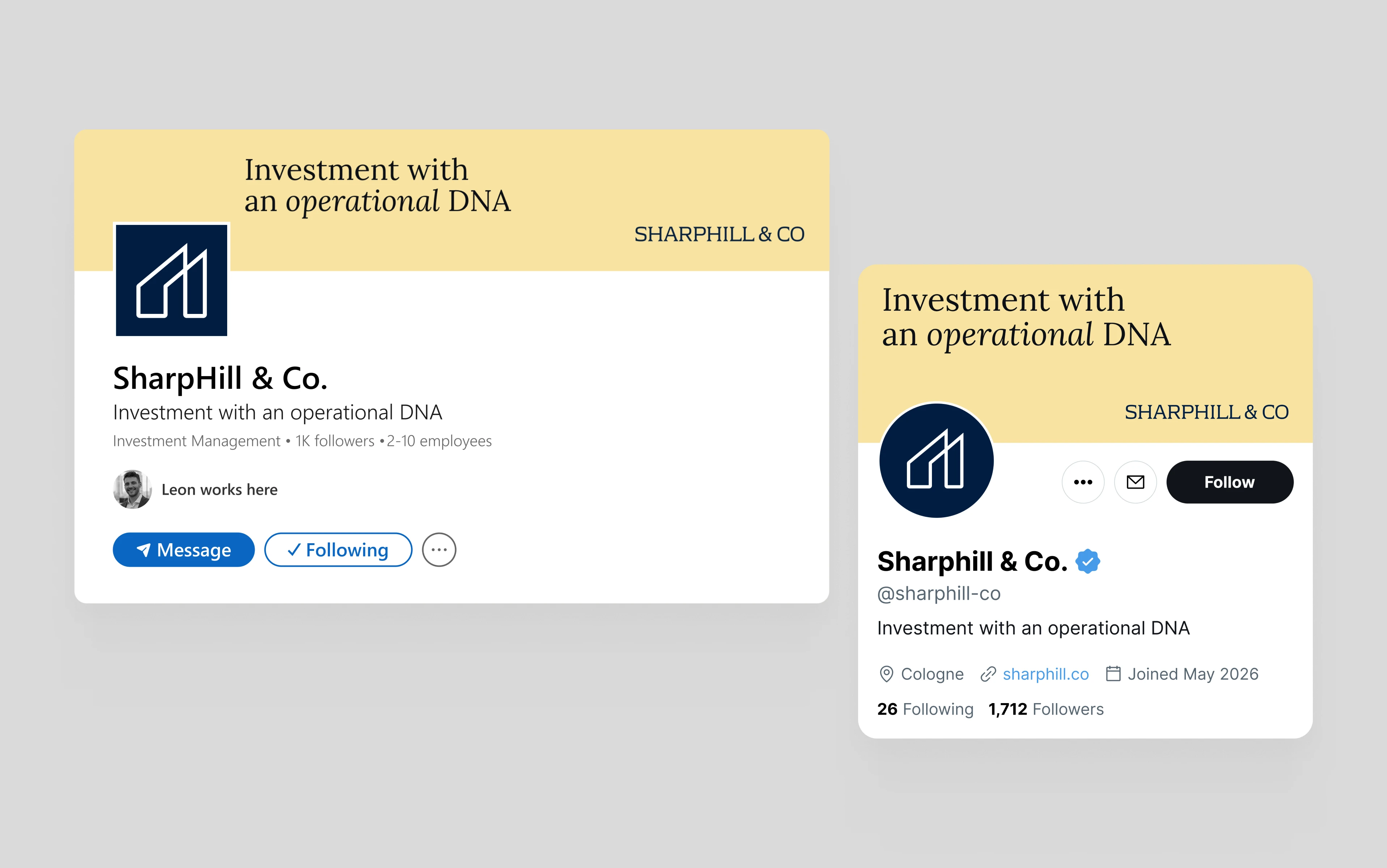
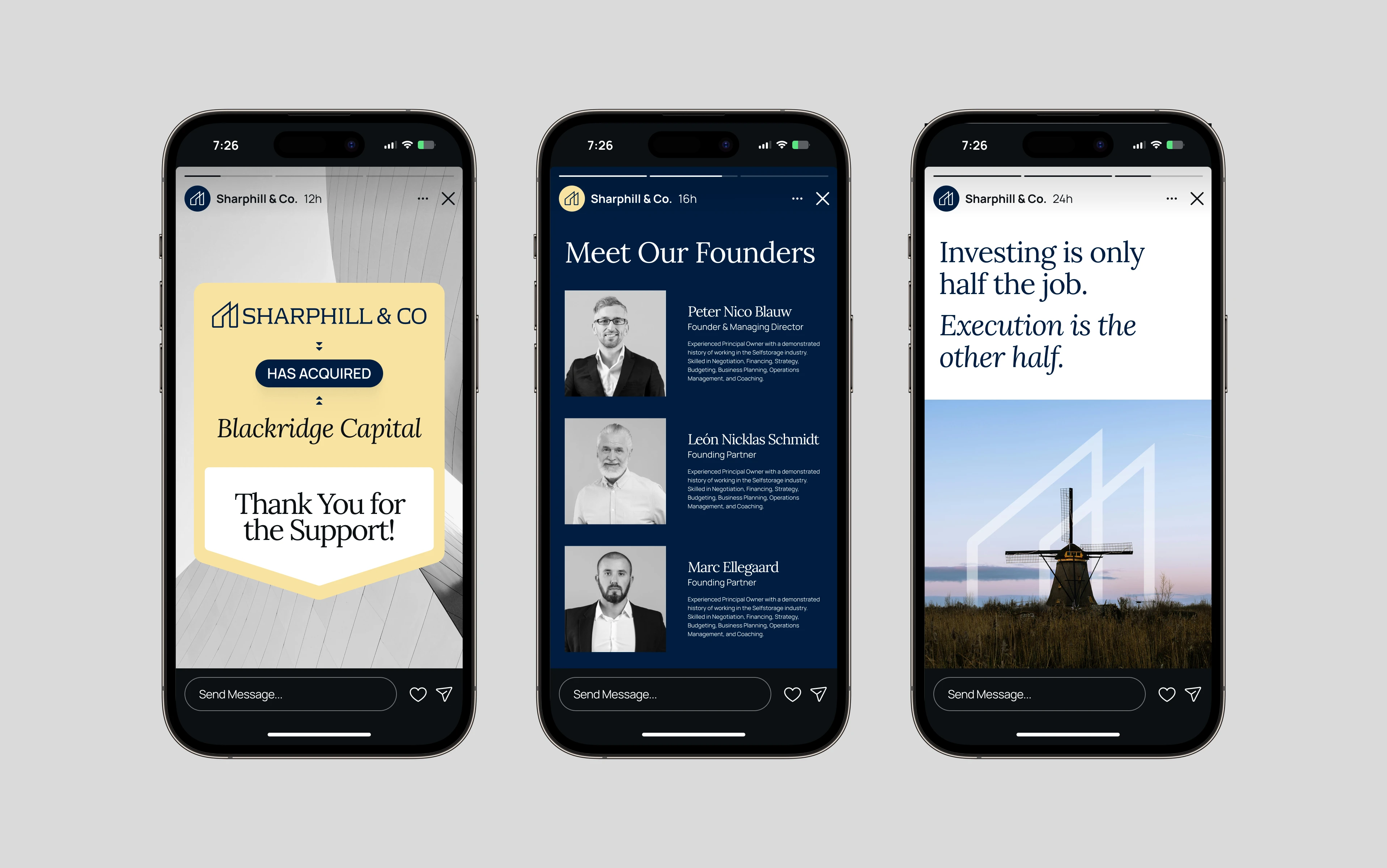
I designed launch-ready social templates, real-world mockups, a presentation template, and marketing materials.
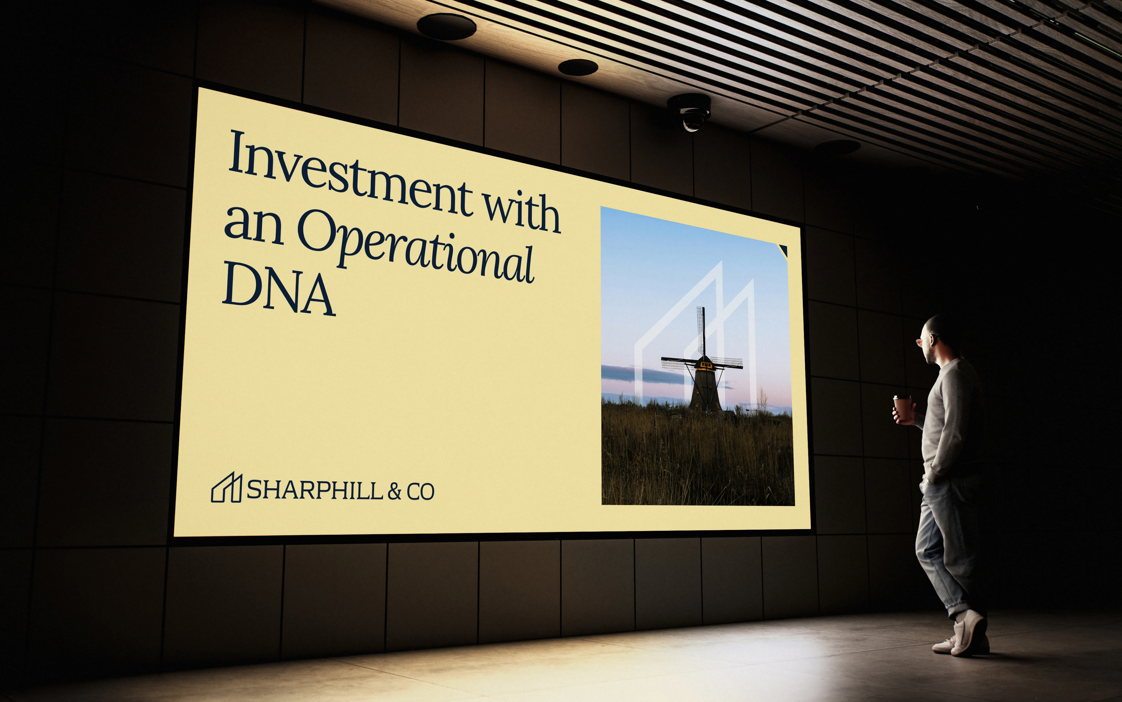
Presentation Template
A perfect presentation template built in PowerPoint for high-end investors and prospects.
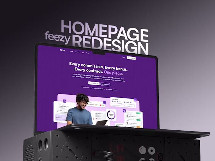
The Landing Page
The Result
The client loved the branding and the website.
Their words: the brand looks premium and high-end, exactly the positioning they wanted.
The site is live at sharphill.framer.website.
Looking for premium branding for your company?
DM to discuss
Like this project
What the client had to say
Well done like previous times!
Peter Blauw, LAGERBOX
Apr 1, 2026, Client
Posted May 25, 2026
High-end brand and landing page design for Sharphill & Co. The design exudes trust and credibility that the brand represents.
Likes
0
Views
30
Timeline
Feb 16, 2026 - Apr 1, 2026
Clients
LAGERBOX