Break Bean Brand Identity Development
Aneri Shah
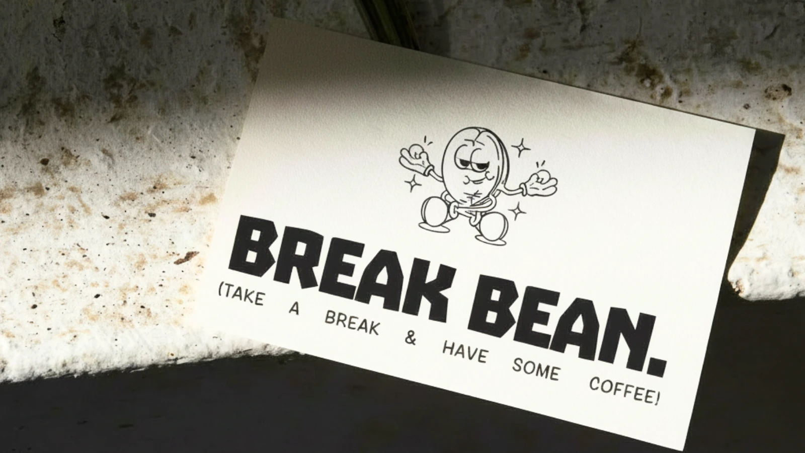
BREAK BEAN
Brand Identity & Visual Systems slightly humorous. It gives the brand a human touch while keeping it memorable.
The Idea
Coffee is everywhere.
But most brands fall into two extremes — either overly premium or completely forgettable.
Break Bean was built to sit in between.
A brand that feels casual, bold, and human — something you don’t overthink, you just pick up as part of your everyday routine.
At its core, Break Bean is about one simple moment:
taking a break.
Not aesthetic. Not aspirational.
Just real.
Design Approach
The goal was to create a system that is:
Instantly recognizable
Easy to apply
Visually bold without complexity
So the design language was stripped down to essentials.
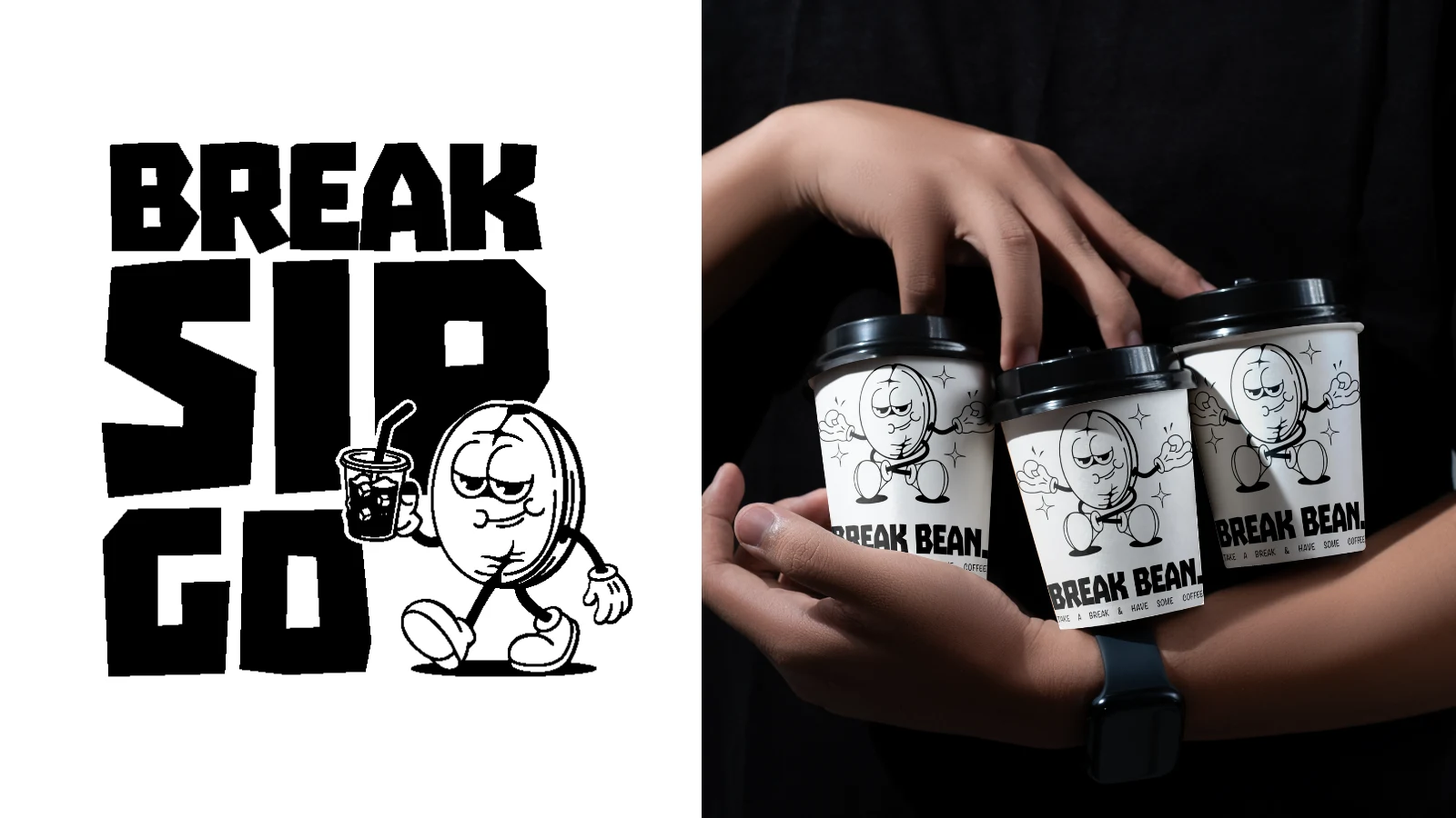
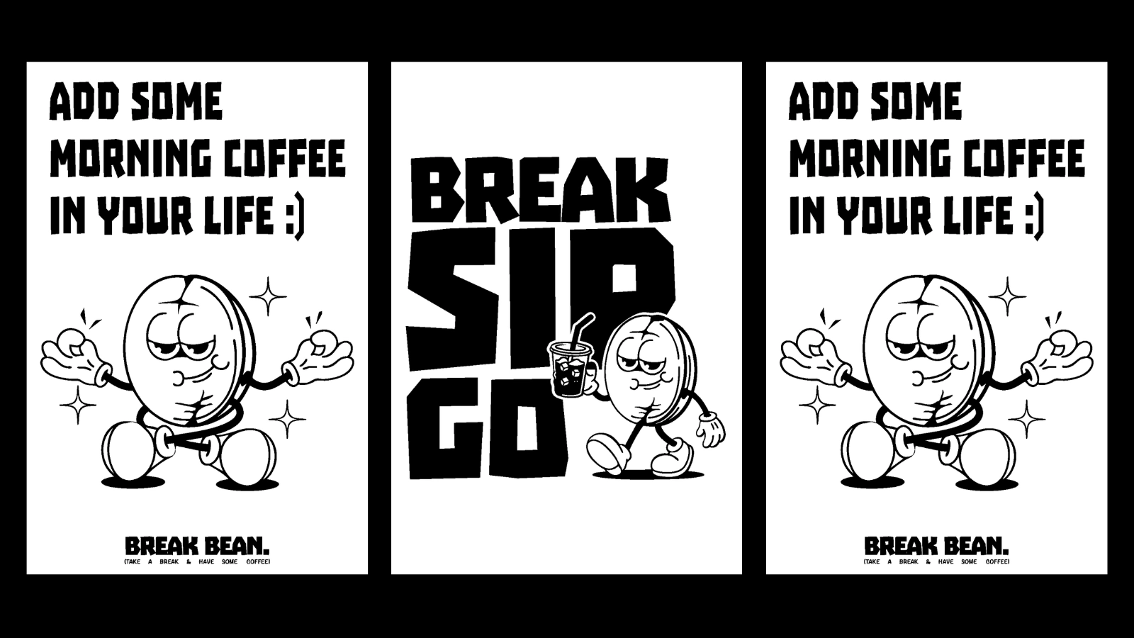
1. Black & White System
A high-contrast palette keeps everything sharp, flexible, and cost-efficient across print and packaging.
2. Bold Typography
Heavy, block-style typography drives attention and gives the brand its voice.
It’s loud, direct, and unapologetic — just like the concept.
3. Expressive Illustration
The hand-drawn bean character adds personality without making the brand feel childish.
It creates emotional recall — which is what most coffee brands lack.
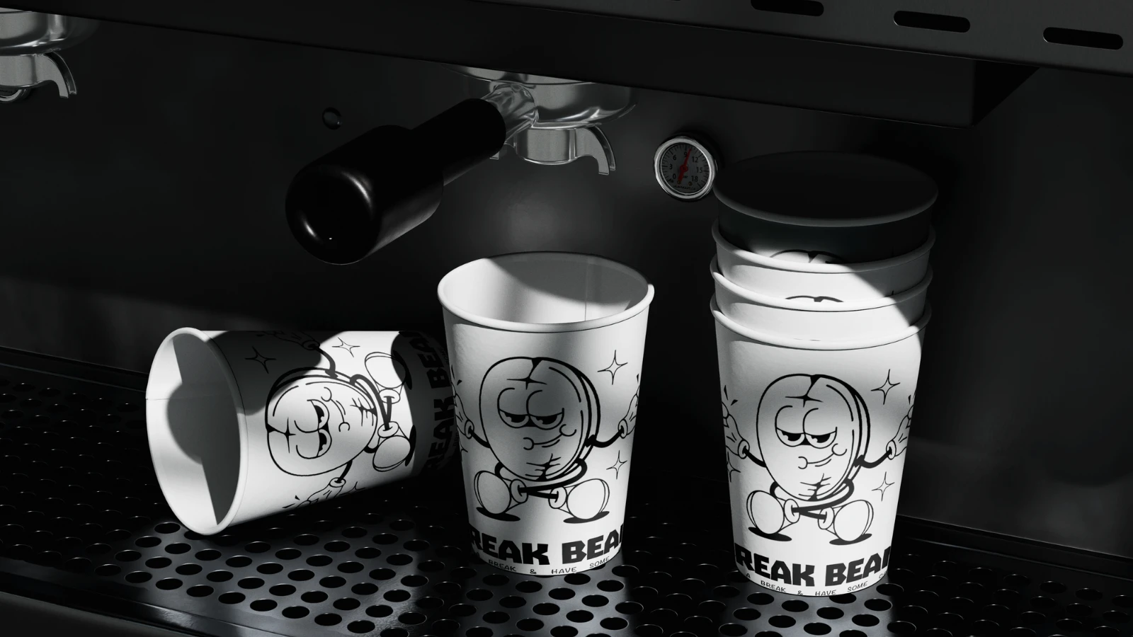
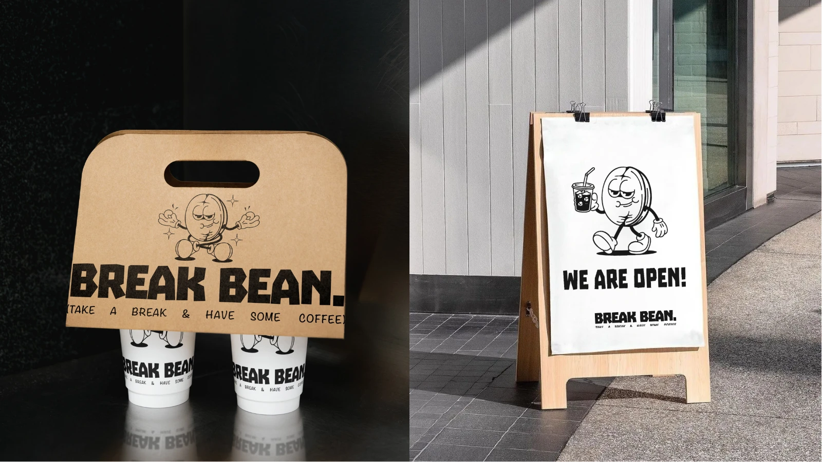
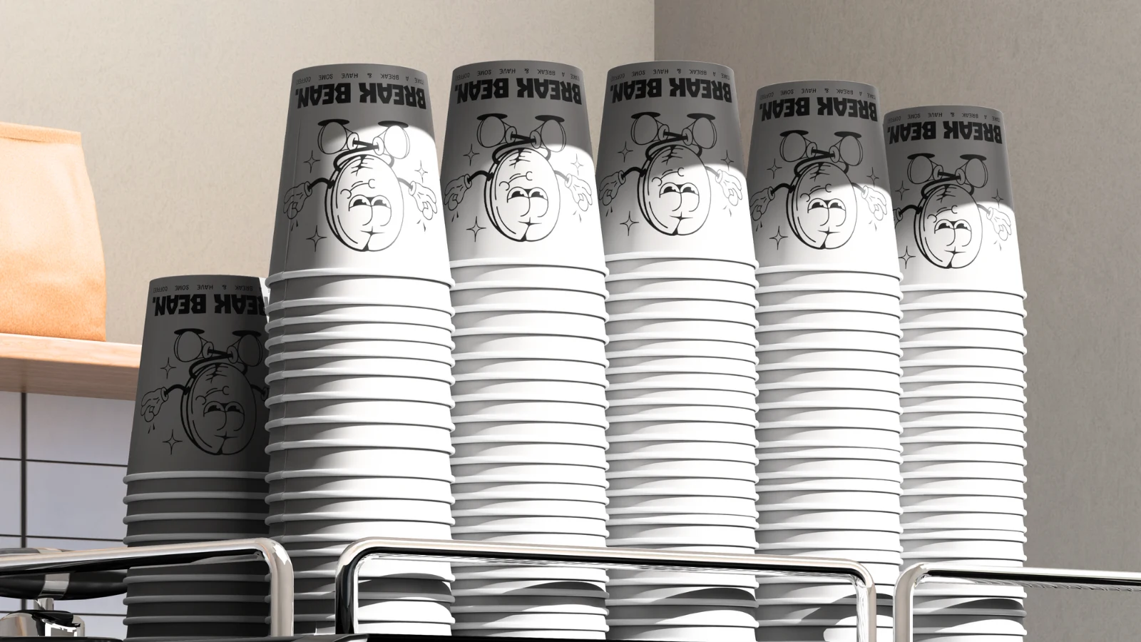
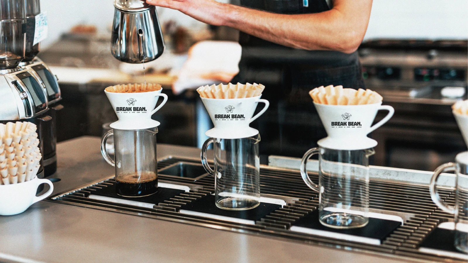
Applications
The system was designed to scale across real-world touchpoints:
Coffee cups & takeaway packaging
Carry bags
Store signage & posters
Print collateral
Social-ready assets
Each application maintains clarity while allowing flexibility in composition.
Because a brand doesn’t live in mockups — it lives in use
Like this project
Posted Mar 31, 2026
Break Bean is a bold, minimal coffee brand built around everyday breaks, combining strong typography & a playful bean character for a clear, memorable identity.