Freelancers in LisbonFreelancers in Lisbon
Creative partner in your brand’s success
$250k+
Earned
57x
Hired
5.0
Rating
1.1K
Followers
Creative partner in your brand’s success
Cosmetics(3)
Luxury Brand and Web Designer
$5k+
Earned
1x
Hired
5.0
Rating
13
Followers
Luxury Brand and Web Designer
Cover image for Château Mocha
Luxury Pâtisserie Brand Identity
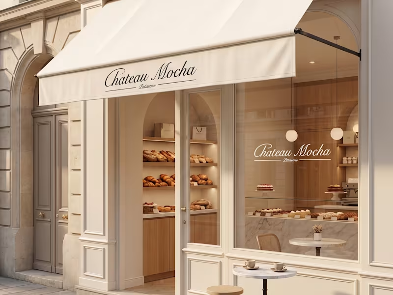
Château Mocha Luxury Pâtisserie Brand Identity & Creative Direction Overview Château Mocha is a luxury pâtisserie concept inspired by the quiet elegance of Parisian cafés, where timeless interiors, artisanal craftsmanship, and refined simplicity come together. The project was developed as a complete brand universe, combining strategy, visual identity, packaging, and art direction to create a cohesive experience across every customer touchpoint. Rather than designing individual assets, the objective was to create a brand that feels instantly recognizable, from the storefront to the packaging, product presentation, and digital imagery. The Concept Luxury isn't created through decoration, it's created through consistency. Château Mocha was imagined as a modern Parisian pâtisserie that celebrates slow mornings, handcrafted pastries, and elevated everyday rituals. Every visual decision was made to communicate warmth, sophistication, and timeless elegance while allowing the products to remain the true focal point. What I Created: • Brand Strategy • Creative Direction • Brand Identity Design • Logo & Monogram Design • Visual Identity System • Packaging Design • Product Visualization • Art Direction Creative Direction The visual language balances classic French elegance with a contemporary minimal aesthetic. A restrained palette of warm creams, rich mocha browns, and soft neutrals creates a sense of warmth and refinement. Editorial-inspired photography, understated typography, and carefully styled product imagery establish an atmosphere that feels premium without appearing excessive. Every element, from the embossed butter monogram to the takeaway packaging and storefront applications, was designed as part of one cohesive brand experience. Outcome The result is a fully realized luxury brand concept that demonstrates how consistent creative direction transforms individual assets into a memorable customer experience. Designed to feel timeless rather than trend-driven, Château Mocha showcases how branding extends beyond a logo to shape the atmosphere, perception, and emotional connection of a brand.
0
26
Cover image for Orivienne
Building a timeless jewelry brand
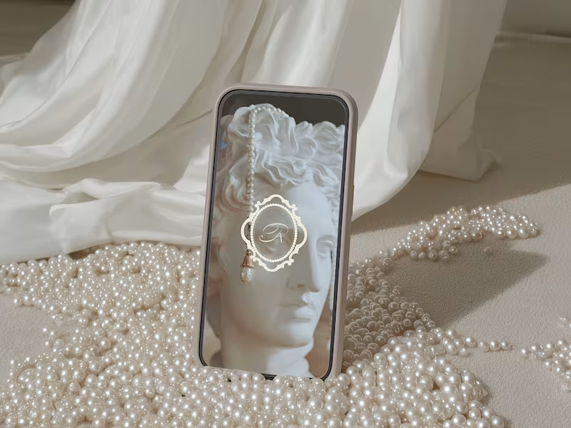
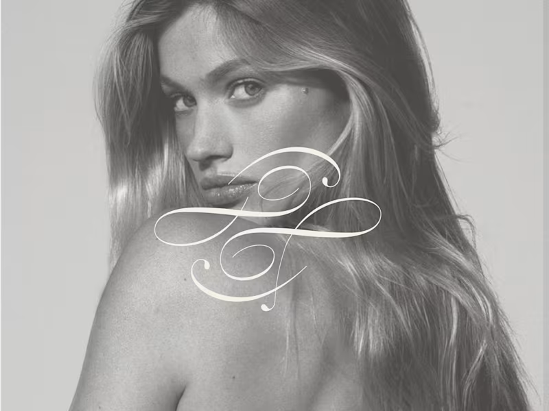
Orivienne Building a timeless jewelry brand inspired by heritage, femininity, and modern luxury. Orivienne is a conceptual fine jewelry brand created to embody quiet luxury through refined design. Inspired by royal emblems, heirloom craftsmanship, and classical European aesthetics, the identity blends tradition with contemporary minimalism to create a brand that feels elegant, collectible, and enduring. Services • Brand Strategy • Visual Identity • Logo Design • Packaging Design • Art Direction • Brand Applications The Vision The goal was to create a jewelry brand that felt established rather than trendy. Instead of following contemporary jewelry branding, I explored visual references rooted in heritage: antique family crests, engraved emblems, archival typography, and timeless packaging. The result is a brand that feels sophisticated, feminine, and quietly luxurious—designed to evoke emotion through restraint rather than excess. Brand Direction Three principles guided the identity: Timeless Design choices that remain relevant beyond seasonal trends. Feminine Elegant typography, delicate ornamentation, and soft neutral tones create a refined aesthetic. Collectible Every touchpoint—from the emblem to the packaging—is designed to feel worthy of keeping. The Identity The centerpiece of the brand is a bespoke emblem inspired by classical European seals. Rather than relying on ornate decoration, the identity balances intricate detailing with generous spacing and understated typography, creating a visual language that feels premium and enduring. The logo system was designed to work seamlessly across packaging, jewelry boxes, digital platforms, and printed materials. Packaging Luxury is experienced through details. The packaging system uses muted taupe tones, embossed finishes, and minimalist layouts to create an elevated unboxing experience. Every element reinforces the brand's heritage-inspired aesthetic while remaining clean and contemporary. Art Direction The imagery embraces soft natural light, sculptural forms, marble textures, pearls, and classical references. Instead of overwhelming the viewer with decoration, each composition leaves space for the product and identity to breathe, reinforcing the quiet confidence of the brand. Digital Presence The visual language extends naturally into digital applications, creating consistency across social media, and marketing assets. Every touchpoint reflects the same elevated atmosphere as the physical brand experience. Outcome Orivienne demonstrates how strategic branding can transform a concept into a complete luxury universe. By combining thoughtful strategy with refined visual execution, the project creates a brand that feels established, desirable, and memorable from its very first interaction.
3
3
748
Cosmetics(1)
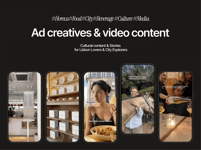
Video editing, Content Marketing, Design
2x
Hired
5.0
Rating
69
Followers
Video editing, Content Marketing, Design
Cosmetics(1)
Crafting captivating articles in English & Spanish
Cosmetics(1)