The network for creativity
Join 1.25M professional creatives like you
Connect with clients, get discovered, and run your business 100% commission-free
Creatives on Contra have earned over $150M and we are just getting started
Back to feedPost
Original Femme
Luxury Skincare Brand Identity & Creative Direction
Overview
Original Femme is a luxury skincare concept created around the belief that beauty isn't something to achieve—it's something to reveal. Rather than promising transformation, the brand celebrates the features that already make every woman unique.
I developed the creative direction, brand identity, packaging, and digital assets, creating a refined visual language that reflects confidence, femininity, and timeless beauty.
The Idea
The beauty industry often relies on the idea that women need to fix, correct, or become someone else.
Original Femme takes a different approach.
The brand positions skincare as a ritual of care rather than correction, celebrating natural beauty through thoughtful design and understated luxury.
My Role
Brand Strategy
Creative Direction
Brand Identity
Logo Design
Packaging Design
Art Direction
Social Media Assets
Product Visualization
Creative Direction
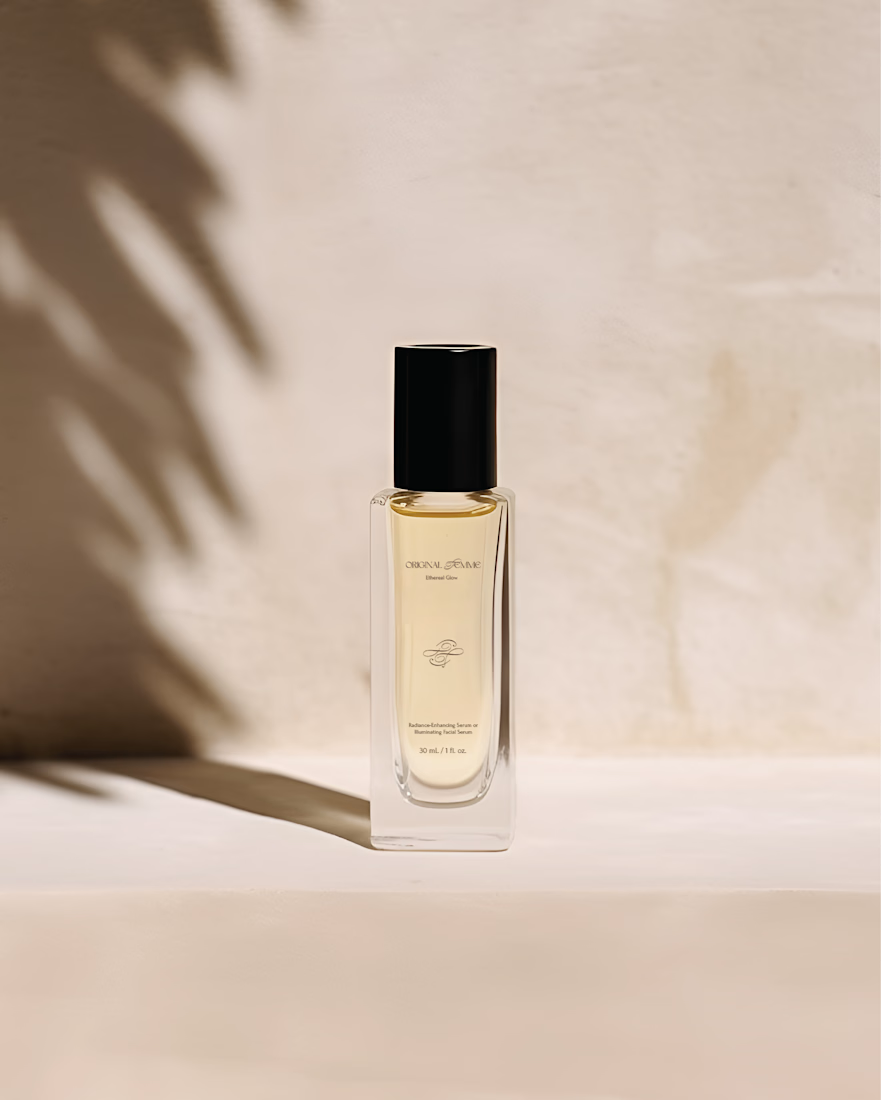
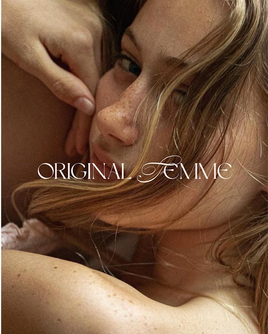
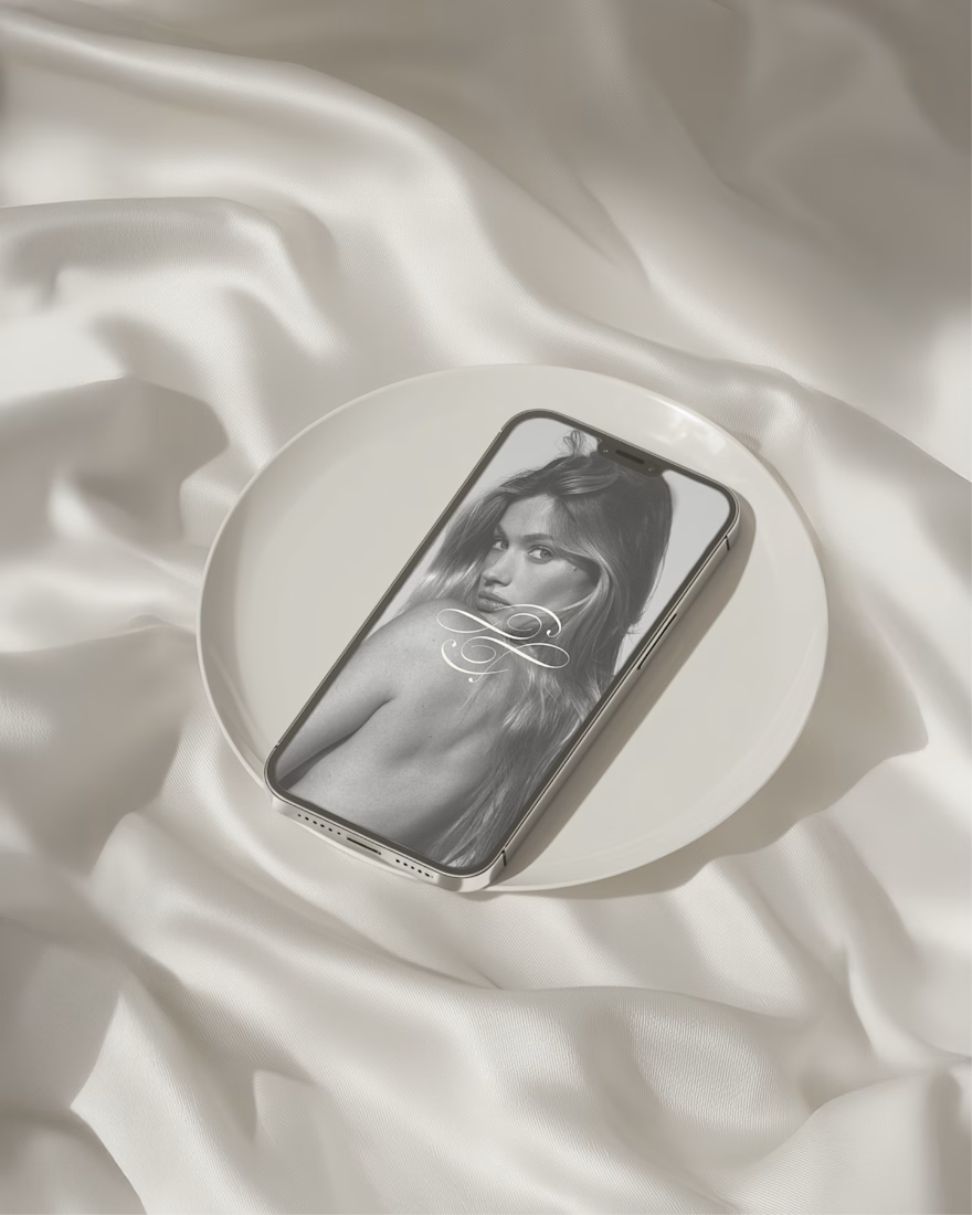
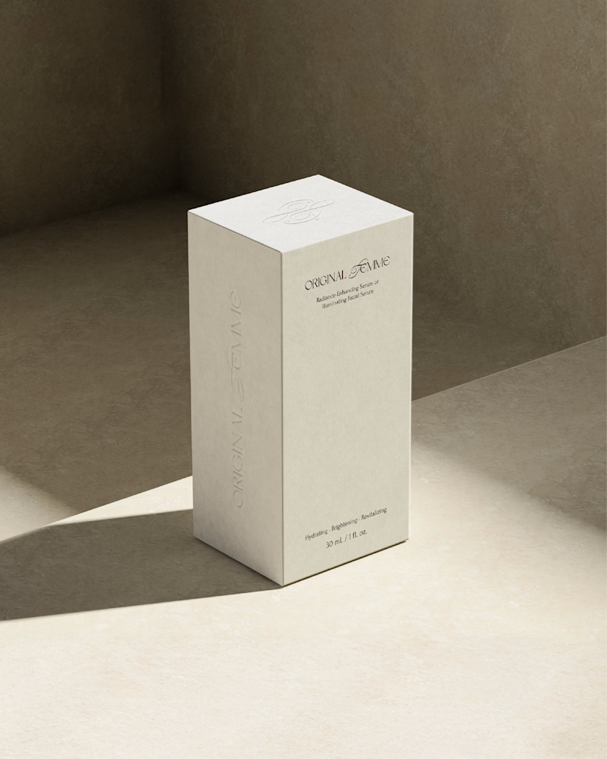
The visual identity was designed to feel soft, editorial, and quietly luxurious.
A restrained neutral palette, elegant typography, and warm photography create a sense of intimacy while allowing the product to become the focal point. Every touchpoint was crafted to communicate sophistication without excess.


Beautiful ✨


Thank you so much!

This looks so stunning! great work 😊
I´m so glad you liked it 😊
The network for creativity
Join 1.25M professional creatives like you
Connect with clients, get discovered, and run your business 100% commission-free
Creatives on Contra have earned over $150M and we are just getting started

Challenges
View all


Related posts

Wonder -- Visual Expressions


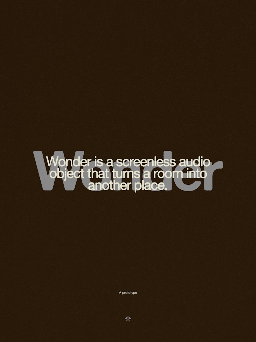
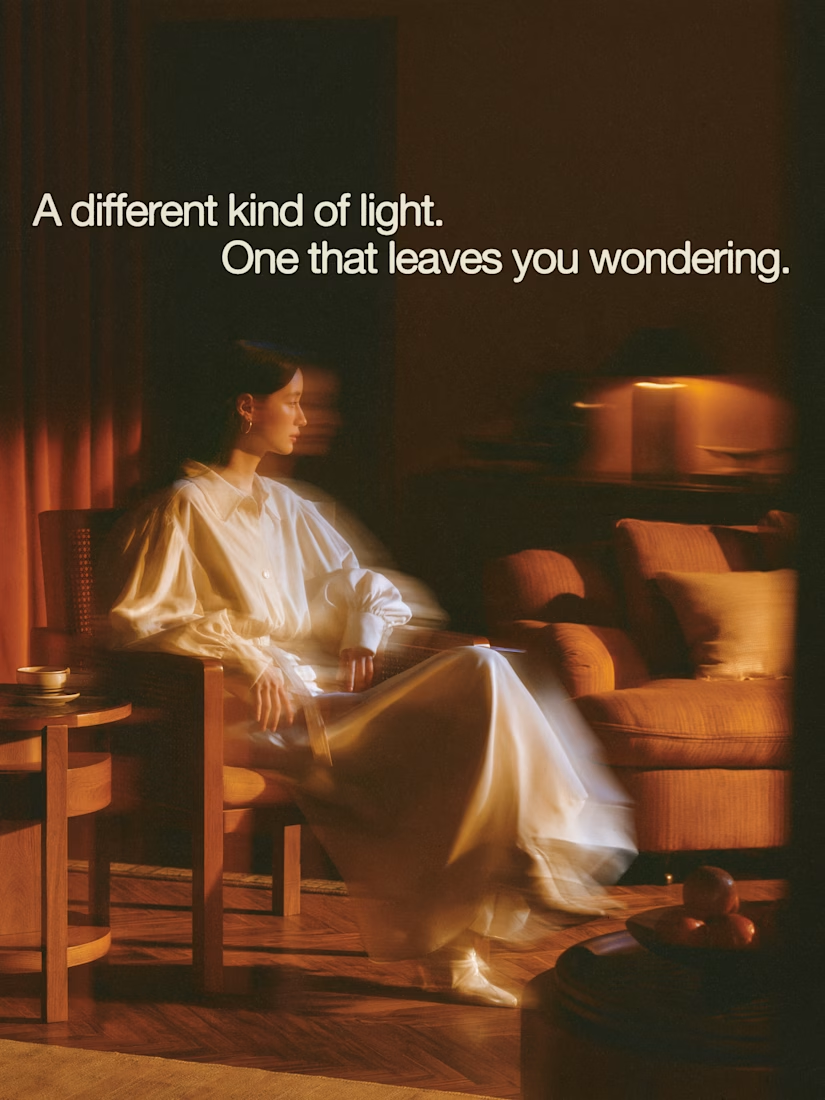

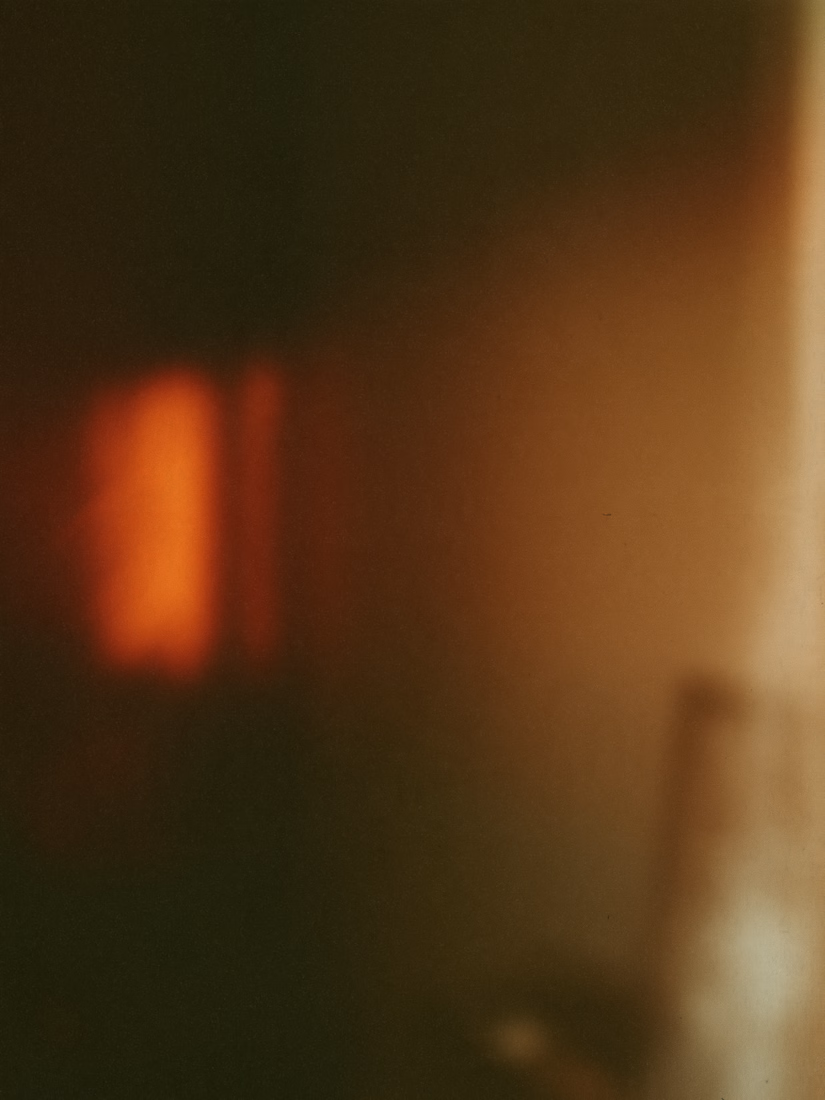

The restraint in the warm palette really lets the sound-object concept breathe—especially that shift from readable type to atmosphere.

What's your one-rule brand? Tell me.
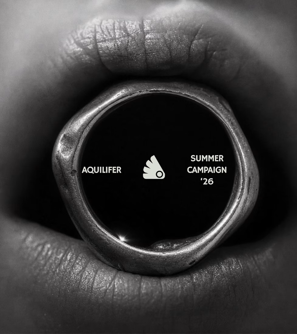
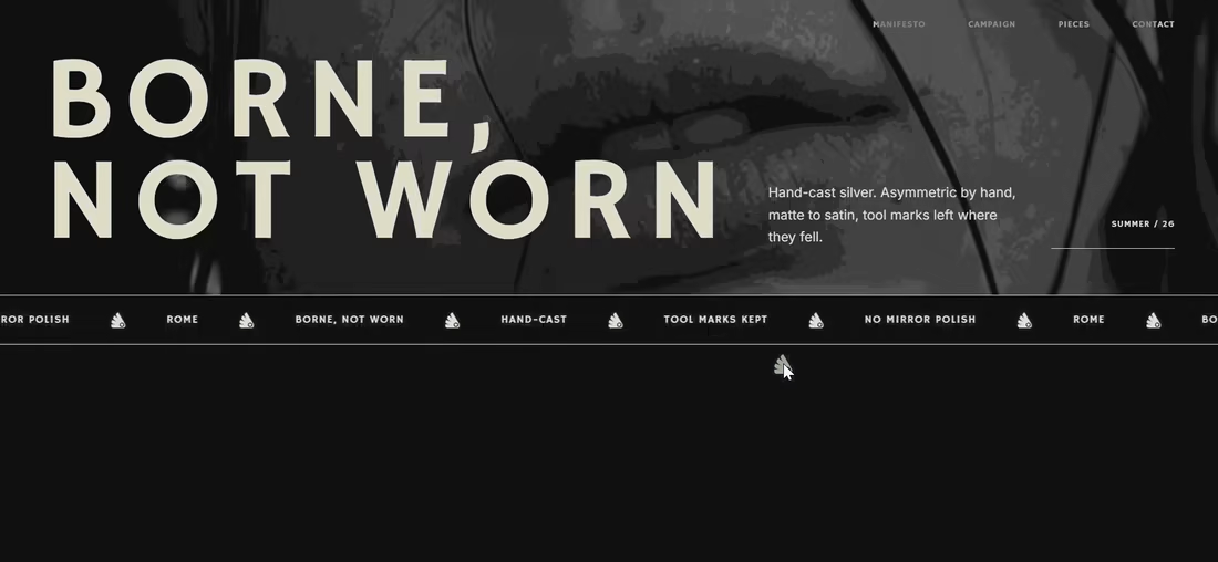
Most jewelry brands photograph the object. This one photographs the grip.
AQUILIFER — a brand I built around one idea: jewelry as something carried, not worn.
Case study + full site now live.
The name comes from Roman military rank. The aquilifer carried the standard — the one thing the legion couldn't afford to drop.
That single word killed my first direction before I'd finished it.
No polish. No faceted stones.
Hand-cast, asymmetric pieces, tool marks left visible.
Photography went extreme macro, unretouched skin, hands gripping the face instead of posing near it.
Color system: two darks instead of one dark + accent.
#1E1E1E and #27331A let the brand shift register — campaign world to product world — without ever going light.
#D9DED4 stays structural only. Never a fill.
Motion rule on the site: diagonal masks only. No rotation, anywhere.
A spinning object reads as being shown off. This brand is about weight, not display.
Same angle, same easing, top to bottom.
One idea, held all the way through — name, object, photography, palette, motion.
That's the whole pitch for how I work.

Absolutely love your works!


A look at the identity we designed for Vetti, a dog health monitoring brand.
There’s a lot of data behind a product like this but the person using it just wants to know their dog is okay.
That’s the balance in the design with a connected dot system that feels precise and warm colors and photography that keep it close to what people care about.
Also, an excellent excuse to spend far too long choosing dog photos.
