

Framer sites, UI animations, Vibe-coding


Framer sites, UI animations, Vibe-coding
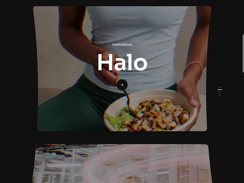
I wanted my next framer template's portfolio showcase to have a standout interaction, not another flat slider.
That idea is now the hero: a carousel where every image bends on a cylinder as it moves. Perspective, velocity skew, a touch of chromatic distortion on the edges.
It's raw WebGL with the cylinder math written from scratch, no libraries. I didn't write any of it. I described the motion to Framer's agent, one prompt with my art direction, and it built the code component, wired it into the canvas, and exposed the motion as sliders: tilt, curve, skew strength, distortion, chroma, parallax.
My part was tuning those sliders until the motion felt right for the template, which took longer than the build itself.
The gap between an effect I can imagine and a component I can ship used to be "someday". Now it's an afternoon.
What's an effect you've wanted on your site but never built?
26
129
14.6K
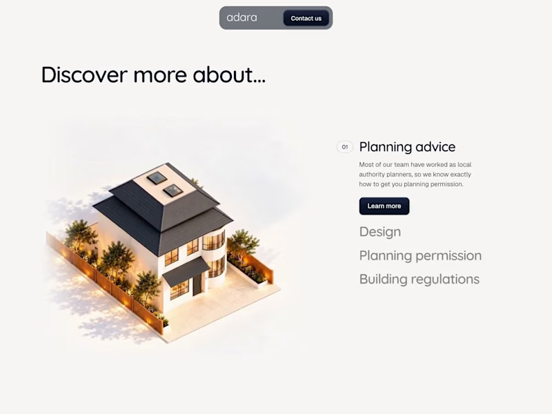
New project in progress: the website for Adara, a residential architecture and planning practice in London. We'll post updates as the build comes together.
First, the services section on the homepage. As you scroll, the house comes apart floor by floor, and each service opens on the right, from planning advice to building regulations.
50
111
4.6K
Arts & Entertainment(2)


Web Design • Development • CRO • eCommerce

Web Design • Development • CRO • eCommerce

Arts & Entertainment(2)

Product Design + Video for Startups | Orygin Studio
- $1k+
- Earned
- 7x
- Hired
- 4.9
- Rating
- 56
- Followers
Product Design + Video for Startups | Orygin Studio


Arts & Entertainment(1)

thoughtful spaces & experiences
- $•••••
- Earned
- 2x
- Hired
- 21
- Followers
thoughtful spaces & experiences

Arts & Entertainment(1)

Brand Strategist and Product Design, Full-stack & AI Dev.
- $5k+
- Earned
- 1x
- Hired
- 34
- Followers
Brand Strategist and Product Design, Full-stack & AI Dev.
Hello everyone ,
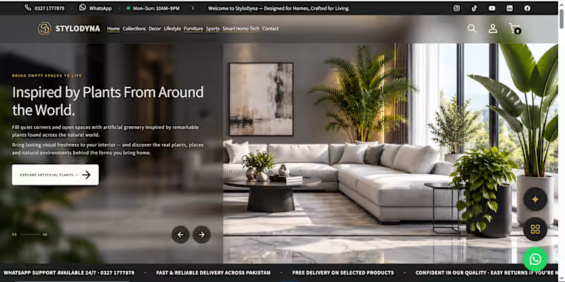
I'd love to share my recently developed personal eCommerce brand, StyloDyna (https://stylodyna.com/) — Home Interior Styling & Lifestyle.
Website: https://stylodyna.com/
(https://stylodyna.com/)I'm an experienced Business & Brand Strategist, Full-Stack Developer, and UI/UX Designer with 8+ years of expertise in modern web technologies, responsive frontend development, scalable design systems, cloud architecture, and AI-powered business solutions.
StyloDyna is more than a custom-designed Shopify storefront. It's a complete eCommerce ecosystem supported by four AI-powered systems for product intelligence, creative operations, data management, and workflow automation.
I personally led the journey from business strategy and brand positioning to UI/UX design, design system architecture, full-stack development, and AI-powered backend operations.
I'd welcome the opportunity to discuss your project and how my experience can contribute to its success.
Best regards,
Muhammad Tahir A.
1
1
80
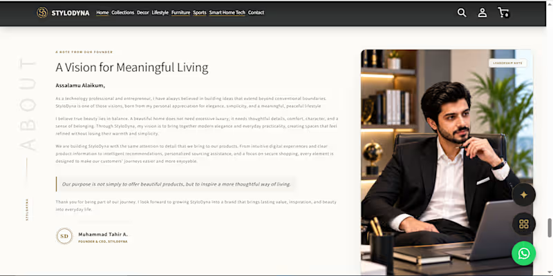
I have launched my own personal brand StyloDyna (https://stylodyna.com/) with proper Business & Brand Strategy, Design System, best UI/UX expertise, Information Flow which leads CTA.
https://stylodyna.com/ (https://stylodyna.com/c)
I had dream of best Shopify frontend fully Customize and Saleable High Performance.
Not only this I have also Build AI-Powered Product Intelligence System. Currently launched in Pakistan.
soon, my next plan is to launch in UK with different niche Idea in couple of months.
Must visit my brand and if you want me to collaborate with you to build plan and develop with you custom frontend idea let me know.
https://stylodyna.com/
Regards,
Muhammad Tahir A
2
1
112

Arts & Entertainment(1)

Brand identities that make new businesses look established
- 1x
- Hired
- 24
- Followers
Brand identities that make new businesses look established
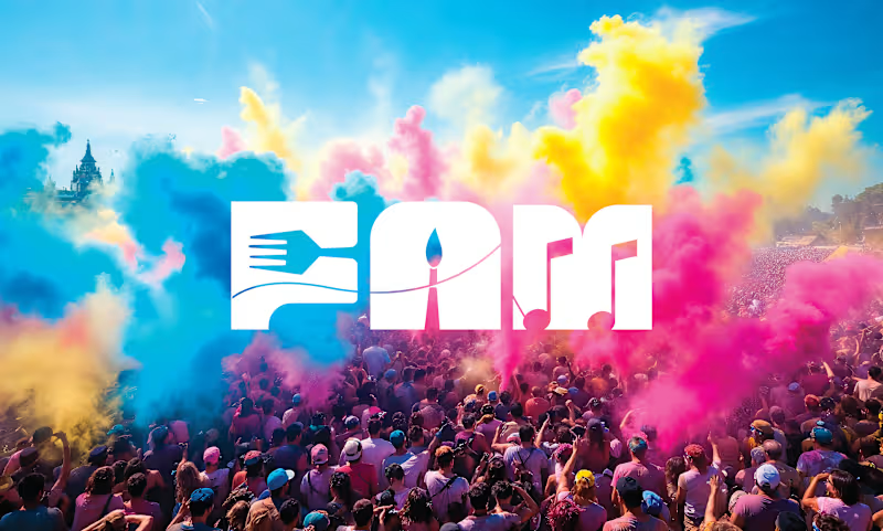
FAM Fest — Brand Identity Case Study
Bringing Food, Arts & Music Together Through One Vibrant Festival Brand
Overview
FAM Fest is a community-driven festival celebrating the three things that connect people the most—Food, Arts, and Music. The goal was to create a modern, memorable identity that captures the energy of live performances, local artists, diverse cuisines, and shared cultural experiences.
The brand needed to feel vibrant, inclusive, and exciting while remaining versatile across digital platforms, event signage, merchandise, and promotional materials.
The Challenge
The festival required a visual identity that could:
Represent food, art, and music equally without favoring one category.
Appeal to families, young adults, creatives, and food lovers.
Stand out across crowded event promotions.
Scale seamlessly from social media graphics to large outdoor signage and festival merchandise.
Create a recognizable brand that could grow into an annual event.
The Solution
We developed a bold and flexible visual identity centered around the acronym FAM, reinforcing both the festival's name and its sense of community.
The design combines clean typography with energetic visual elements inspired by:
Vibrant culinary experiences
Creative artistic expression
Live music and entertainment
Community gatherings
Cultural diversity
The color palette was selected to communicate excitement, creativity, and warmth, while the typography balances modern simplicity with festival energy.
1
3
185
Arts & Entertainment(1)

Graphic Designer + Creative Director
Arts & Entertainment(1)

I Will Turn Your Vision Into Digital Gold.
I Will Turn Your Vision Into Digital Gold.

Arts & Entertainment(1)