
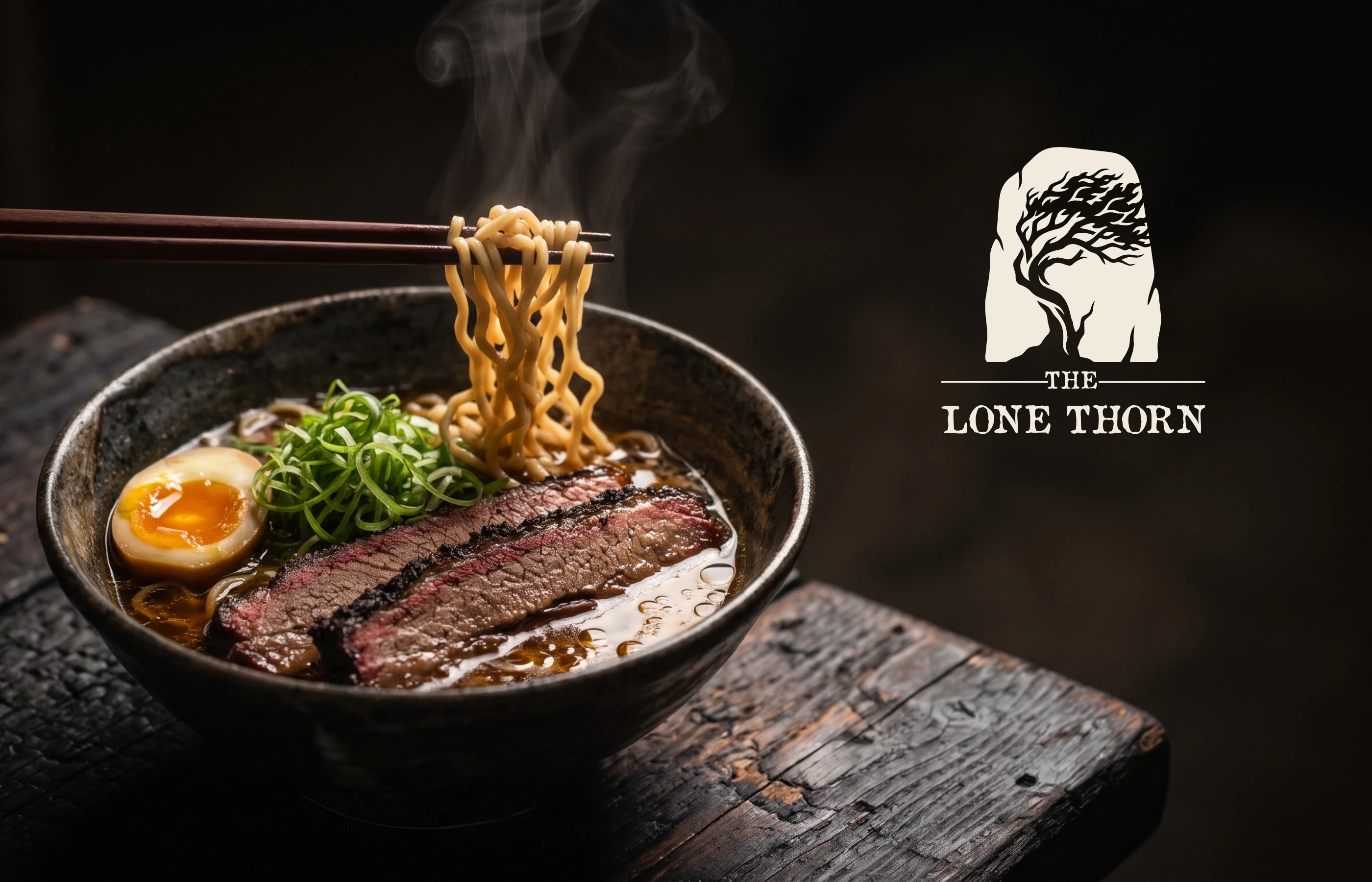
American at heart, Japanese in craft
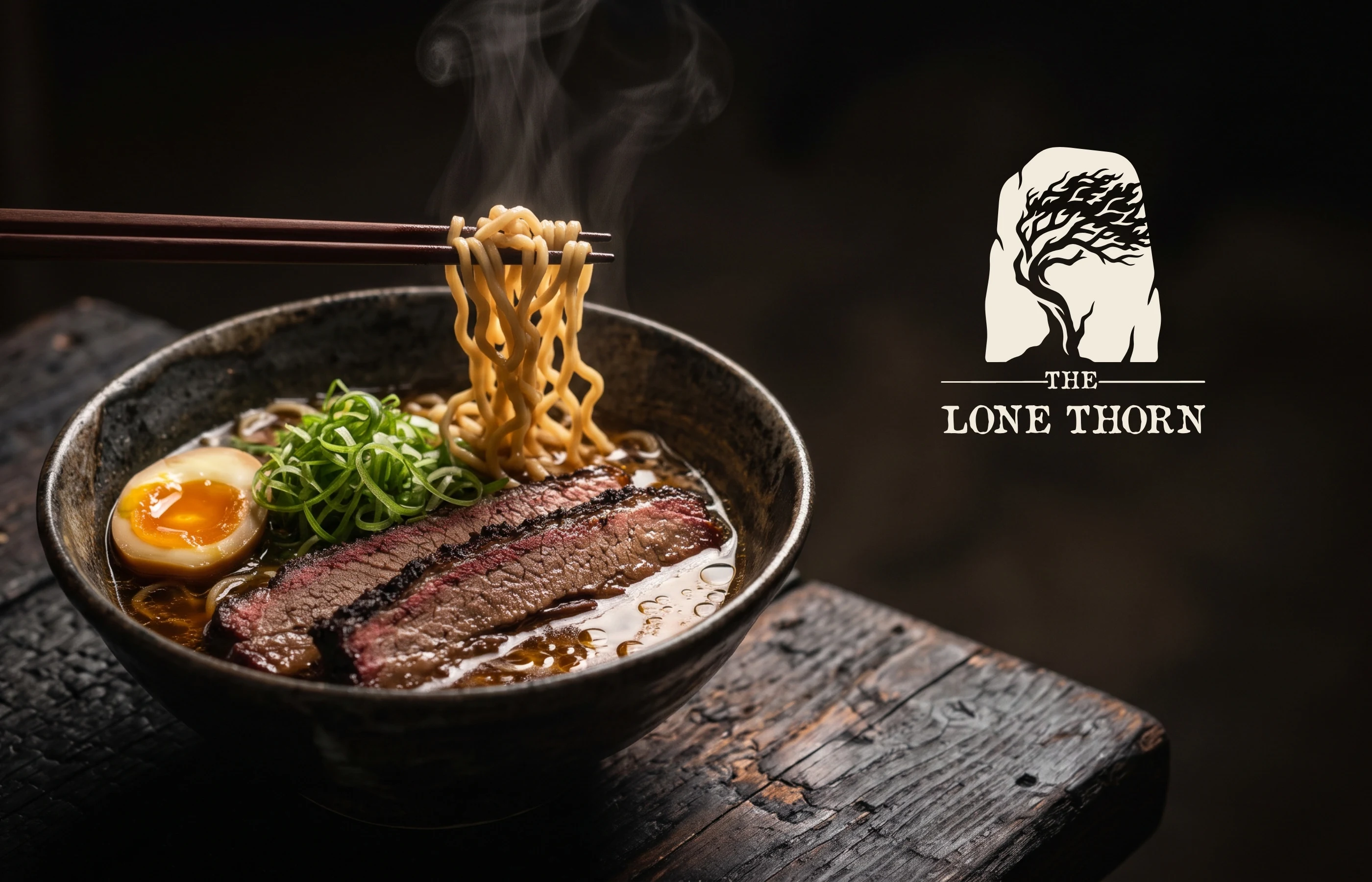
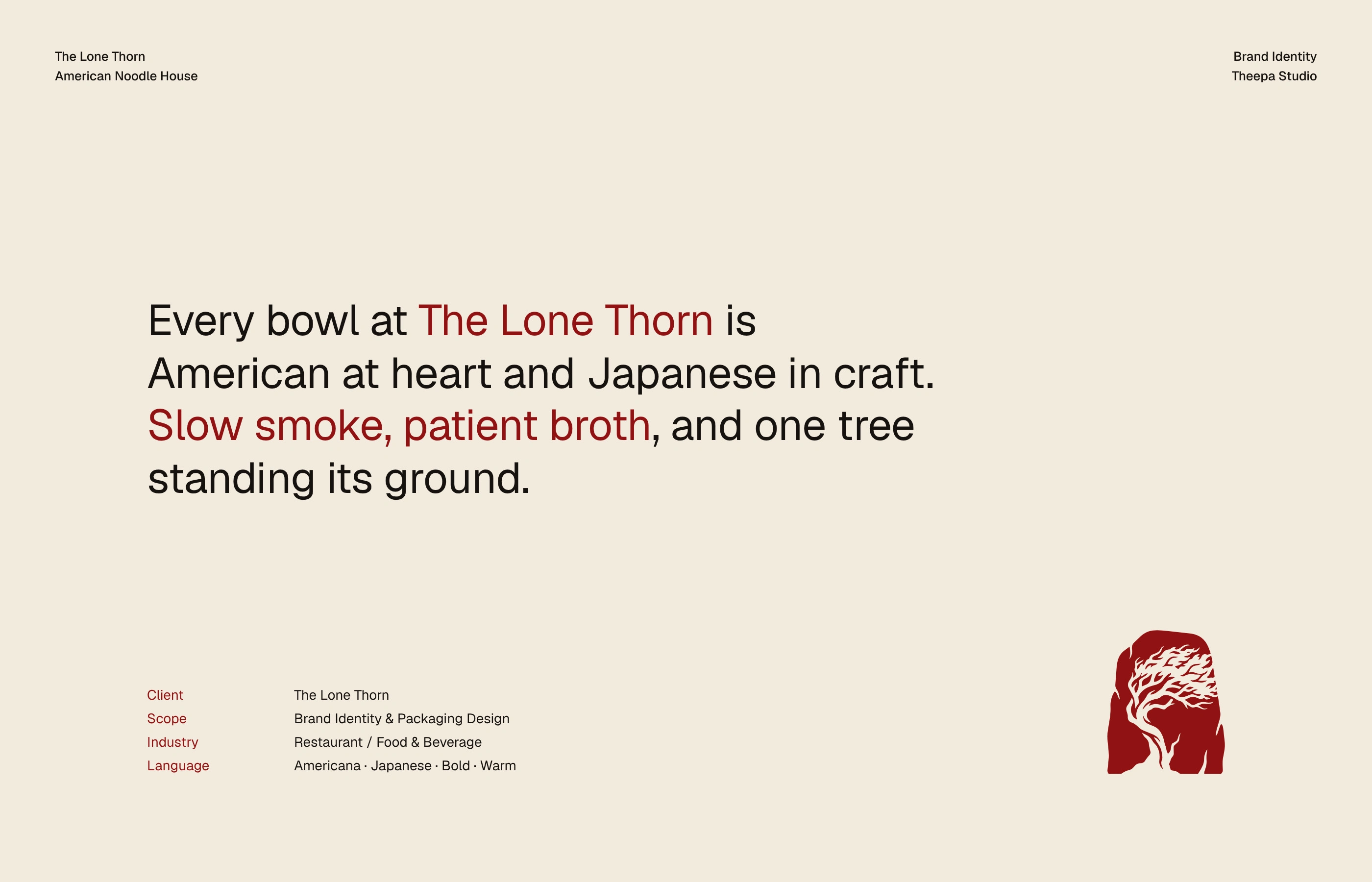
The Lone Thorn is an American noodle house with a Japanese soul: slow-smoked brisket and short rib in patient broth, served under one tree standing its ground. The identity had to carry both sides at once, frontier Americana and Japanese restraint, and feel bold and warm whether it's on a takeaway sleeve or a wet street at midnight.
Scope: brand identity and packaging design: logo and symbol, colour, bilingual typography, pattern, packaging, menus, storefront, stationery and an after-dark campaign.
The Lone Thorn
The Lone Thorn
The Lone Thorn
One stone, one tree, one sign
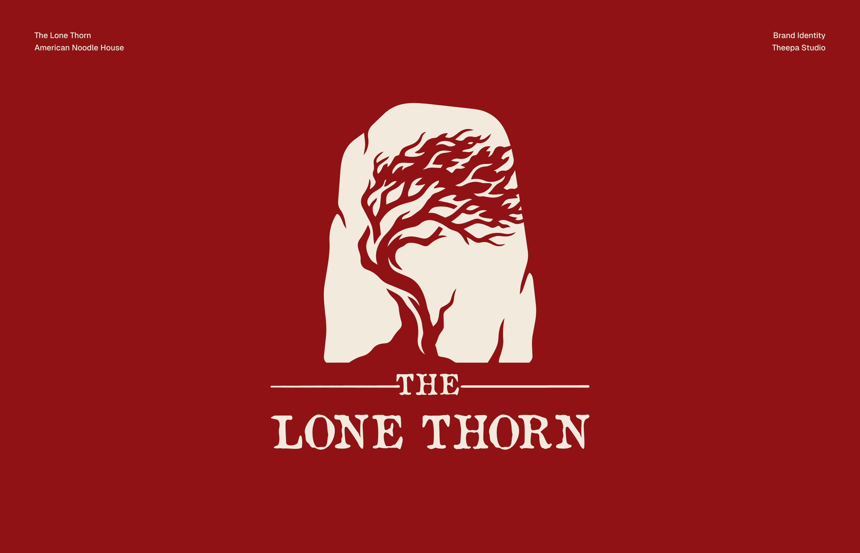
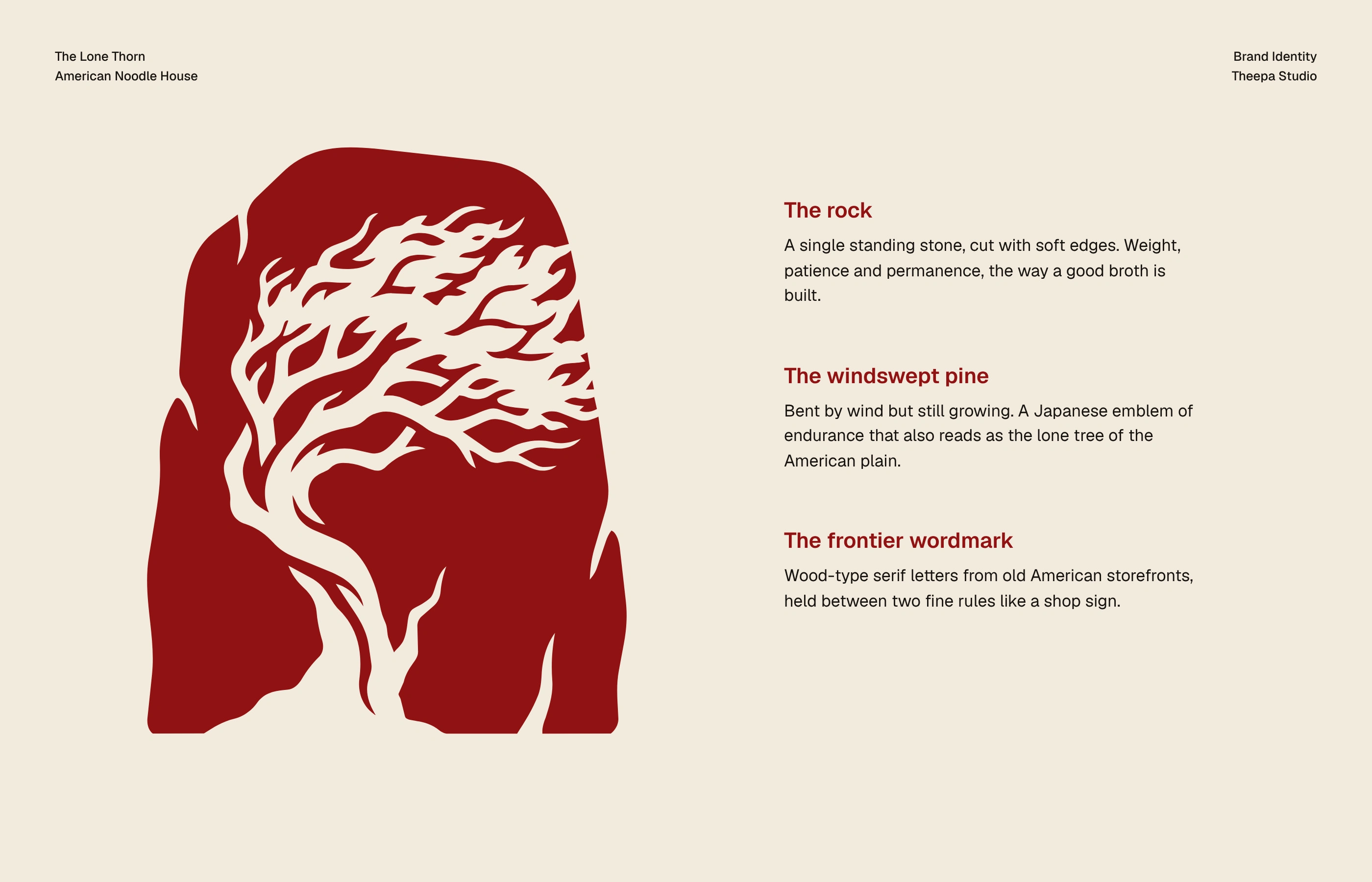
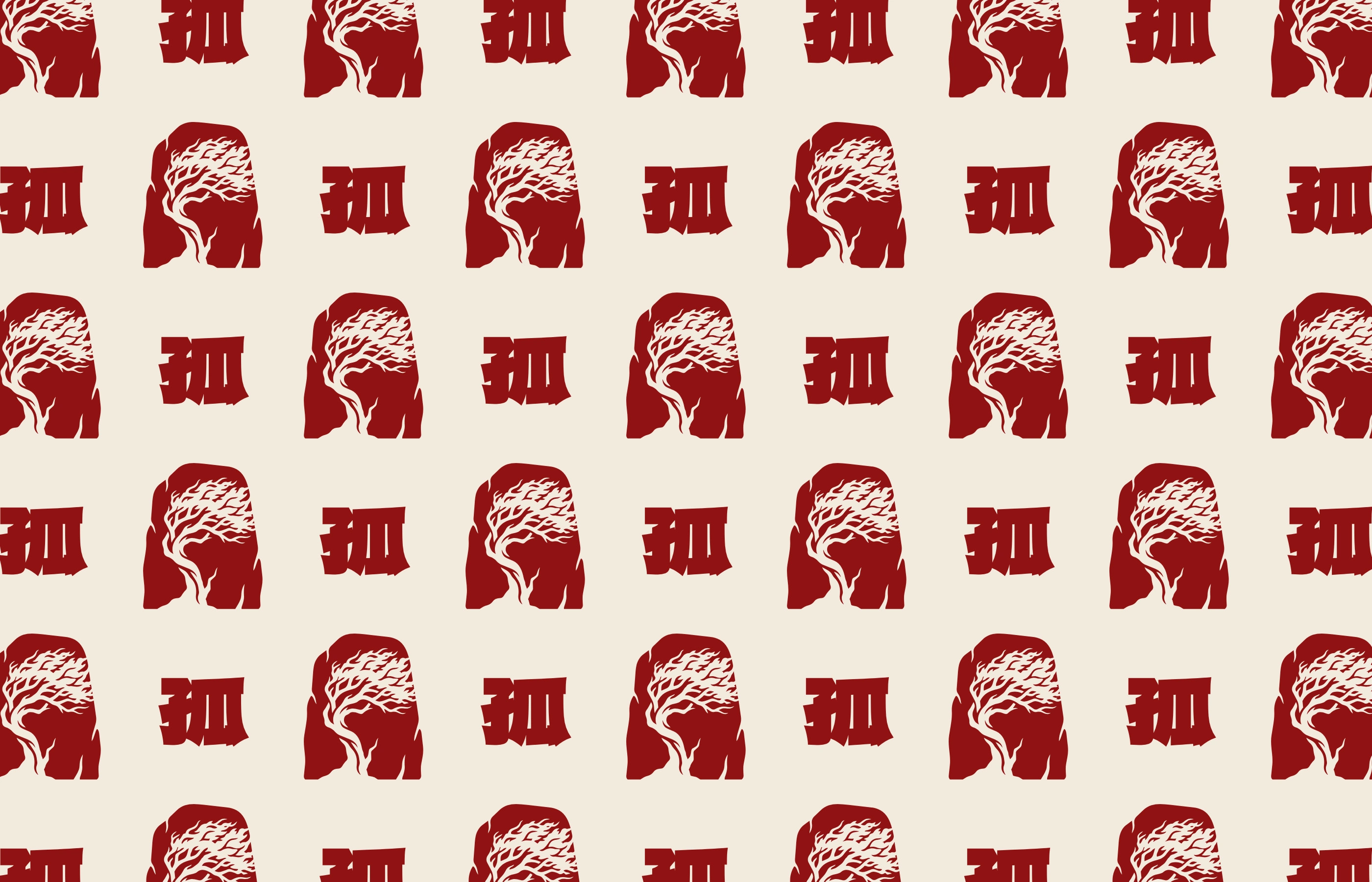
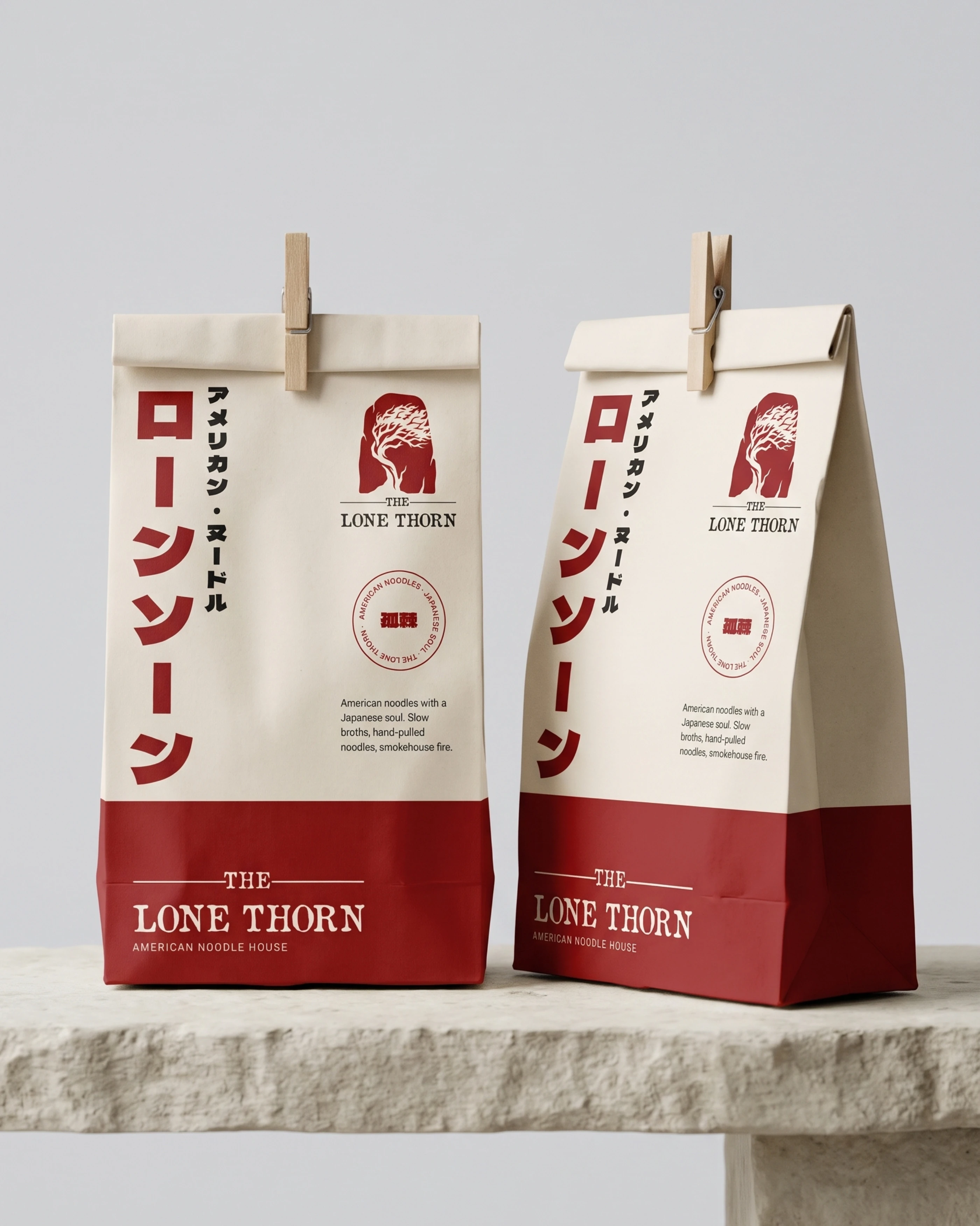
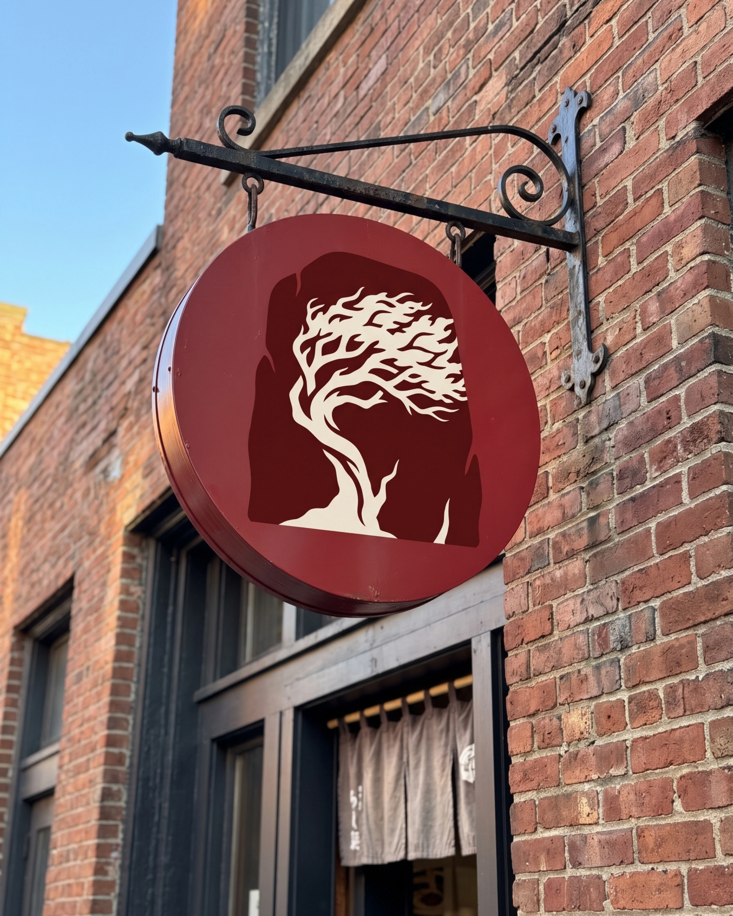
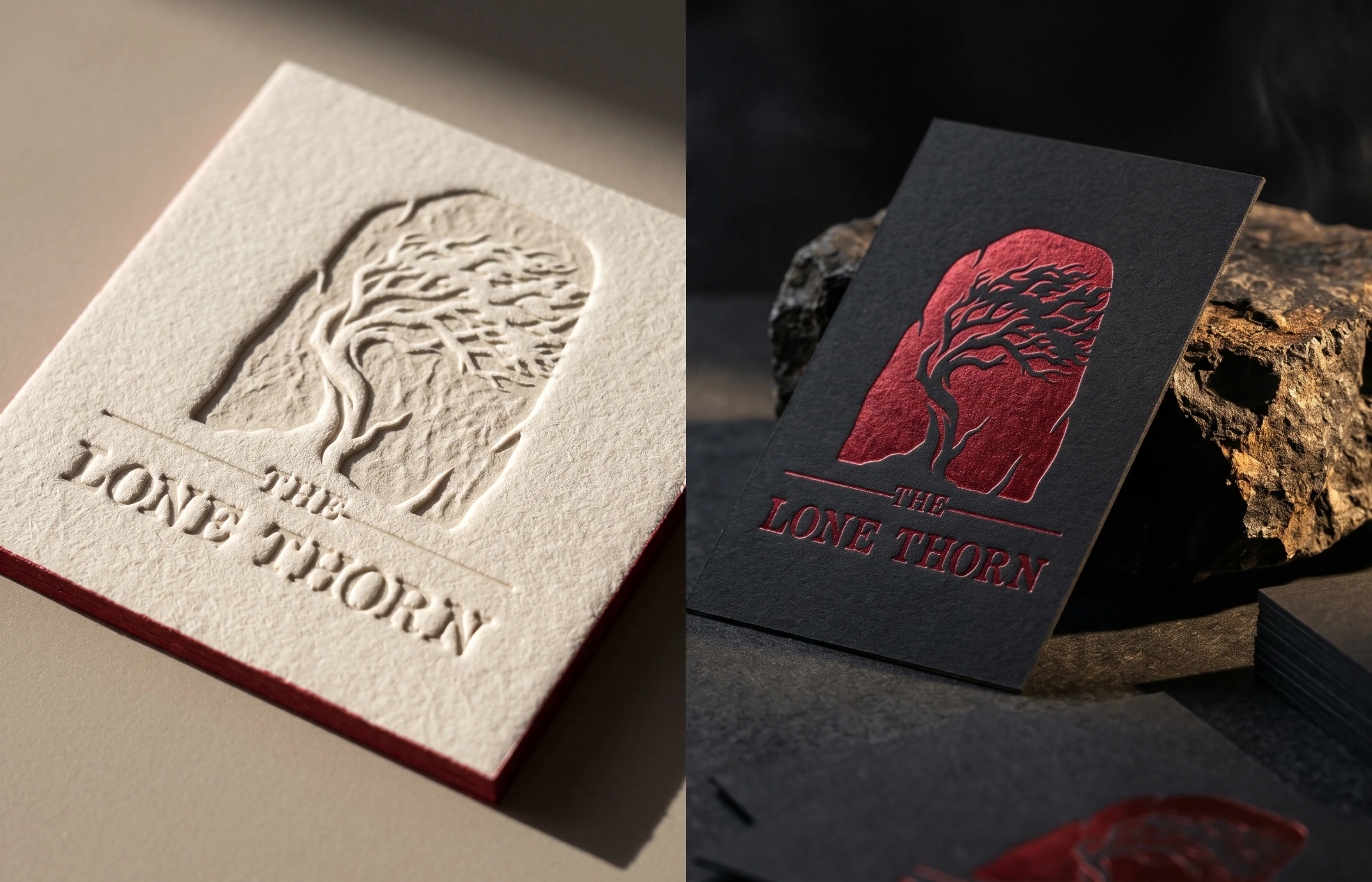
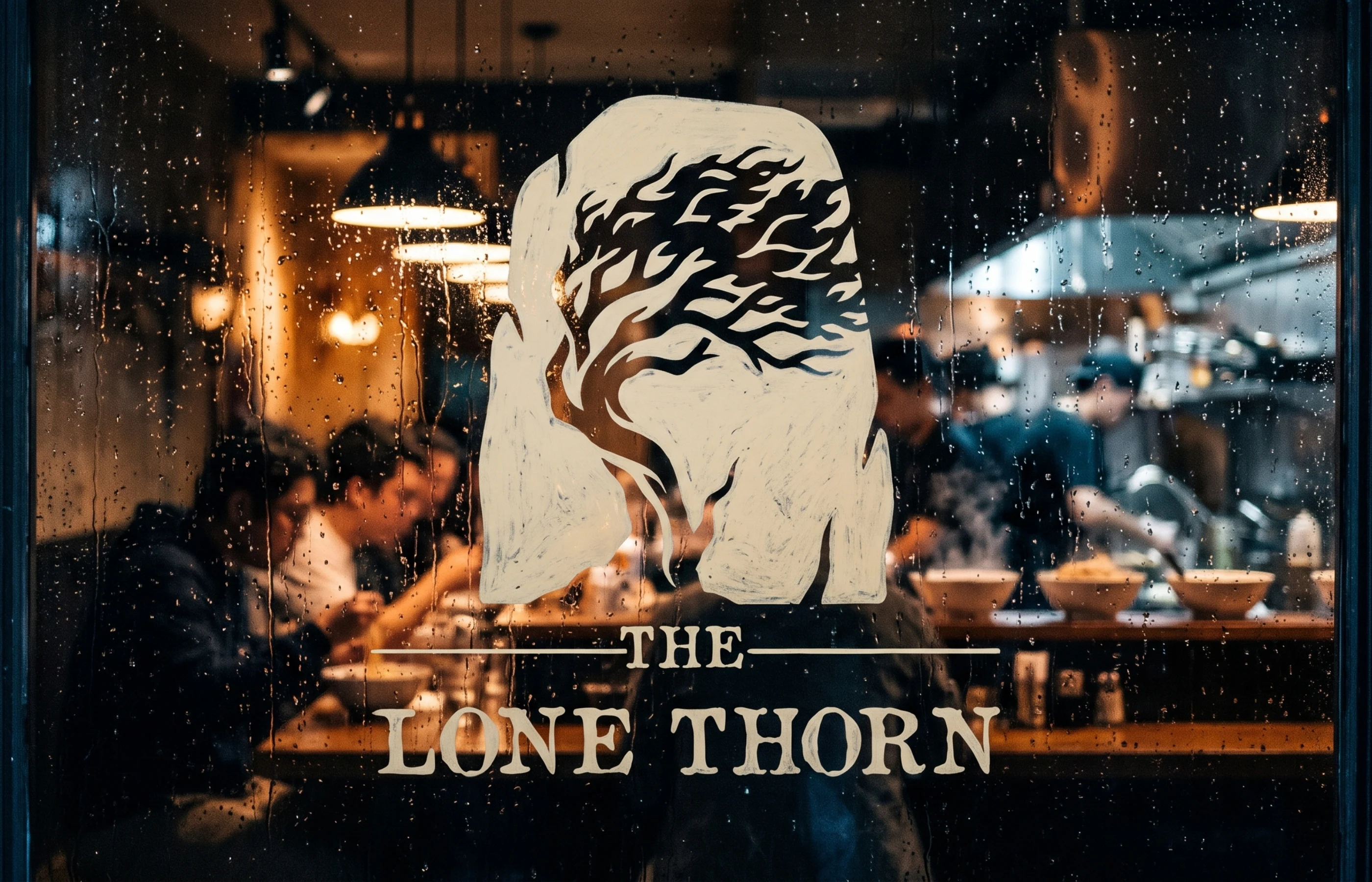
The symbol is a single standing stone with soft-cut edges, the weight and patience of a good broth. Cut into it is a windswept pine, bent by wind but still growing: a Japanese emblem of endurance that also reads as the lone tree of the American plain. The wordmark uses wood-type serif letters from old American storefronts, held between two fine rules like a shop sign.
The Lone Thorn
The Lone Thorn
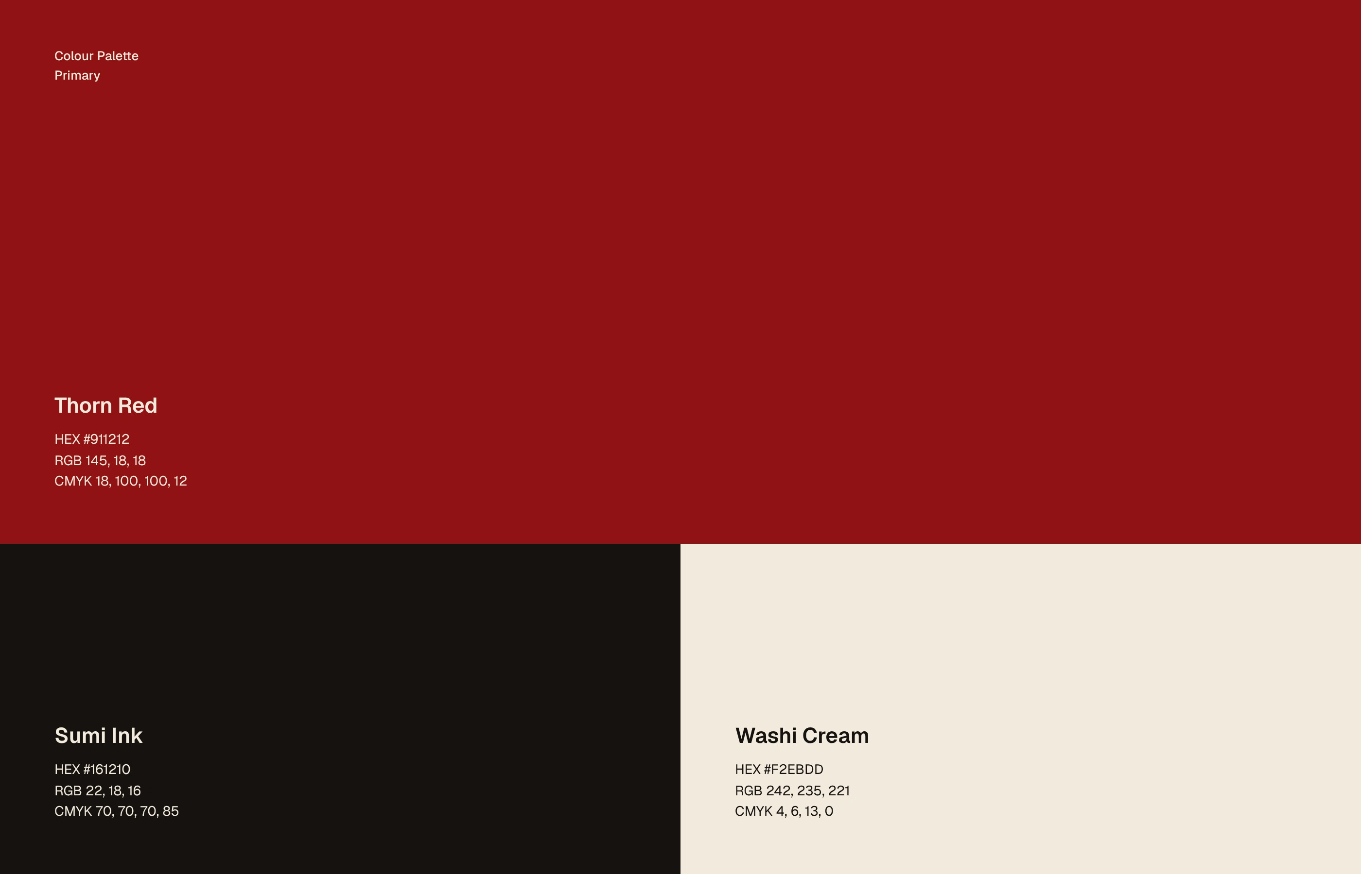
Thorn Red, Sumi Ink, Washi Cream
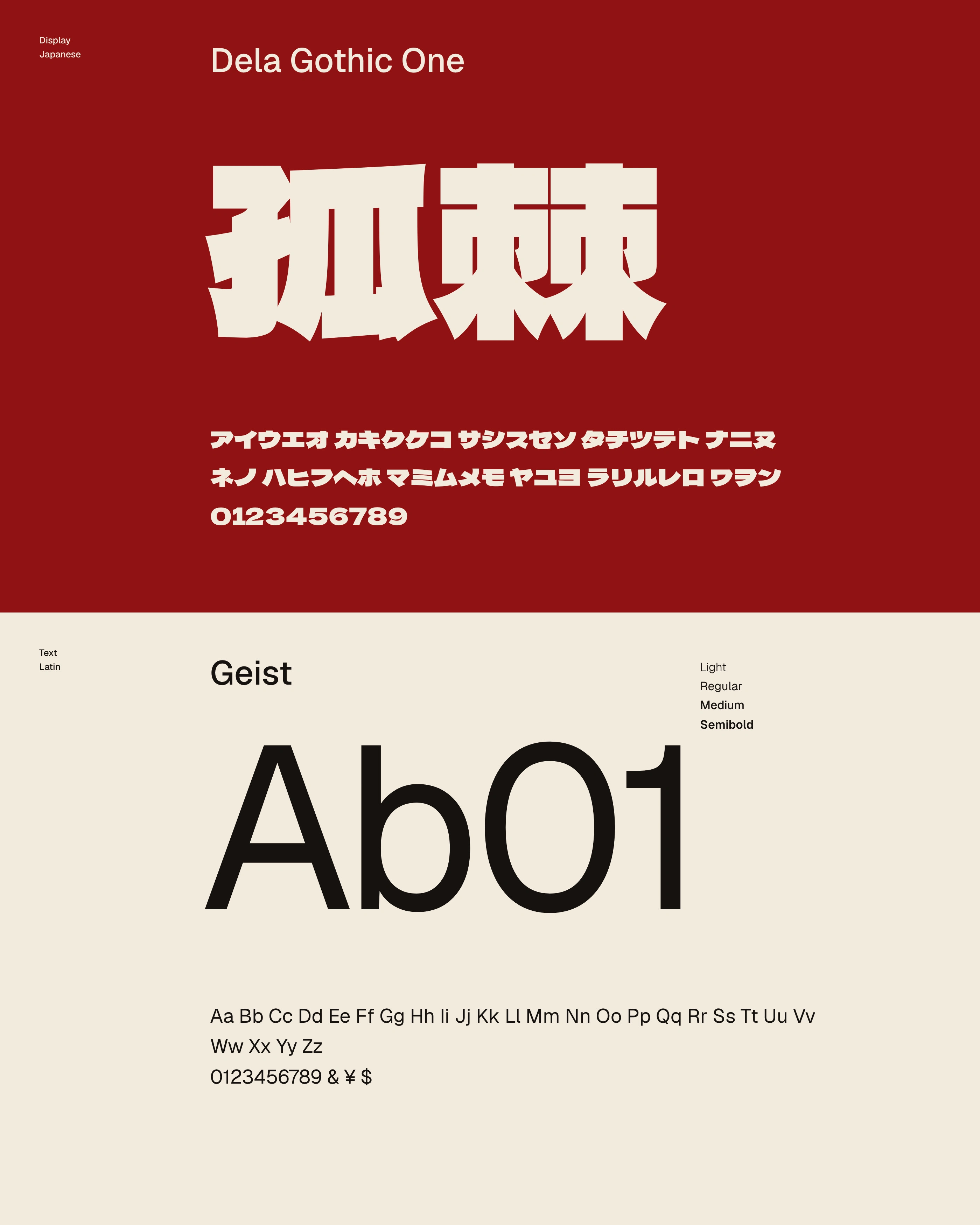
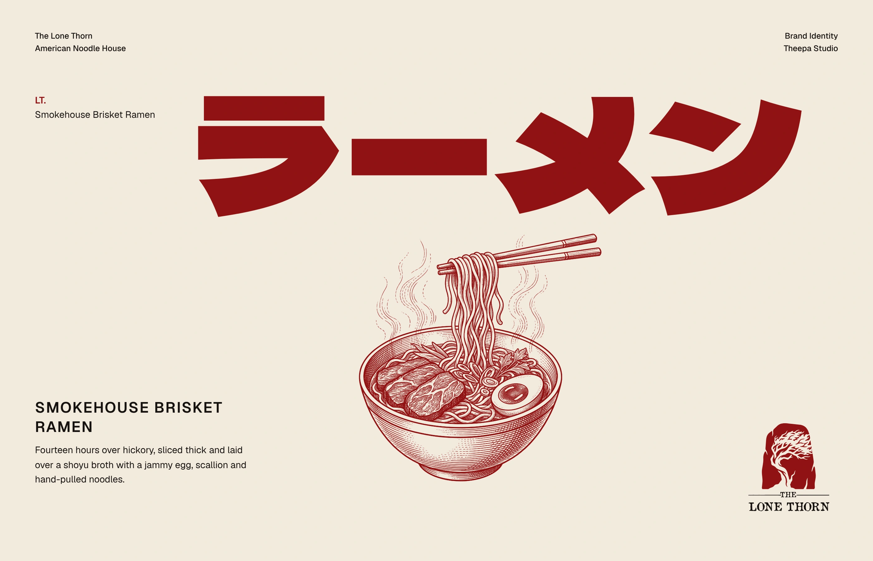
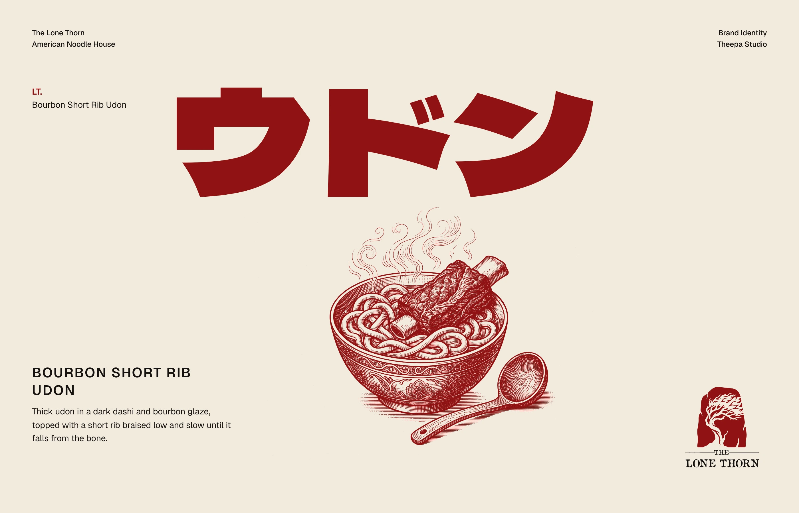
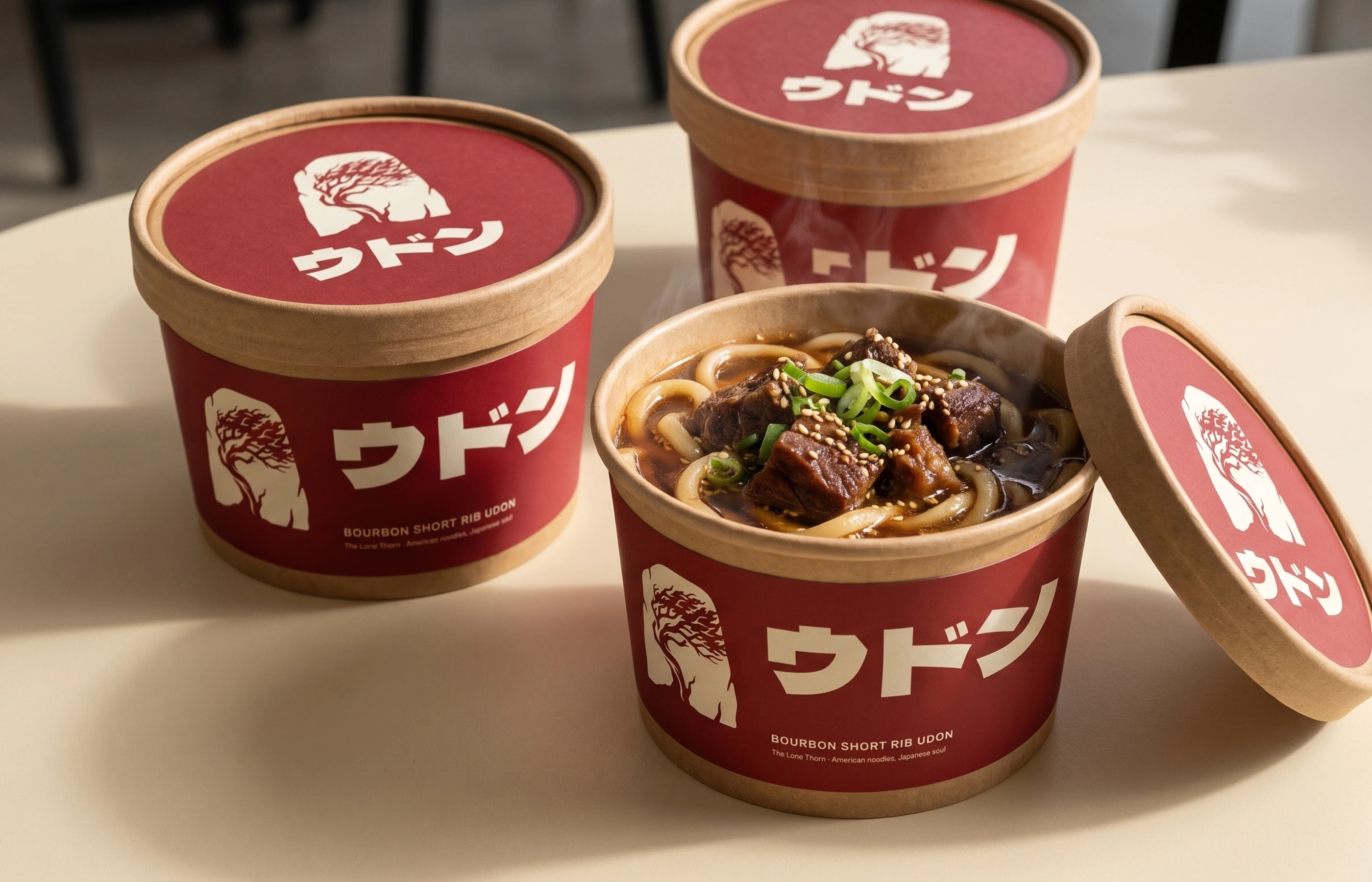
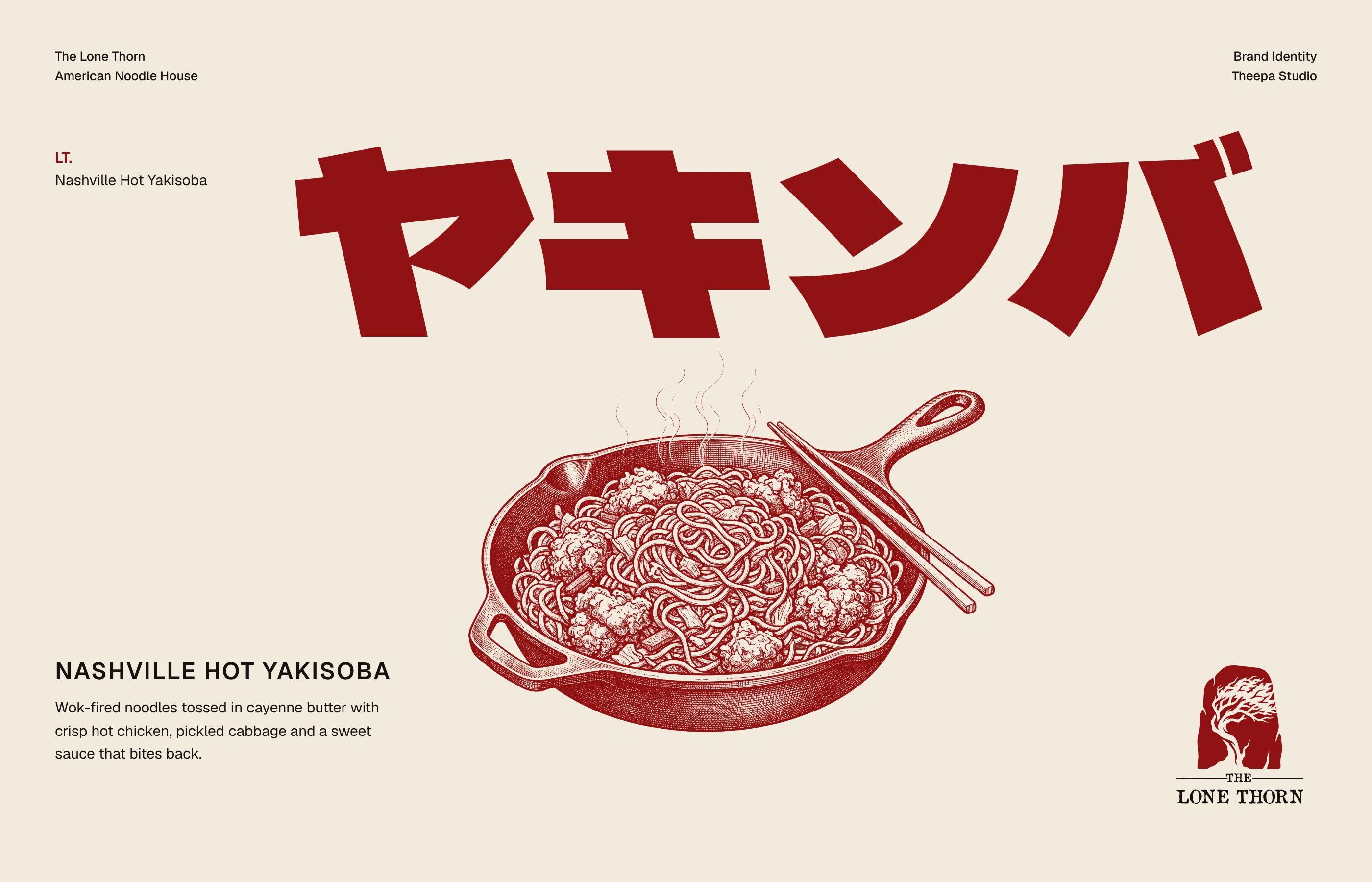
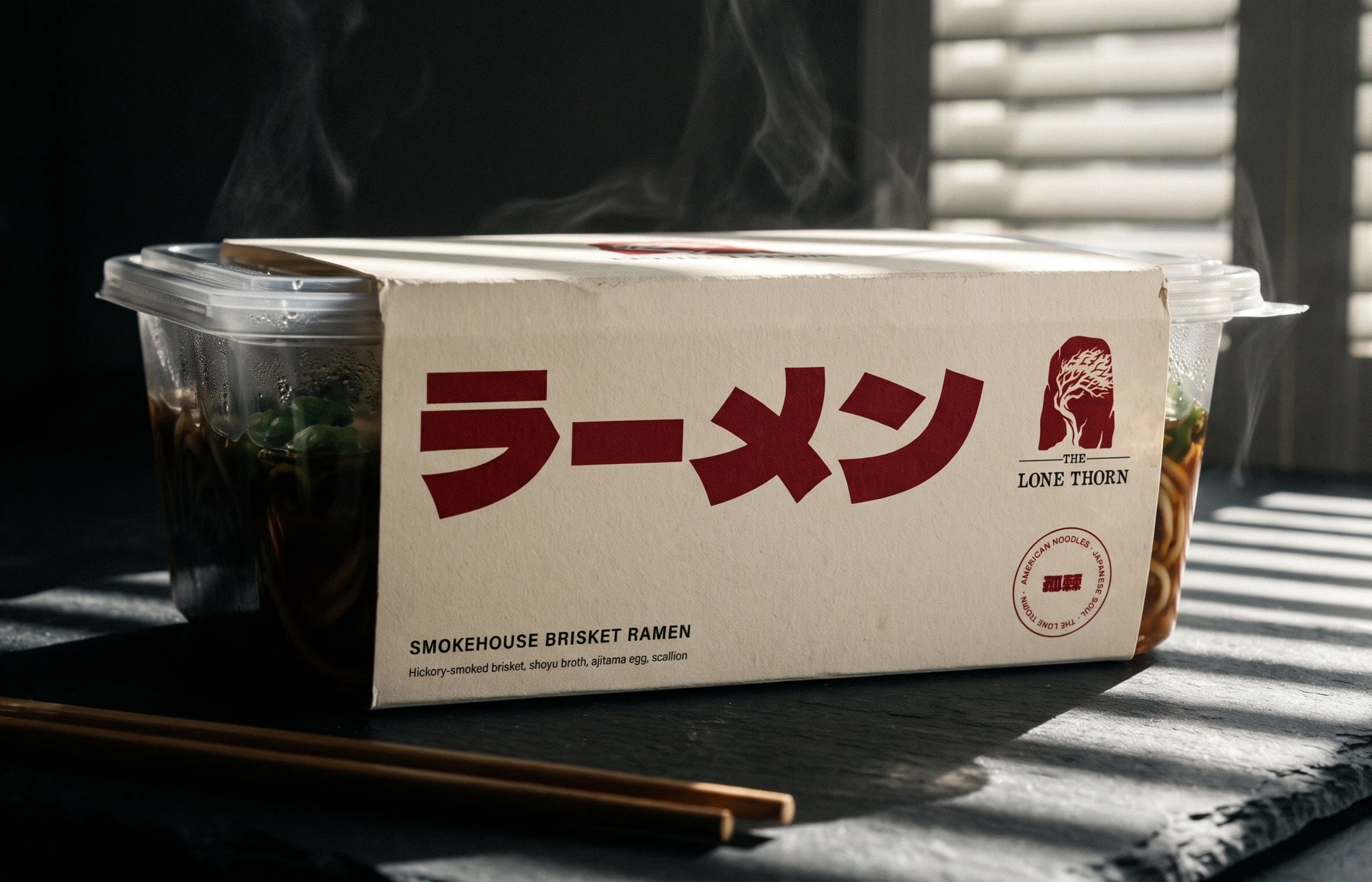
Three colours and nothing more. Thorn Red leads, Sumi Ink holds the dark and Washi Cream gives it room. Dela Gothic One sets the Japanese display type in heavy katakana, so menu words like ラーメン and ウドン read as graphics on their own. Geist handles everything in Latin.
The Lone Thorn
The Lone Thorn
The Lone Thorn
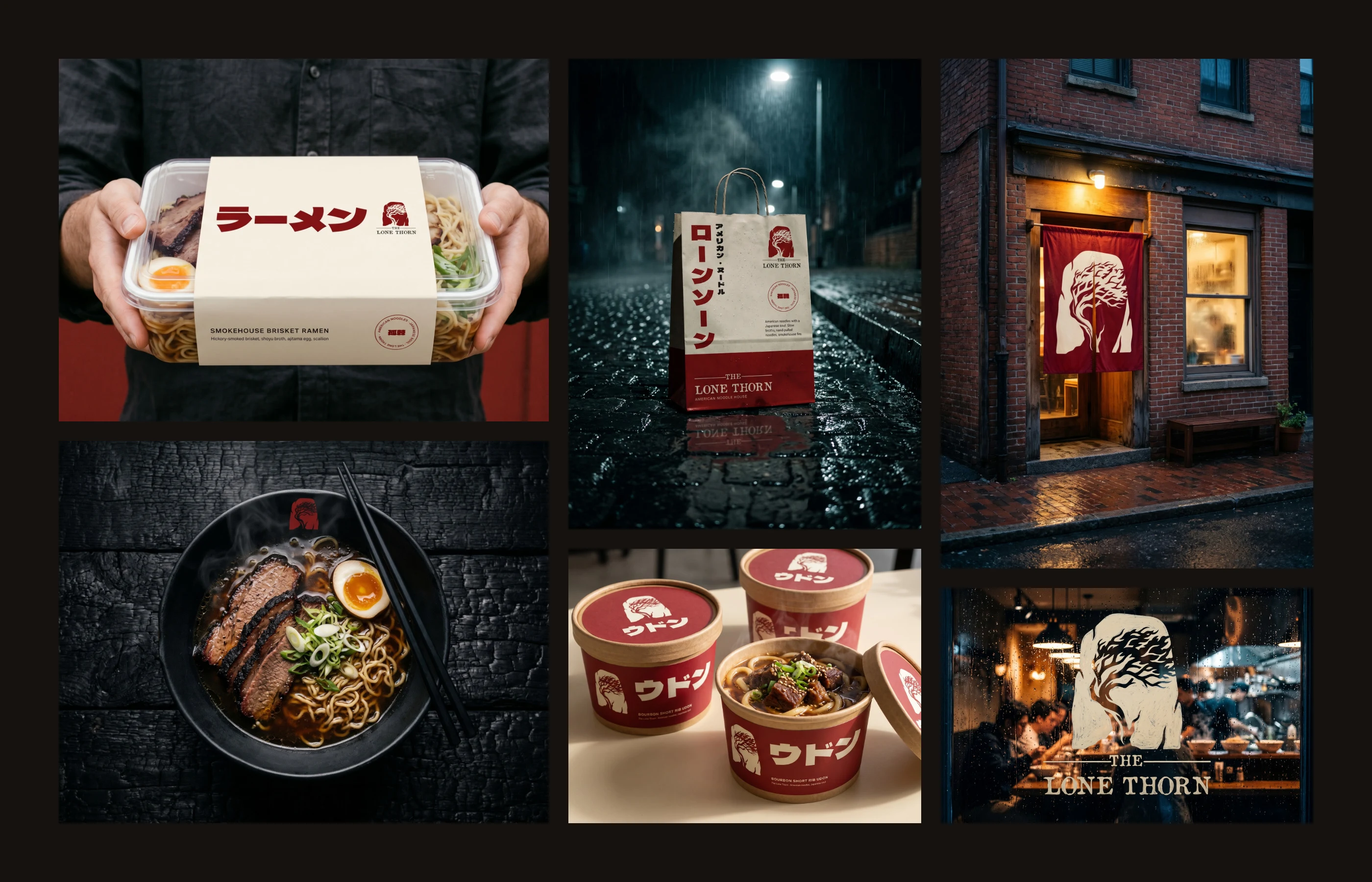
On the counter and out the door
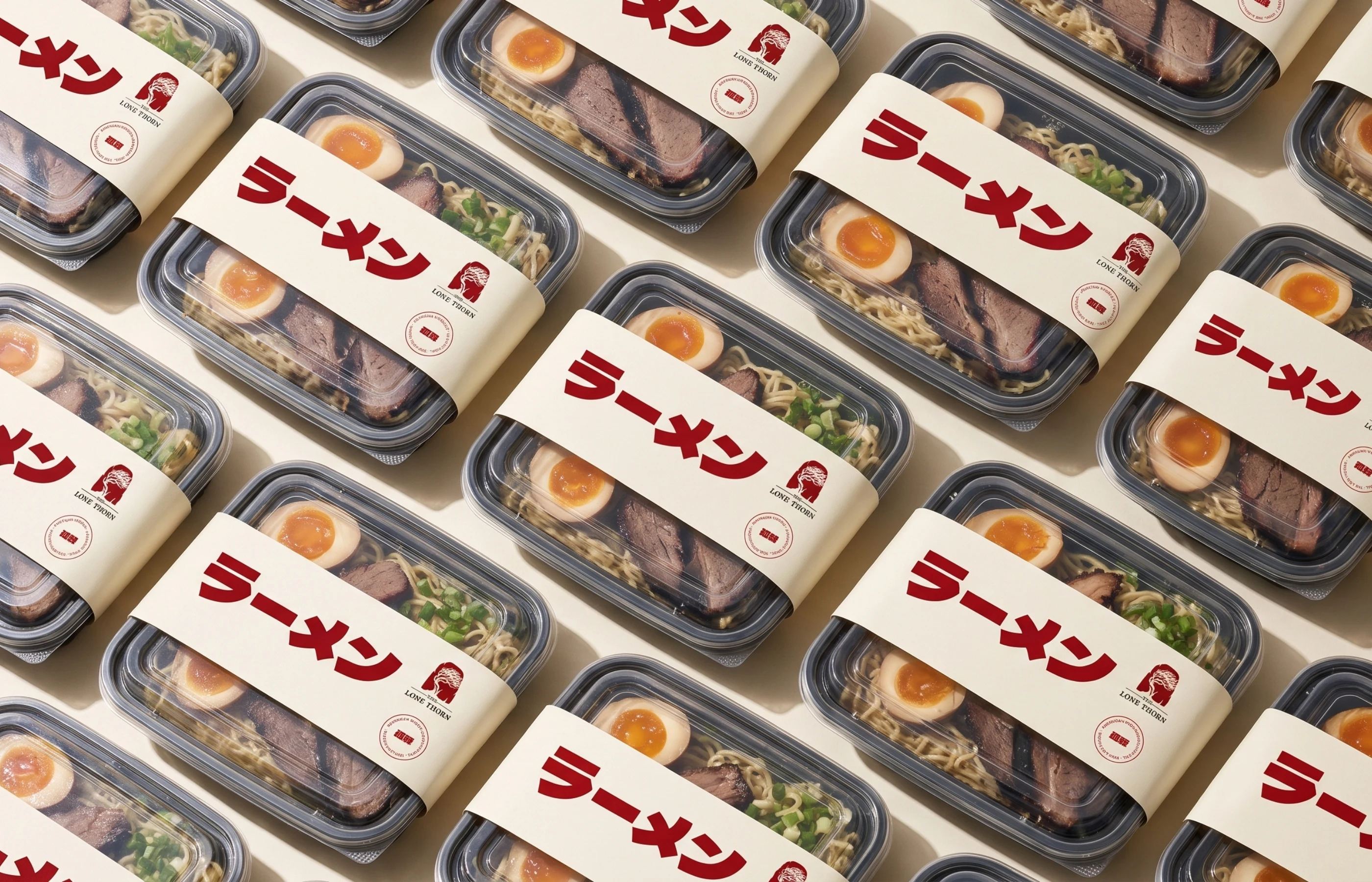
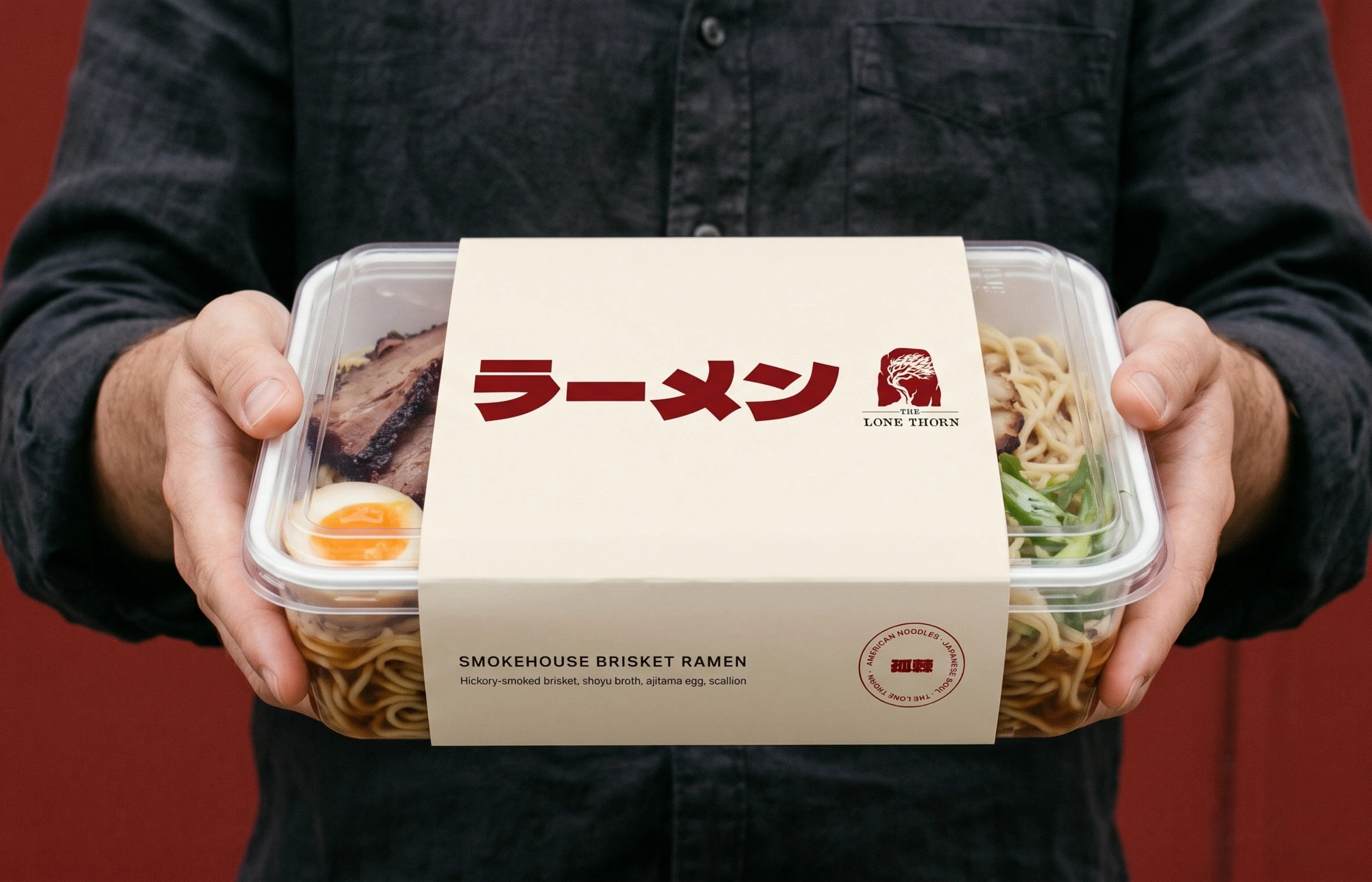
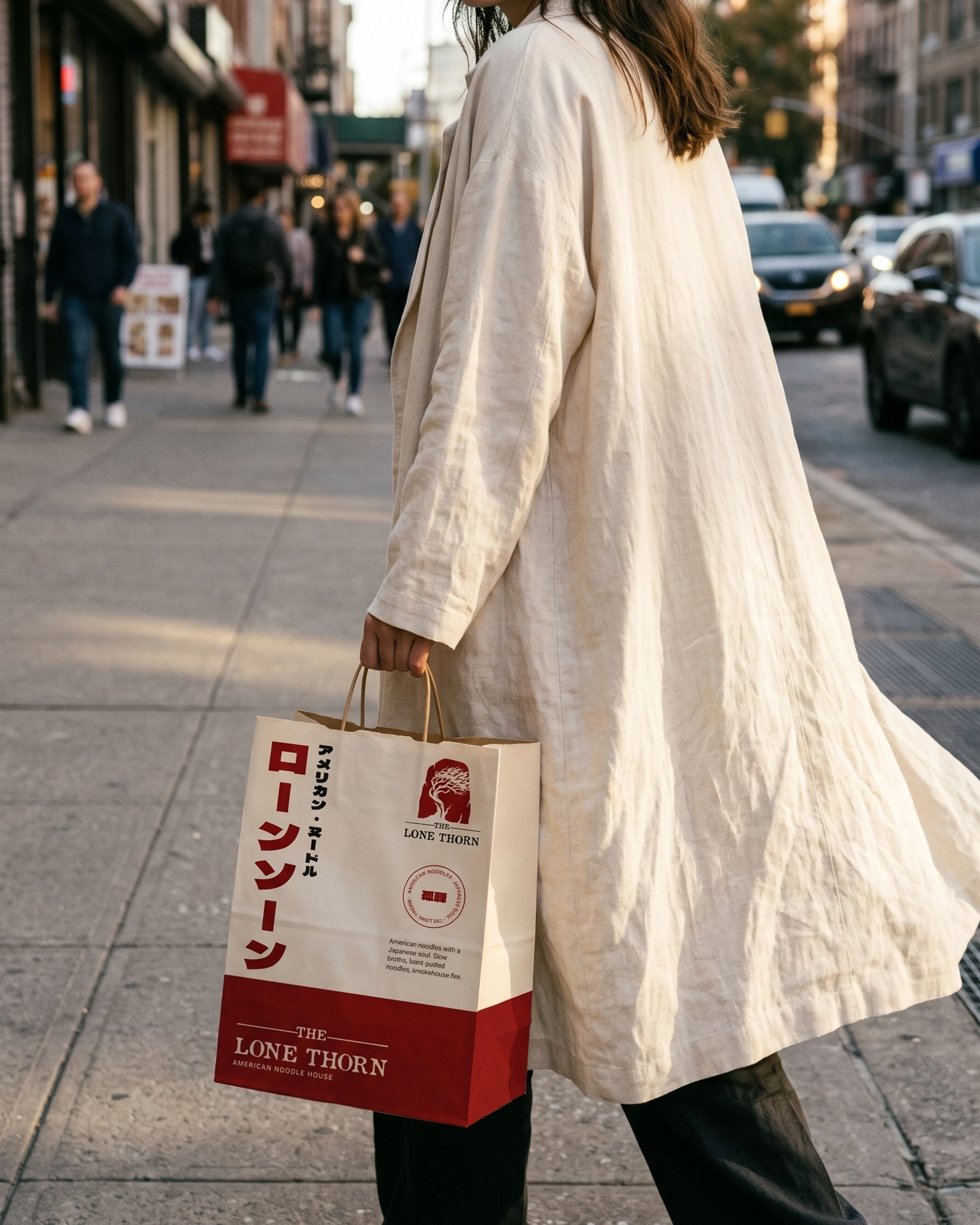
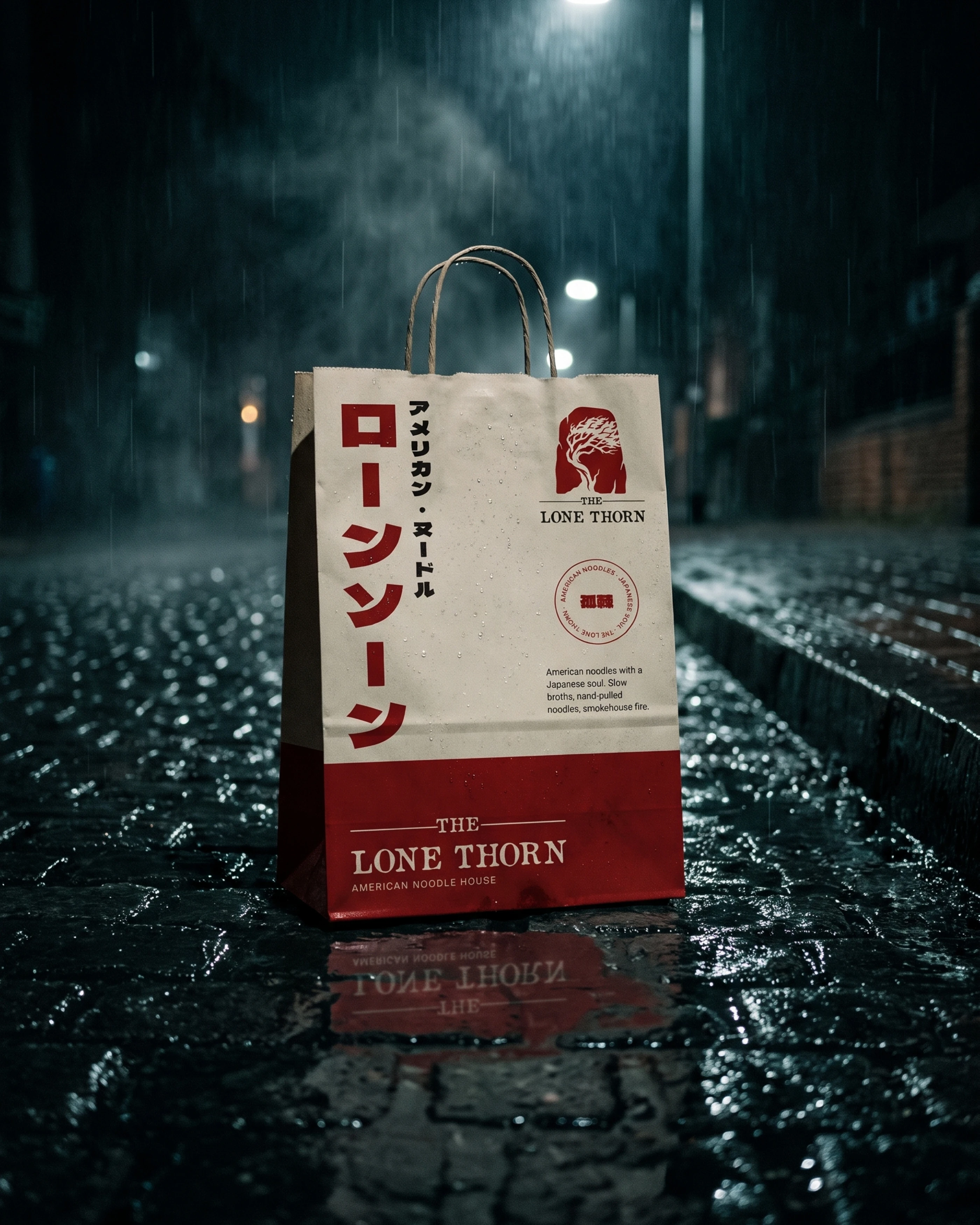
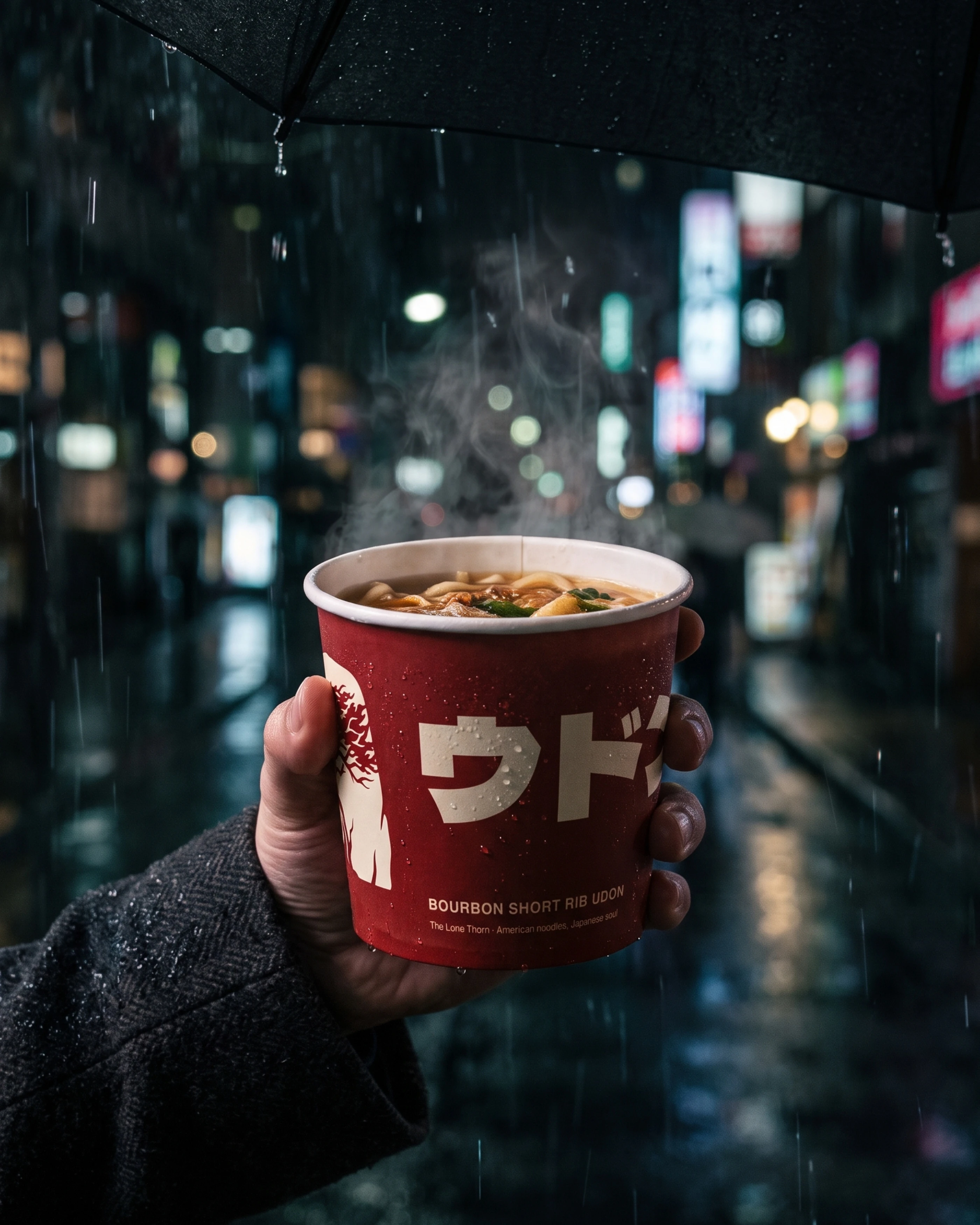
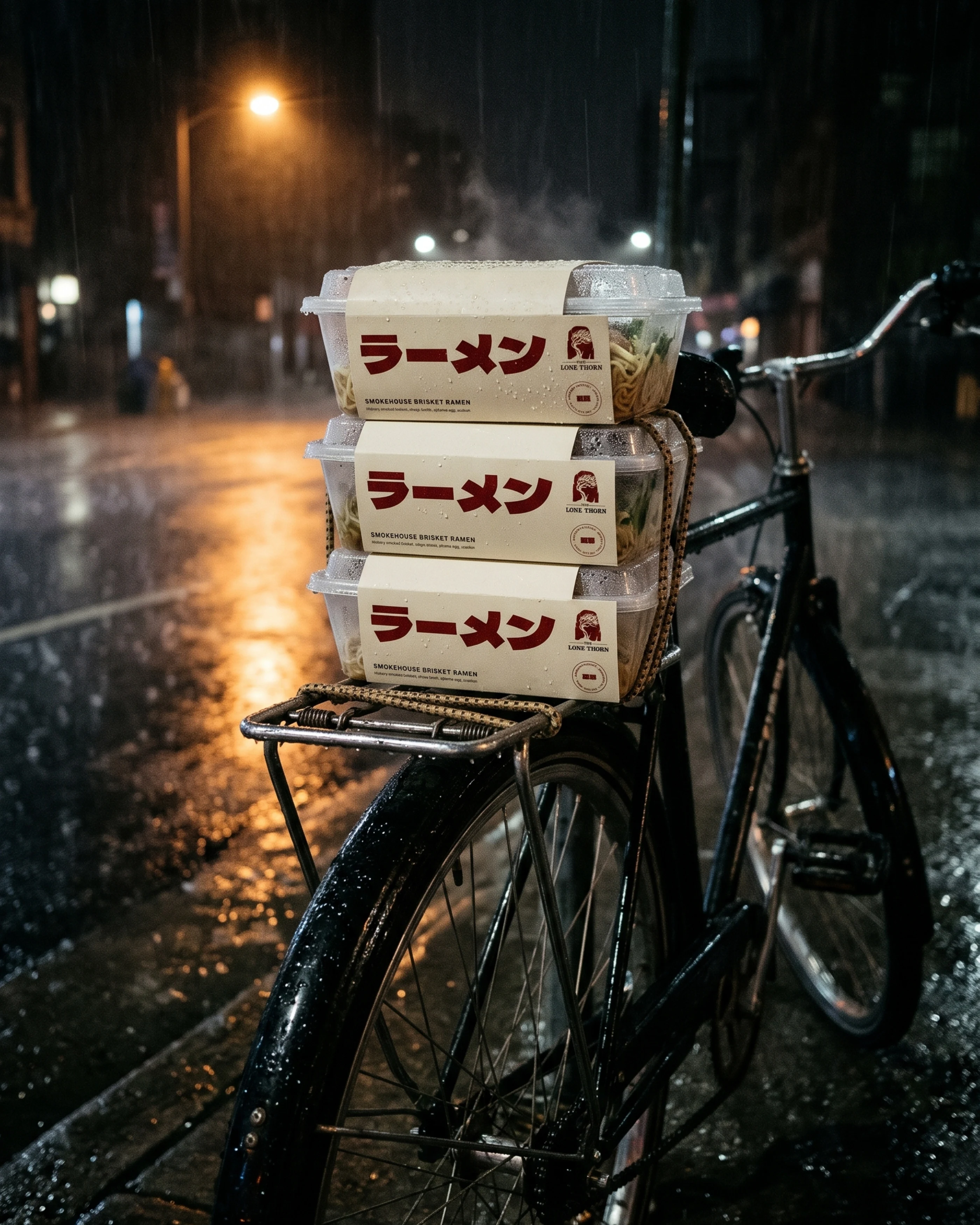
Takeaway sleeves name each dish in big katakana: ramen, udon, yakisoba. Every one carries the symbol and a round stamp. Kraft bags, cups, menus and table pieces share one simple system.
The Lone Thorn
The Lone Thorn
The Lone Thorn
The Lone Thorn
The Lone Thorn
The Lone Thorn
The Lone Thorn
The Lone Thorn
The shopfront
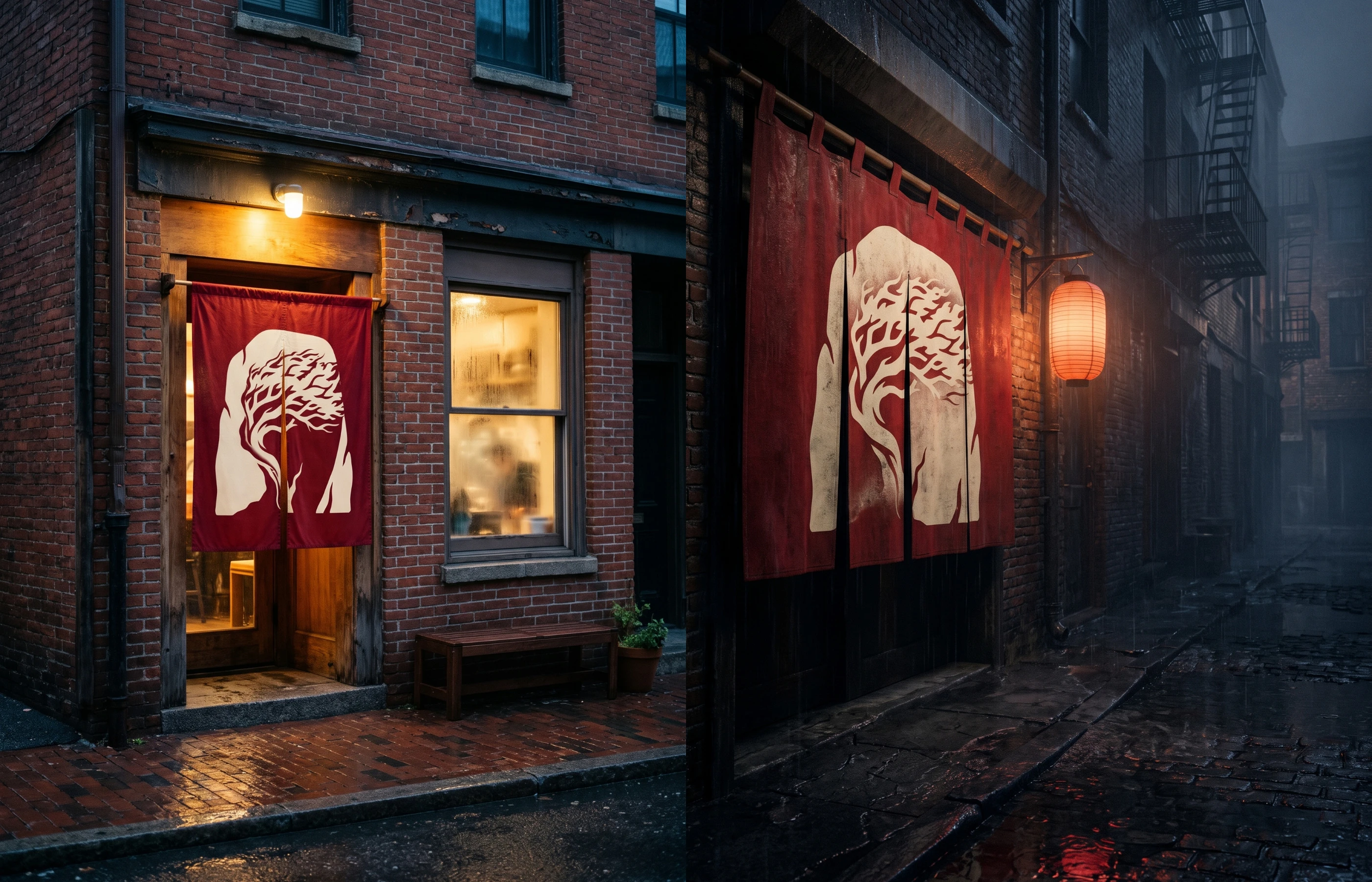
A hanging sign, a red noren over the door from day into night, and stationery for the house.
The Lone Thorn
The Lone Thorn
The Lone Thorn
After dark
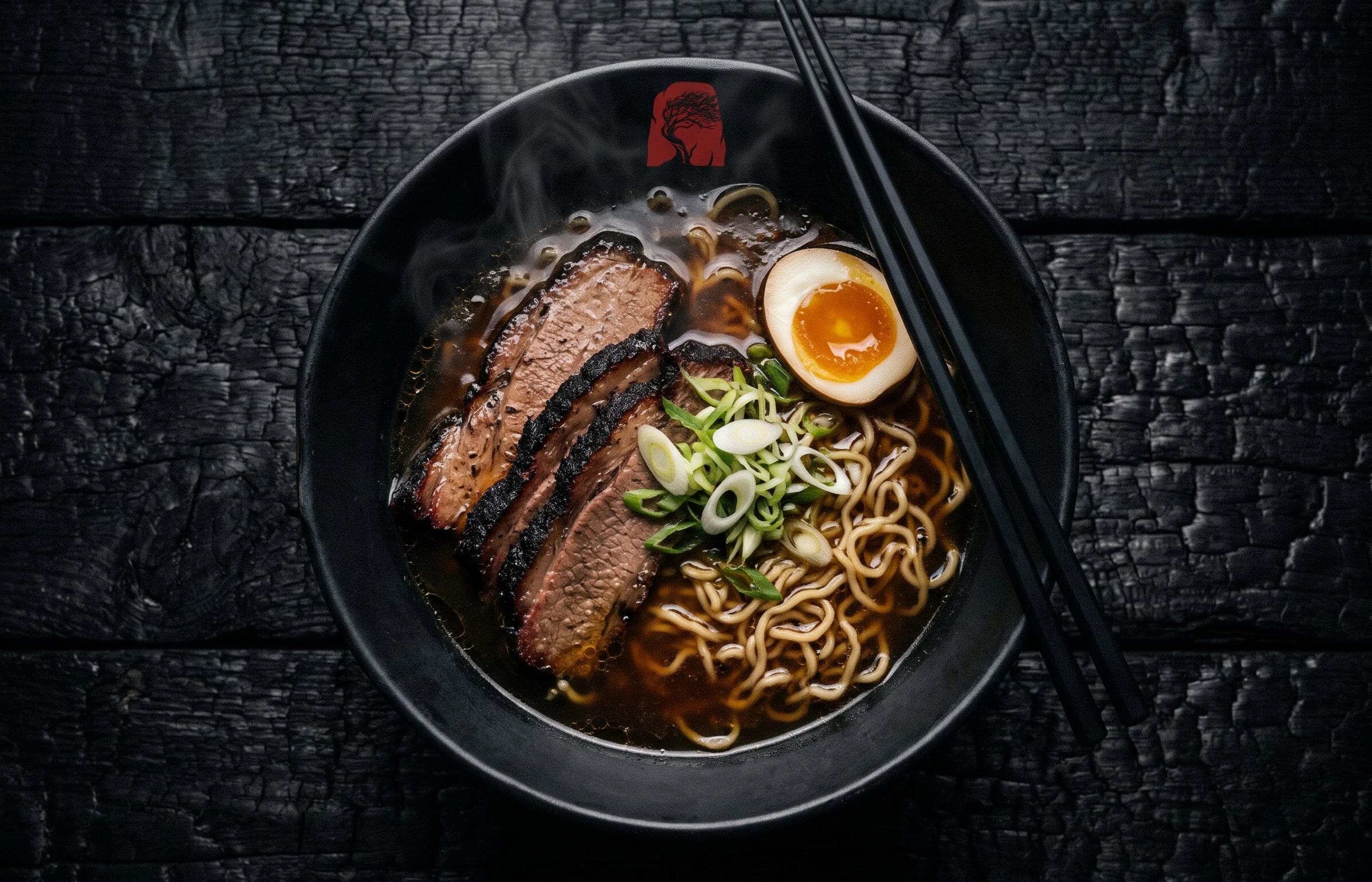
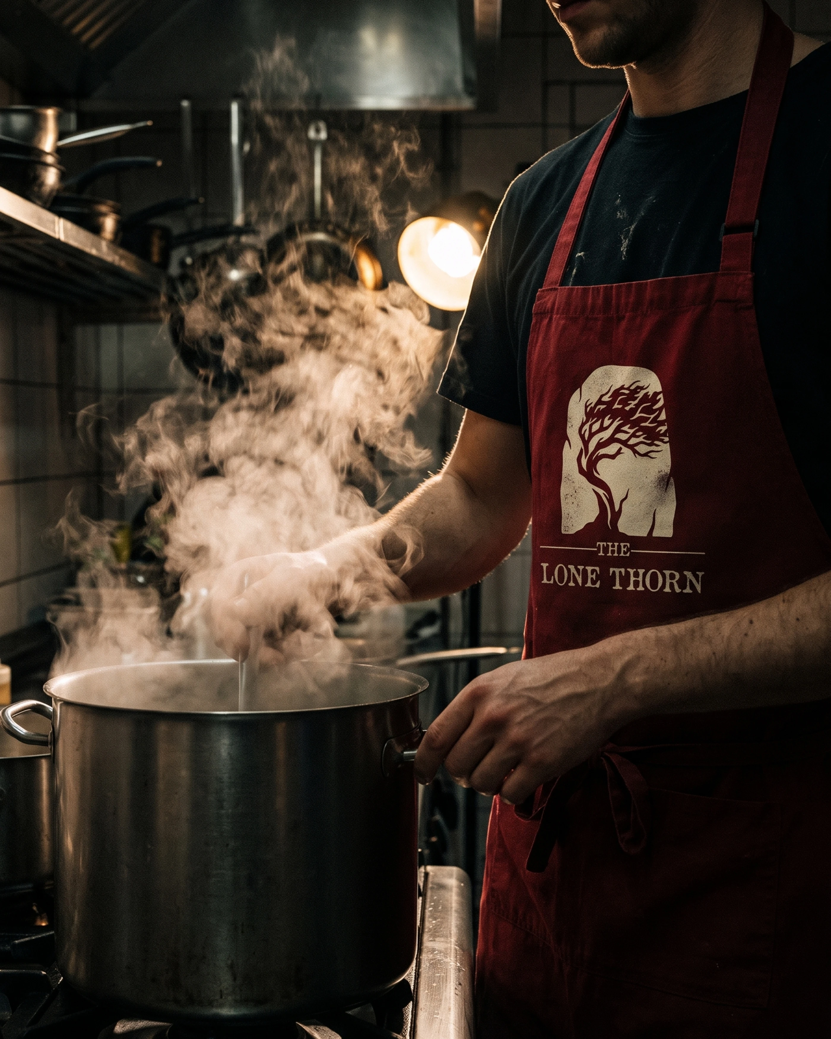
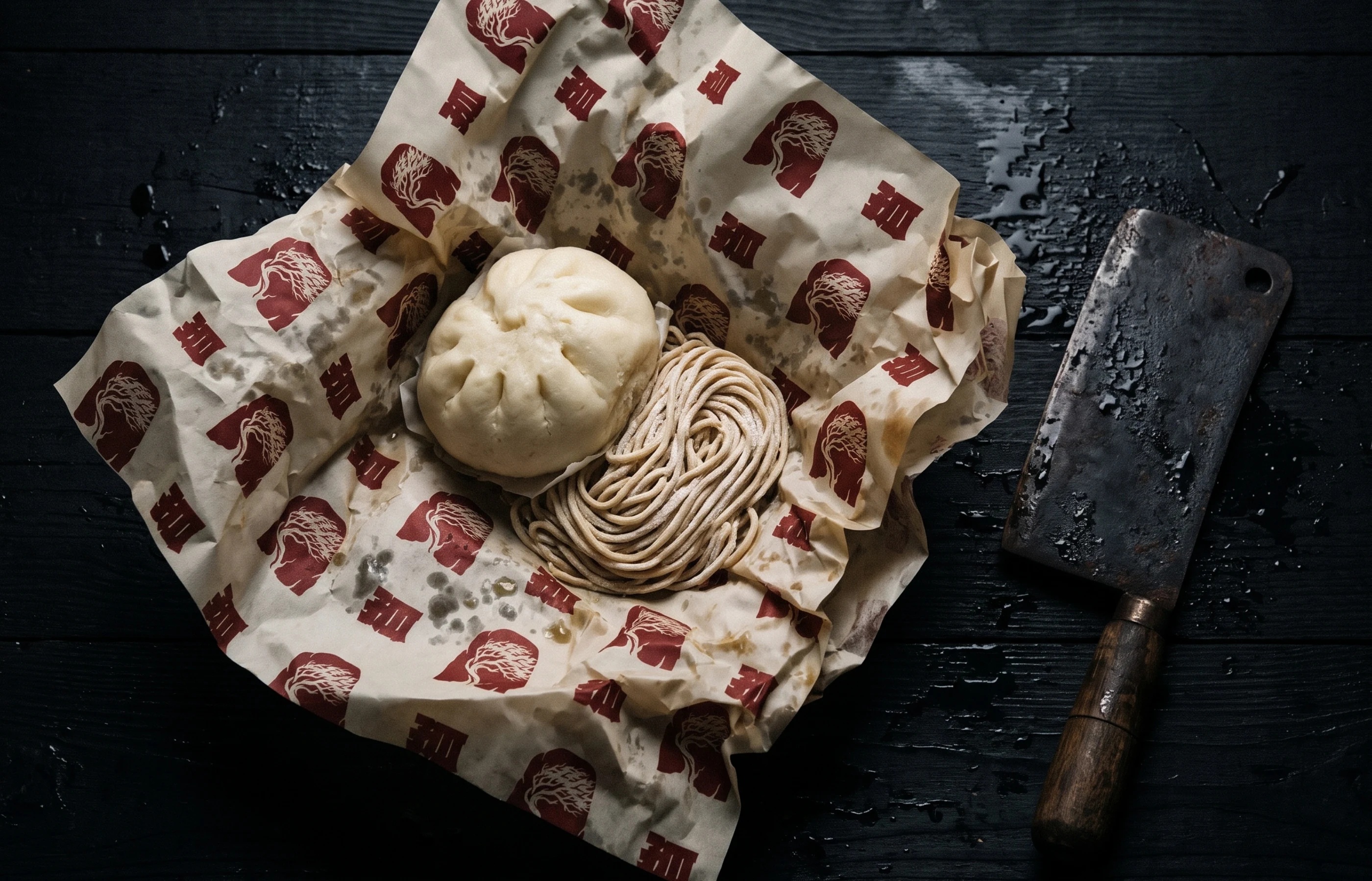
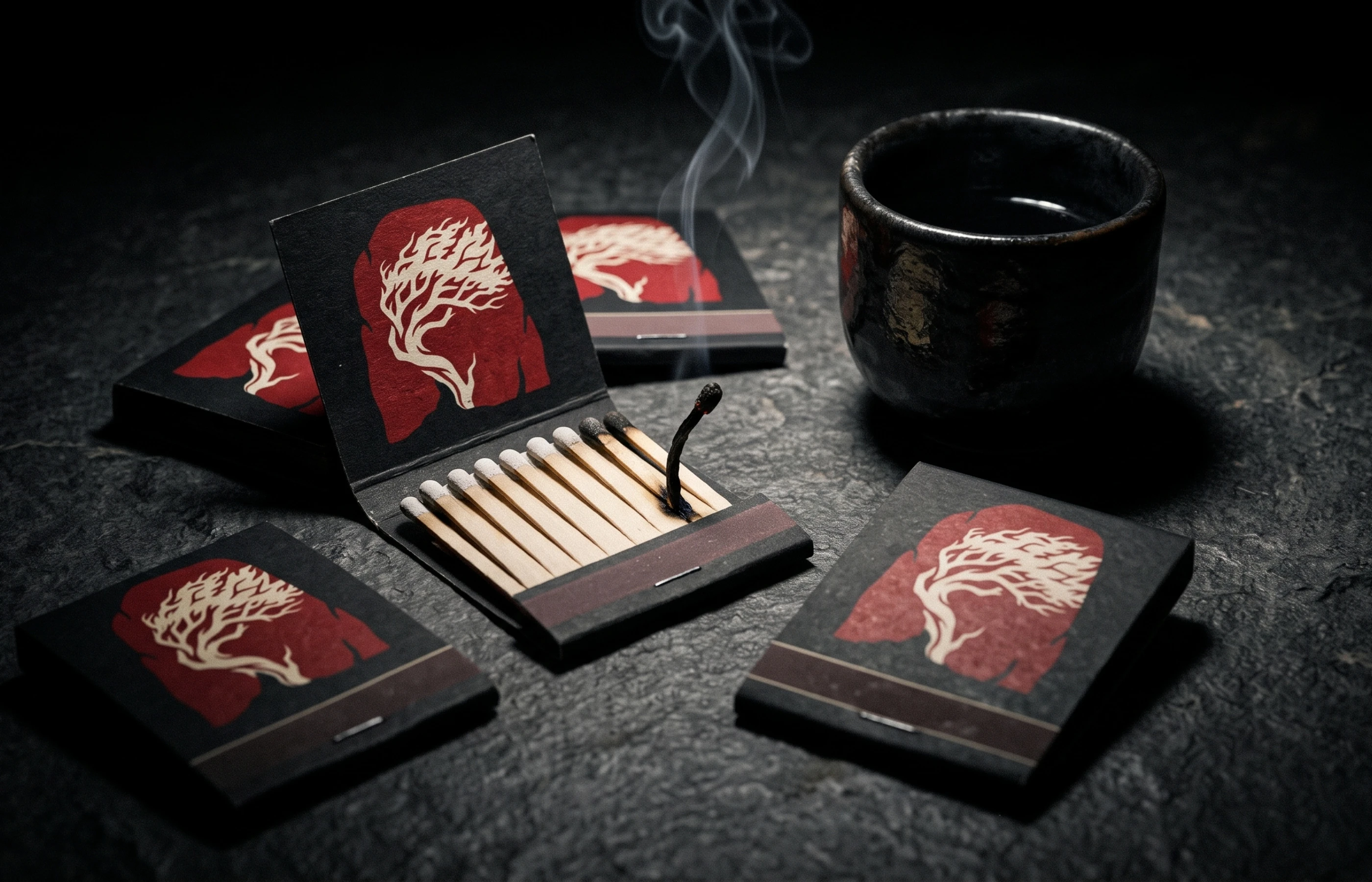
When the street goes quiet, the broth keeps going: rain on the window, steam in the alley, one red light still on. A darker set of scenes shows the identity holding up at night, from window graphics and blinds to bags, bowls, the chef, the delivery bike, wrap paper and matchboxes.
The Lone Thorn
The Lone Thorn
The Lone Thorn
The Lone Thorn
The Lone Thorn
The Lone Thorn
The Lone Thorn
The Lone Thorn
The Lone Thorn
The Lone Thorn
The Lone Thorn
Brand identity by Theepa Studio. Mockups are AI-generated.
0 likes · 2 views · Nov 9, 2026
Brand identity and packaging for The Lone Thorn, an American noodle house with a Japanese soul: a standing stone cut with a windswept pine, Thorn Red, Sumi Ink and Washi Cream, bold katakana packaging and an after-dark campaign.
