FlyPeejay Branding Identity
FlyPeejay Brand Identity – Private Aviation
What This Is
A full brand identity for FlyPeejay, a private jet platform targeting high-end clients. The goal was to create a brand that feels premium, confident, and modern without falling into the usual corporate look.
What I Did
I led the branding from scratch. This included:
Logo system
Typography
Color direction
Brand voice
Visual style for print, product, and digital
The Problem
Most aviation brands feel outdated or overly formal. FlyPeejay needed something minimal, sharp, and scalable. A brand that communicates luxury without being loud.
The Design Solution
Logo: A custom F blended with a wing. It represents flight, lift, and discretion
Colors: Deep blue, steel grey, and gold to express calm, precision, and trust
Typography: A high-contrast serif paired with a clean sans-serif for balance
System: Built to work across digital, physical, and motion assets
Why It Works
The identity now reflects what FlyPeejay stands for. It feels elevated, efficient, and built for people who value time and clarity.
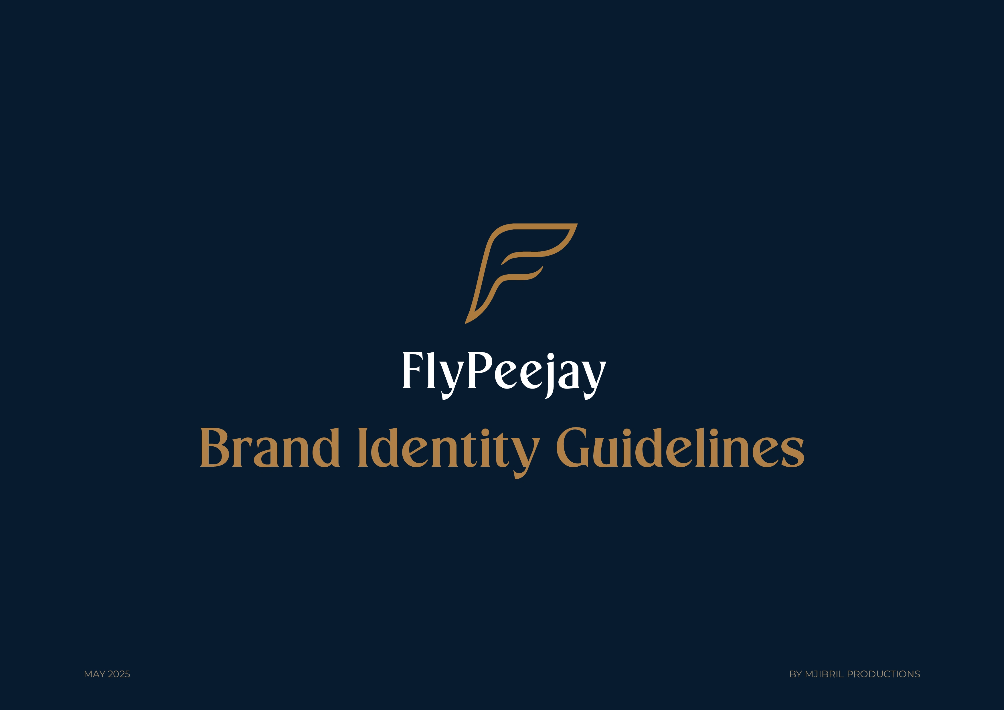
The Brand
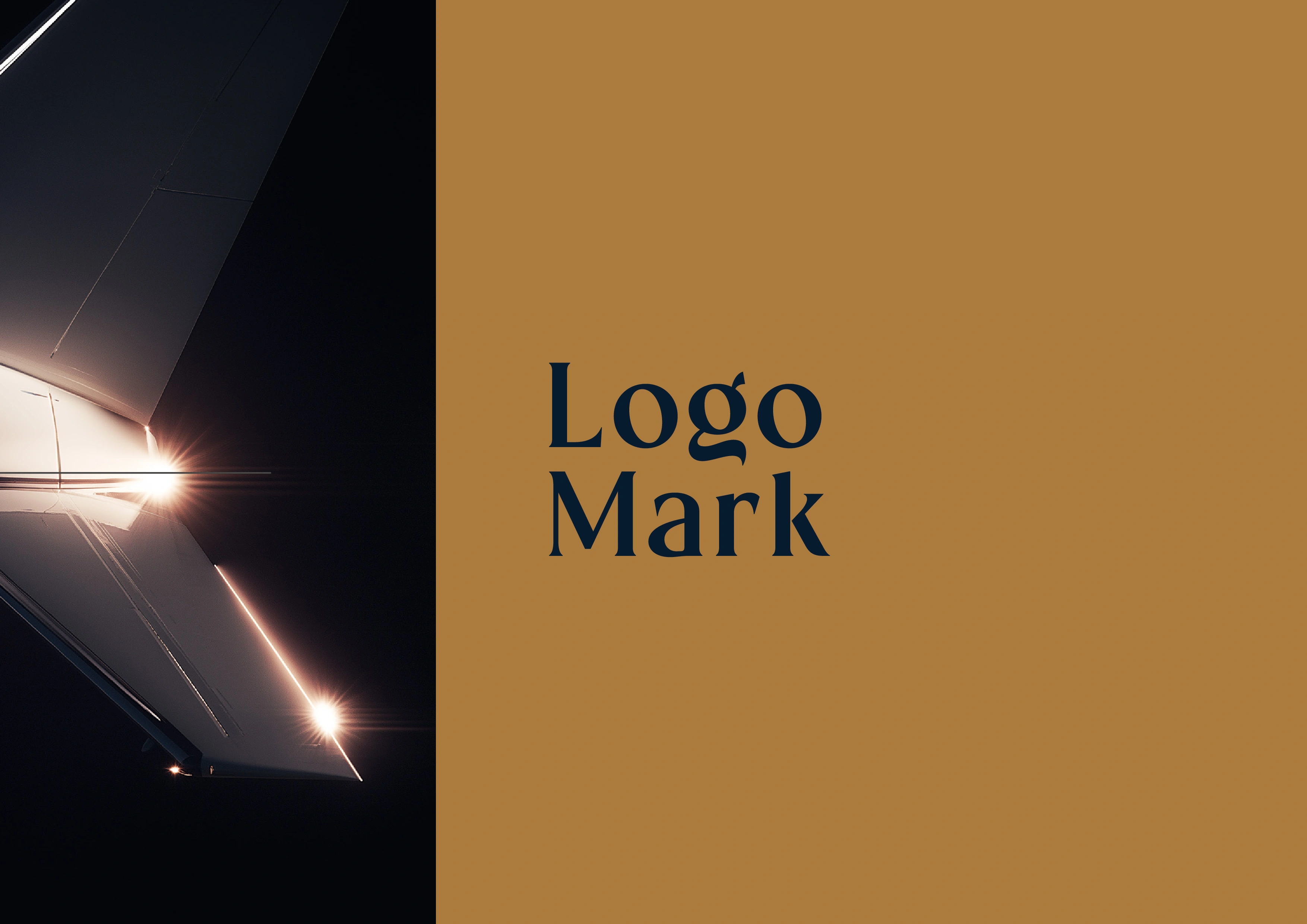
Framing the visual language of the brand. Simple, sharp, and confident.
Main vertical logo. Built to feel light, fast, and premium.
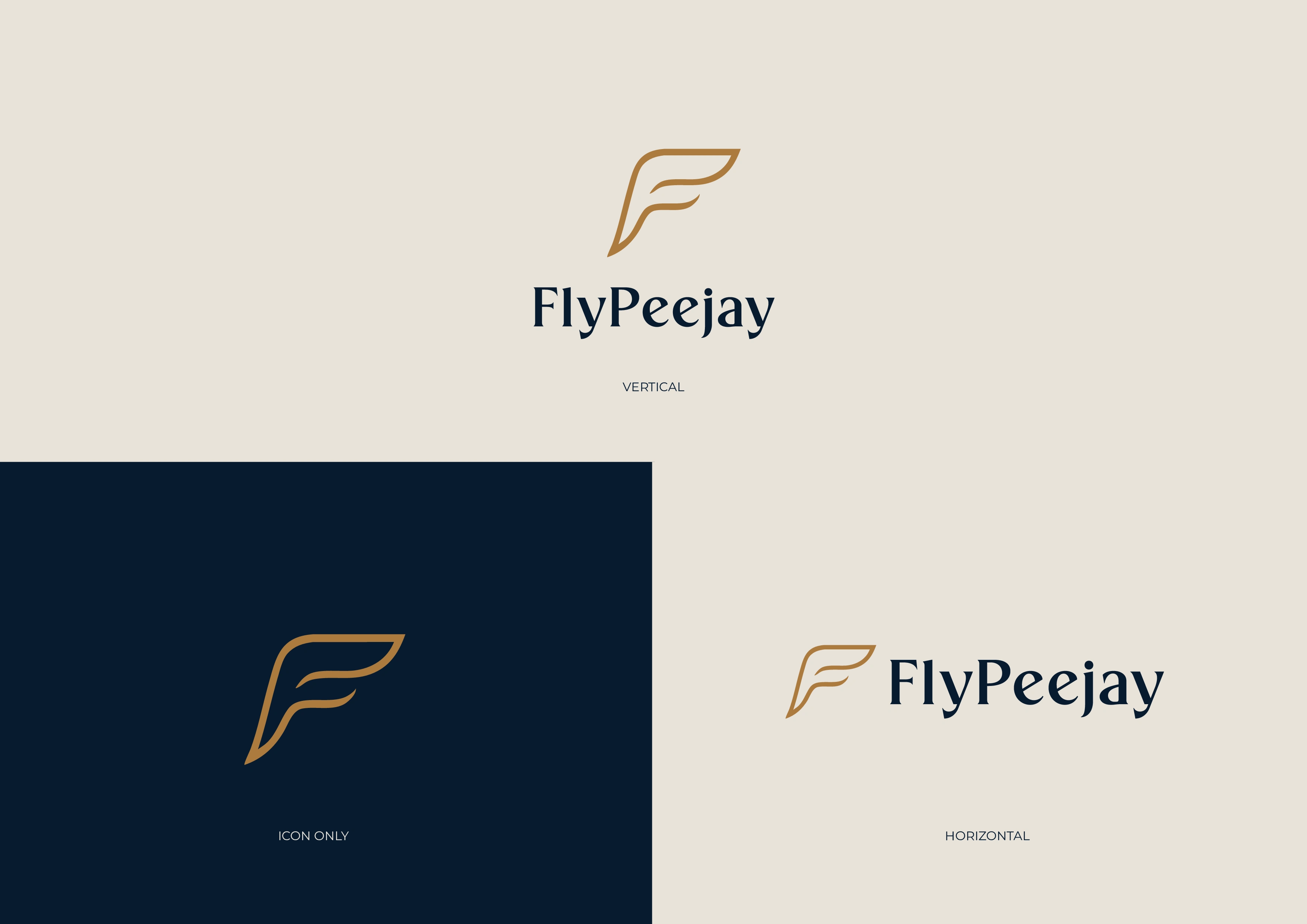
Full logo system: vertical, horizontal, and standalone icon.
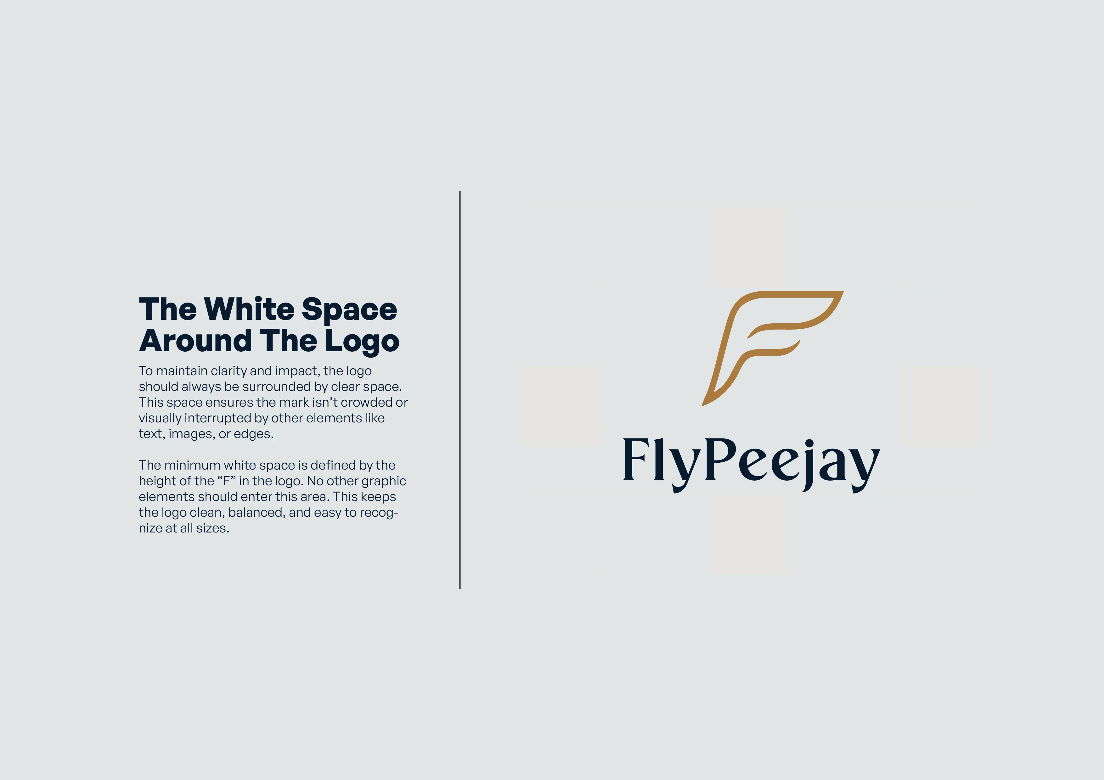
Full logo system: vertical, horizontal, and standalone icon.
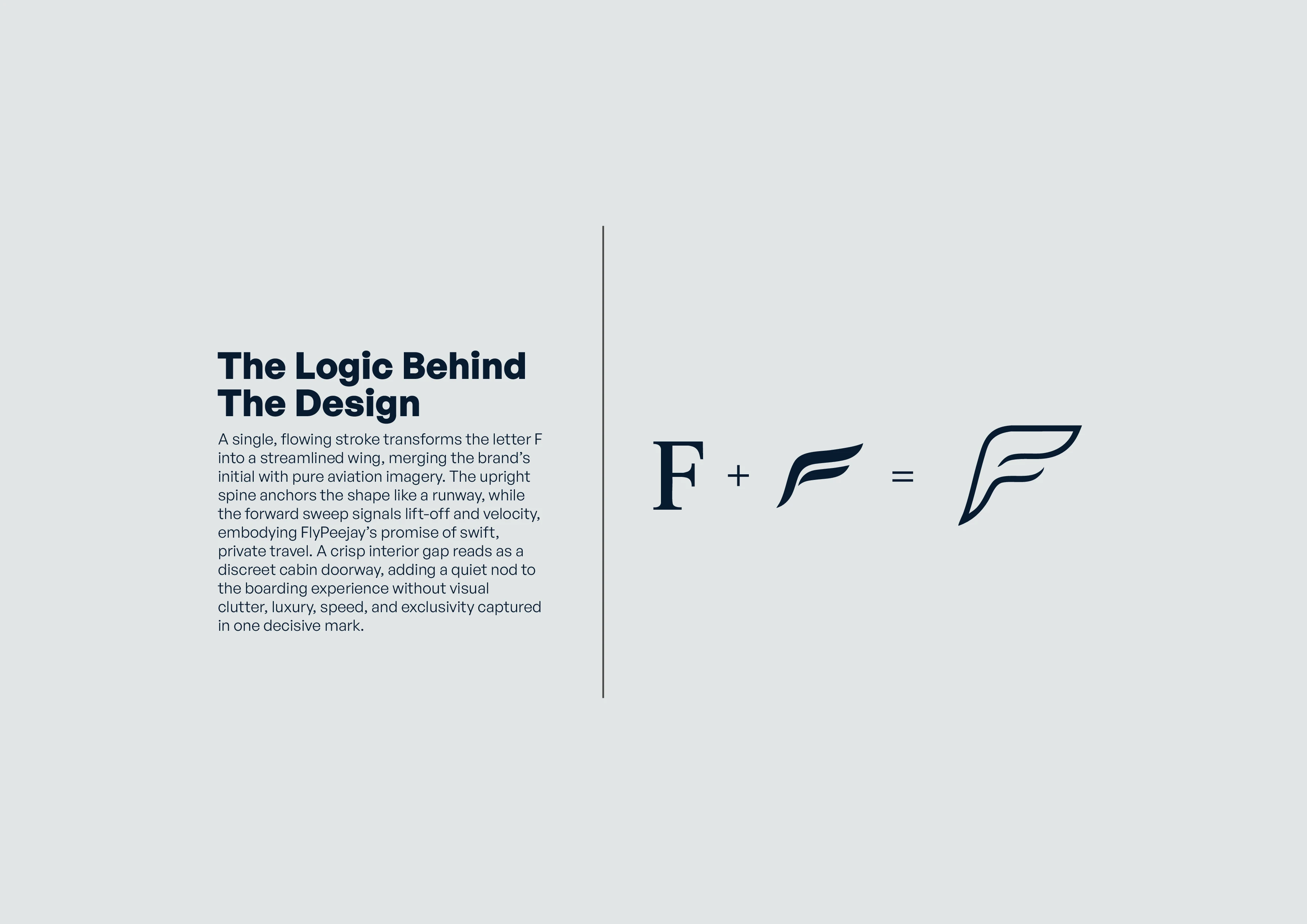
Full logo system: vertical, horizontal, and standalone icon.
The logo mark sets the tone for everything that follows. It needed to feel fast, premium, and unmistakably aviation. I used a clean layout with strong contrast to establish the brand’s presence immediately. This section introduces the viewer to the core identity.
Full logo system: vertical, horizontal, and standalone icon.
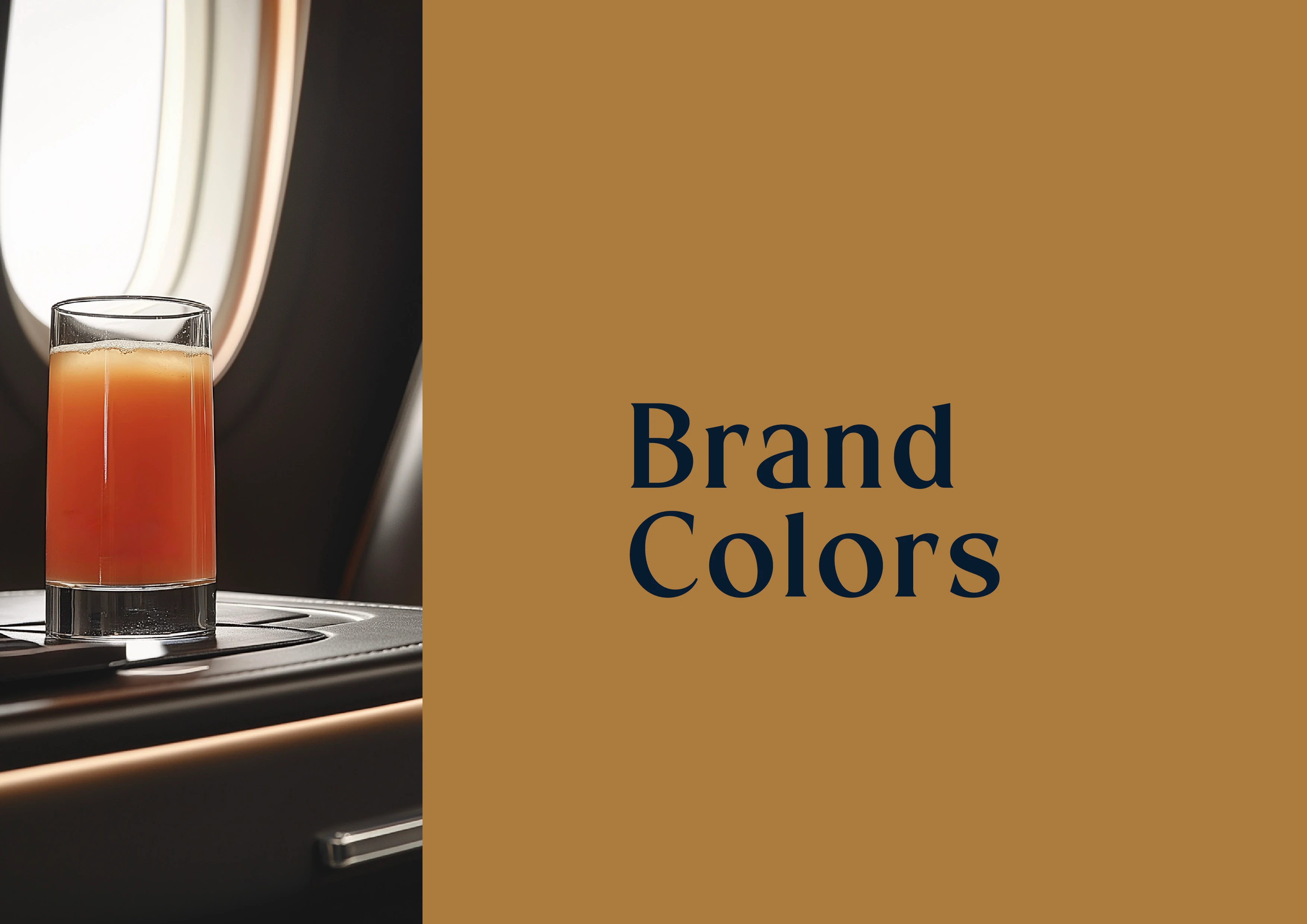
Color matters, especially in aviation where trust and calm are essential. This section introduces the palette through atmospheric imagery and cues luxury before showing the actual swatches.
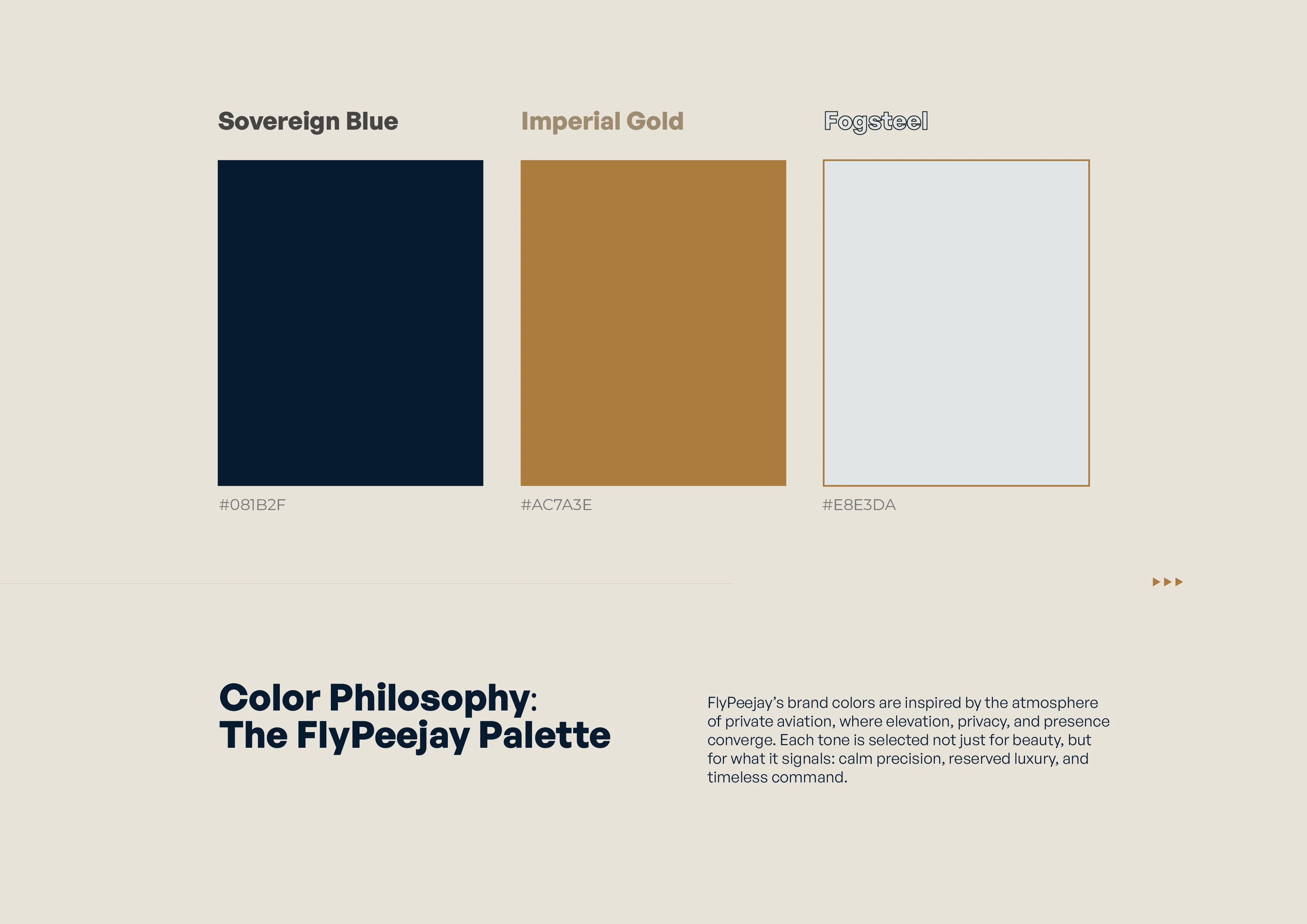
Sovereign Blue, Imperial Gold, and Fogsteel define the FlyPeejay atmosphere.
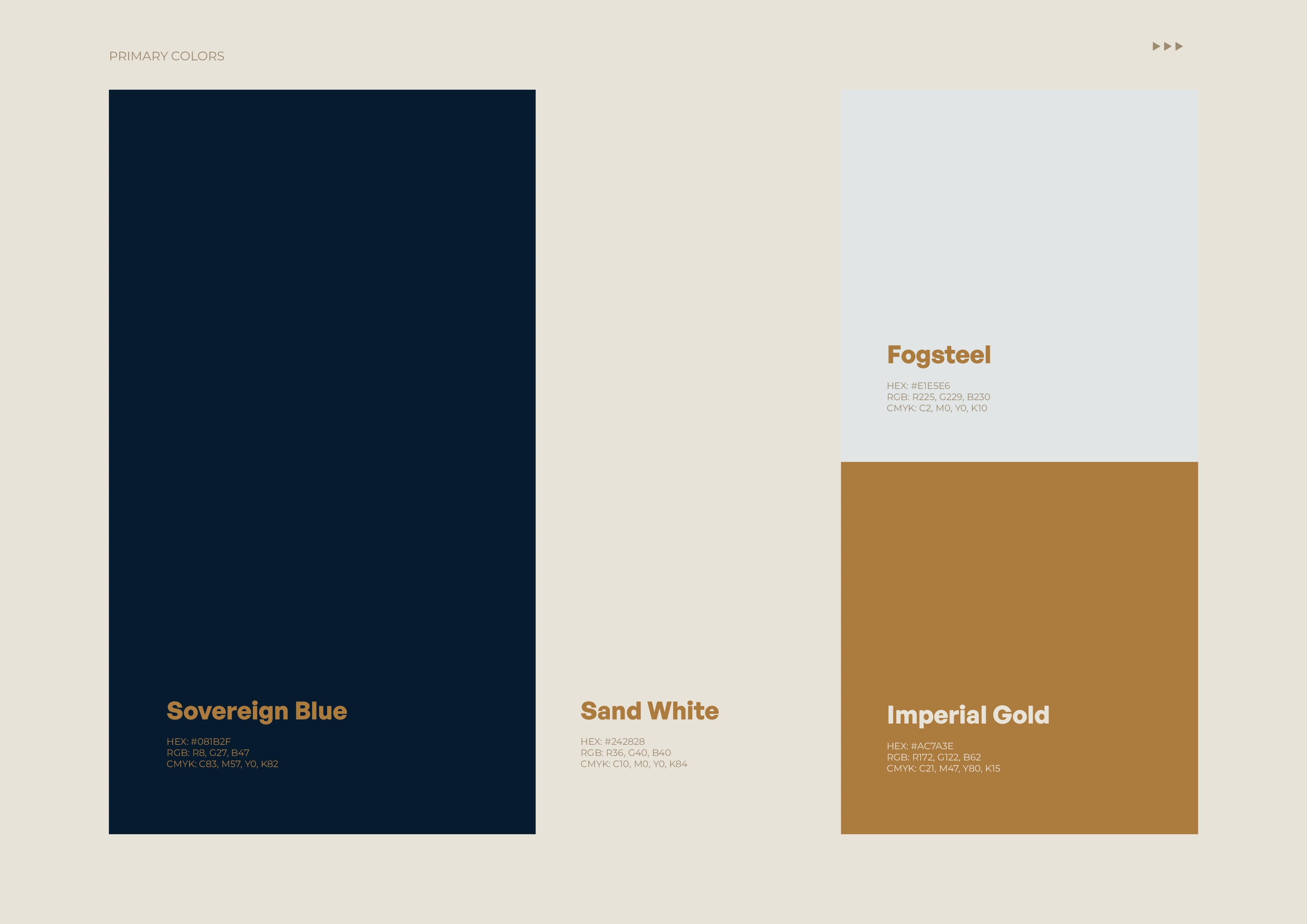
Additional brand tones for depth, contrast, and digital flexibility.
These colors were chosen to feel grounded, calm, and premium. Sovereign Blue reflects trust and professionalism. Imperial Gold adds warmth and exclusivity. Fogsteel softens the contrast, keeping the brand easy on the eyes and usable across screen and print.
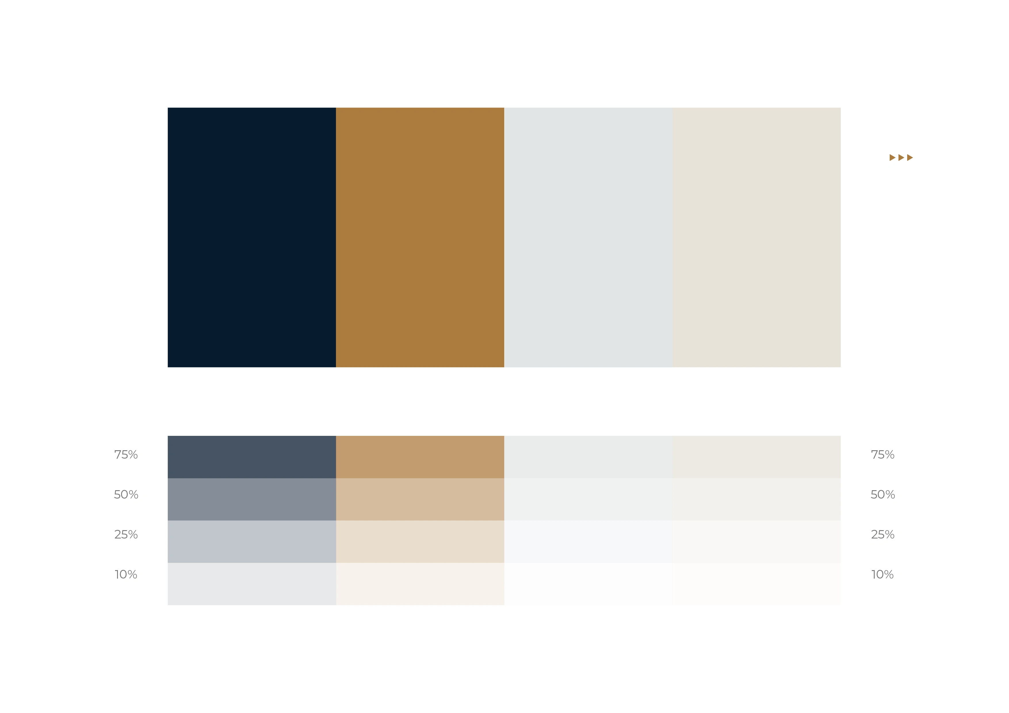
Full brand system with secondary tones. Built for print, web, and UI consistency.
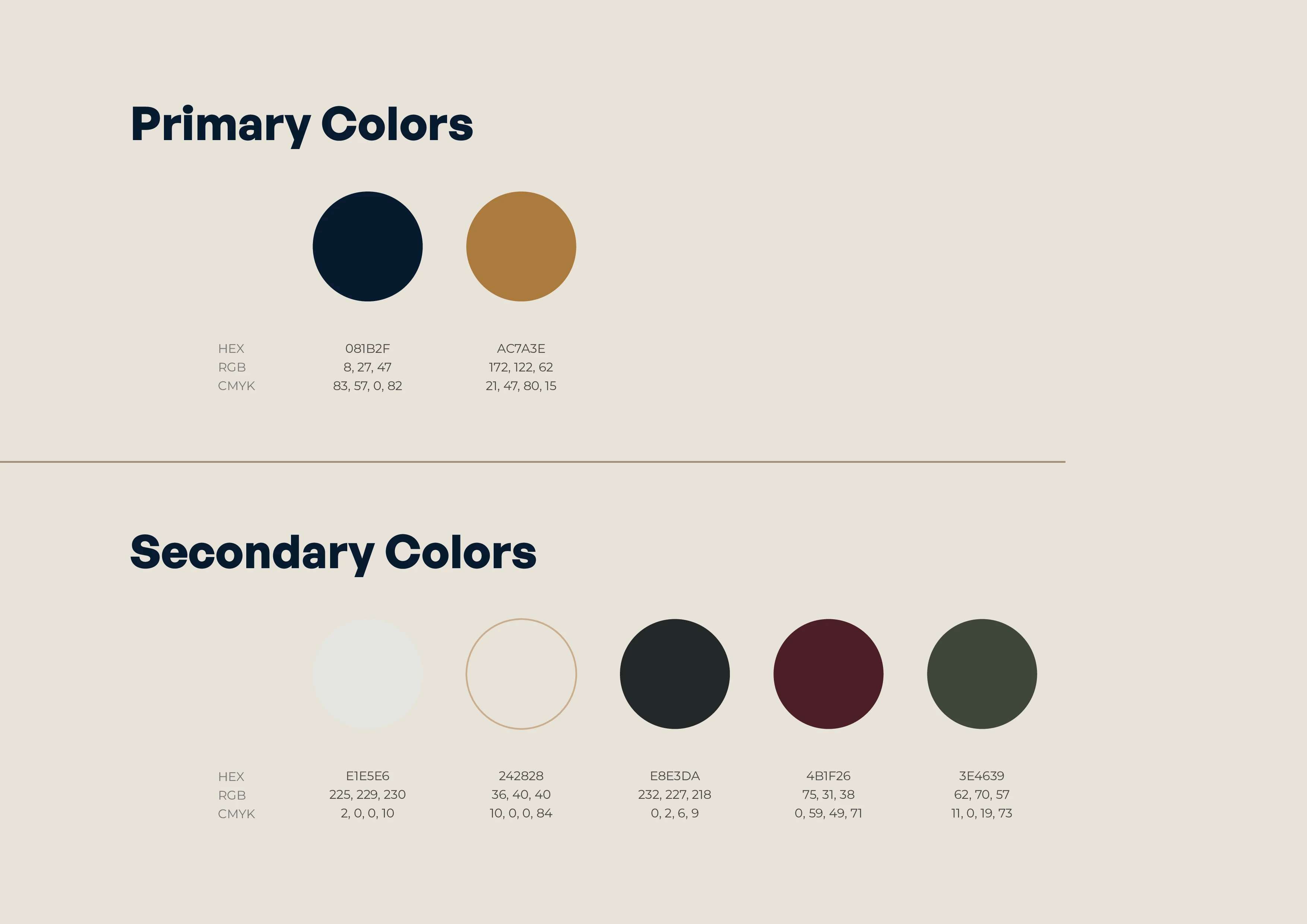
Full palette breakdown with HEX, RGB, and CMYK values for every use case.
Full palette breakdown with HEX, RGB, and CMYK values for every use case.
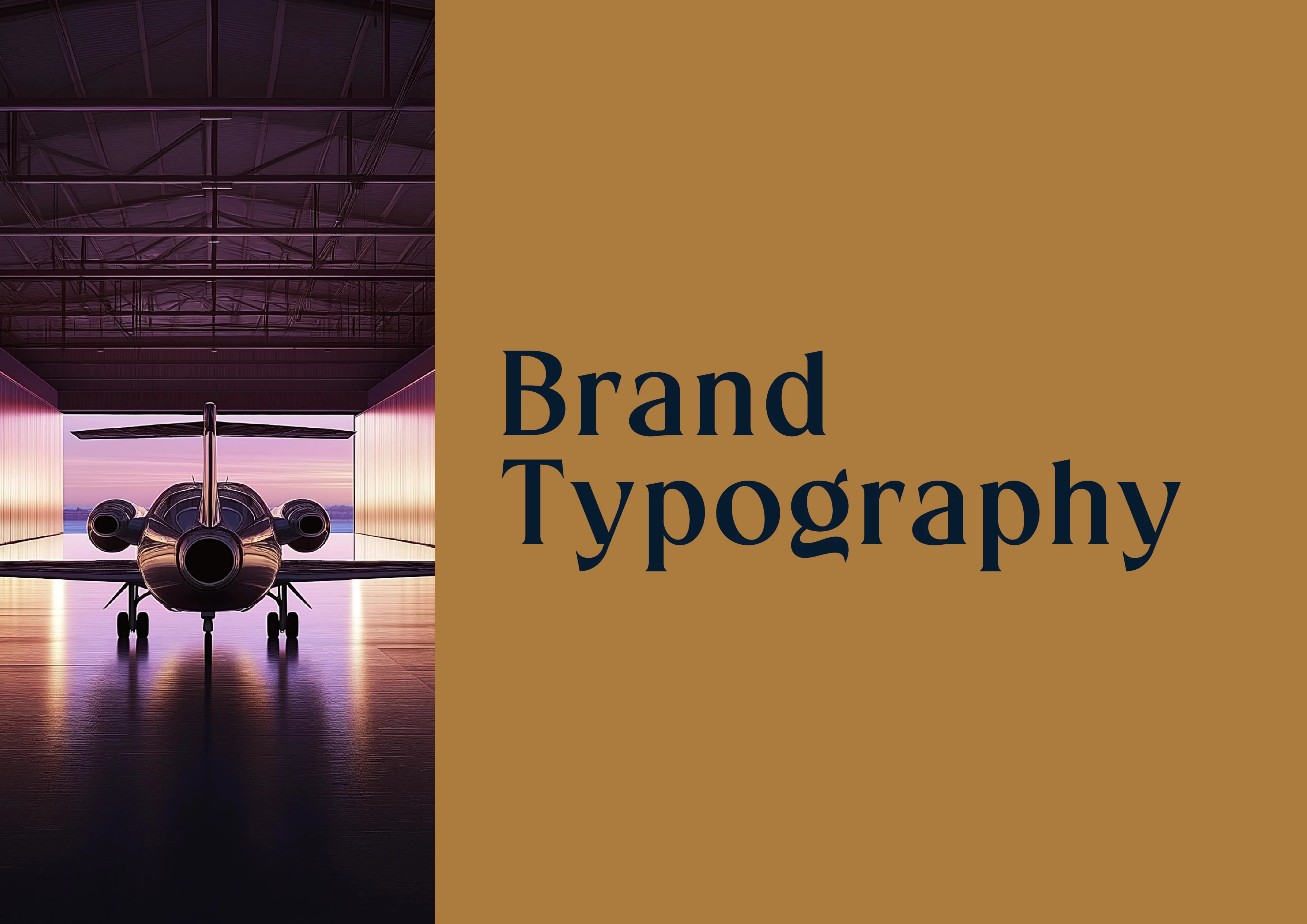
Typography builds personality. This transition slide previews the tone shift toward how FlyPeejay speaks through type. It links directly to the quiet confidence that defines the rest of the brand.
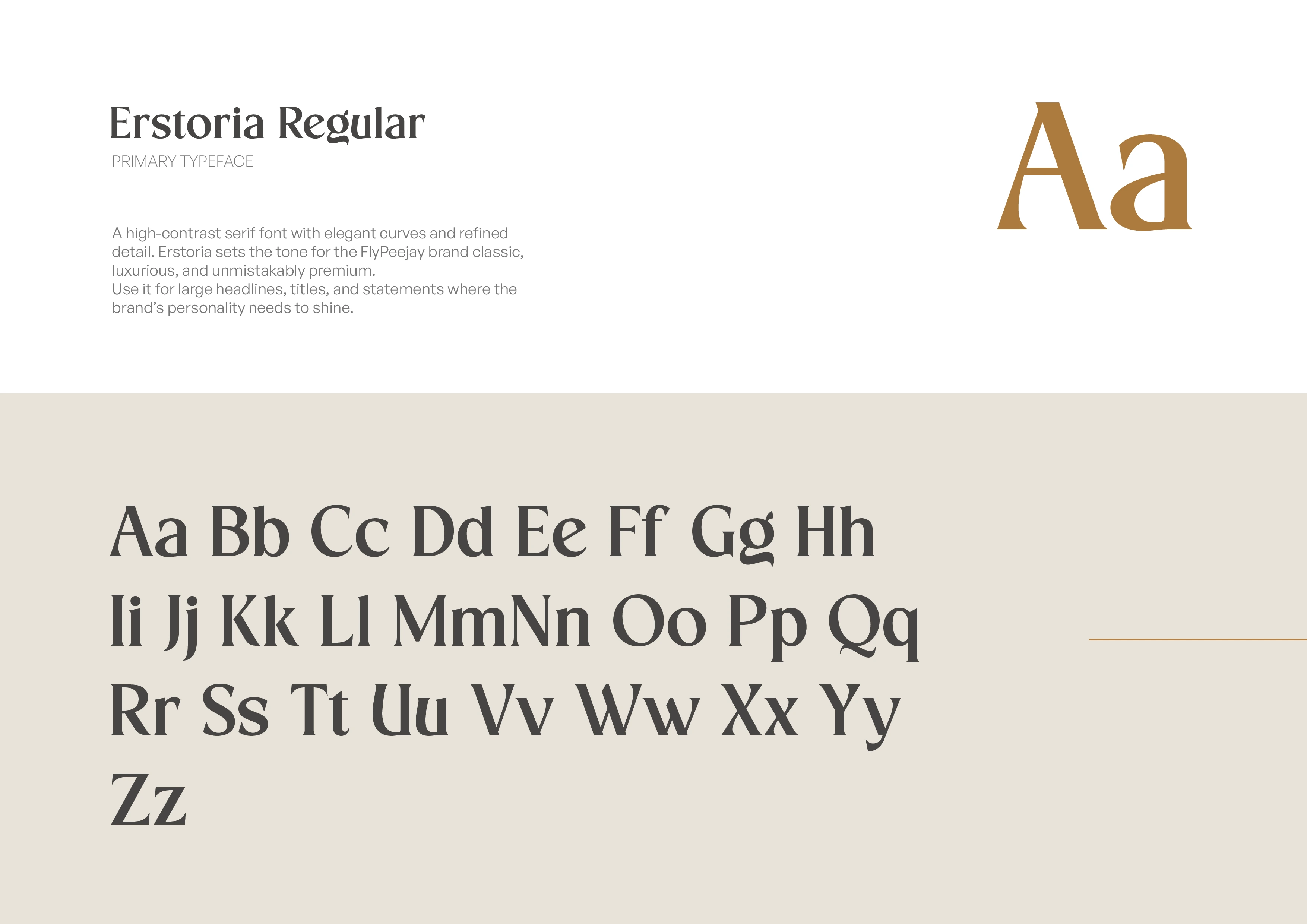
Full palette breakdown with HEX, RGB, and CMYK values for every use case.
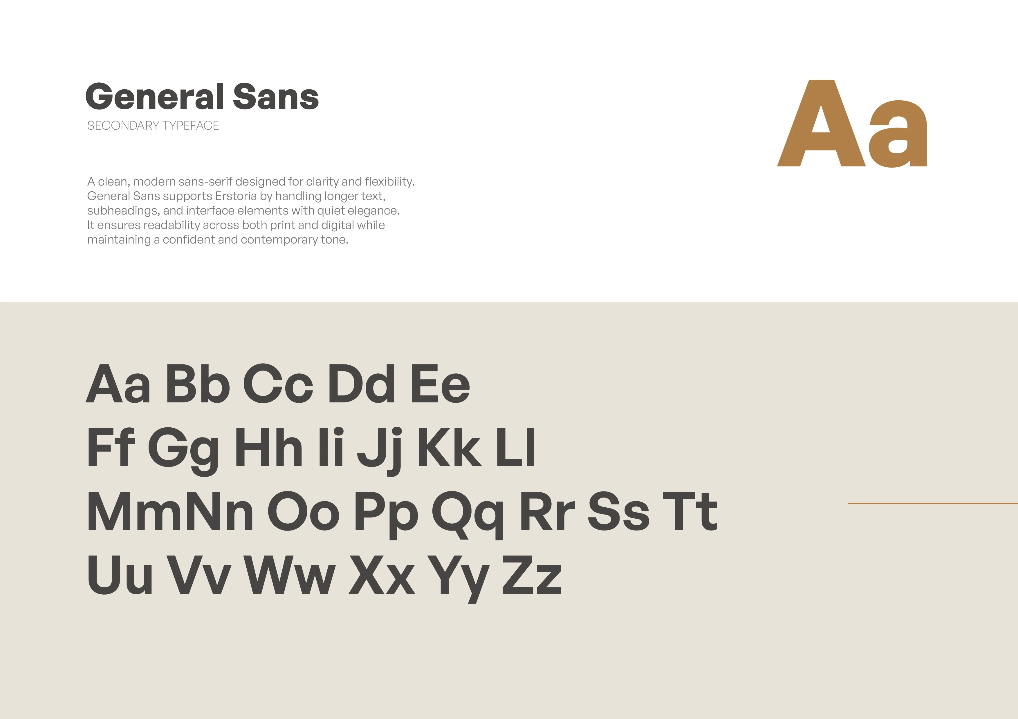
Full palette breakdown with HEX, RGB, and CMYK values for every use case.
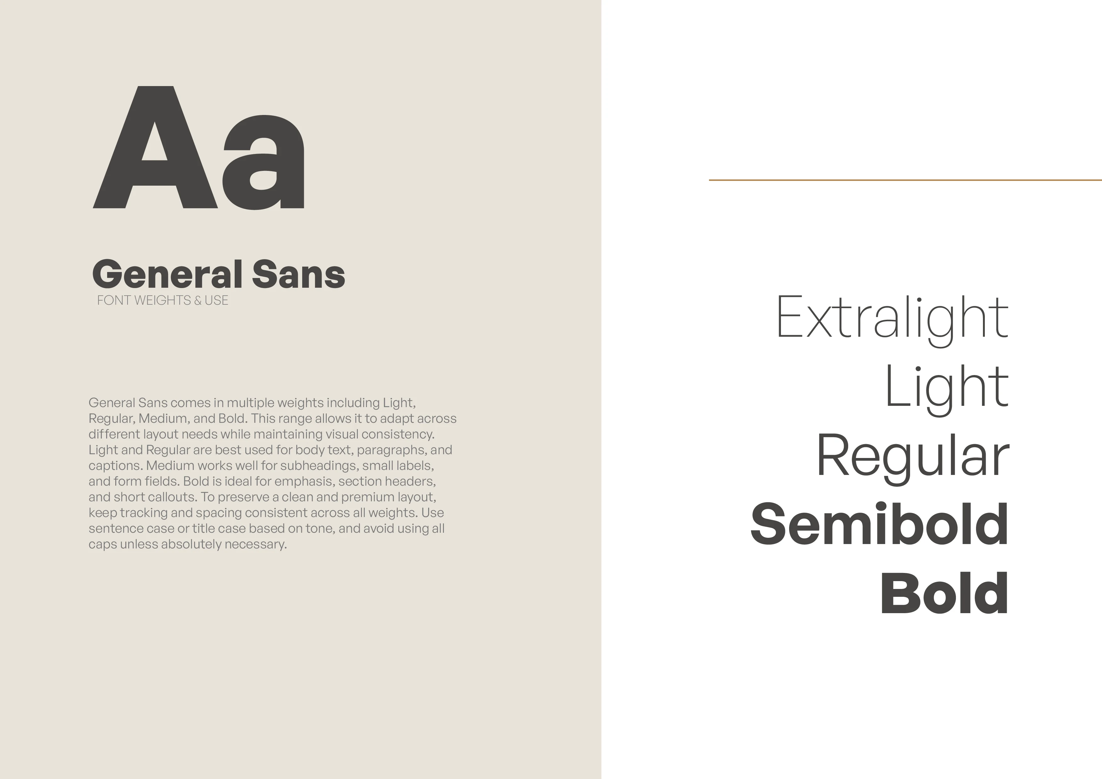
Font weights guide for consistency across interfaces, print, and motion.
Transitioning from brand theory to how the identity lives in the real world.
A brand only matters if it can live outside a pitch deck. This slide signals that we’re now looking at real-world use , what the identity looks like when it leaves the Figma file and meets the client or customer.
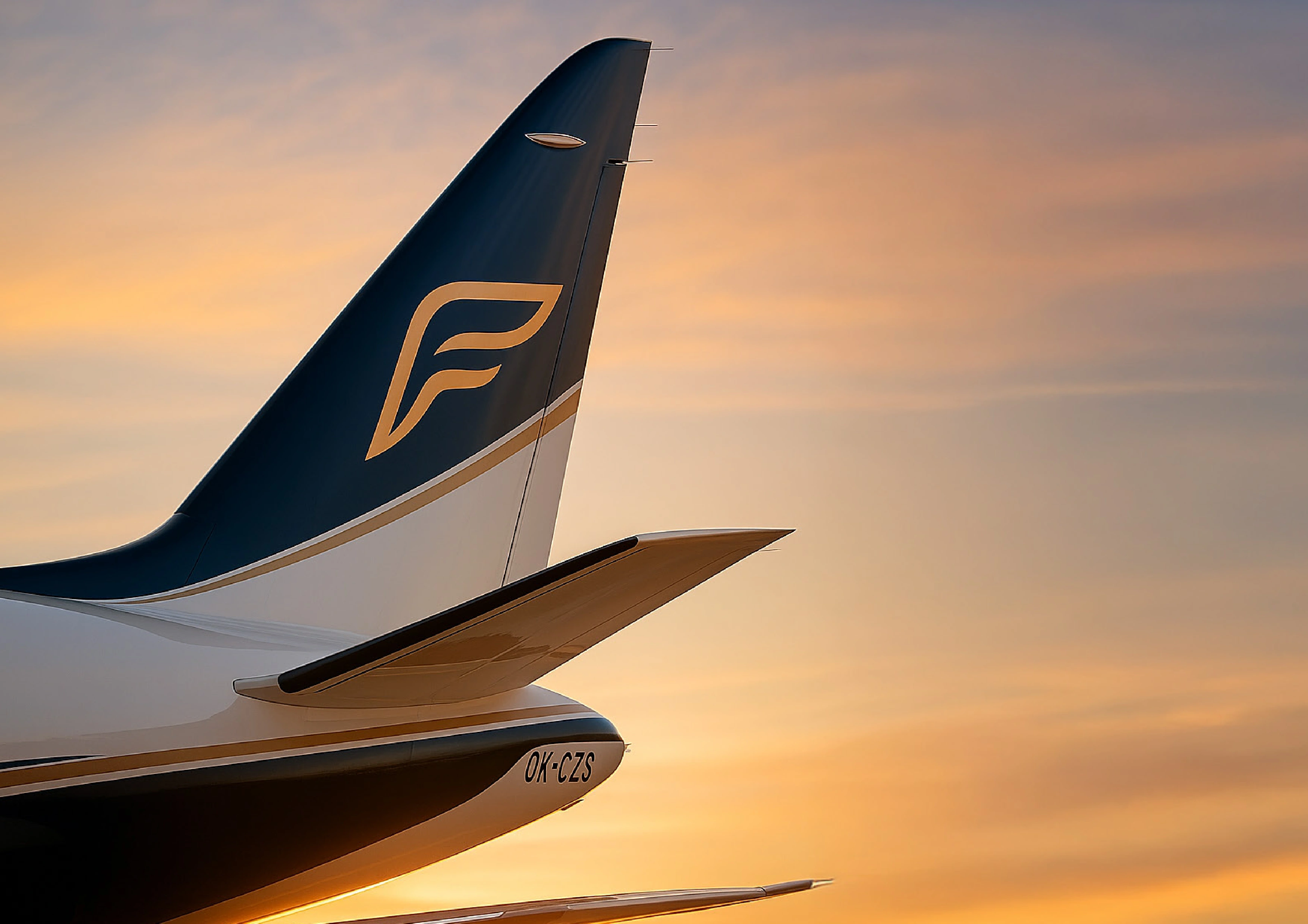
Primary icon applied on a jet tail. Built to feel premium and confident at scale.
Primary icon applied on a jet tail. Built to feel premium and confident at scale.
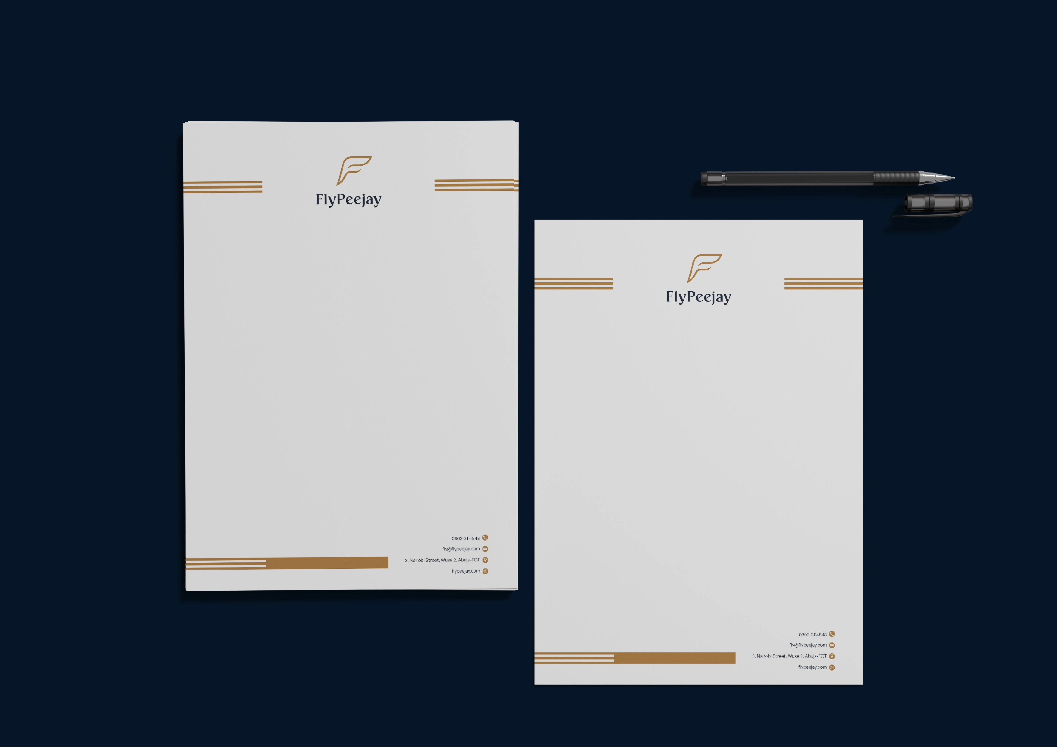
Primary icon applied on a jet tail. Built to feel premium and confident at scale.
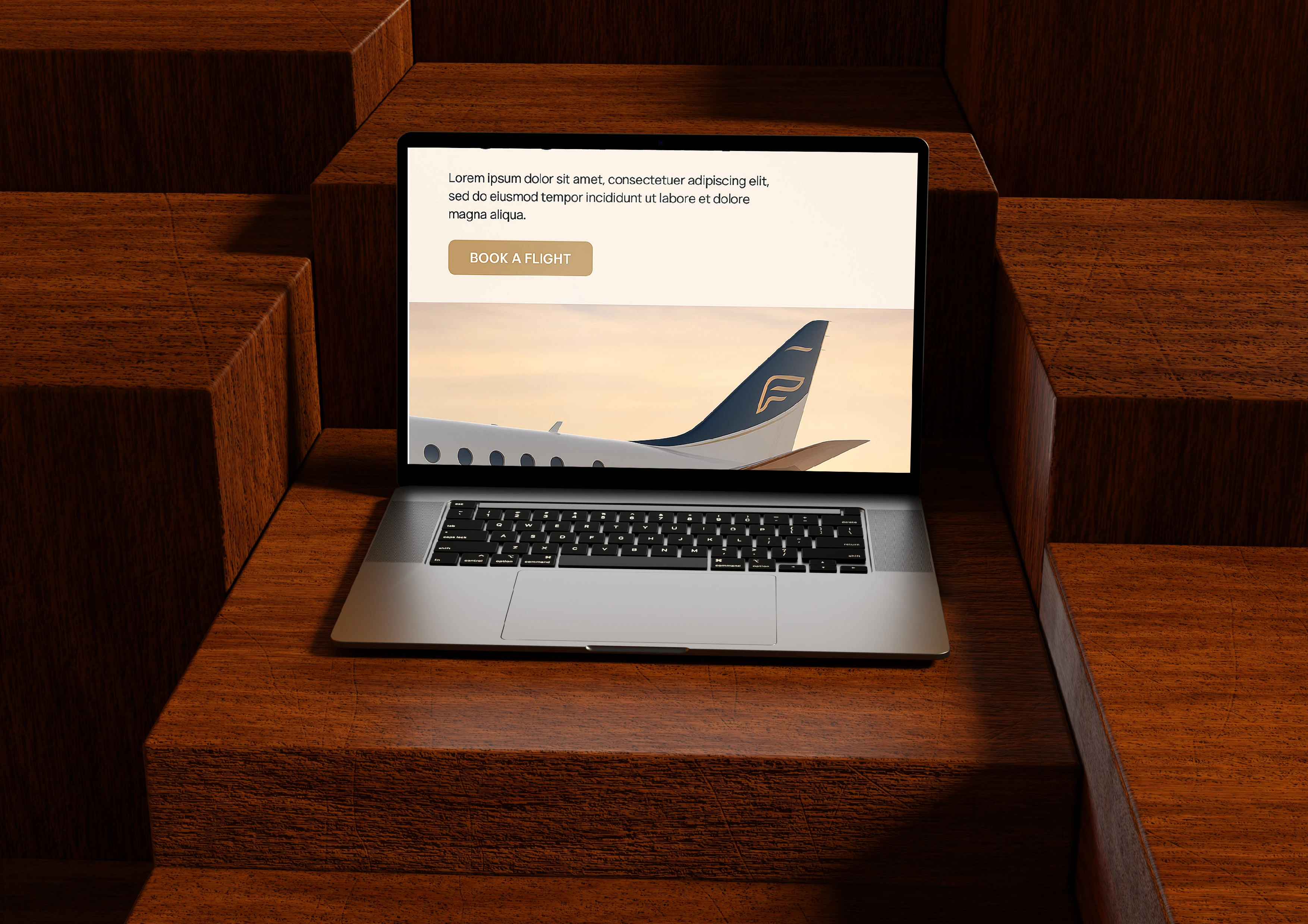
A preview of the brand applied in digital. Focused on clarity, luxury, and user action.
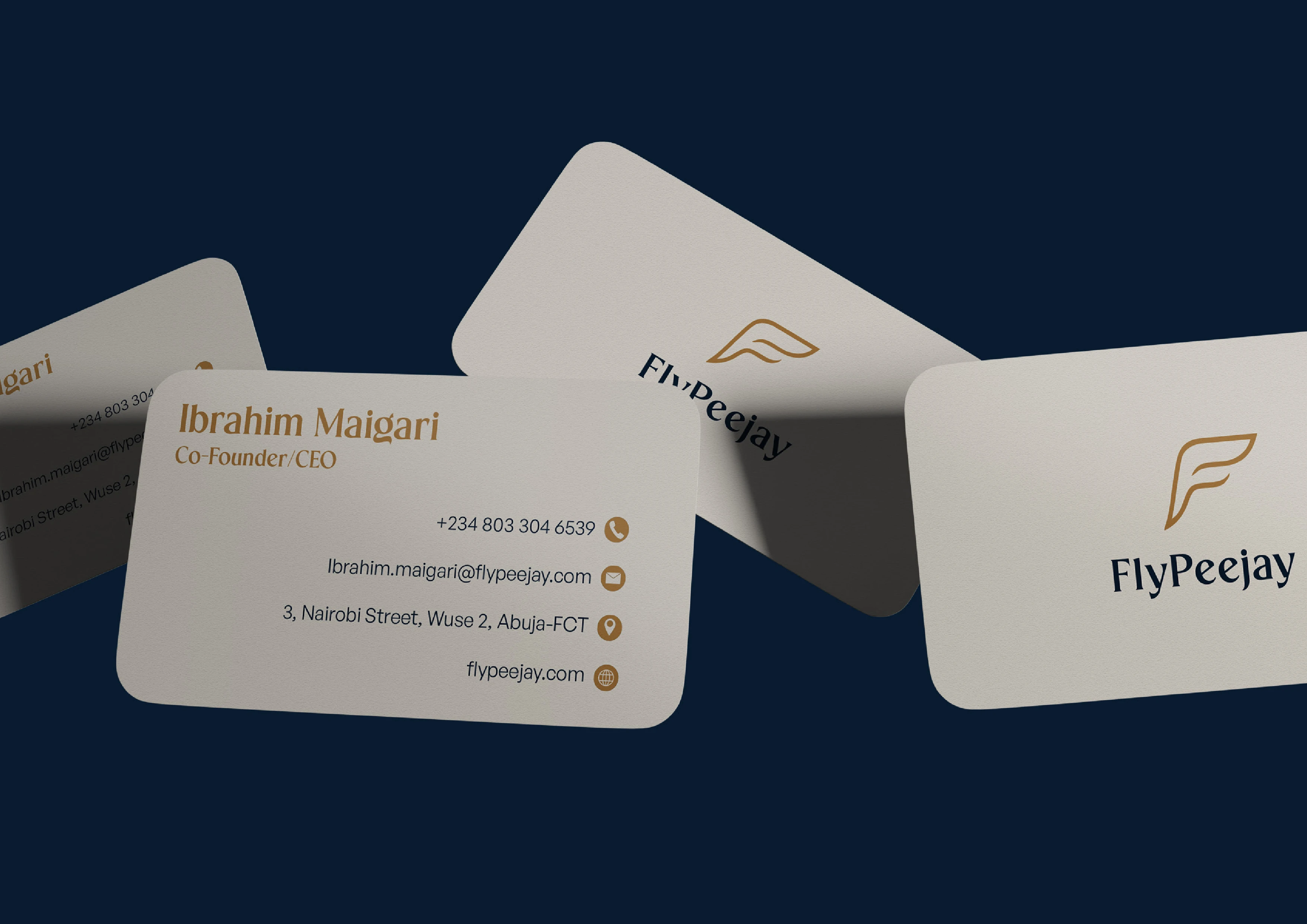
Closing panel with personal branding and contact details. Ties the identity to its creator.
Like this project
Posted Jun 19, 2025
Full brand identity design for a private jet platform. Logo, typography, color system, and real-world mockups crafted to feel modern, premium, and elevated.
