
Verified Framer Partner, Unicorn Club Top 1% Framer Creator


Verified Framer Partner, Unicorn Club Top 1% Framer Creator
Advertising(1)

Building Brand Systems That Evolve Across Every Touchpoint

Building Brand Systems That Evolve Across Every Touchpoint

Advertising(3)

Design Partner for Growing Startups
Perception Media — Media Kit Design
Designed to bring together the studio's work, capabilities, and reach into a cohesive presentation.
1
0
142
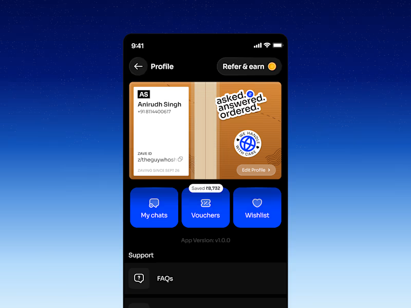
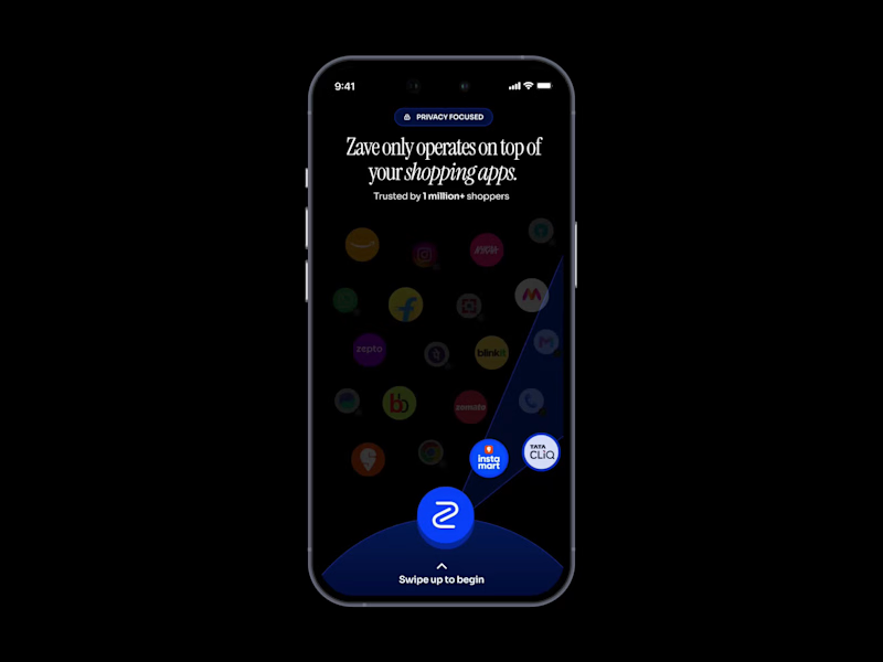
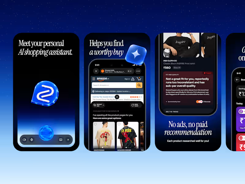
Zave — Profile Screen Design
For Zave, an AI-powered shopping app, I reimagined the traditional profile screen as a shipping box, complete with cardboard textures, packing tape, shipping labels, and tiny details that make the experience feel like unboxing a package.
0
83
Advertising(1)

UI/UX Designer for SaaS & Conversion-Focused Web Design
- 5.0
- Rating
- 15
- Followers
UI/UX Designer for SaaS & Conversion-Focused Web Design
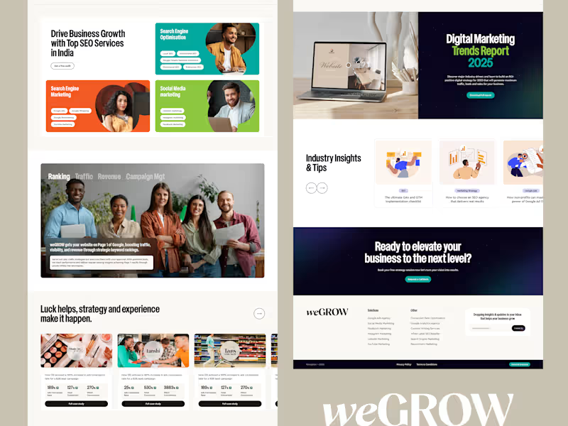
Besides services, case study results, and blog insights, what else drives maximum trust for you on an agency page?
0
90
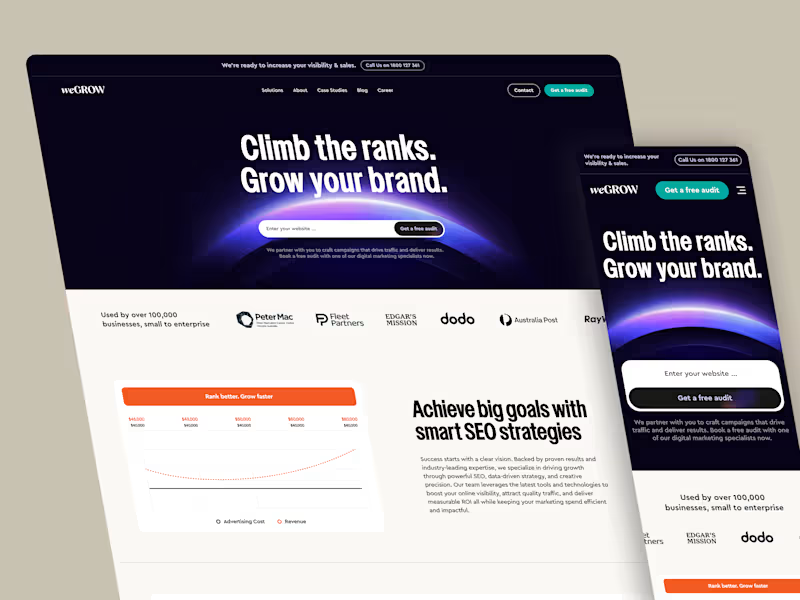
Question for designers & SaaS builders:
When landing pages mix dark-mode hero sections with light-mode content blocks:
1️⃣ Do you feel it creates a premium look?
2️⃣ Or do you prefer full dark / full light theme consistency throughout?
Drop your thoughts below! 👇
5
2
275
Advertising(2)

Branding, Social & AI Visuals That Scale

A calm, sun-lit narrative built around skin, light and intention.
We shaped this series to show how natural glow, close-up detail and quiet expression can elevate a beauty brand’s identity. Each frame leans into warmth and refined tonality, giving the brand a stronger emotional pull and a more premium, modern presence. It’s crafted to help beauty labels stand out with clarity and confidence across touchpoints.
If you’re looking to build visuals that feel elevated, consistent and ready for scale, we can support your next move.
Let’s build your next campaign.
hola.monkix@gmail.com
(mailto:hola.monkix@gmail.com)monkix.in
(http://monkix.in)Start your project🚀
3
238

Pet supplements that actually have a personality :brand campaign, product ads & editorial design for ZURI.
4
339

Crafted visuals that speak in quiet luxury.
We built this series to highlight texture, depth, and emotion through close-up storytelling. Each frame focuses on the kind of detail that elevates a brand’s presence and drives stronger visual equity across touchpoints.
If you want campaigns that feel refined, modern, and built to convert, we can help you get there.
Let’s create work that stands out.
hola.monkix@gmail.com
(mailto:hola.monkix@gmail.com)monkix.in
(http://monkix.in)Start your project now🚀
10
22
663

Advertising(1)

Product Designer from india
Product Designer from india
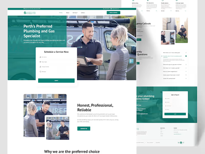
Sureflow — Plumbing & Gas Specialist Landing Page
Plumbing is an emergency-adjacent industry — half the people landing on this site have water actively going somewhere it shouldn't. So Sureflow's design had to do two things at once: feel calm and professional for someone comparing quotes, and get someone in a genuine emergency to the phone number in under five seconds.
The hero photo does a lot of the "professional" work on its own — two real people, a branded van, a tablet mid-conversation — while the "Schedule a Service Now" form sits as a clean white card cut directly into the teal hero, immediately actionable without needing a scroll. Google star ratings appear early too, right below the fold, four separate short reviews rather than one long testimonial, because for a trade business, volume of proof reads more convincing than a single polished quote.
The water-drop shape from the logo becomes a running visual motif — it wraps around team photos as a soft background shape, sits behind the "Contact us for upfront pricing" banner, reappears at the free-safety-check section — small thing, but it ties a fairly text-heavy, section-heavy page back to the brand every time the eye lands on a new block. The six-service grid (Safety Checks, Taps & Sink Installation, Hot Water & Gas Servicing, Appliance Installs) uses real on-the-job photos instead of icons, because a homeowner deciding whether to book wants to see the actual work, not an abstract pictogram.
Two small sections do real conversion work: a 3-step "Locate → Identify → Remove" breakdown that turns "we fix blocked drains" into something that sounds like an actual method, not a vague promise, and an "Emergency Callouts" block that's deliberately more urgent in tone — burst pipes, blocked toilets, gas leaks — set apart from the calmer sections around it.
Thanks for scrolling through this one 🙌
2
166
Advertising(1)

UI/UX Designer • Web & Mobile • Empathy-Driven Design
- 5.0
- Rating
- 1
- Followers
UI/UX Designer • Web & Mobile • Empathy-Driven Design

Advertising(1)

3D Environment Artist, Cinematics | Unreal Engine

Advertising(2)