
pro
Dwij Trivedi
Branding, Social & AI Visuals That Scale
Ready for work
Dwij is ready for their next project!
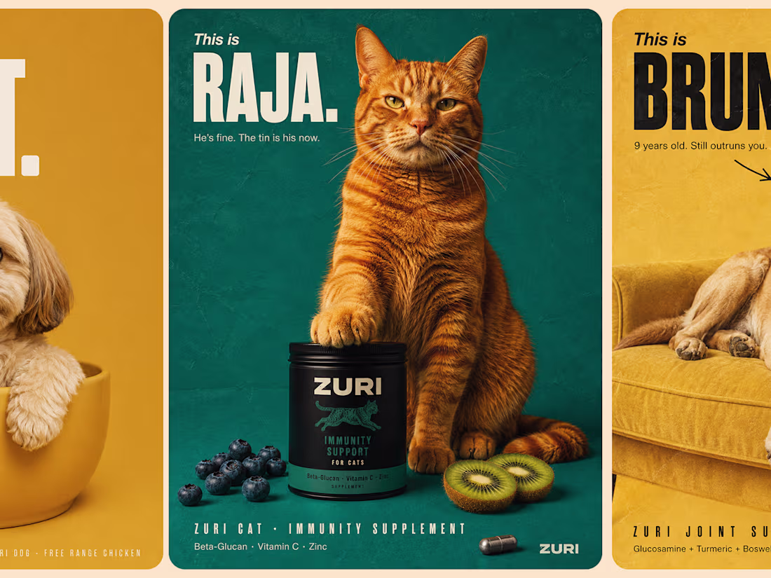
Pet supplements that actually have a personality :brand campaign, product ads & editorial design for ZURI.
3
147
Crafted visuals that speak in quiet luxury.
We built this series to highlight texture, depth, and emotion through close-up storytelling. Each frame focuses on the kind of detail that elevates a brand’s presence and drives stronger visual equity across touchpoints.
If you want campaigns that feel refined, modern, and built to convert, we can help you get there.
Let’s create work that stands out.
hola.monkix@gmail.com
(mailto:hola.monkix@gmail.com)monkix.in
(http://monkix.in)Start your project now🚀
10
22
474
BRGR Identity Development
1
9
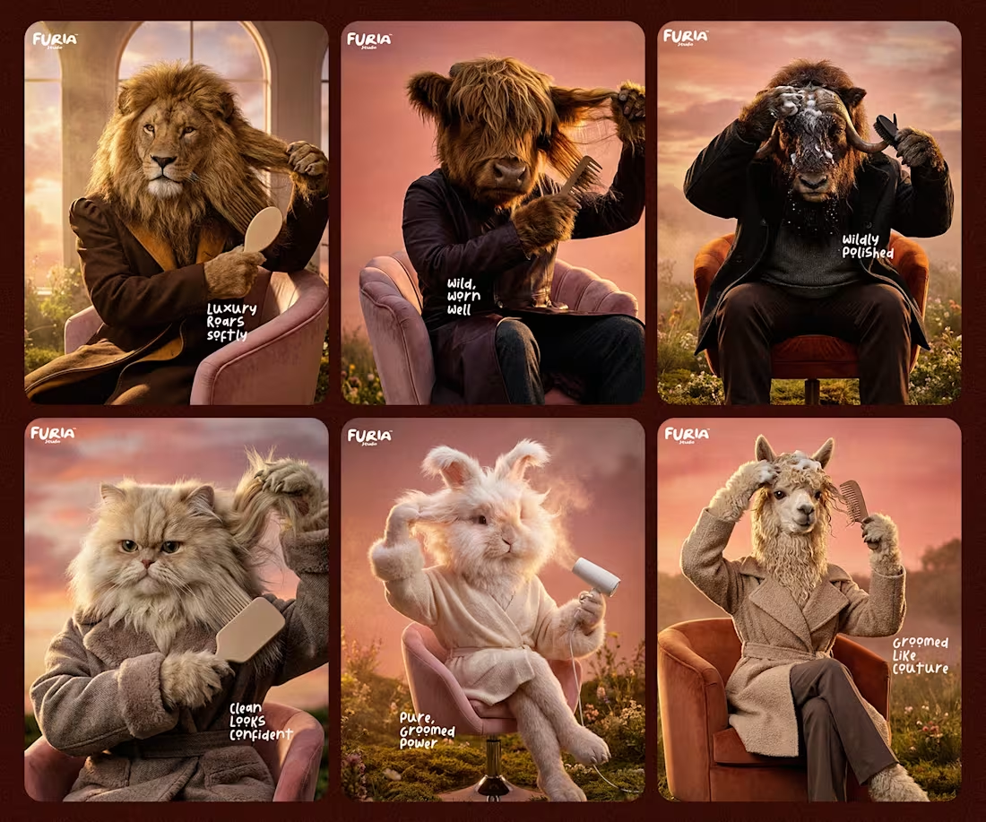
FURIA Studio – Premium Grooming Campaign Design
1
10
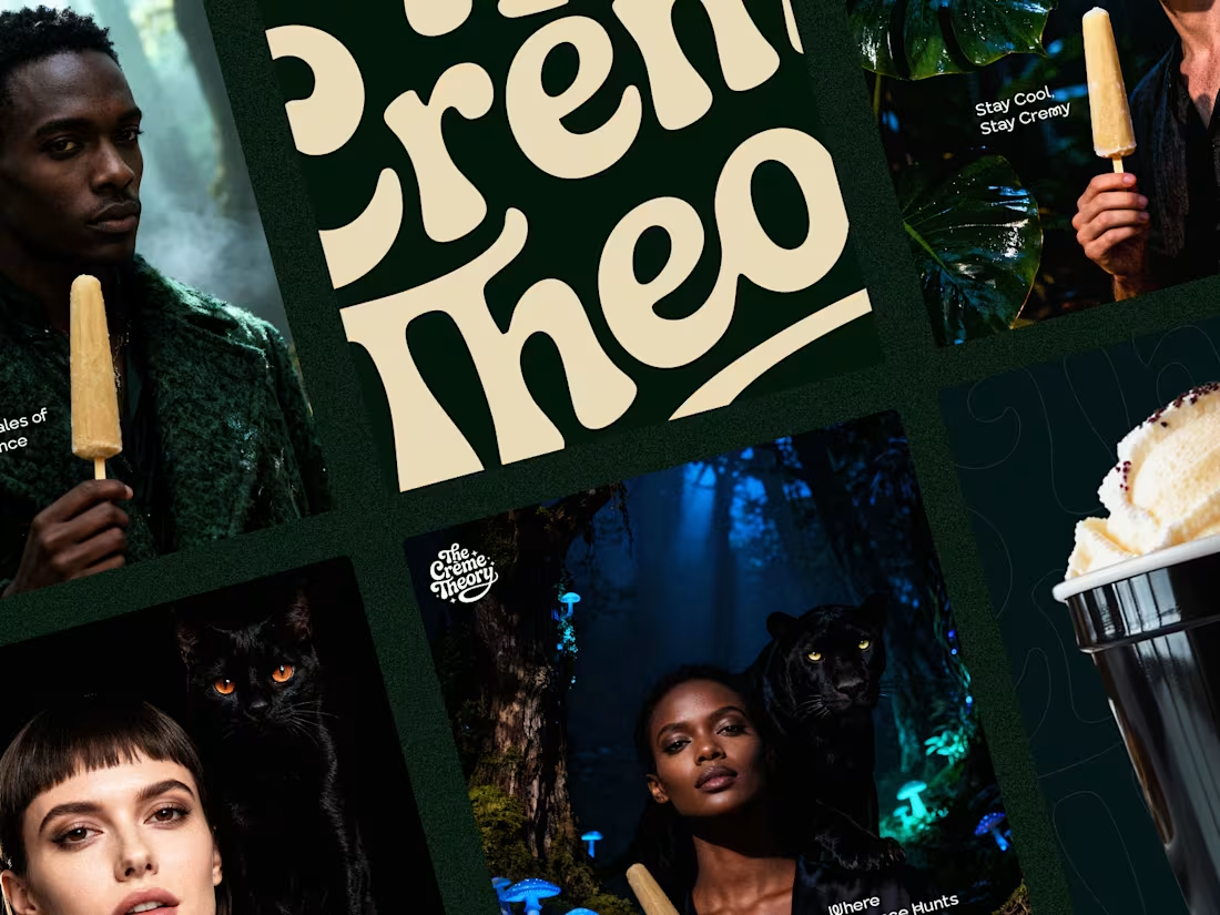
The Creme Theory is positioned as a modern luxury ice cream brand that blends indulgence with storytelling. The visual language draws inspiration from nature, elegance, and quiet confidence, creating a campaign that feels cinematic, refined, and emotionally rich.
Each composition places the product within bold, unexpected narratives lush forests, nocturnal settings, and striking companions transforming a simple indulgence into a statement of style and mood. The restrained color palette, dramatic lighting, and fashion-forward styling elevate the brand beyond traditional dessert advertising.
The result is a brand presence that feels premium, distinctive, and memorable, designed to connect with audiences who value aesthetics as much as taste.
3
348
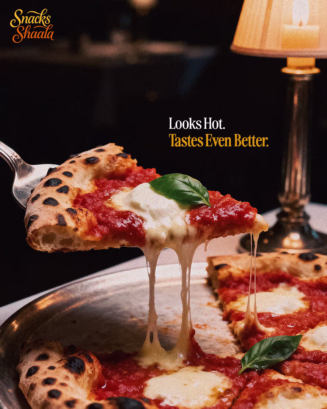
Social media strategy for Snack Shaala focused on AI-powered food photography, cinematic food visuals, and lifestyle food content designed to increase organic reach, drive engagement, improve conversions, and build consistent brand assets for paid social campaigns and digital marketing.
Services include AI food photography, cinematic food reels, lifestyle food shoots, social media content creation, brand-aligned visuals, performance-driven creatives, and scalable assets for Instagram ads, Facebook ads, and online promotions.
Get started: 📩 Hola.monkix@gmail.com (mailto:Hola.monkix@gmail.com) | 🌐 monkix.in (http://monkix.in)
1
3
295
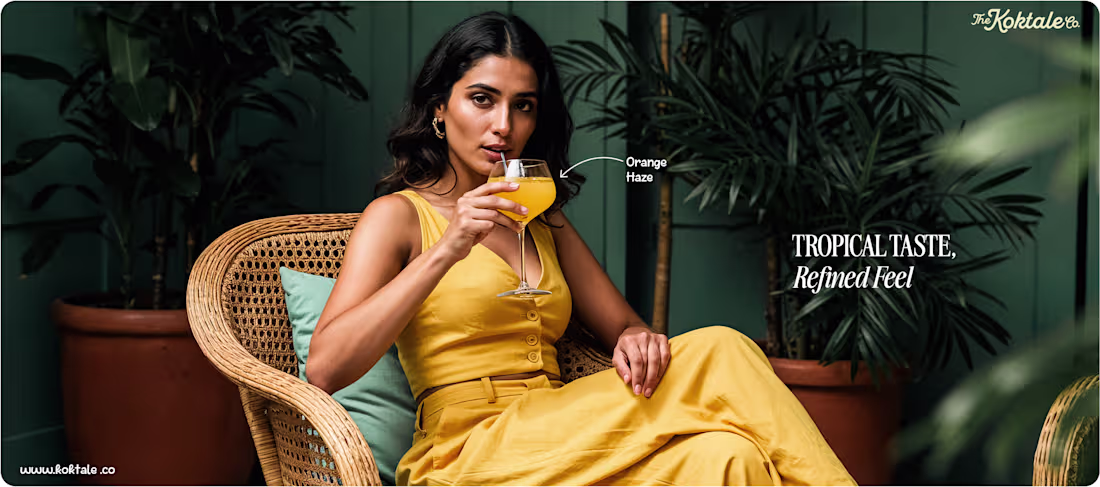
A slow-living visual story shaped around taste, mood and modern leisure.
We built this series to highlight how color, ambience and relaxed behaviour can elevate a beverage brand’s presence. Each frame blends tropical freshness with refined styling to deliver a calm, aspirational atmosphere. It’s designed to help lifestyle brands build stronger recall and a more polished identity across social and retail touchpoints.
If you’re aiming for visuals that feel premium, consistent and built for scale, we can support your next phase.
Let’s build your next campaign.
hola.monkix@gmail.com
(mailto:hola.monkix@gmail.com)monkix.in (http://monkix.in)
3
277
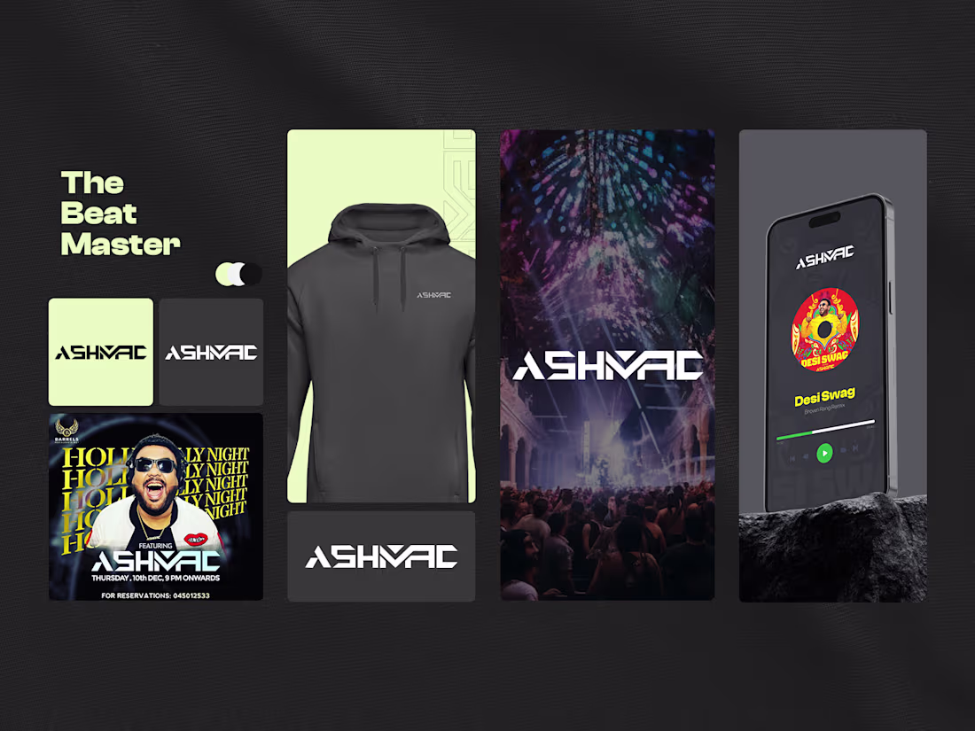
Ashmac’s brand identity is bold, energetic, and performance-driven. Strong typography, high-contrast visuals, and dynamic color choices reflect the intensity of live music and club culture.
The branding is built to work seamlessly across merchandise, digital platforms, and event promotions, creating a consistent and recognizable presence for an artist-led entertainment brand.
3
262
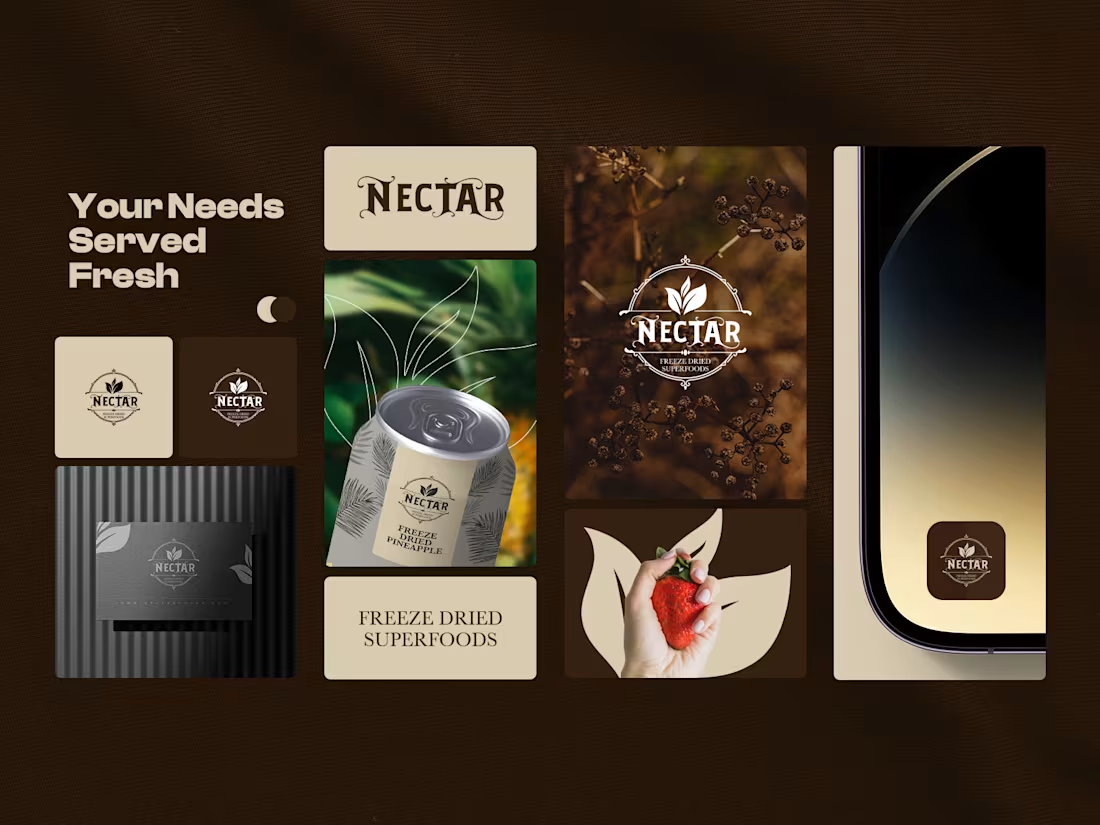
Nectar’s branding focuses on freshness, purity, and nature-driven nutrition. Earthy colors, organic textures, and botanical elements work together to communicate honesty and health without feeling clinical.
The identity is designed to stand out on shelves while reinforcing trust in natural, minimally processed superfoods. Every visual element supports a clean, premium, and wholesome brand presence.:
3
206
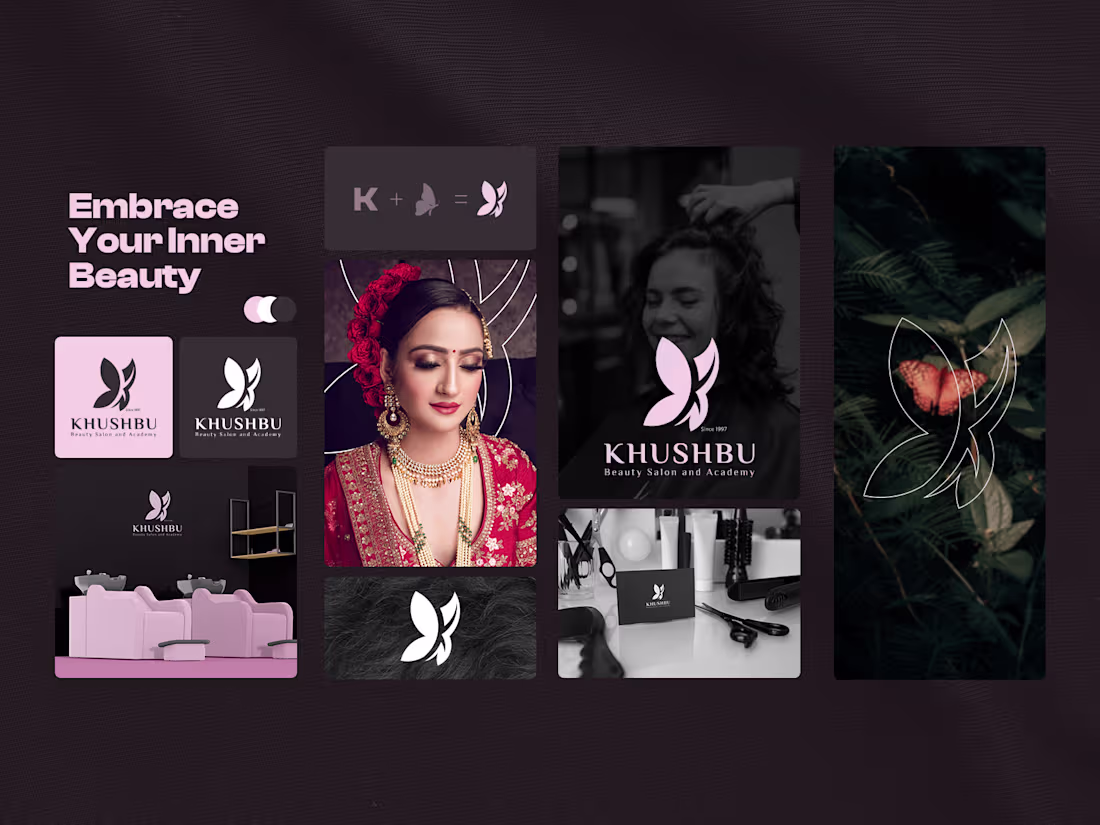
Khushbu’s brand identity is built around elegance, confidence, and self-expression. The visual system blends soft tones with refined typography to reflect a premium beauty experience rooted in trust and personal care.
The butterfly mark symbolizes transformation and inner beauty, while the overall aesthetic balances modern salon culture with timeless femininity, making the brand feel aspirational yet approachable.
3
178
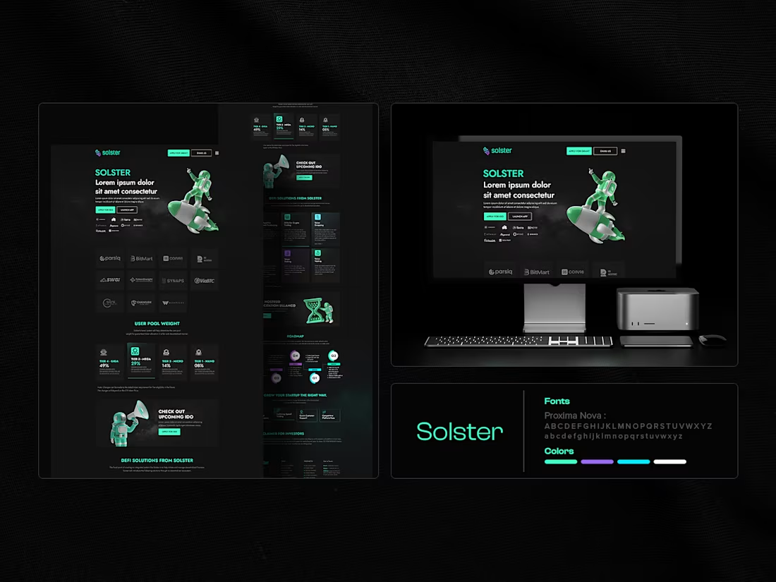
Solster’s website UI presents a bold, futuristic identity tailored for Web3 and tech-driven audiences. The design combines dark surfaces, vibrant accents, and clear call-to-actions to communicate innovation and momentum.
Complex product information is structured in a way that feels approachable and conversion-focused.
3
164
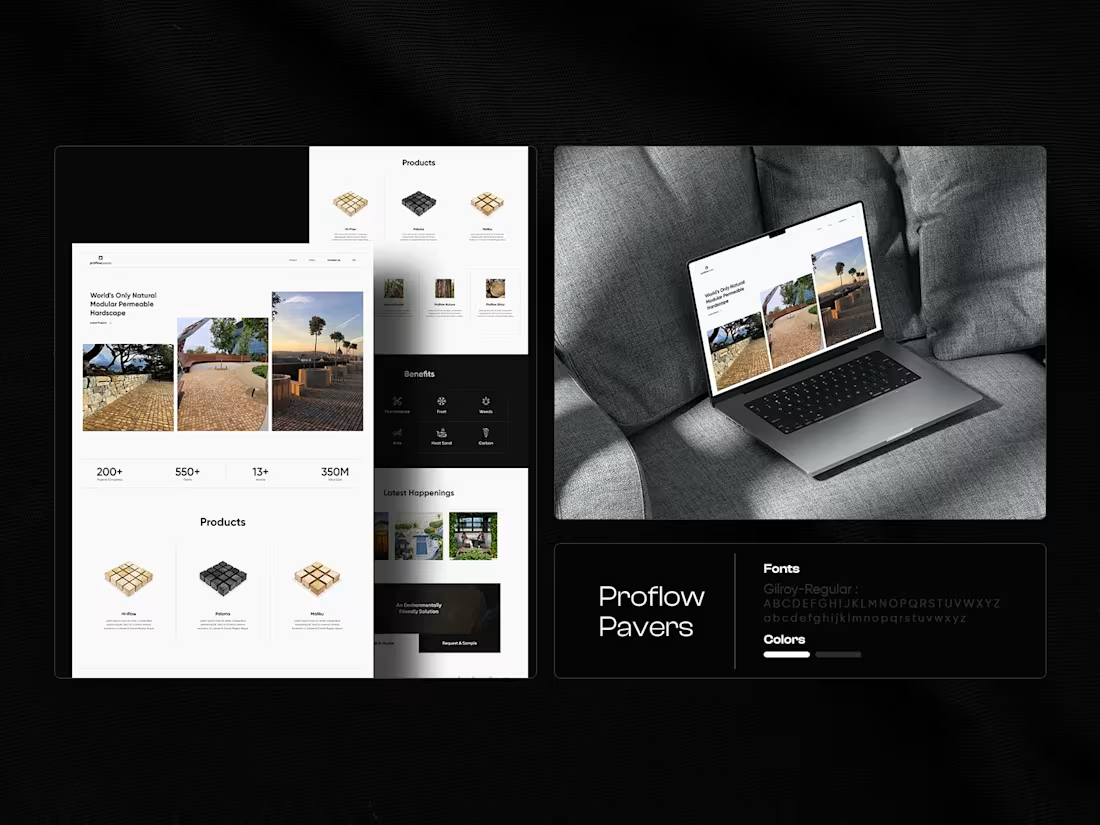
Proflow Pavers’ website UI highlights product quality, scale, and reliability through a clean, structured layout. The design emphasizes product categories, real-world applications, and benefits, making it easy for users to understand value at a glance.
The interface balances industrial strength with a refined, professional visual language.
3
155
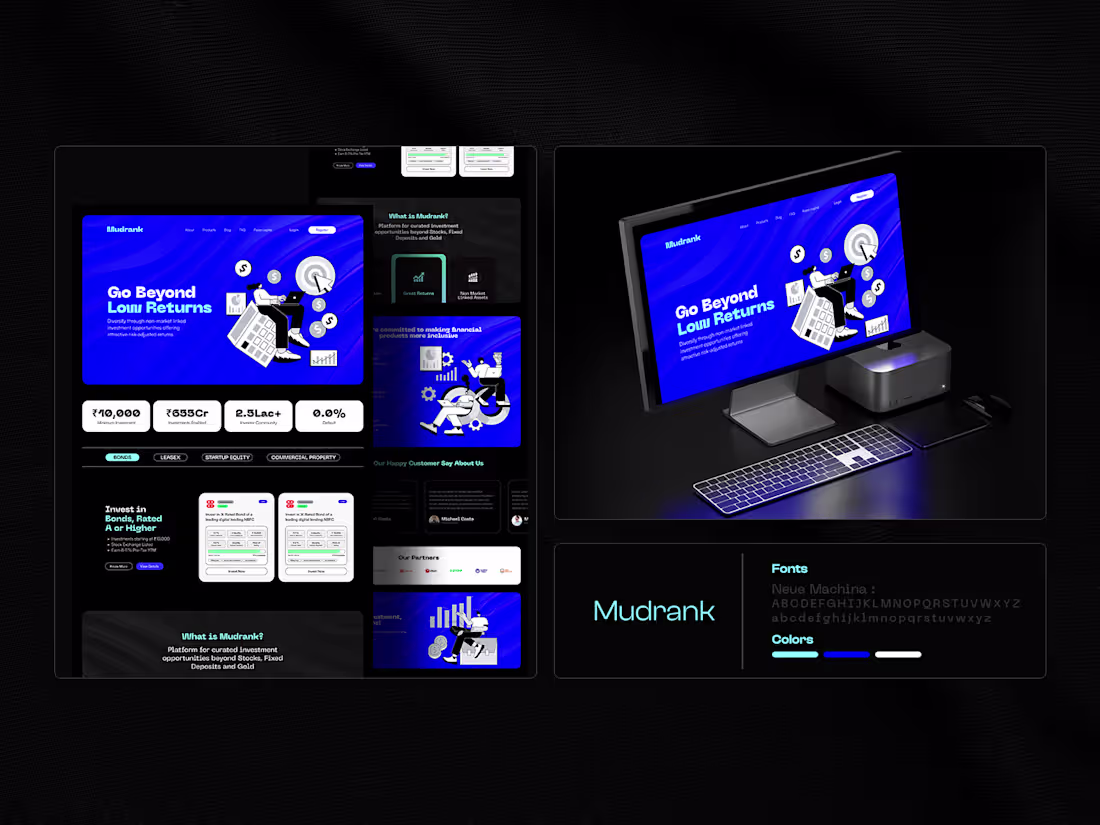
A modern fintech website UI design focused on clarity, trust, and data readability. The layout uses a dark interface to highlight key metrics, strong typography hierarchy, and clear visual grouping to guide users through complex financial information.
Designed for scalability across dashboards, landing pages, and product sections.
3
146
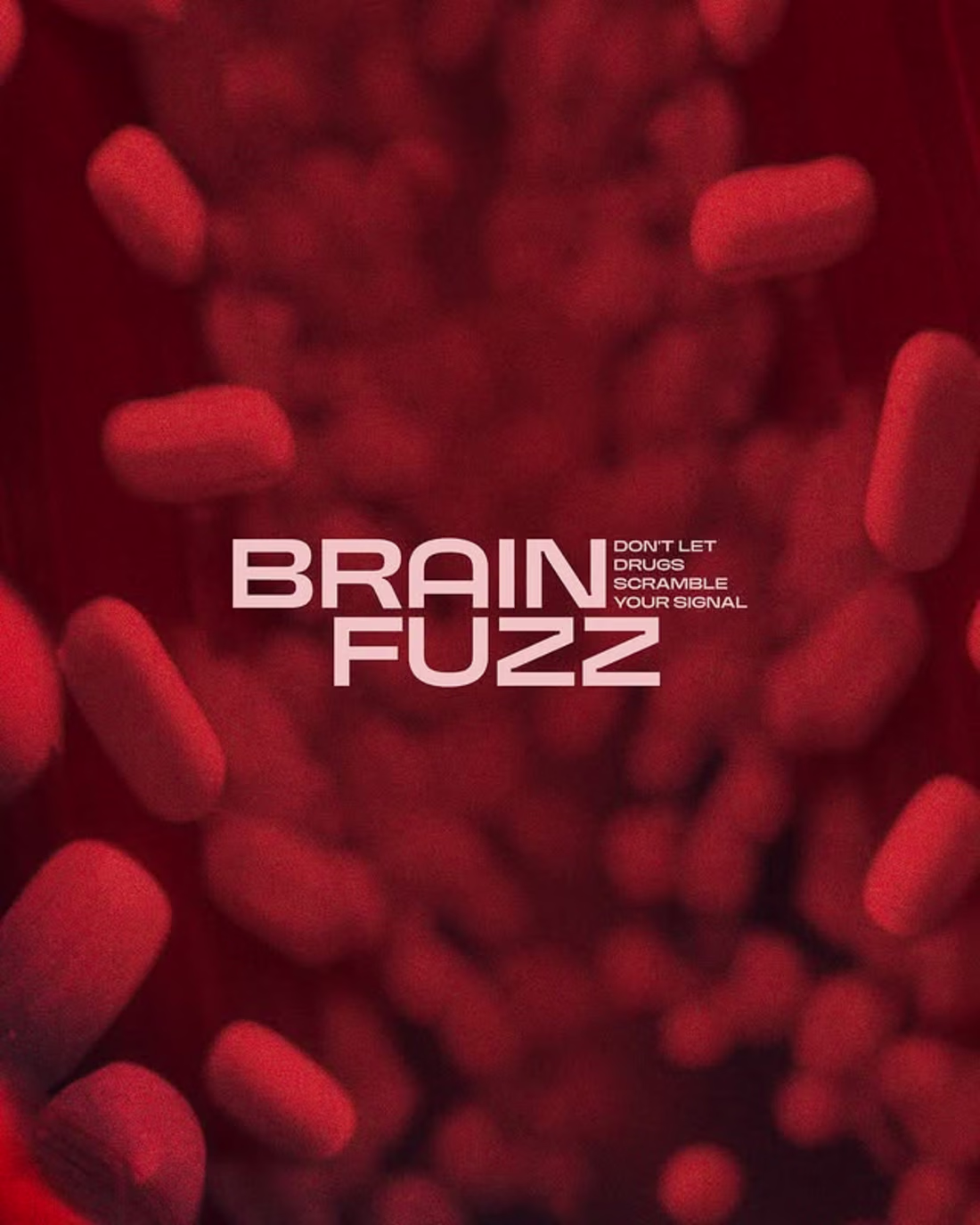
A high-impact visual concept built to cut through the noise.
We designed this series to show how tension, energy, and sharp storytelling can lift an awareness message into something that actually sticks. The framing, expressions, and motion cues all work together to reinforce the idea of a scrambled signal and the urgency behind it. It’s built to help campaigns hit harder and communicate with clarity.
If you want visuals that challenge, provoke, and deliver a stronger message across your channels, we can support that direction.
Let’s shape your next campaign.
hola.monkix@gmail.com
(mailto:hola.monkix@gmail.com)monkix.in
(http://monkix.in)Start your project🚀
4
159
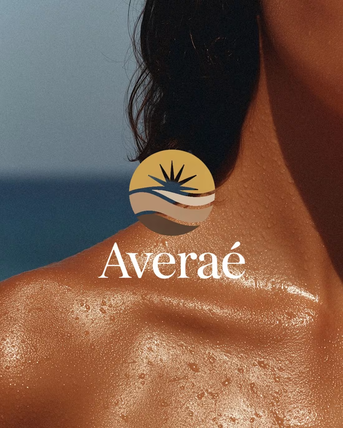
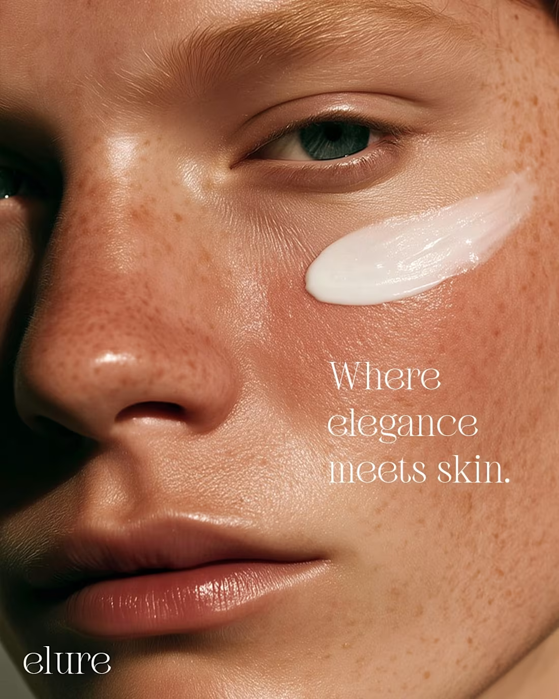
A calm, sun-lit narrative built around skin, light and intention.
We shaped this series to show how natural glow, close-up detail and quiet expression can elevate a beauty brand’s identity. Each frame leans into warmth and refined tonality, giving the brand a stronger emotional pull and a more premium, modern presence. It’s crafted to help beauty labels stand out with clarity and confidence across touchpoints.
If you’re looking to build visuals that feel elevated, consistent and ready for scale, we can support your next move.
Let’s build your next campaign.
hola.monkix@gmail.com
(mailto:hola.monkix@gmail.com)monkix.in
(http://monkix.in)Start your project🚀
3
159
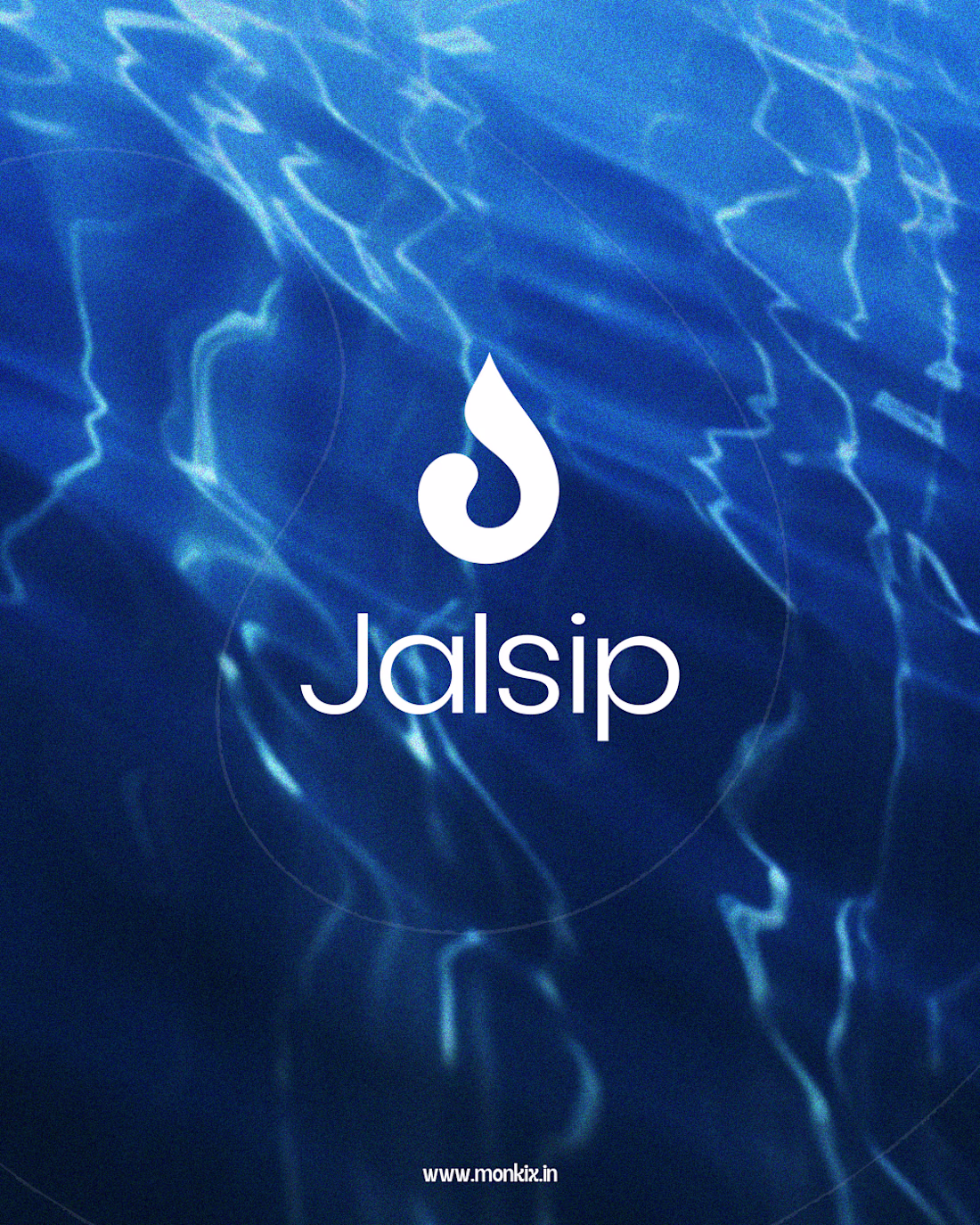
A bright, movement-first campaign shaped around purity, clarity and momentum.
We created this series to show how a water brand can lean into lifestyle energy without losing its sense of trust. The clean blues, dynamic framing and expressive moments all work together to build a clear visual identity. It’s designed to help Jalsip stand out as a fresh, purposeful brand built for everyday movement.
If you’re looking to scale your visual storytelling with work that feels modern, consistent and conversion-ready, we can help you drive that shift.
Let’s build your next campaign.
hola.monkix@gmail.com
(mailto:hola.monkix@gmail.com)monkix.in
(http://monkix.in)Start your project🚀
4
219
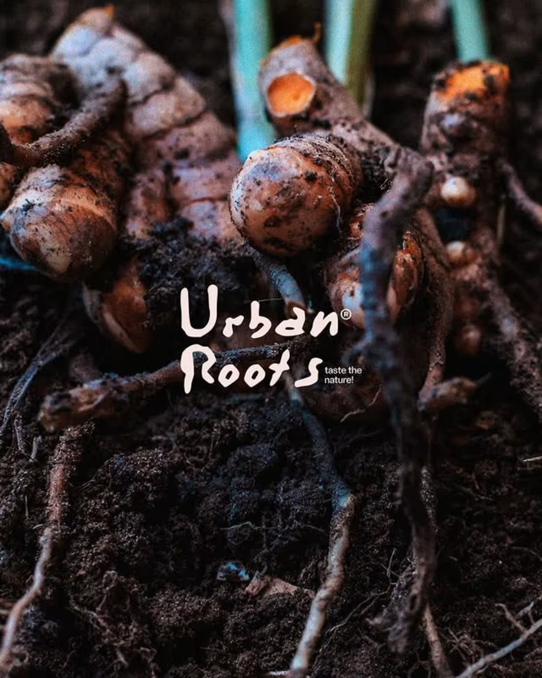
A grounded visual story built on raw texture and honest freshness.
We shaped this series to highlight the beauty of produce in its most natural state. Each frame leans into earthy detail and rich color, giving the brand a stronger sensory pull and a more authentic market presence. It’s a look built to help food brands stand out with real character, not polish.
If you want visuals that feel organic, intentional and built for stronger shelf and social impact, we can support your next move.
Let’s craft your next campaign.
hola.monkix@gmail.com
(mailto:hola.monkix@gmail.com)monkix.in
(http://monkix.in)Start your project🚀
3
147
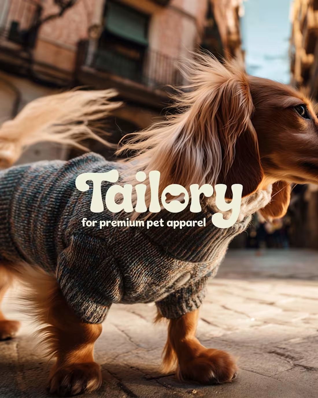
A clean, character-driven series built to boost brand recall.
We designed this set to show how personality, styling and product detail can work together to strengthen a premium pet-apparel identity. Each frame leans into warmth, texture and charm to give the brand a clear voice and a polished presence across channels.
If you’re looking to scale your visual storytelling and push your brand assets further, we can help you shape that momentum.
Let’s build your next campaign.
hola.monkix@gmail.com
(mailto:hola.monkix@gmail.com)monkix.in
(http://monkix.in)Start your project🚀
2
3
171