Built with Framer
Accoutrement Tours Luxury Travel Website

Hardikkumar Vinzava Top 1% Framer Creator
Verified


Accoutrement Tours Luxury Travel Website
Luxury culinary tours deserve a digital experience that feels just as considered as the journey itself.
Accoutrement Tours already had a strong visual direction in Figma, but the existing Framer implementation needed significant structural and responsive improvements before it was ready to launch.
I reviewed the complete project, rebuilt key sections using Framer best practices, corrected layout inconsistencies, improved SEO and accessibility, and polished the experience across desktop, tablet, and mobile.
Project Overview
Project Type: Framer Website Rebuild, Optimization & Development
Industry: Luxury Travel, Culinary Tourism, Hospitality
Role: UI/UX Designer, Framer Designer & Framer Developer
Platform: Framer
Live Website:
https://accoutrementtours.com.au/
At a Glance
Restructured the existing Framer project architecture
Rebuilt key sections with reusable components
Fixed desktop, tablet, and mobile responsiveness
Standardized spacing, sizing, containers, and max widths
Improved SEO metadata and page structure
Added missing accessibility and image alt-text details
Completed detailed QA and final launch refinements
Created a scalable foundation for future tours and content
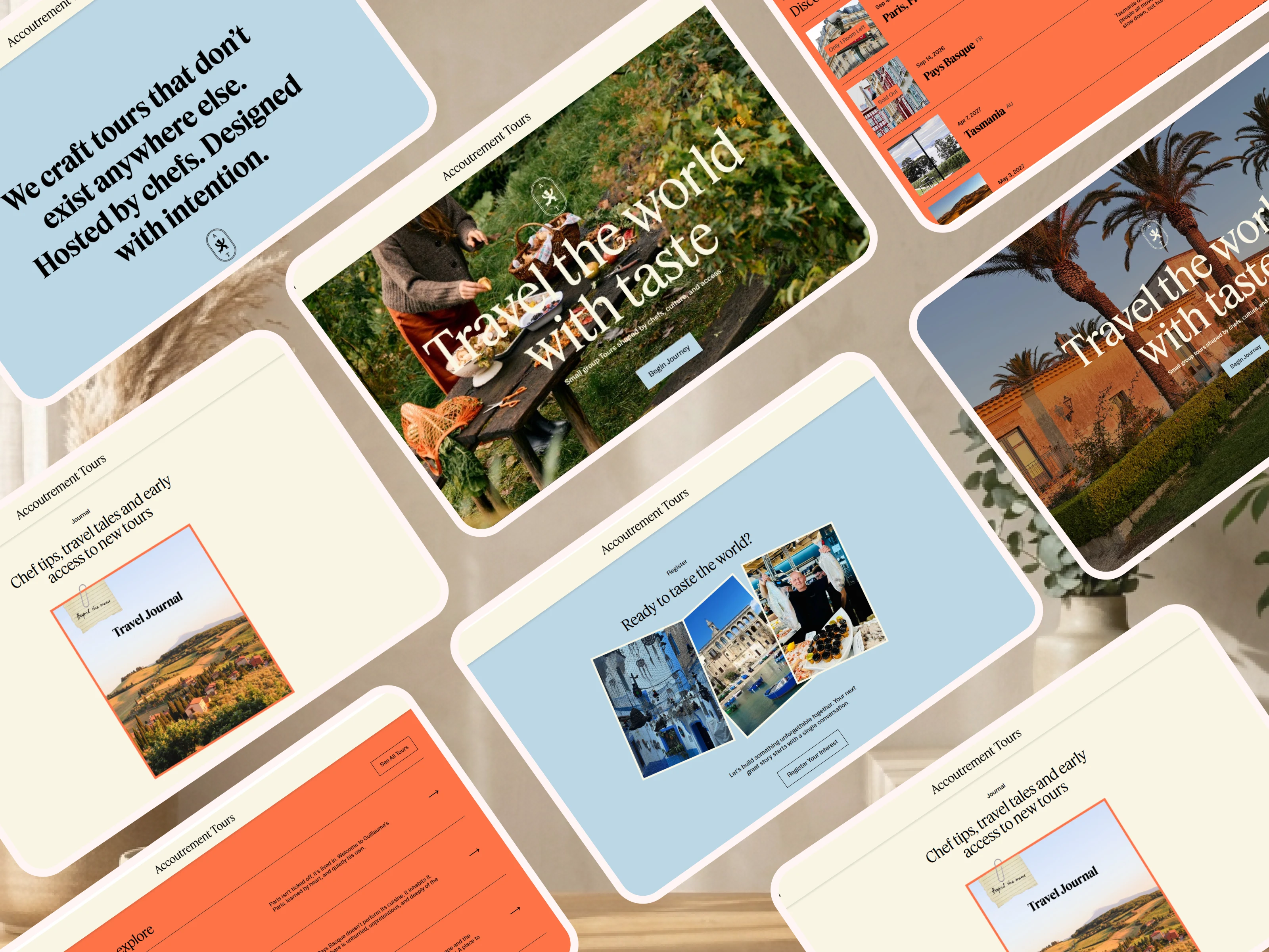
About Accoutrement Tours
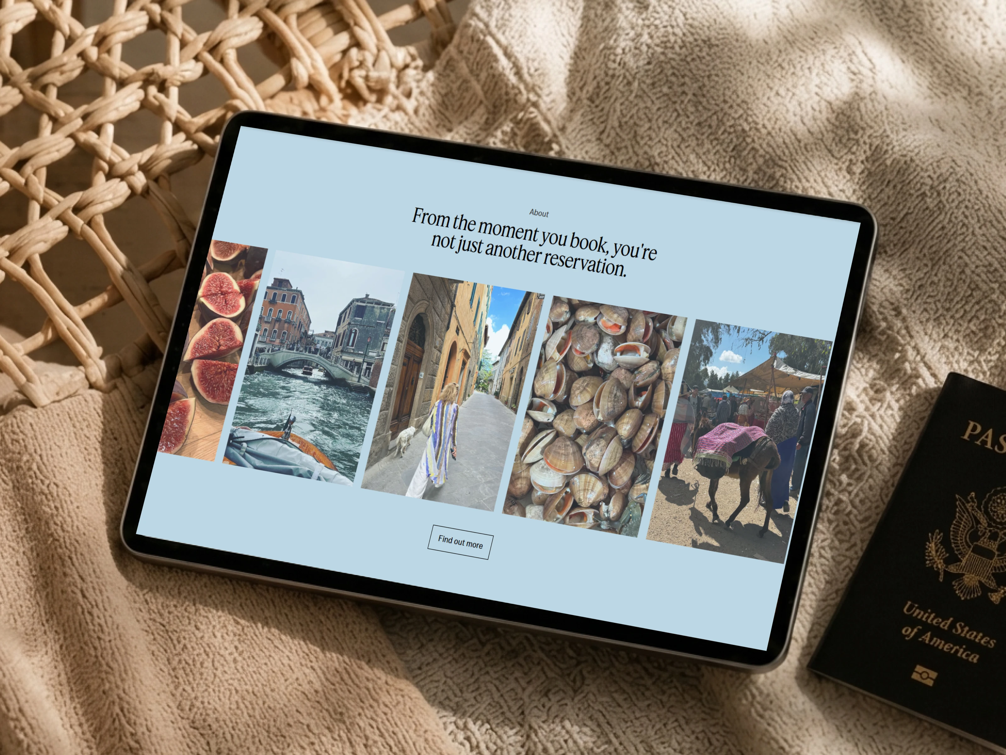
Accoutrement Tours creates intimate culinary journeys shaped by chefs, local culture, food, wine, and exclusive access.
The brand offers small-group travel experiences designed to go beyond traditional tourism. Guests explore destinations through private dining, regional produce, cultural encounters, expert hosts, and carefully curated itineraries.
The website needed to communicate this sense of access, hospitality, and discovery from the first interaction.
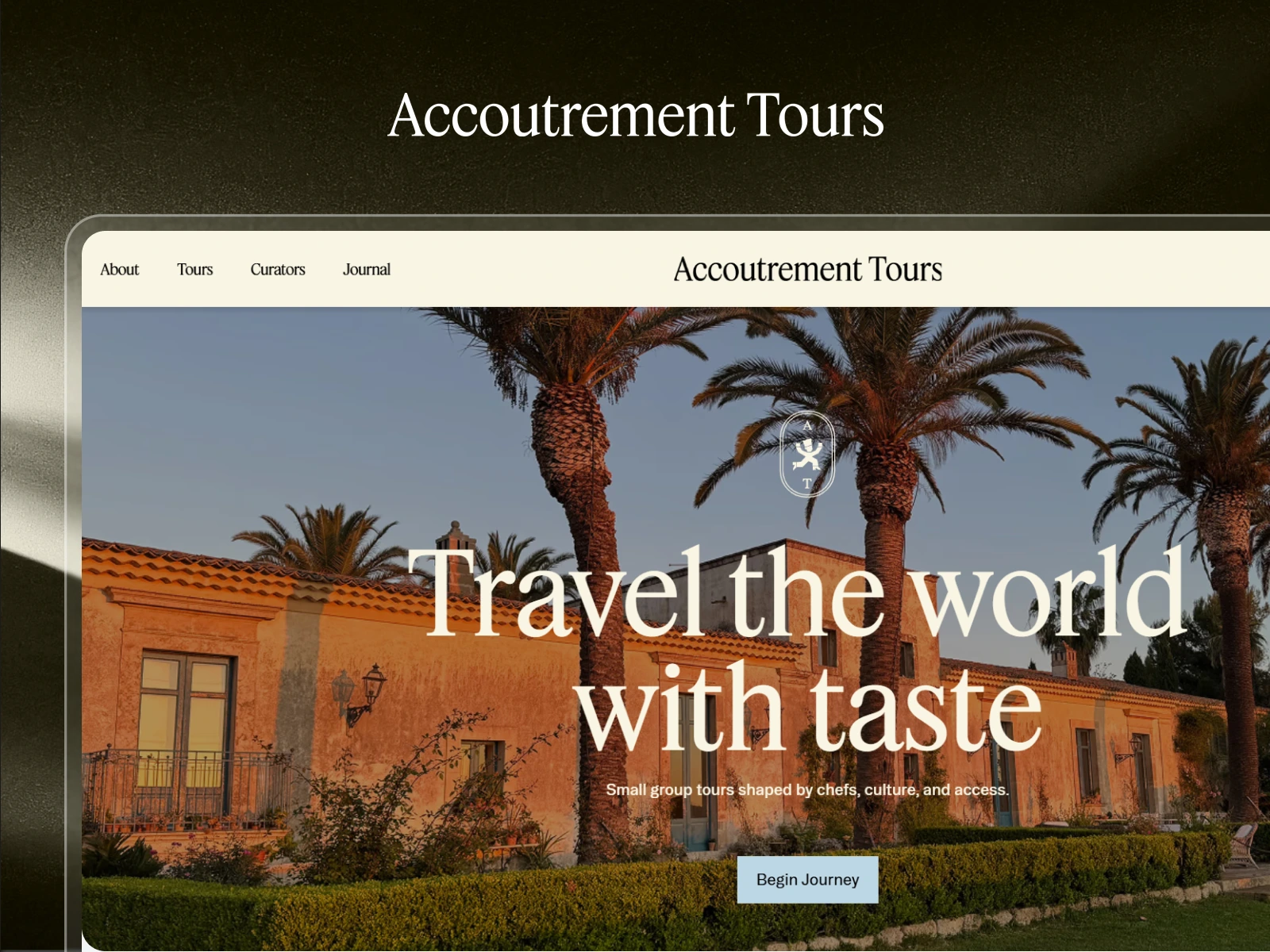
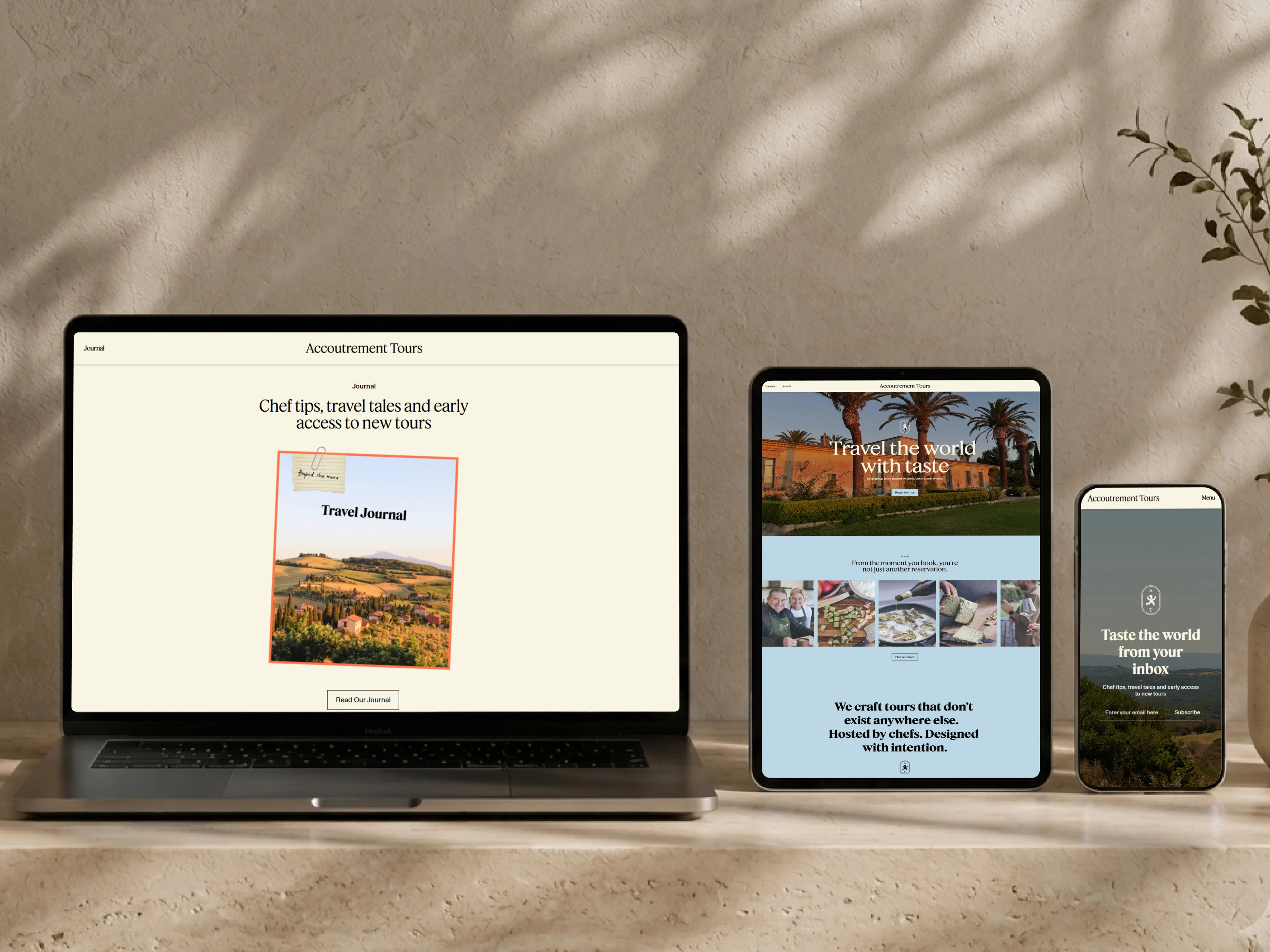
Its central message “Travel the world with taste” positions the experience around small-group tours shaped by chefs, culture, and access.
The Challenge
The website had a strong design concept, but its existing Framer structure was not ready for a reliable launch.
Layouts used inconsistent max widths, spacing rules, sizing settings, and responsive behaviour. Some sections worked visually at one screen size but became misaligned, oversized, compressed, or unpredictable at other breakpoints.
The project architecture also made future updates more difficult than necessary. Repeated elements were not always structured as reusable components, and several sections needed to be rebuilt rather than patched.
Beyond visual issues, the website required improvements to:
SEO titles and descriptions
Heading hierarchy
Image alt text
Accessibility settings
Responsive image behaviour
Component consistency
Cross-device presentation
For a premium travel brand, even small inconsistencies can reduce trust. The experience needed to feel intentional at every breakpoint.
Project Goals
The goal was not simply to fix individual layout issues.
The goal was to turn the existing Framer project into a polished, scalable, and delivery-ready website that could support the brand long after launch.
The key objectives were to:
Match the approved Figma direction more accurately
Improve the underlying Framer architecture
Build consistent and reusable components
Create smoother responsive behaviour
Strengthen the presentation of tours and destinations
Make booking actions easier to discover
Improve SEO and accessibility foundations
Simplify future website updates
Deliver a premium experience across every device
Scope of Work
Framer Project Audit
I reviewed the existing pages, layers, stacks, components, sizing rules, breakpoints, and content structure to identify the main implementation issues.
Architecture Restructuring
The project was reorganized to create a cleaner hierarchy and reduce unnecessary complexity. Key sections were rebuilt using more predictable Framer layout practices.
Component Rebuild
Repeated interface elements were converted into reusable components and variants wherever appropriate, improving consistency and making future edits easier.
Responsive Optimization
Desktop, tablet, and mobile layouts were reviewed individually rather than relying on automatic scaling.
This included refining:
Stack direction
Content wrapping
Fixed and fluid sizing
Image proportions
Section padding
Text widths
Grid behaviour
Component alignment
Breakpoint visibility
Navigation behaviour
Layout Standardization
Section containers and max widths were standardized to create a more consistent visual rhythm throughout the website.
SEO Improvements
Page titles, descriptions, heading structure, and other foundational metadata were reviewed and refined to improve search visibility and content clarity.
Accessibility Improvements
Missing image alt text and accessibility issues were addressed to create a more inclusive and search-friendly experience.
Final QA
The complete website was tested across common desktop, tablet, and mobile dimensions. Links, interactions, content, forms, responsive behaviour, spacing, and visual consistency were reviewed before delivery.
The Process
1. Audit Before Editing
Rather than fixing isolated issues one by one, I first evaluated how the full project had been built.
This revealed recurring problems in section widths, responsive rules, stack behaviour, and component structure. Solving the system behind those issues prevented the same problems from appearing elsewhere.
2. Compare Framer Against Figma
Each key section was compared against the approved Figma design.
The focus was not only visual accuracy. I also determined how each section should behave responsively and how it could be structured cleanly inside Framer.
3. Rebuild the Foundation
Sections that relied on fragile positioning or inconsistent sizing were rebuilt with cleaner stacks, constraints, containers, and reusable components.
This created a more stable foundation instead of adding temporary fixes to an already inconsistent structure.
4. Design Every Breakpoint Intentionally
Luxury editorial layouts often depend on large imagery, controlled spacing, and expressive typography. These elements need different treatment on smaller screens.
Tablet and mobile layouts were refined independently to preserve hierarchy, readability, and visual impact.
5. Improve SEO and Accessibility
SEO and accessibility were treated as part of the experience rather than final launch tasks.
Metadata, heading logic, image descriptions, and interactive elements were reviewed alongside the visual build.
6. Polish and Test
The final stage focused on details that influence perceived quality:
Consistent spacing
Clean image cropping
Text balance
Button alignment
Navigation behaviour
Section transitions
Mobile readability
Link and form validation
The Solution
The final website combines premium visual storytelling with a much stronger Framer foundation.
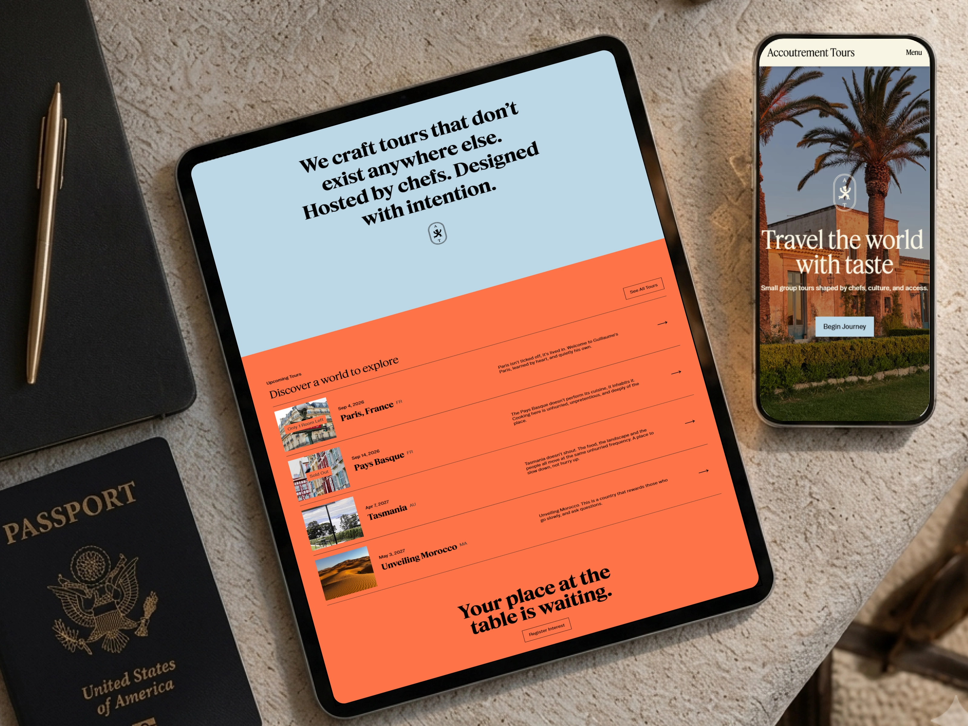
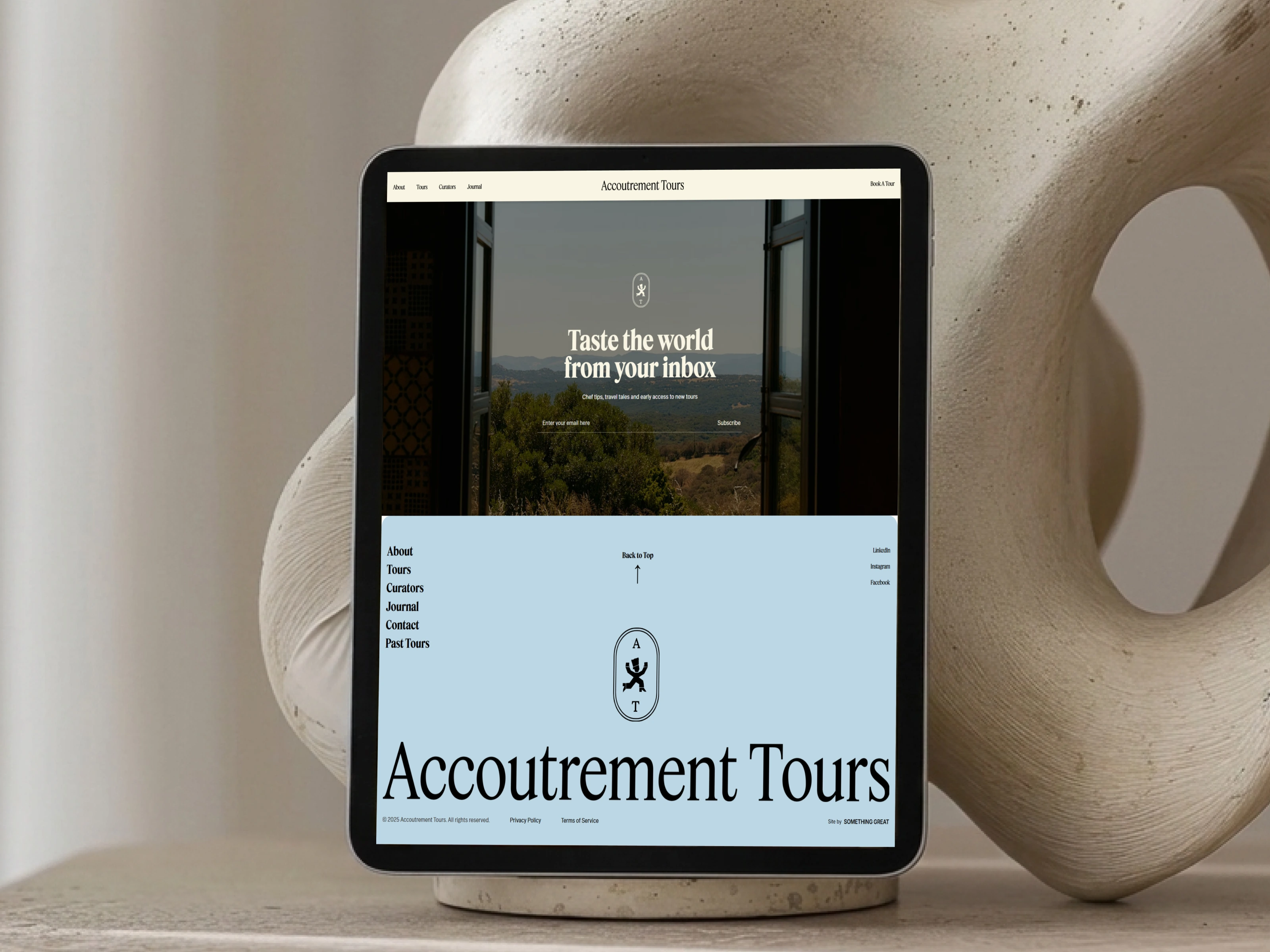
Large destination imagery establishes emotion, while clear content hierarchy helps visitors understand the experience, explore tours, discover curators, and move toward booking.
The live site now presents dedicated navigation for About, Tours, Curators, and Journal content, alongside prominent booking and journey-focused calls to action.
Behind the interface, the project is more organized, reusable, responsive, and easier to maintain.
Instead of relying on disconnected fixes, the rebuild introduced a consistent system for containers, sections, spacing, components, and breakpoint behaviour.
Key Features
Luxury editorial travel experience
Destination-led visual storytelling
Reusable Framer components and variants
Standardized page and section containers
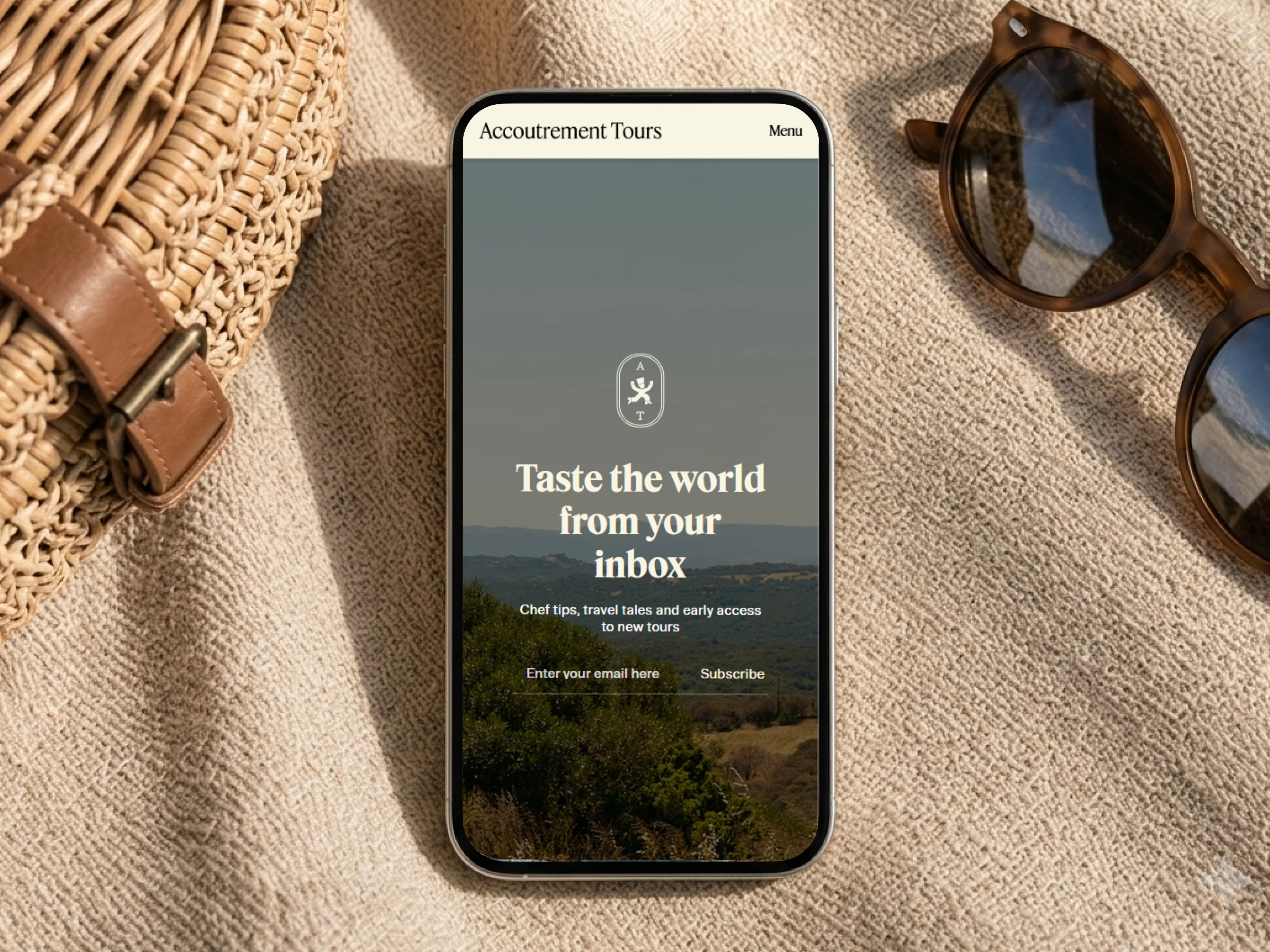
Responsive desktop, tablet, and mobile layouts
Tour exploration and booking pathways
Curator and chef-focused storytelling
Testimonials and trust-building content
Journal and editorial content structure
Search-friendly metadata
Accessibility-focused image descriptions
Scalable architecture for future tour launches
Fully editable no-code Framer setup
Conversion-Focused Improvements
A luxury travel website must build desire before asking visitors to take action.
The page flow was refined to move visitors through three key stages:
Inspiration
Immersive imagery and destination storytelling create emotional interest.
Trust
Curator expertise, small-group positioning, brand history, and guest experiences reinforce credibility.
Action
Clear booking and journey CTAs help visitors move from exploration to enquiry without interrupting the storytelling.
This balance keeps the website aspirational while still supporting business goals.
Deliverables
Restructured Framer project
Rebuilt responsive sections
Reusable component system
Figma-aligned website implementation
Standardized layout and container system
Desktop, tablet, and mobile optimization
SEO metadata improvements
Accessibility refinements
Image alt-text implementation
Link and interaction QA
Final project polish
Delivery-ready Framer website
The Results
The completed project provides Accoutrement Tours with a stronger digital foundation for presenting and growing its luxury travel experiences.
The rebuild delivered:
More consistent layouts across the website
Improved responsive behaviour
Cleaner and more maintainable Framer architecture
Stronger alignment with the approved Figma design
Better presentation of destination photography
Clearer paths toward tour discovery and booking
Improved SEO and accessibility foundations
Faster and easier future content updates
A polished experience ready for client delivery
The result is a website that feels considered, immersive, and premium—while remaining practical for the team managing it.
Content Management Efficiency
The improved Framer structure makes ongoing updates more manageable.
The team can update tour information, imagery, curator content, journal entries, testimonials, and calls to action without rebuilding the underlying page layouts.
Reusable components help keep design patterns consistent as the website grows, while standardized spacing and width rules reduce the risk of future visual inconsistencies.
Tech Stack
Figma
Framer
Framer Components
Component Variants
Responsive Stacks
Layout Constraints
Native Framer Forms
SEO Metadata
Accessibility Settings
Responsive Image Optimization
Lessons & Insights
Build the System, Not Just the Screen
Fixing individual sections without reviewing the broader architecture usually creates more inconsistencies. A complete audit made it possible to solve the underlying layout system.
Responsive Design Requires Intent
A desktop design cannot simply be compressed for mobile. Each breakpoint needs deliberate decisions around hierarchy, spacing, imagery, and content order.
Premium Design Lives in the Details
For luxury brands, trust is influenced by alignment, typography, spacing, imagery, and interaction quality. Small refinements have a significant impact on perceived value.
Reusable Components Protect Consistency
A clear component system makes the website easier to maintain and prevents repeated sections from drifting visually over time.
SEO and Accessibility Strengthen the Experience
Metadata, semantic hierarchy, and descriptive alt text improve more than compliance. They create a more discoverable, inclusive, and professionally built website.
Final Outcome
Accoutrement Tours now has a polished Framer website that reflects the quality of its culinary journeys.
The experience combines immersive travel storytelling, strong brand presentation, intuitive booking pathways, and a scalable technical foundation—ready to support future destinations, tours, and editorial content.
Like this project
What the client had to say
Great experience working with Hardik. He is diligent, hardworking and easy to deal with. Highly recommend


James Hill, Something Great
May 12, 2026, Client
Posted Jul 14, 2026
Rebuilt Accoutrement Tours in Framer with scalable components, responsive layouts, stronger SEO, accessibility, and a polished luxury travel experience.
Likes
1
Views
29
Timeline
Apr 22, 2026 - May 12, 2026
Clients
Something Great