The network for creativity
Join 1.25M professional creatives like you
Connect with clients, get discovered, and run your business 100% commission-free
Creatives on Contra have earned over $150M and we are just getting started
Back to feedPost
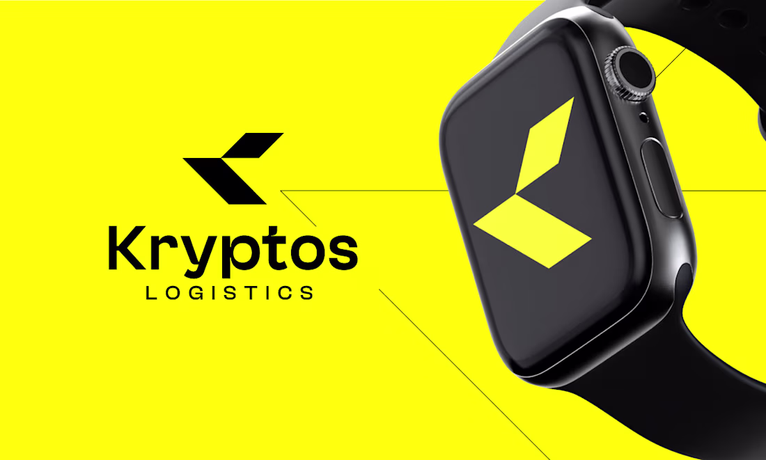
Some brands whisper. Kryptos was built to roar.
In an industry flooded with generic truck icons and forgettable wordmarks, Kryptos Logistics needed something that hit differently. A mark that didn't just represent a company — it represented a promise. Fast. Precise. Unstoppable.
The Challenge:
How do you make logistics feel exciting? You strip it down to pure energy.
The Solution:
Two razor-sharp geometric forms locked together into a "K" that looks like it's cutting through air. No curves. No softness. Just angular confidence moving in one direction — forward. Paired with electric yellow on black, the identity doesn't ask for attention. It demands it.
The Secret:
The icon stands completely alone. Cover the wordmark — the mark still tells the whole story. That's not just good design. That's brand architecture.
The Feeling:
Your shipment is already there before it leaves.
The network for creativity
Join 1.25M professional creatives like you
Connect with clients, get discovered, and run your business 100% commission-free
Creatives on Contra have earned over $150M and we are just getting started
Related posts
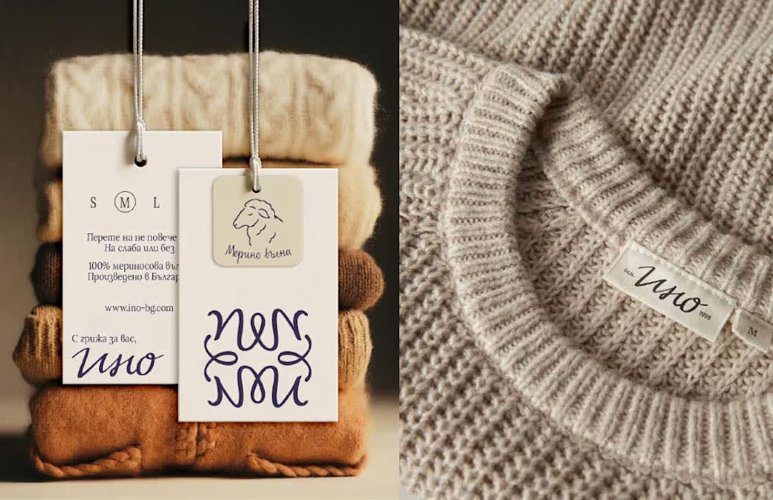
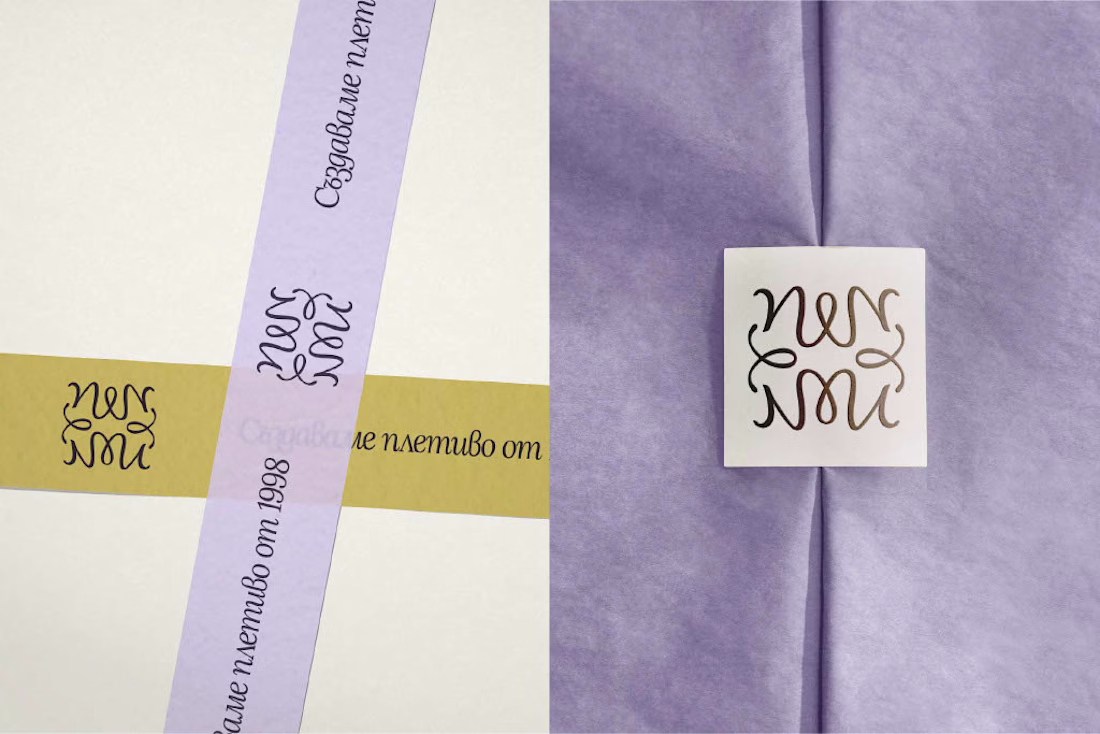
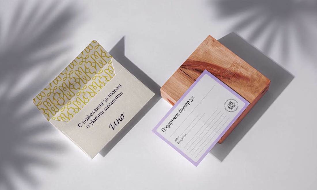
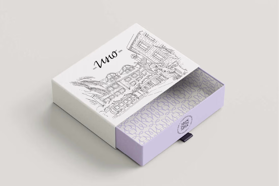
Ino is a Bulgarian family knitwear brand with 25+ years of craft behind it - but its old identity no longer reflected the warmth, quality and heritage at the heart of the brand.
For the redesign, I built the concept around family heritage and personal signature - creating a visual system that feels refined, human and timeless, while giving Ino a more recognizable presence across packaging, social media and brand touchpoints.
Good one here
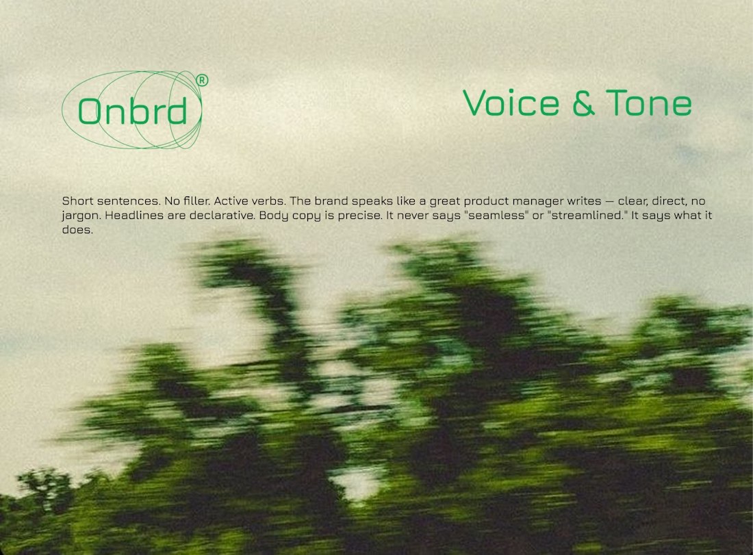
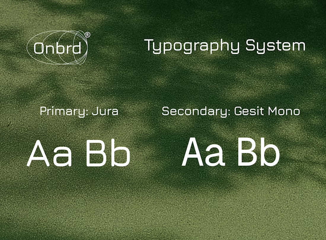
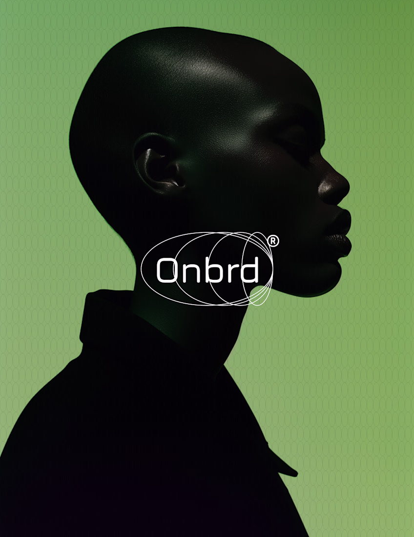
Remote onboarding was being treated like a checklist problem. The real problem was that new hires had no sense of arrival — no moment where the company said: you're here, and here's what that means. Onbrd needed to be the brand that changed that.
Nice! I love the energy the logo has
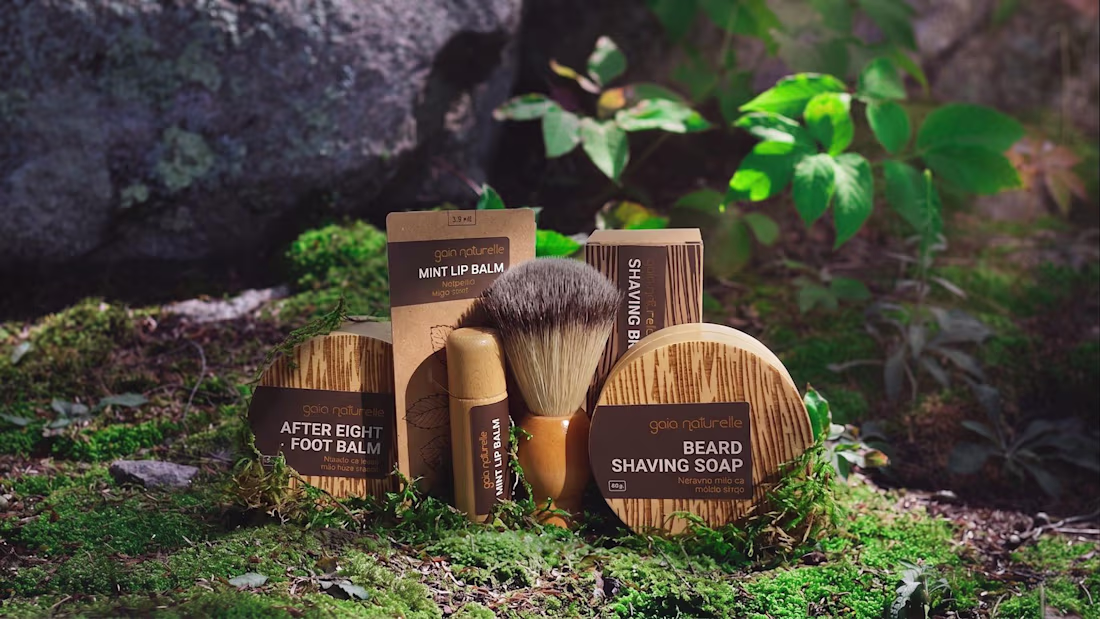
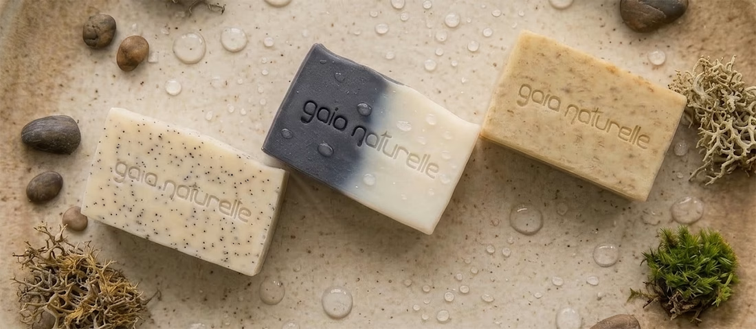
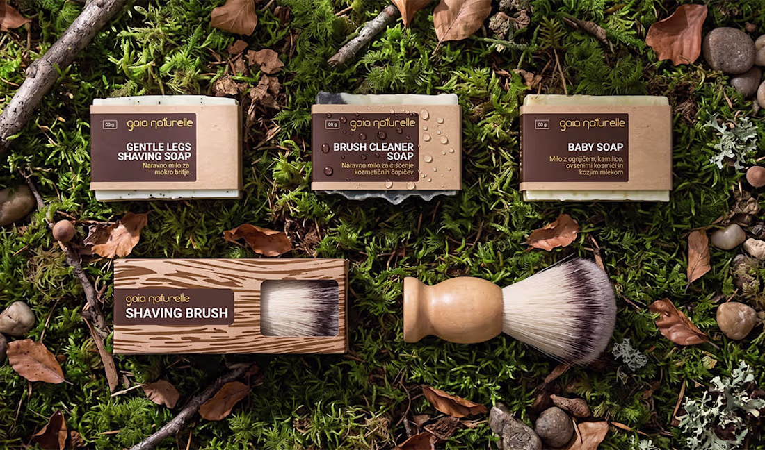
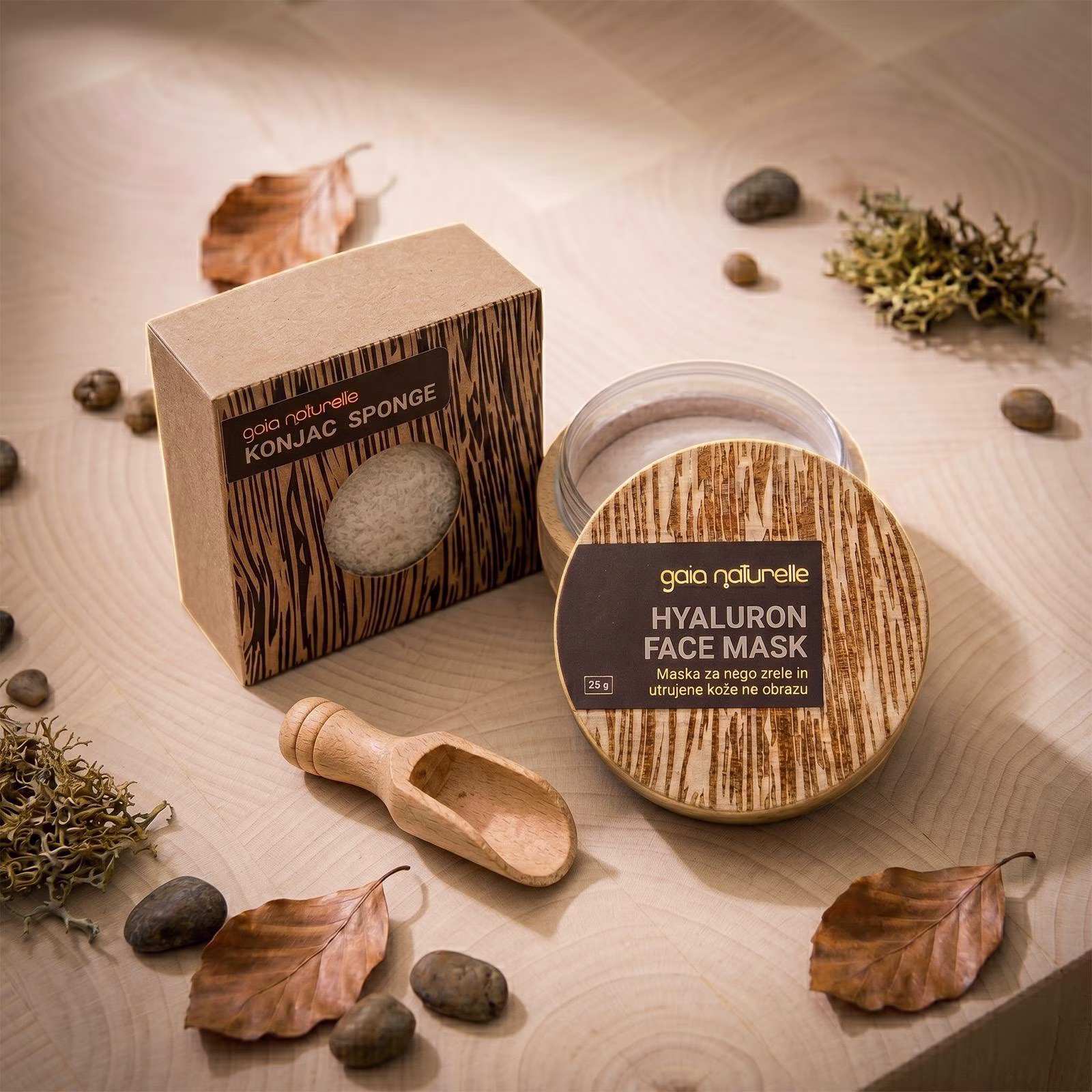
We partnered with Gaia Naturelle, a Slovenian skincare brand, to design a brand and packaging system built from wood — a material almost no one in cosmetics uses.
The challenge was making it work as actual packaging, not as a gimmick. It had to feel genuinely natural up close, hold up across a full product range, and still earn attention from across a retail shelf.
The identity is built around a single typographic mark designed to survive any surface — printed on paper, burnt into wood, or stamped into handmade soap. That consistency became the spine of the system, letting the range feel like one family across very different materials and finishes.
The packaging itself is local wood, finished with custom laser-engraved grain patterns that give each piece its own character. Gold-foil labels carry product information and bring just enough contrast to keep the range legible at a distance. Every decision was about restraint — fewer elements, used with intent.
The result is a skincare brand that doesn't look like other skincare brands. Natural where it should be, deliberate everywhere else, and unmistakable on a shelf.
Amazing work!
Trending
Claude
Claude has entered the design space. How are you using Claude Design?
Contra University
Learn from expert creatives how to earn more using next-gen AI tools.
creativeaiflow
Creative AI workflows are evolving. What tools do you use, and what are their strengths and weaknesses?
portfolioreview
The best portfolios tell a story, not just show a grid. Share yours for feedback.
freelancerlife
Freelancer life is wins, pivots, and everything in between. What’s yours right now?