
Kylie Touch
Minimalist logos that make your brand impossible to forget.
New to Contra
Kylie is ready for their next project!
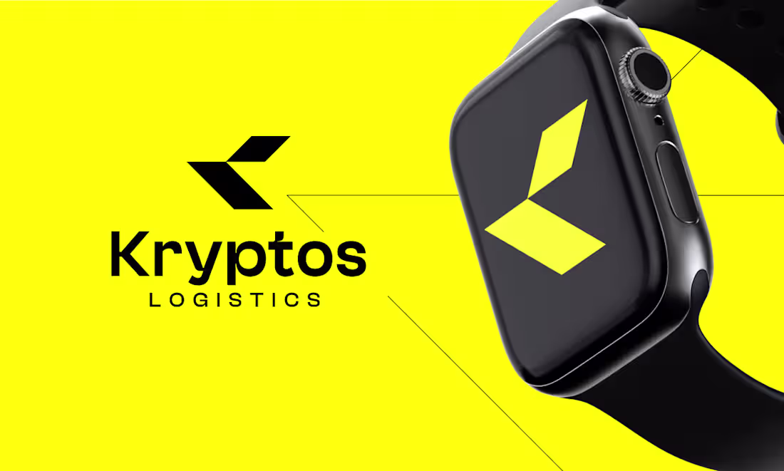
Some brands whisper. Kryptos was built to roar.
In an industry flooded with generic truck icons and forgettable wordmarks, Kryptos Logistics needed something that hit differently. A mark that didn't just represent a company — it represented a promise. Fast. Precise. Unstoppable.
The Challenge:
How do you make logistics feel exciting? You strip it down to pure energy.
The Solution:
Two razor-sharp geometric forms locked together into a "K" that looks like it's cutting through air. No curves. No softness. Just angular confidence moving in one direction — forward. Paired with electric yellow on black, the identity doesn't ask for attention. It demands it.
The Secret:
The icon stands completely alone. Cover the wordmark — the mark still tells the whole story. That's not just good design. That's brand architecture.
The Feeling:
Your shipment is already there before it leaves.
2
21

PureGlow Skincare needed a brand identity that felt as clean and trustworthy as the products themselves. The brief was clear — warm, natural, and premium. A brand that speaks directly to modern skincare lovers who value simplicity and results.
The Concept:
The "P" monogram was designed with a soft, organic curve — subtle enough to feel gentle, strong enough to feel professional. The warm earthy tone palette communicates naturalness, purity, and skin-first values. No harsh edges. No loud colors. Just quiet confidence.
Where it lives:
The PureGlow identity was built for versatility across every brand touchpoint:
— Product packaging (skincare bottles & cleanser range)
— Wearable branding (Apple Watch)
— Apparel (t-shirt)
— Professional lifestyle imagery (clinic setting)
The Result:
A cohesive, minimalist brand identity system that feels at home on a pharmacy shelf, a skincare clinic counter, and a social media feed — all at once.
0
7
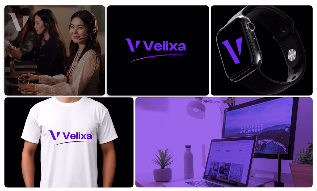
Velixa came to me needing a brand identity that felt modern, tech-forward, and instantly recognizable. The goal was simple — create a minimalist logo mark that could live across every touchpoint, from wearables to workspaces.
The Concept:
The "V" monogram was crafted with sharp, geometric precision — clean angles that communicate speed, innovation, and confidence. The purple accent adds a sense of premium quality and digital-age energy, making it feel right at home in the tech space.
Where it lives:
The mark was designed to be truly versatile — and it shows. The Velixa identity was applied across:
— Product branding (Apple Watch mockup)
— Apparel (t-shirt)
— Digital workspace & lifestyle visuals
— Full wordmark lockup for marketing use
The Result:
A timeless minimalist logo system that works beautifully at any size, on any surface, in any context.
1
23

Designed a logo for Sparked Nest Cleaning Co. a company that deals in commercial and residential cleaning. In this logo, i tried to incorporate a single element to avoid clutter and to show the uniqueness of a single element that makes my client brand impossible to forget 🙌
0
17