The network for creativity
Join 1.25M professional creatives like you
Connect with clients, get discovered, and run your business 100% commission-free
Creatives on Contra have earned over $150M and we are just getting started
Back to feedPost

VITALIS — Nature-Powered Wellness Landing Page 🌿💊
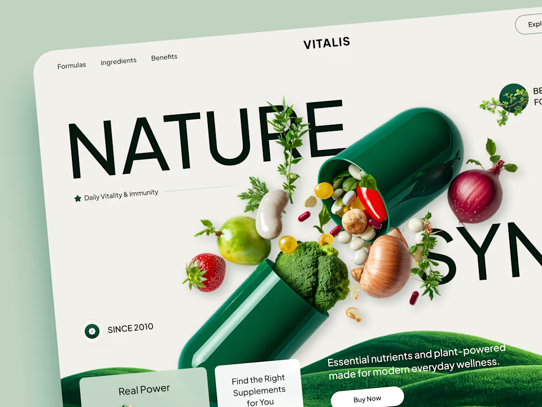
VITALIS is a wellness and supplements website concept built around the connection between nature, science, and everyday health.
The goal was to move away from the typical clinical supplement aesthetic and create something that feels fresh, natural, and contemporary — while still communicating product credibility and making the path to purchase clear.
Special attention was given to:
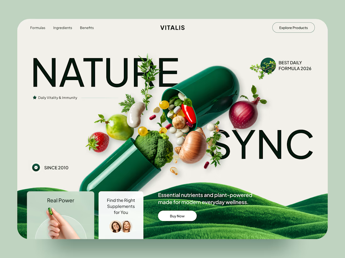
• a bold product-first hero built around the visual connection between supplements and natural ingredients;
• oversized typography integrated directly into the composition;
• a calm green and off-white palette that reinforces the natural wellness positioning 🌿;
• ingredient imagery that makes the formula feel tangible, fresh, and easy to understand;
• clear product discovery and “Buy Now” actions without overcrowding the experience;
• supporting trust elements and benefit-focused content around vitality and immunity;
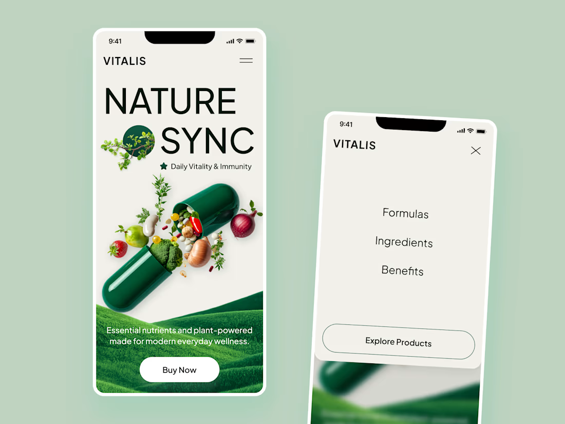
• responsive mobile layouts that preserve the visual storytelling while simplifying navigation 📱;
• a clean, scalable visual system suitable for additional formulas and wellness products.
The result is a fresh digital experience that brings together nature and modern wellness — making the product feel both approachable and premium.
Looking to create a distinctive digital experience for your wellness, suppl



Great work 👏

Love the colors 💚

The capsule visual makes the hero really memorable 🔥

The green palette works perfectly here.

Such a nice balance between natural and modern😍

Beautiful concept!

Great work, Man!

very nice job 👍

Love this one 🌿
The network for creativity
Join 1.25M professional creatives like you
Connect with clients, get discovered, and run your business 100% commission-free
Creatives on Contra have earned over $150M and we are just getting started





Related posts



Which hero visual feels right for this brand?
While working on the homepage for Halfspace, a website design and SEO agency, I explored two different hero visuals for the same headline and layout. Same message, same structure, just a different visual metaphor and mood.
Option 1 - Rocket Launch. Bold, literal, and energetic, visually reinforcing the "launch your business" message with motion and fire.
Option 2 - Glass Cube. Abstract, sleek, and premium, giving a more refined, tech-forward feel without relying on a literal metaphor.
Would love your honest UX/UI take, which direction feels more impactful, memorable, and aligned with a web design/SEO brand, and why?
11 voted
41%
16 voted
59%
27 votes
Closed

Both design are great; it's hard to choose one


Option B feels nothing but premium