The network for creativity
Join 1.25M professional creatives like you
Connect with clients, get discovered, and run your business 100% commission-free
Creatives on Contra have earned over $150M and we are just getting started
Back to feedPost
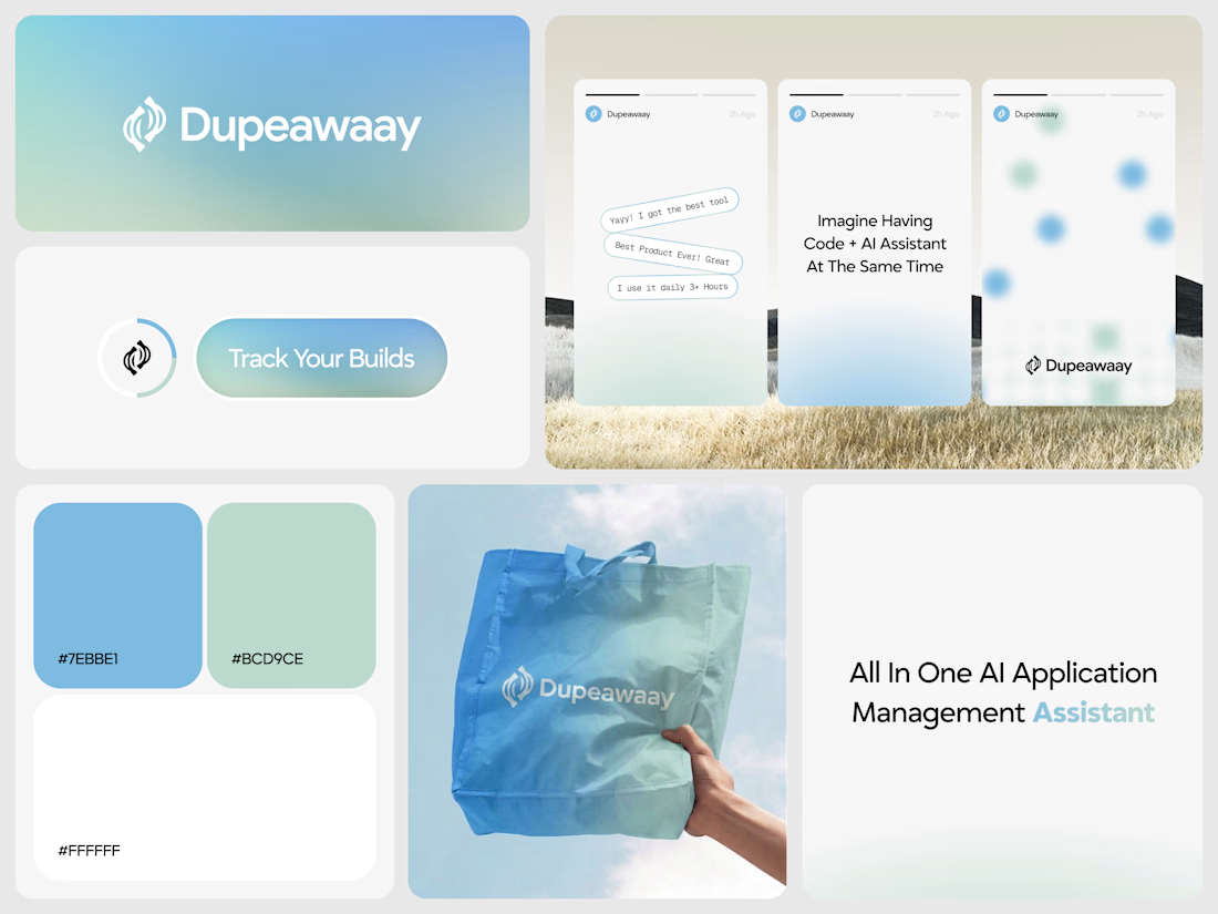
Just wrapped up the brand identity for Dupeawaay! ✨
This project was all about creating a logo that feels calm, minimal, and approachable for an AI code agent.
The client wanted to move away from the typical AI aesthetic—bright colors, sharp corners, and overly futuristic visuals. Instead, we crafted an identity that feels clean, modern, and trustworthy while still reflecting intelligence and innovation.
You can check out the complete case study on my profile. I'd love to hear what you think!
Link here!



Thankyou!

Nice
Thankyou for your feedback 👋

loved the color
Appreciated!
The network for creativity
Join 1.25M professional creatives like you
Connect with clients, get discovered, and run your business 100% commission-free
Creatives on Contra have earned over $150M and we are just getting started







Related posts

Created the complete brand identity for Nerada, a natural tea brand — developing the visual direction and design elements that shape how the brand looks and feels across every touchpoint. The goal was a clean, organic aesthetic that reflects the brand's natural positioning and builds a consistent, recognizable identity.

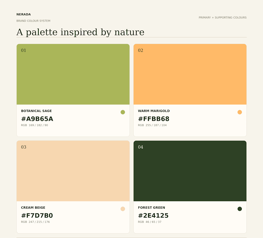
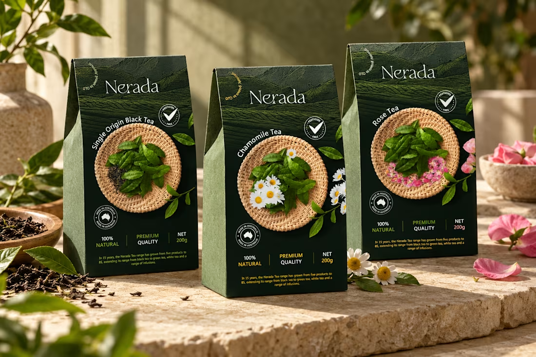
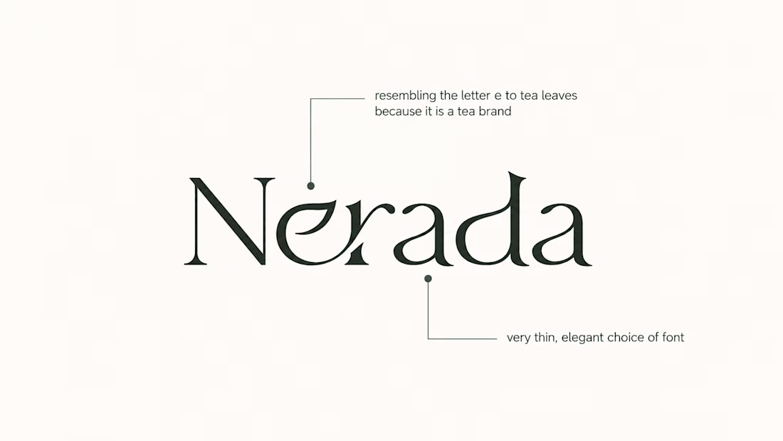
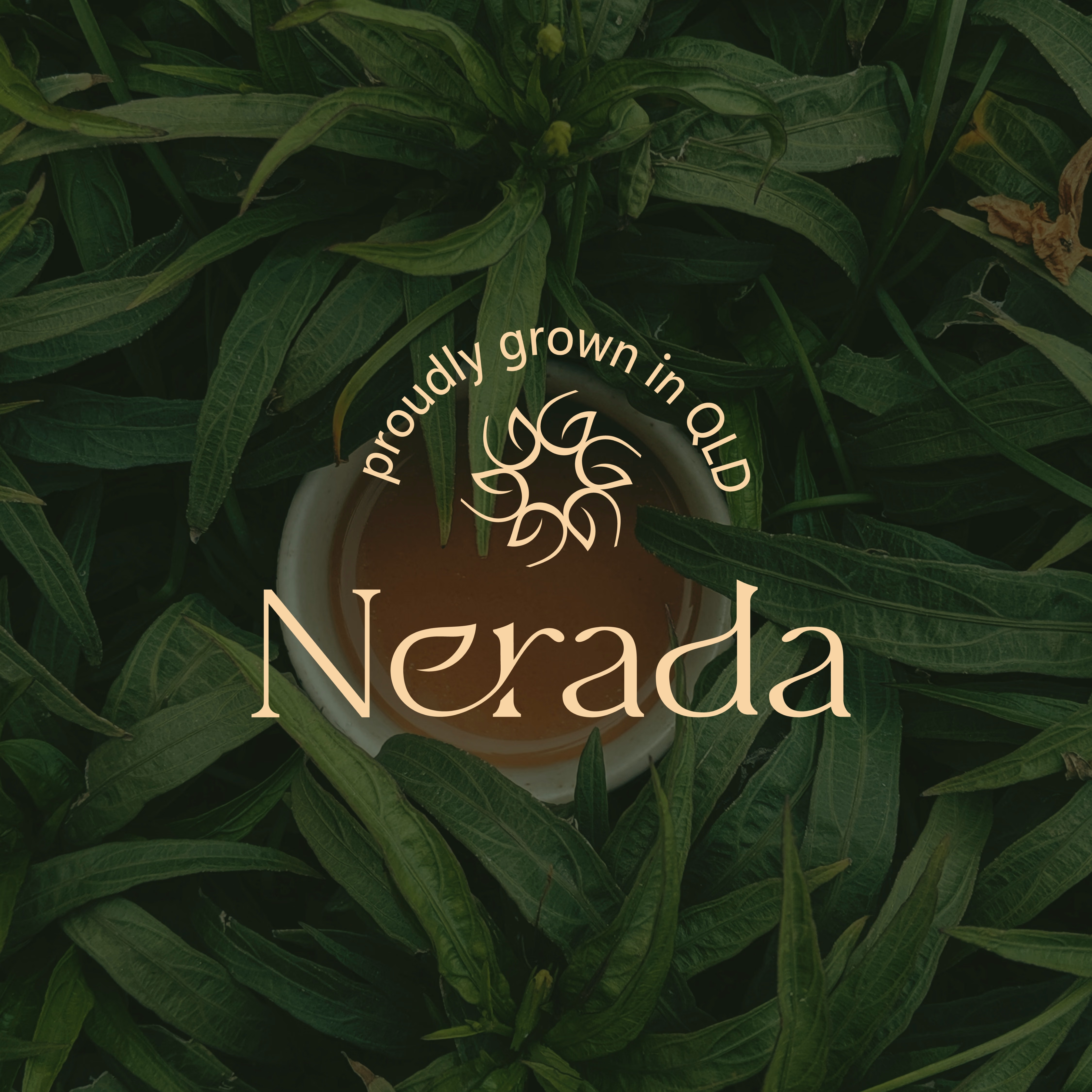

The mark feels grown rather than drawn, which is exactly right for a natural tea brand. Packaging is where tea brands win or lose. Does the identity change tone across blends, or stay one voice with different colours?

Exploring imagination through texture, typography and skincare. ✨
For THÉRAPEAU, I wanted to push the visual identity beyond packaging and explore how serum, gel and cream could become part of the brand language itself.
Using the core wordmark as a starting point, I experimented with different materials, colours and tactile expressions — turning skincare textures into typography and visual studies.
These explorations were created together with ChatGPT as part of the creative process, helping me test ideas quickly while keeping the final brand direction grounded in my own identity system and design decisions.
A small study in how texture can become communication. 💧
#ChatGPT #AIinDesign #Branding #VisualIdentity #SkincareBranding
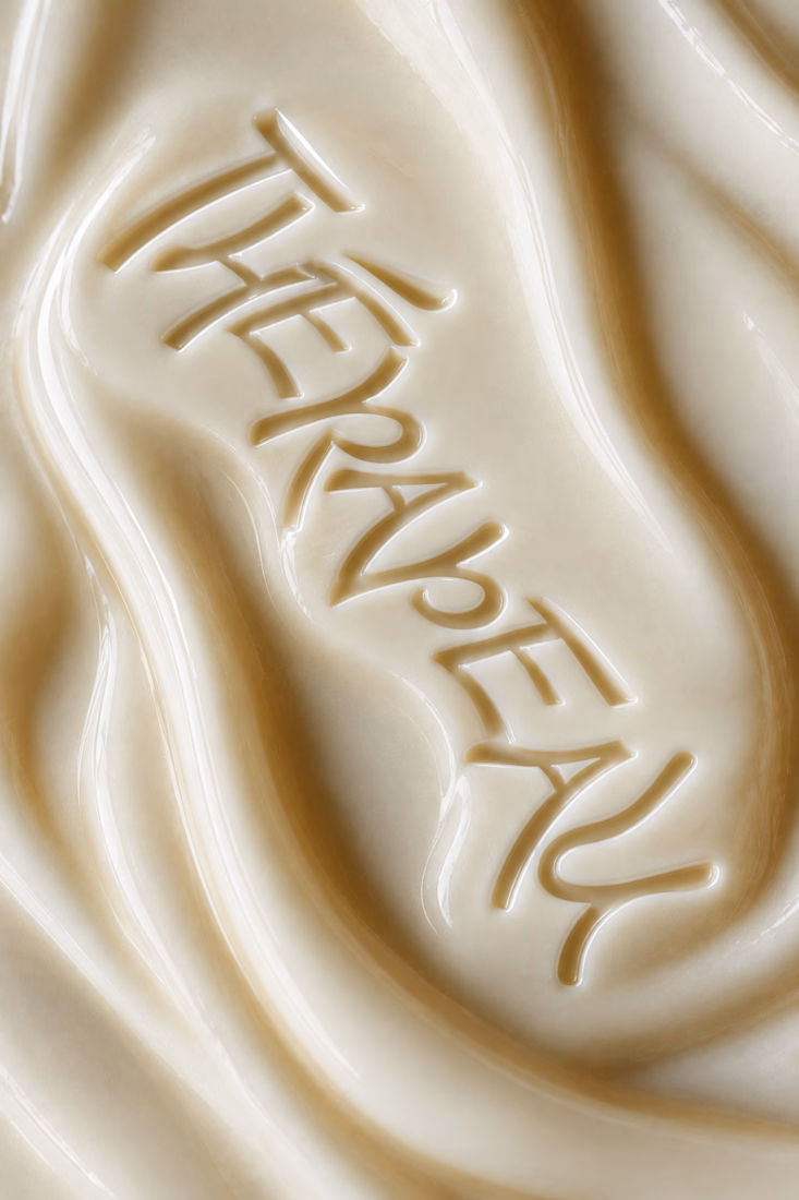
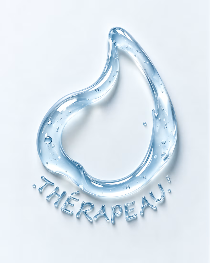
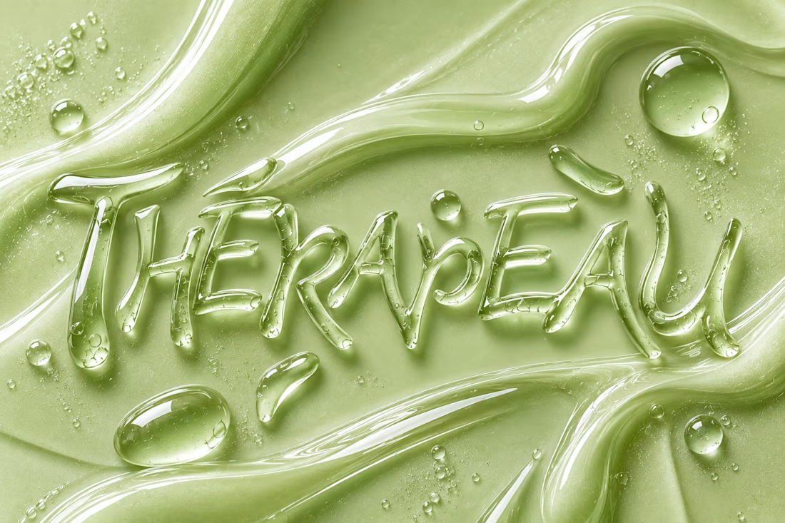
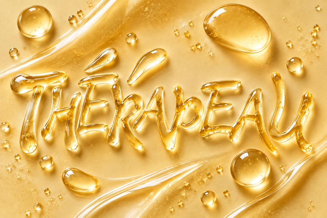

Letting the wordmark turn into the material itself is a strong idea. Did you set a limit for how far a texture can distort the letters before it stops reading as THÉRAPEAU?

Refreshing my portfolio and revisiting one of my favorite projects from 2025 🧡💙
Bilsoft has made accounting software for over 20 years, and 100,000+ businesses use it every day. When we started, the trust was there, but the brand had grown piece by piece until it looked like several different companies.
The tricky part was a tension most fintech brands face. The software has to feel precise and serious, but the people using it are small business owners who just want things to be simple. So I drew the wordmark on a strict grid and softened every corner. The name does the rest: “Bil” means knowing, “Soft” means steady. Then I built it into a system the team could use without a designer in the room.
While putting the case study together, I added something new: a motion piece where the logo builds itself letter by letter.
Curious how others here handle this: when a client’s product is serious but their users want simple, which way do you lean? 👇
Full case study on my Contra profile.


I lean simple on the surface, serious underneath — and your grid-plus-softened-corners move is exactly that split. The structure carries the precision, the corners carry the approachability, so a small business owner isn't intimidated before they've even logged in. With 100,000+...