The network for creativity
Join 1.25M professional creatives like you
Connect with clients, get discovered, and run your business 100% commission-free
Creatives on Contra have earned over $150M and we are just getting started
Back to feedPost

Visual Identity: AI OS (WIP)
For decades, operating systems have been designed around applications. Windows.
Icons.
Menus.
Files.
But AI is changing that interaction model.
Instead of navigating software, what if we simply described an outcome?
The interface becomes conversation.
Applications become implementation details.
The computer becomes an autonomous collaborator rather than a collection of tools.
This is my current visual exploration for AI OS—an AI-native operating environment where voice, memory, and autonomous agents become the primary interface.
Still very much a work in progress, but I'm exploring how a visual identity can communicate concepts like autonomy, orchestration, trust, and intelligence without relying on the familiar operating system metaphors we've used for decades.
Curious where this evolves.
Breaking the old pattern to start a new one..
#BrandIdentity #CreativeDirection #VisualIdentity #AI #ProductDesign #MotionDesign #FutureOfWork


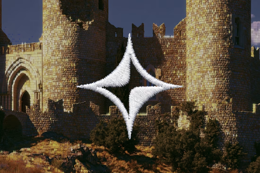


Looks incredible, just on my opinion; if that background photo and knit logo were to be blended each other significantly, it could level up for sure.

Excited to see how this turns out! Sticking around!
The network for creativity
Join 1.25M professional creatives like you
Connect with clients, get discovered, and run your business 100% commission-free
Creatives on Contra have earned over $150M and we are just getting started





Related posts

Brand identity work for WesoftAI



A new visual direction for Friedrich Naumann Foundation - Jordan.
I developed a visual sub-identity for the “Nau Media” project, a media training initiative focused on digital communication, human rights-sensitive media, and combating misinformation.
The goal was to build a distinct visual system that could stand on its own while remaining connected to the broader FNF Jordan identity.
This is an initial look at the project. The full visual identity and its applications will be shared soon.


Great visual identity I like the way you show the brand that's unique 🎉❤️

Which one brings more clarity to the hero section?
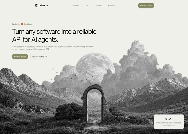
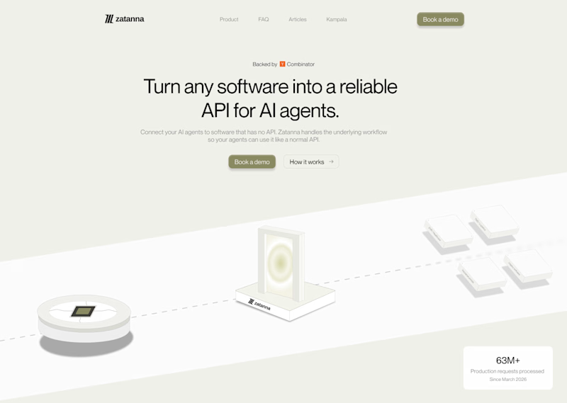
I was exploring a hero section concept for an AI product and tried two different visual directions.
Visual-led — focuses on explaining the idea through the interface/visual.
Isometric — uses a visual system to represent how the product works.
Both look good, but the real question isn't which one looks better.
Which one helps you understand the product faster?
That's something I always try to think about when designing hero sections — the visual should help explain the product, not just make the page look good.
Which one would you choose?
7 voted
58%
5 voted
42%
12 votes
Closed

The visual direction looks great, but I think Isometric does a better job of explaining the product.