The network for creativity
Join 1.25M professional creatives like you
Connect with clients, get discovered, and run your business 100% commission-free
Creatives on Contra have earned over $150M and we are just getting started
Back to feedPost
Taste Test
Taste test 👀
Two simple versions of the same scene.
No huge changes - just different feeling and pacing.
Funny how even small tweaks completely change the vibe.
Been switching between them for too long now.
Which one works better to you - and why?
12 voted
36%
21 voted
64%
33 votes
Closed
This is a tough choice 😅
I prefer Version B.
Even though the scene is visually very close to Version A, the caption placement changes the read of the moment. It gives the viewer context earlier, improves the hierarchy, and makes the sequence feel more intentional within the short runtime.
Curious about...
I'd go with the B version 🙌
B for sure, it provides a better user experience!
B wins just because the font in A looks a tad too small
The consistency here is excellent. Everything feels aligned, structured, and professional. Option B all day
My Vote for version B, as User don't have to chase the point to read the context
B is better
The network for creativity
Join 1.25M professional creatives like you
Connect with clients, get discovered, and run your business 100% commission-free
Creatives on Contra have earned over $150M and we are just getting started
Related posts
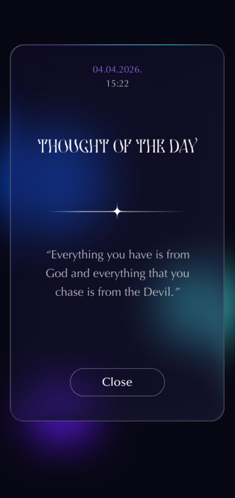
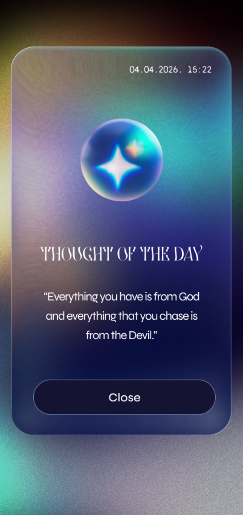
I'm testing out dark themes for the daily motivation app.
Which version you prefer?
6 voted
21%
23 voted
79%
29 votes
Closed
version 1
I’m excited to announce that I’ve started a collaboration with @Consensys MetaMask 🦊 as a Motion/Interaction Designer, with @Rive playing a significant role in my workflow.
To celebrate this, I’m sharing a warm-up exercise I did a while ago, where I explored my own take on what the logo intro could look like 🔊 👇

🔥
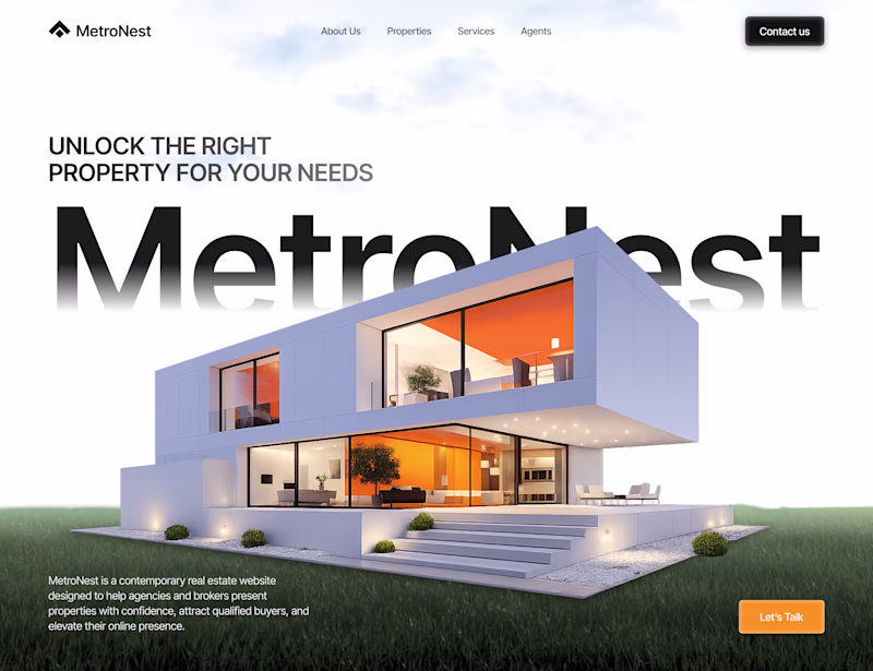
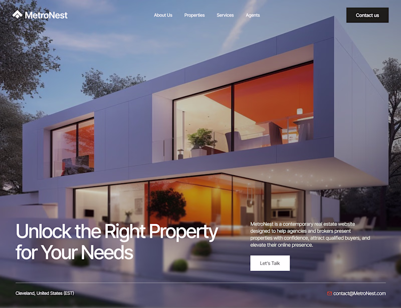
Need your opinions, guys
Which homepage direction works better?
A or B
39 voted
32%
82 voted
68%
121 votes
Closed
Challenges
View allTrending
Claude
Claude has entered the design space. How are you using Claude Design?
Contra University
Learn from expert creatives how to earn more using next-gen AI tools.
creativeaiflow
Creative AI workflows are evolving. What tools do you use, and what are their strengths and weaknesses?
portfolioreview
The best portfolios tell a story, not just show a grid. Share yours for feedback.
freelancerlife
Freelancer life is wins, pivots, and everything in between. What’s yours right now?