The network for creativity
Join 1.25M professional creatives like you
Connect with clients, get discovered, and run your business 100% commission-free
Creatives on Contra have earned over $150M and we are just getting started
Back to feedPost
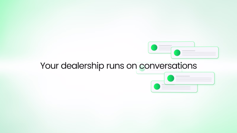
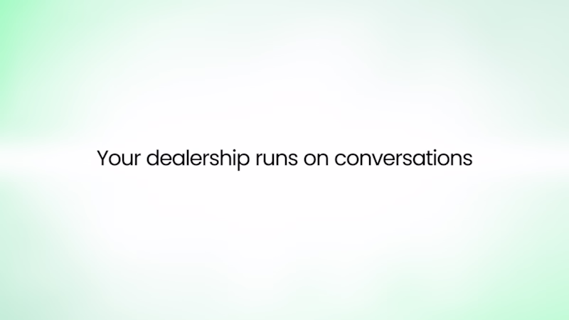
Taste Test
Taste test 👀
Two simple versions of the same scene.
No huge changes - just different feeling and pacing.
Funny how even small tweaks completely change the vibe.
Been switching between them for too long now.
Which one works better to you - and why?
14 votes
Ends in 1d
I'd go with the B version 🙌
I prefer Version B.
Even though the scene is visually very close to Version A, the caption placement changes the read of the moment. It gives the viewer context earlier, improves the hierarchy, and makes the sequence feel more intentional within the short runtime.
Curious about...
B for sure, it provides a better user experience!
B wins just because the font in A looks a tad too small
The consistency here is excellent. Everything feels aligned, structured, and professional. Option B all day
The network for creativity
Join 1.25M professional creatives like you
Connect with clients, get discovered, and run your business 100% commission-free
Creatives on Contra have earned over $150M and we are just getting started
Related posts
Taste test 👀
Same scene. Two directions.
One keeps the focus entirely on the message.
The other adds supporting UI elements and a bit more motion context.
At first, the version with extra elements felt more alive…
but now I’m wondering if it actually weakens the main headline.
Does it help tell the story - or just split the attention?
Which one works better - and why?
48 voted
51%
46 voted
49%
94 votes
Closed
I will go for 1
Logomation of Facebook! It was under my FX animation assignment, and the most fun part was to plan and execute it!
Totally digging that--it's hypnotizing.

They look so realistic
Trending
Claude
Claude has entered the design space. How are you using Claude Design?
Contra University
Learn from expert creatives how to earn more using next-gen AI tools.
creativeaiflow
Creative AI workflows are evolving. What tools do you use, and what are their strengths and weaknesses?
portfolioreview
The best portfolios tell a story, not just show a grid. Share yours for feedback.
freelancerlife
Freelancer life is wins, pivots, and everything in between. What’s yours right now?