The network for creativity
Join 1.25M professional creatives like you
Connect with clients, get discovered, and run your business 100% commission-free
Creatives on Contra have earned over $150M and we are just getting started
Back to feedPost


New case study loading....🚀


Very clean!

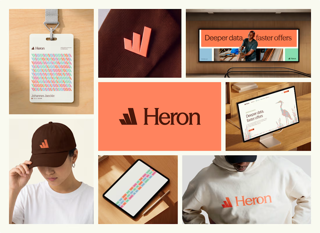
the colors on that ID badge all come together so beautifully, i love the palette you went with!

Love this!

Good Branding

I love the choice of color. Good job!

Heron's brand system covering everything from the pitch deck to merch to the badge makes it feel fully lived-in rather than just a logo package. Did the deck design come first as the anchor point, or did the merch and product screens end up shaping it more?


Excited to watch it.
The network for creativity
Join 1.25M professional creatives like you
Connect with clients, get discovered, and run your business 100% commission-free
Creatives on Contra have earned over $150M and we are just getting started











Related posts


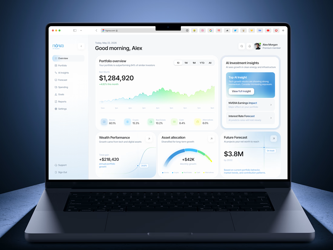
Insanely smooth and elegant dashboard concept! Love the color palette and typography. Outstanding work!


EarthHub – A Platform for Nature Expeditions ⛰️
Stumbled upon this project in my hard drive, had to publish!

Top to bottom nice work

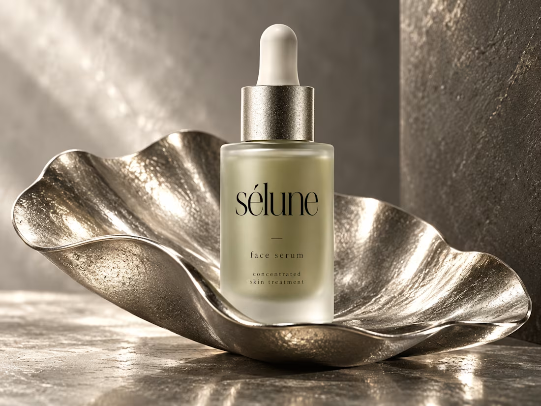
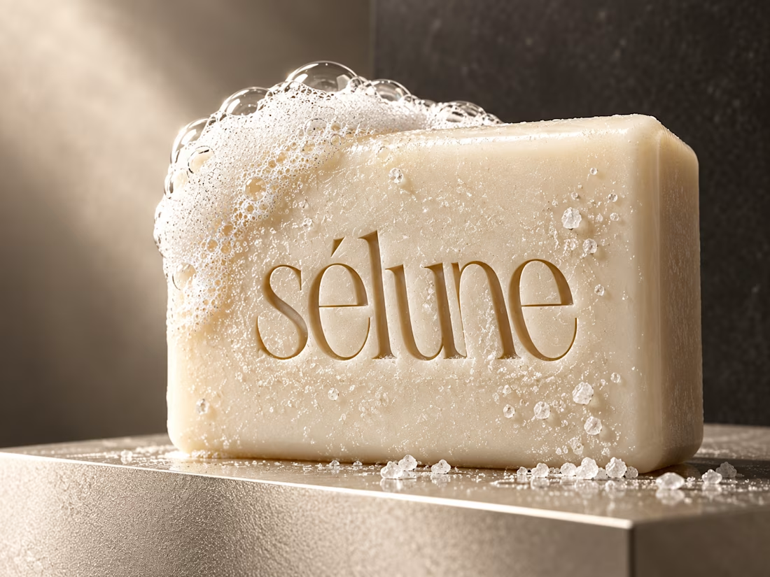
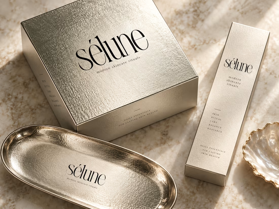
✨ Introducing SÉLUNE — where skincare meets quiet luxury.
What do you think of this direction for a modern skincare brand? ✨


Amaizinh nusrat ♥️♥️🔥