The network for creativity
Join 1.25M professional creatives like you
Connect with clients, get discovered, and run your business 100% commission-free
Creatives on Contra have earned over $150M and we are just getting started
Back to feedPost

✨ Introducing SÉLUNE — where skincare meets quiet luxury.
What do you think of this direction for a modern skincare brand? ✨


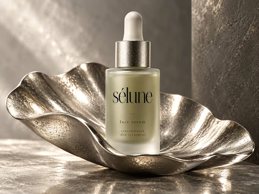
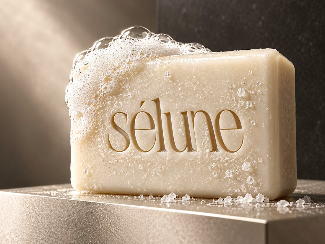
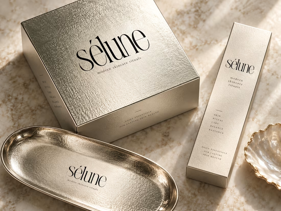

Love this direction! The subtle textures and sophisticated typography capture modern luxury perfectly.
Thank you

Amaizinh nusrat ♥️♥️🔥
Thank you
Most welcom♥️

this feels so quiet luxury, love it. the serif on sélune + that brushed metal texture is perfect for skincare. did you customise the type or is it a modified serif? really elevates the face serum bottle
Thank you

I think quiet luxury is exactly right for skincare, Jerin. SÉLUNE has that calm, considered feel that makes products feel like rituals rather than routines.
Thank you

The soft silver and lowercase serif feel properly quiet luxury.
The network for creativity
Join 1.25M professional creatives like you
Connect with clients, get discovered, and run your business 100% commission-free
Creatives on Contra have earned over $150M and we are just getting started











Related posts

New case study added!
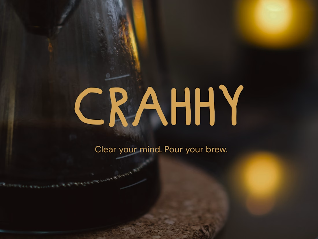
Crahhy is a speciality coffee brand rooted in the relatable human psychology of coffee cravings.
The objective was to design a brand that is minimal on the outside yet delightfully chaotic on the inside, blending specialty coffee aesthetics with honest, humorous storytelling.


minimal outside chaotic inside is the right brief for coffee


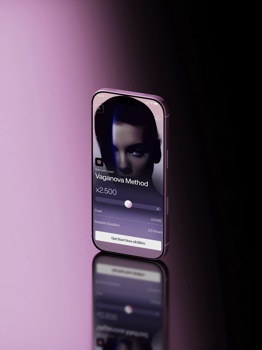
Super sleek presentation! ✨ The phone mockup with that purple gradient is looking premium. Clean editing!

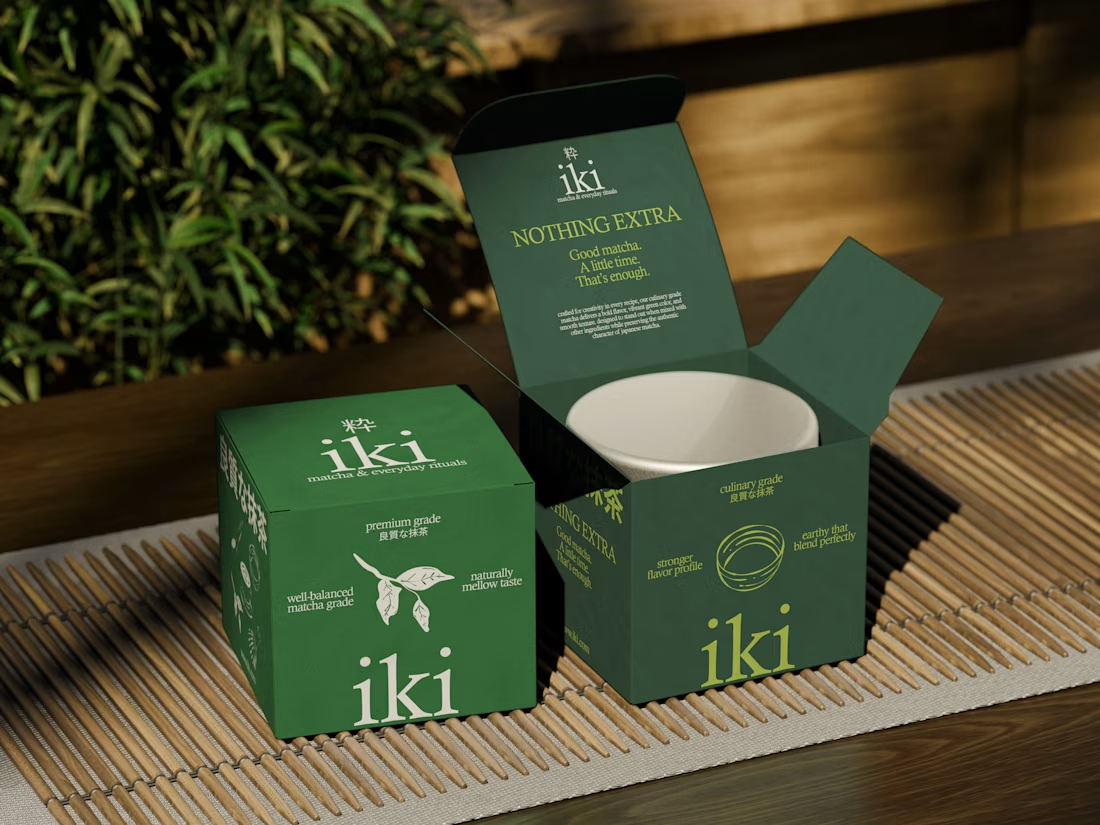
more visuals from iki, a matcha shop i’ve been working on 🍵
the project is getting close to its final stage, and it’s been really interesting to see how the initial concept has gradually turned into a complete brand.
from the strategy to the visual identity, every decision has helped shape a more cohesive and distinctive world for iki.
almost there. excited to share more of the final result soon
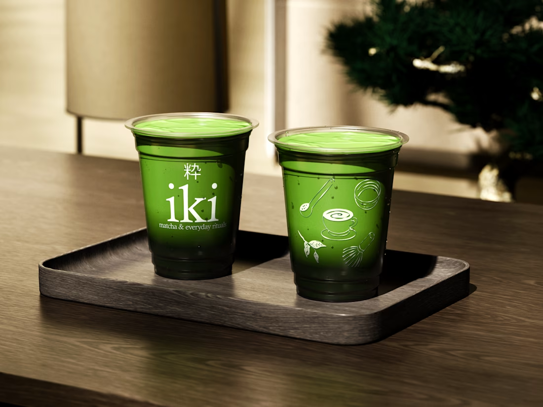
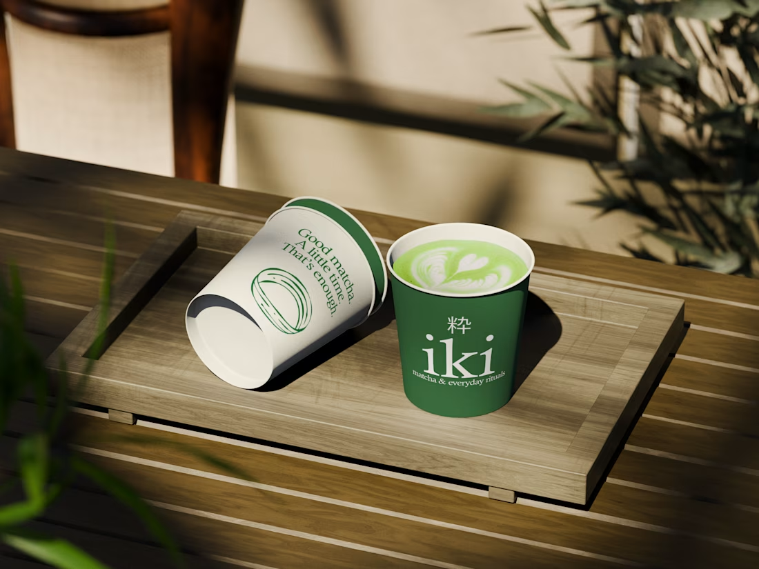
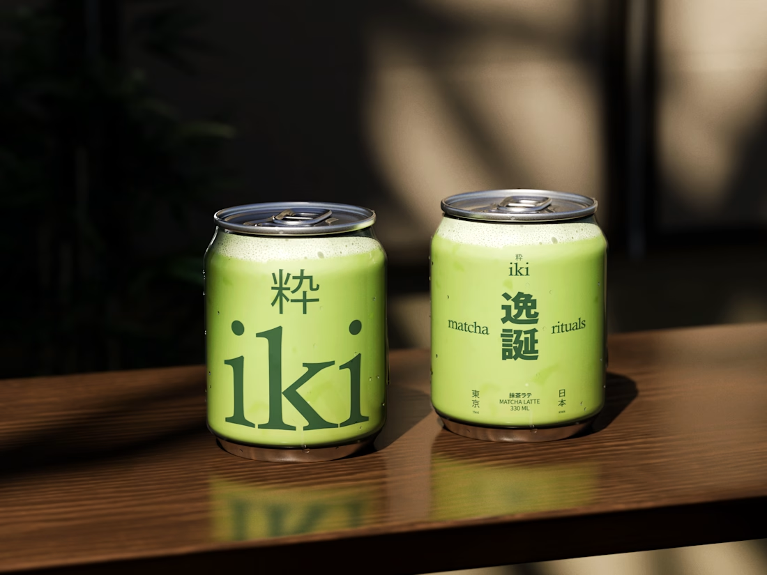

Strong concept and thoughtful execution. The logo feels distinctive and communicates the brand identity clearly.