The network for creativity
Join 1.25M professional creatives like you
Connect with clients, get discovered, and run your business 100% commission-free
Creatives on Contra have earned over $150M and we are just getting started
Back to feedPost
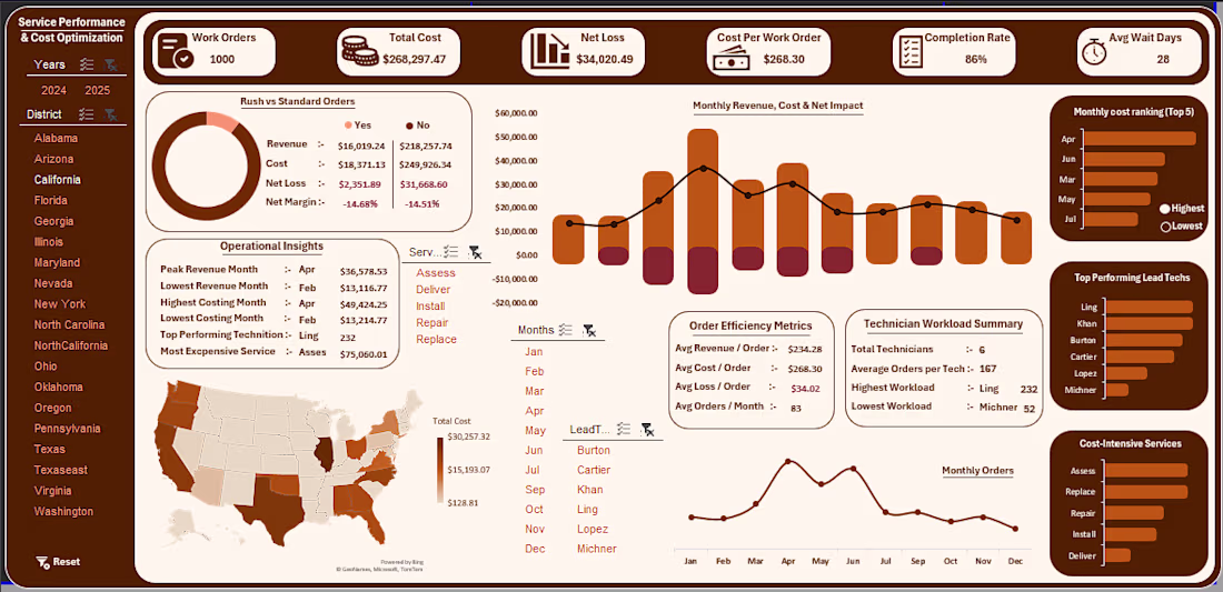
Service Performance & Cost Optimization Dashboard
This dashboard analyzes service performance, operational costs, and revenue trends to help businesses understand profitability and efficiency.
Key features:
• KPI overview including total cost, net loss, and work orders
• Monthly revenue and cost trend analysis
• Service efficiency and order performance metrics
• Geographic insights through a US performance map
• Technician workload and top performer tracking
Tools used:
Excel for data processing and dashboard design.
Purpose:
This dashboard helps businesses quickly identify cost drivers, performance trends, and operational inefficiencies.


Combining technician workload tracking with geographic performance mapping in one Excel dashboard is really impressive — most service businesses track these separately and miss the connection between regional demand and team capacity. The cost-intensive services breakdown at the...

manually
That's impressive — building a US performance map manually in Excel takes real skill. Most people would reach for Power BI or Tableau for that. Clean execution!
The network for creativity
Join 1.25M professional creatives like you
Connect with clients, get discovered, and run your business 100% commission-free
Creatives on Contra have earned over $150M and we are just getting started
Related posts

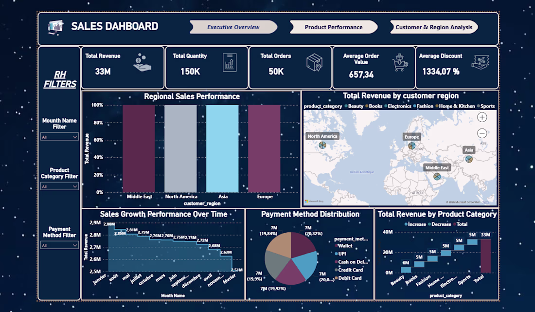
Sales Performance Dashboard – Power BI
This Sales Dashboard helps businesses track revenue, sales performance, and key KPIs.
Features:
• Monthly sales analysis
• Revenue trends
• Top performing products
• Interactive filters
Tools used: Microsoft Power BI


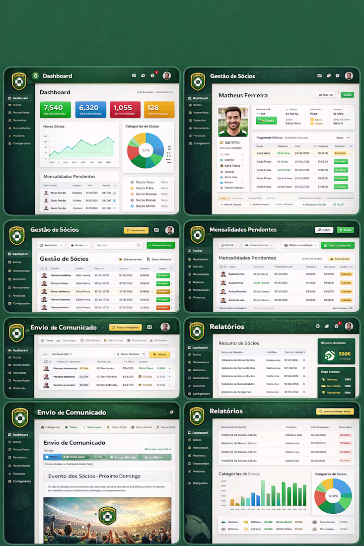
Revolutionizing Member Management: My Deep Dive into an All-in-One Dashboard Experience
Managing a community or organization can be overwhelming, especially when juggling multiple platforms for payments, communications, and reporting. But recently, I had the chance to dive into a member management system that completely transformed the way I handle these tasks. From the moment I logged in, the seamless integration of features took the stress out of admin work.
The dashboard's design is sleek yet incredibly intuitive. Whether it's tracking memberships in real-time, visualizing payment statuses, or managing detailed member profiles, every tool I needed was right at my fingertips. The 'Gestão de Sócios' feature allowed me to quickly overview and edit member details, all while tracking pending payments and outstanding dues.


Great work!!🎉
What framework did you use?

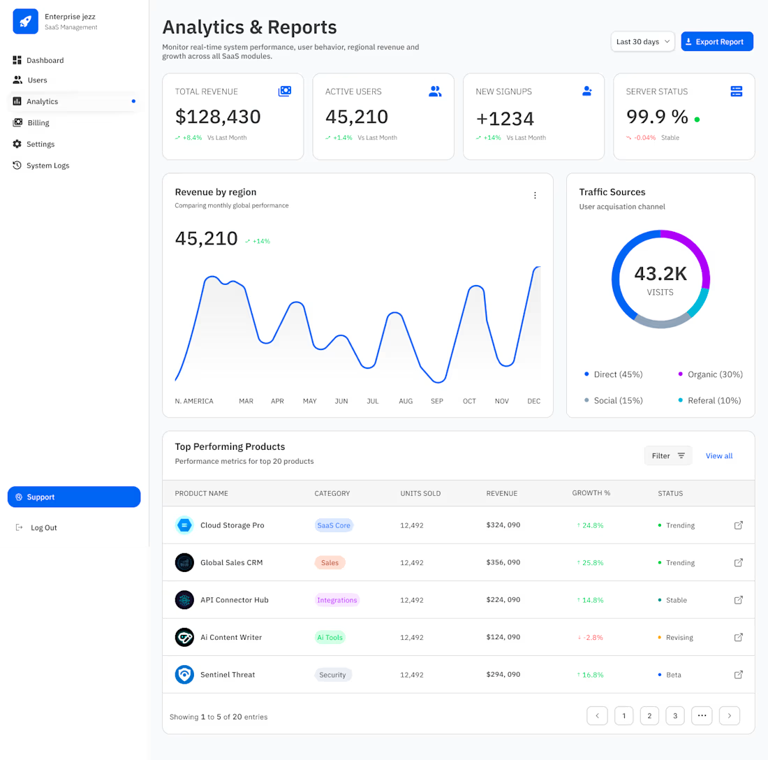
From "Data Dump" to "Decision Engine."
If the dashboard is the heartbeat, the Analytics page is the brain. For Enterprise Jezz, I didn’t want users hunting for insights—I wanted the insights to find them.
When designing for scale, "more charts" isn't the answer. Visual hierarchy is.
For this view, I prioritized:
♣︎. The 4-Pillar Pulse: High-level KPIs (Revenue, Users, Signups, Server Status) at the top for an "at-a-glance" health check.
♣︎. Dual-Axis Storytelling: Combining a high-density Revenue line graph with a Traffic Source donut to show not just what happened, but where it came from.
♣︎. Status-First Tables: Using semantic "Trending," "Stable," and "Beta" tags so product managers can spot outliers in seconds, not minutes.
99.9% Server Status is great, but 100% clarity for the user is the goal. :)
#BuildInPublic #SaaS

Clean and simple


Trending
aivideo
AI video tools are moving at warp speed. Which ones are you experimenting with?
illustration
Handcrafted illustration is bubbling up across the web. What are you drawing lately?
aidesignflow
AI tools are redefining design work. What's your current workflow?
returntonature
Spring is a reset for creativity. What’s inspiring you outside the screen right now?
freelancerlife
Freelancer life is wins, pivots, and everything in between. What’s yours right now?