The network for creativity
Join 1.25M professional creatives like you
Connect with clients, get discovered, and run your business 100% commission-free
Creatives on Contra have earned over $150M and we are just getting started
Back to feedPost
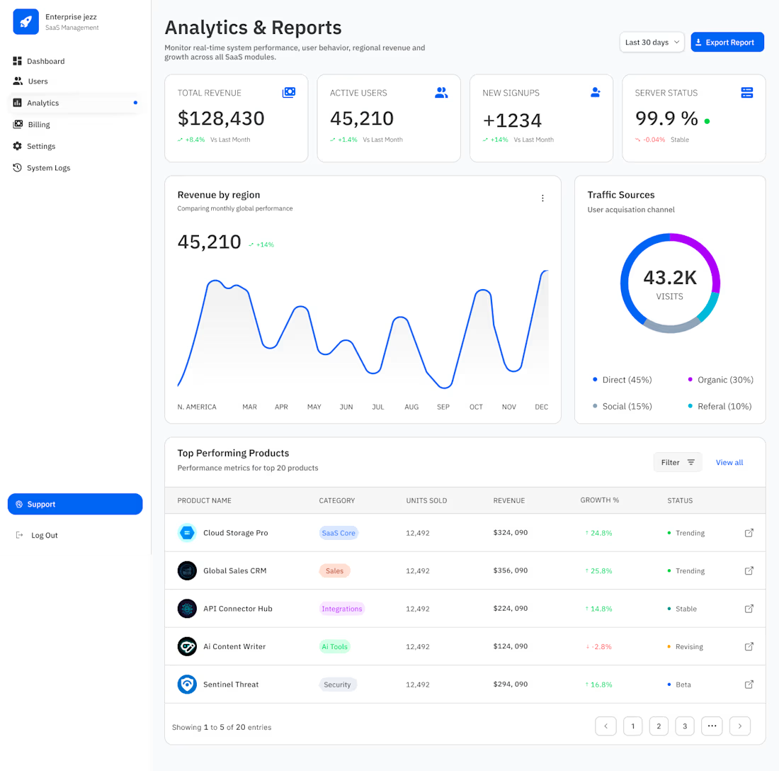
From "Data Dump" to "Decision Engine."
If the dashboard is the heartbeat, the Analytics page is the brain. For Enterprise Jezz, I didn’t want users hunting for insights—I wanted the insights to find them.
When designing for scale, "more charts" isn't the answer. Visual hierarchy is.
For this view, I prioritized:
♣︎. The 4-Pillar Pulse: High-level KPIs (Revenue, Users, Signups, Server Status) at the top for an "at-a-glance" health check.
♣︎. Dual-Axis Storytelling: Combining a high-density Revenue line graph with a Traffic Source donut to show not just what happened, but where it came from.
♣︎. Status-First Tables: Using semantic "Trending," "Stable," and "Beta" tags so product managers can spot outliers in seconds, not minutes.
99.9% Server Status is great, but 100% clarity for the user is the goal. :)
#BuildInPublic #SaaS


From "Data Dump" to "Decision Engine " line attracted my eyes 🔥.

That’s the goal! 😀 In Enterprise UI, if a user has to hunt for an insight, the design has failed.

Absolutely love this approach! Moving from a data dump to a decision engine is exactly what enterprise analytics needs. The focus on visual hierarchy, high-level KPIs, and semantic tagging makes complex data instantly digestible.
Thanks! Glad that resonated. In enterprise scale, I’ve found that the biggest friction point isn't a lack of data, but 'data fatigue.' The goal with Enterprise Jezz was to ensure the UI acts as a filter, not a firehose.

Good job
Thank you, Rasel.

Clean and simple
Thank you, David.


Thank you, Munna.
The network for creativity
Join 1.25M professional creatives like you
Connect with clients, get discovered, and run your business 100% commission-free
Creatives on Contra have earned over $150M and we are just getting started
Related posts

Pricing pages for an eSports focused AI translation SaaS. One that is more minimal or the more detailed version.Which pricing page looks the best, and why do you think so?

39 voted
43%
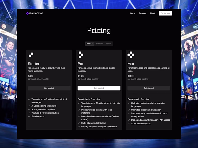
52 voted
57%
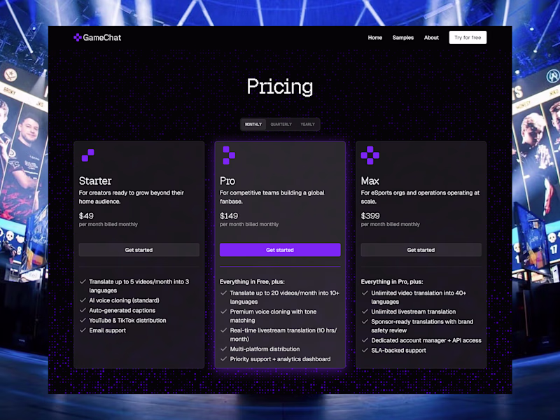
91 votes
Closed

The icons looks like the logo, so it should also take the colour

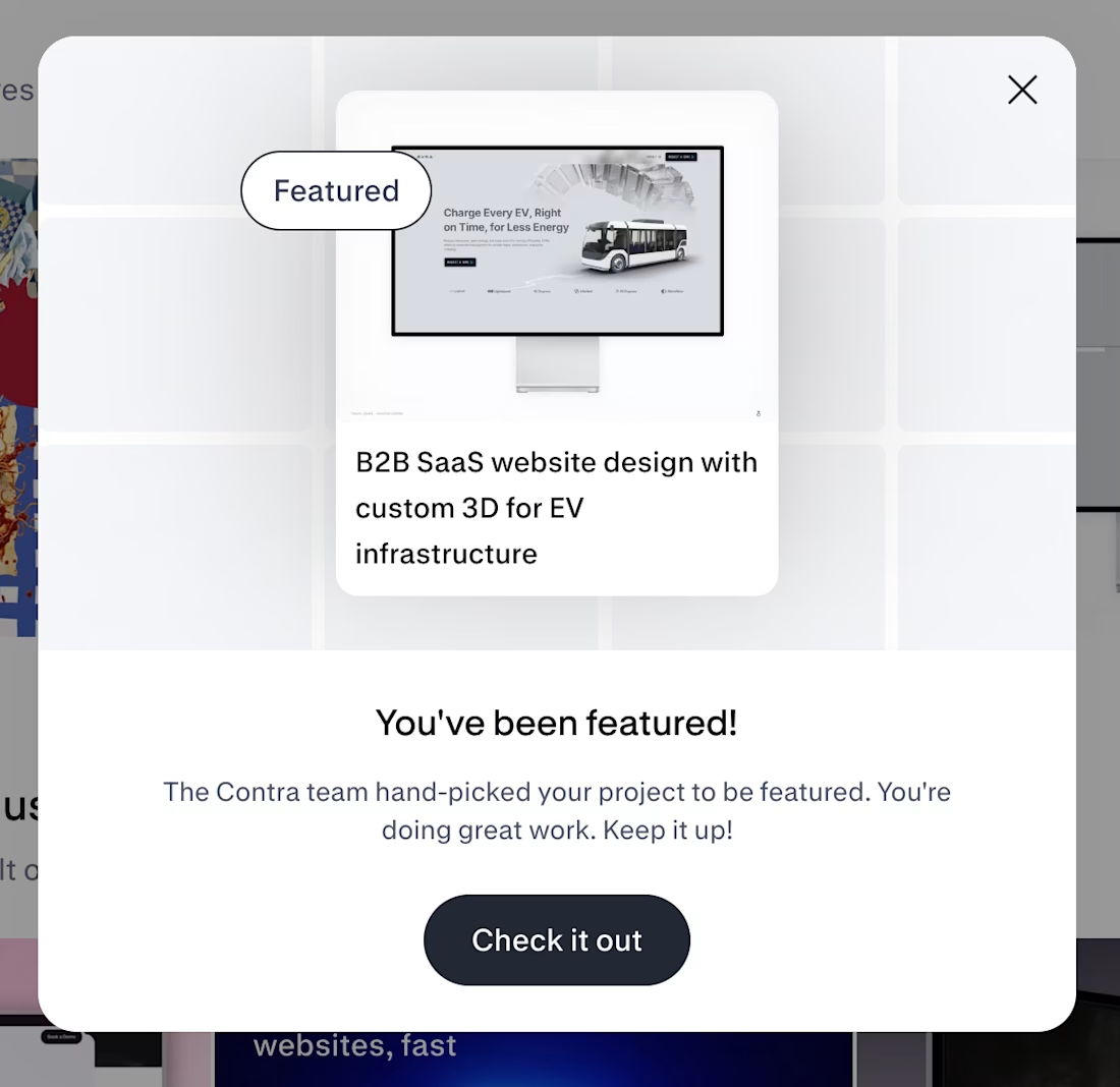
My, i think my 4th feature on Contra. It would be great if @Contra HQ could give us a badge/ribbon/award once getting featured like behance/awwwards etc. or at least some way to display this accolade.


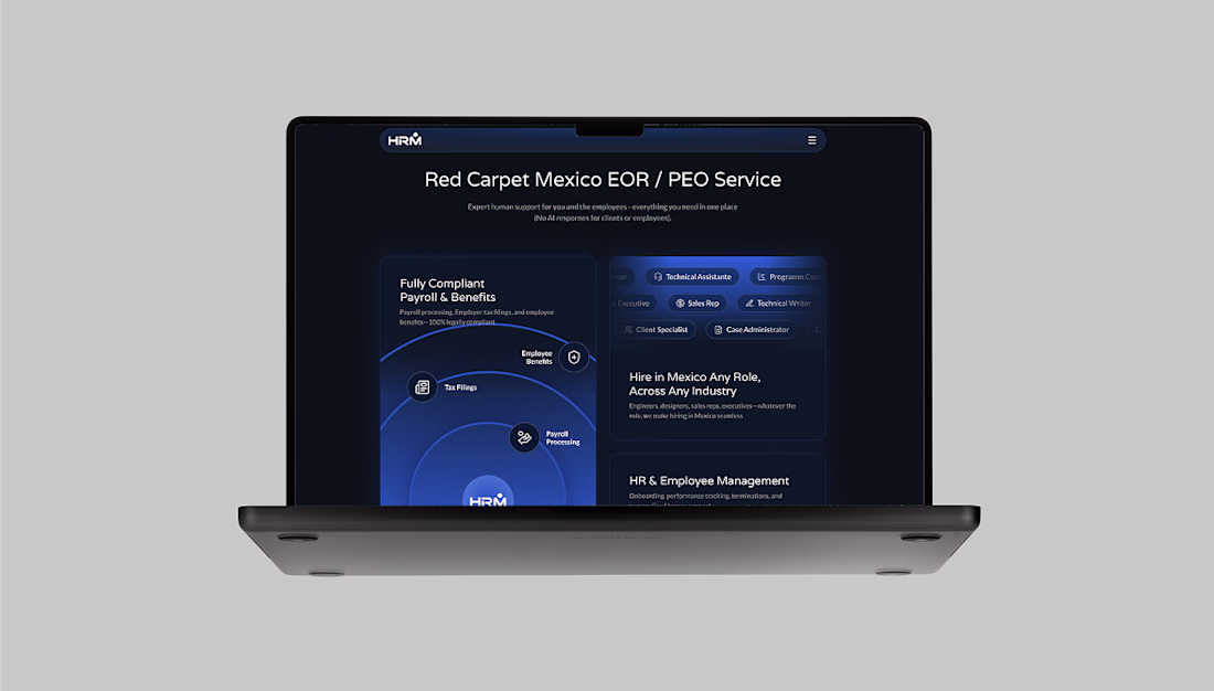
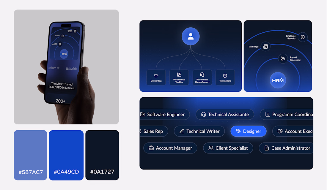
We designed and built the brand and digital experience for HRM, a PEO/EOR provider focused on Mexico.
The challenge was structuring multiple services: payroll, compliance, benefits, into a clear, unified system.
The result is a controlled interface, strong hierarchy, and a visual system that communicates trust and operational precision.


Trending


FLORA
Reusable workflows are replacing one-off prompts in creative AI. Share what you're building in FLORA.

Contra University
Learn from expert creatives how to earn more using next-gen AI tools.
creativeaiflow
Creative AI workflows are evolving. What tools do you use, and what are their strengths and weaknesses?
portfolioreview
The best portfolios tell a story, not just show a grid. Share yours for feedback.
freelancerlife
Freelancer life is wins, pivots, and everything in between. What’s yours right now?