
Precious Olaoluwa
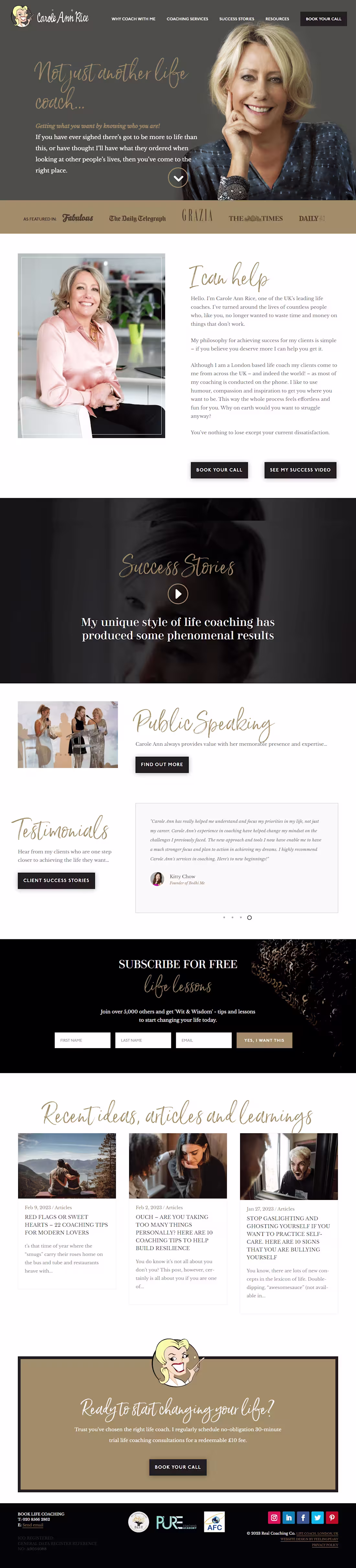
I specialize in creating visually stunning website
Ready for work
Precious is ready for their next project!
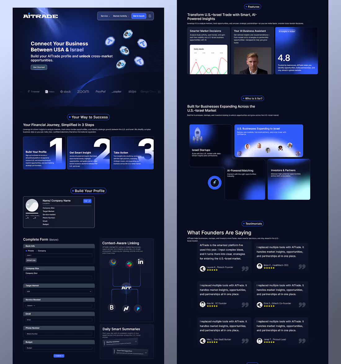
How do you make complex cross-border trade feel as simple as a local transaction?
That was the question at the heart of this project. When bridging two powerhouse markets like the US and Israel, the design can’t just look premium—it has to feel inevitable.
I started by stripping away the noise to focus on a "3-step success" framework right above the fold. The goal was simple: ensure every founder understands their path to growth within seconds of landing.
Instead of hiding the complexity, I leaned into a high-tech fintech aesthetic. Deep gradients and glowing focal points guide the eye, moving the user from initial curiosity into the grounded trust of "Founder Voices" and partner networks.
Every interaction from the streamlined lead capture to the custom data visualizations was engineered to turn a high-stakes business decision into a seamless digital experience.
Design is only as good as the friction it removes.
8
4
118
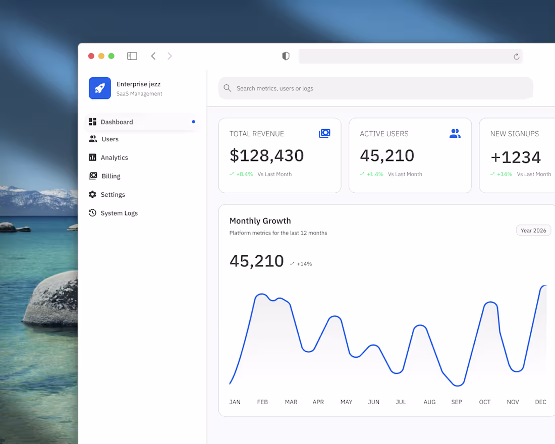
Enterprise Jezz | SaaS Dashboard UI/UX Case Study
2
3
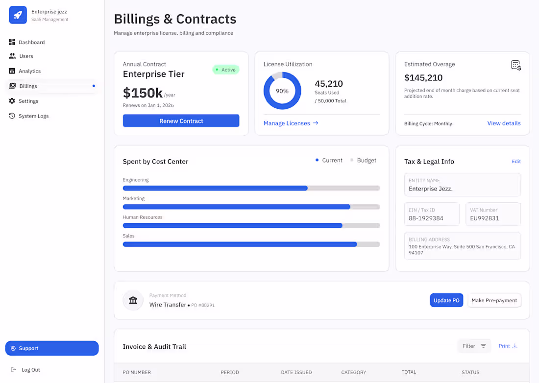
From Confusion to Compliance.
Billing at scale is a nightmare if the design is cluttered. For the Billings & Contracts view in Enterprise Jezz, I focused on reducing "Invoice Anxiety" by making the most critical financial data instantly scannable.
Here is the strategy behind the screen:
♣︎. The Utilization Pulse: A donut chart for license seats. It’s not just a number; it’s a warning system for when the client is at 90% capacity and needs to scale.
♣︎. Budget vs. Reality: The 'Spent by Cost Center' bars aren't just decorative. They provide a quick visual comparison of actual spending against the set budget for every department.
♣︎. The Audit Trail: I designed the 'Invoice & Audit Trail' to be high-density but readable.
Design is successful when the Finance team doesn't have to call Support to understand their own bill. :)
2
64
it's been while here.., but trust me i never left the kitchen.
#agencywebsiteuidesign #create
4
4
84
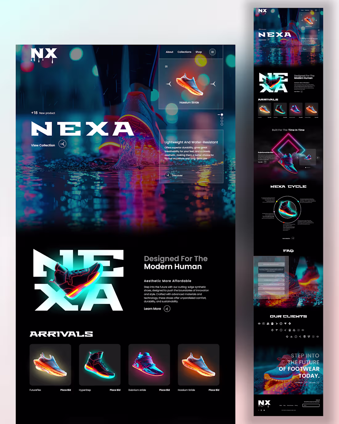
Figma-designed e-commerce website for a sneaker brand! 👟💻
2
78
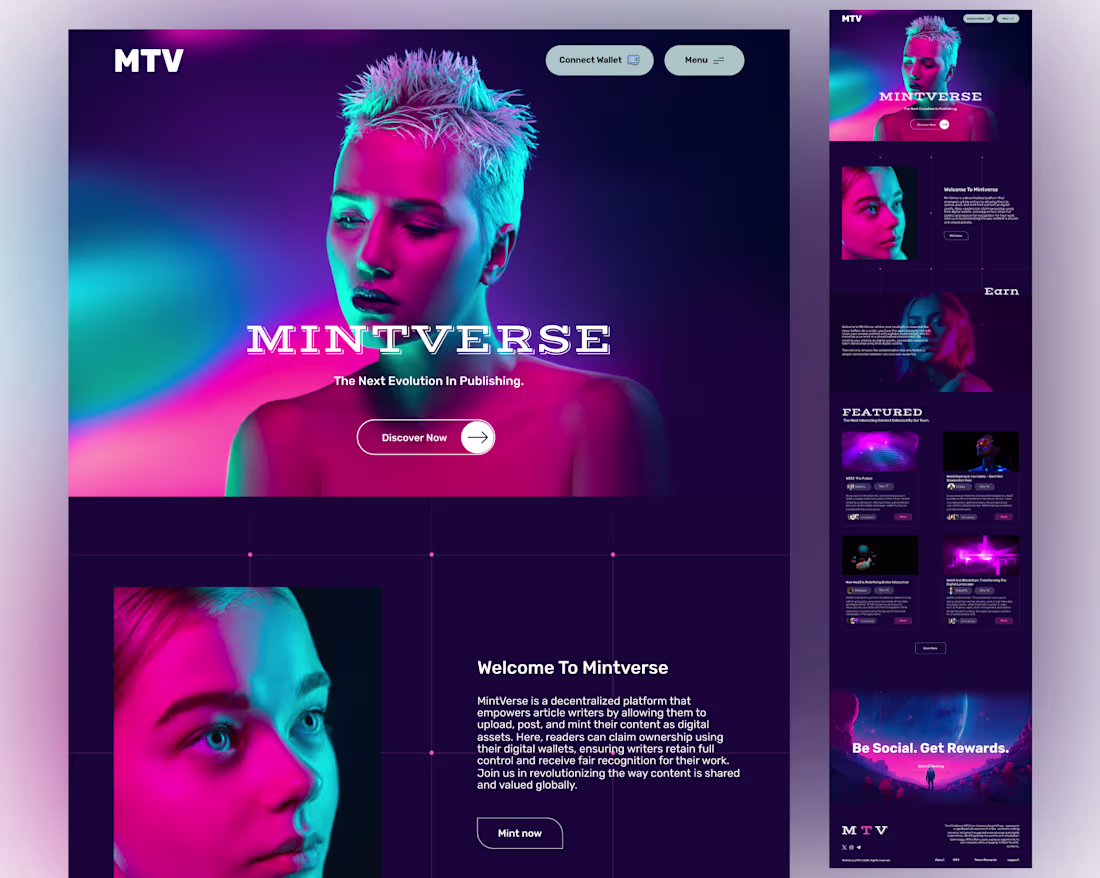
Writers pour their souls into every line—only to watch algorithms bury them, platforms skim the value, and ownership slip away like smoke.
MintVerse changes that forever.I designed the homepage to honor that truth: a space where your words become minted digital assets, truly yours on-chain.
No more fading into feeds. No more begging for scraps. Just direct control, fair rewards, and readers who can claim real ownership through their wallets.
2
66
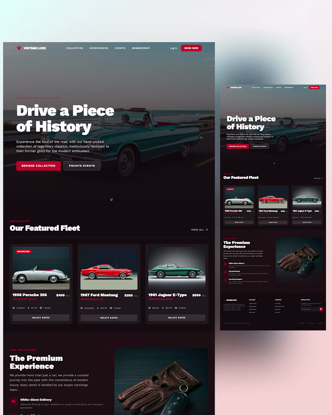
Timeless elegance meets modern UX.
Crafted a sleek landing page for a vintage car collection clean layouts, hero shots that roar, and intuitive navigation for car enthusiasts.
What's your dream ride?
3
103
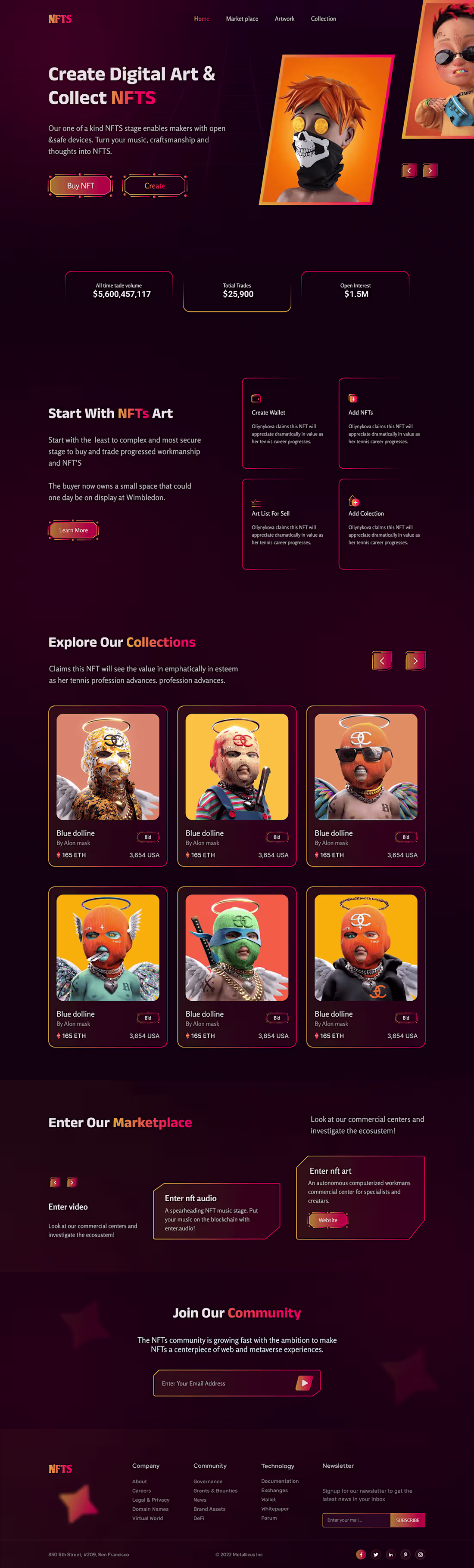
NFT Landing page design
1
8
Consulting website design on WordPress using elementor
1
9
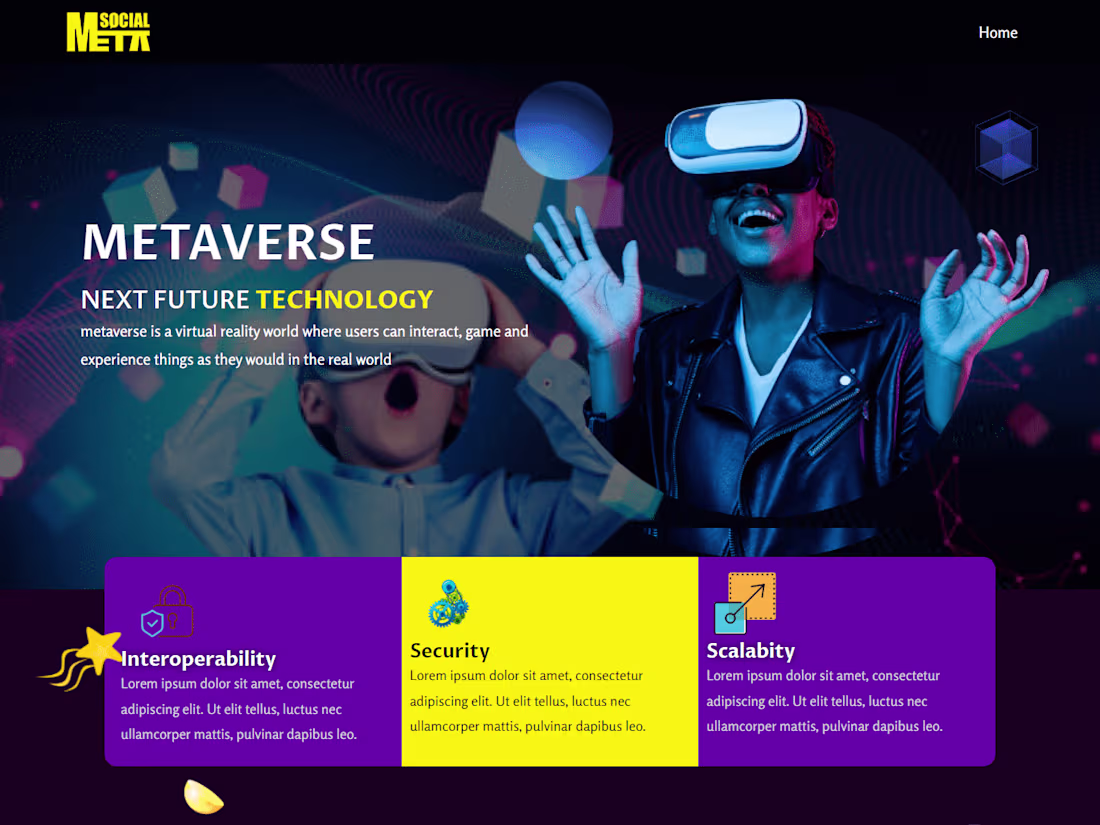
Metaverse website design
1
37
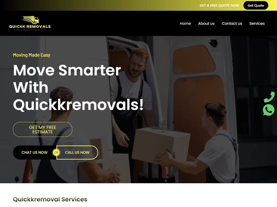
Moving company website design
0
25