The network for creativity
Join 1.25M professional creatives like you
Connect with clients, get discovered, and run your business 100% commission-free
Creatives on Contra have earned over $150M and we are just getting started
Back to feedPost

From Confusion to Compliance.
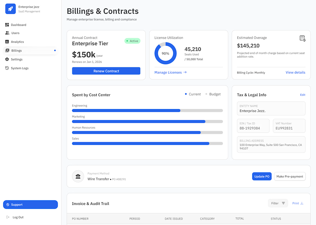
Billing at scale is a nightmare if the design is cluttered. For the Billings & Contracts view in Enterprise Jezz, I focused on reducing "Invoice Anxiety" by making the most critical financial data instantly scannable.
Here is the strategy behind the screen:
♣︎. The Utilization Pulse: A donut chart for license seats. It’s not just a number; it’s a warning system for when the client is at 90% capacity and needs to scale.
♣︎. Budget vs. Reality: The 'Spent by Cost Center' bars aren't just decorative. They provide a quick visual comparison of actual spending against the set budget for every department.
♣︎. The Audit Trail: I designed the 'Invoice & Audit Trail' to be high-density but readable.
Design is successful when the Finance team doesn't have to call Support to understand their own bill. :)

The network for creativity
Join 1.25M professional creatives like you
Connect with clients, get discovered, and run your business 100% commission-free
Creatives on Contra have earned over $150M and we are just getting started

Challenges
View all


Related posts

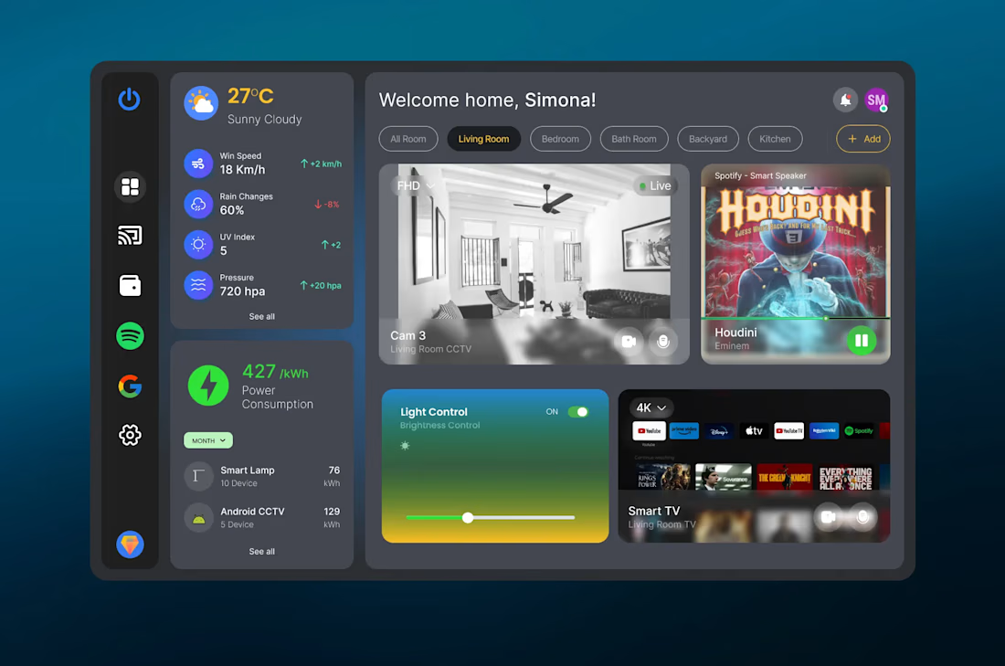


really like the calm feel of this one

VYRO — redefining essentials through a bold, minimal digital experience.


Nice work!

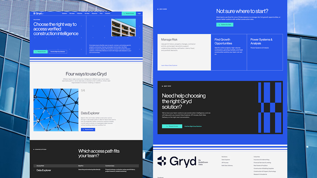
30+ pages, 3 weeks, and honestly one of my favorite projects in a while.
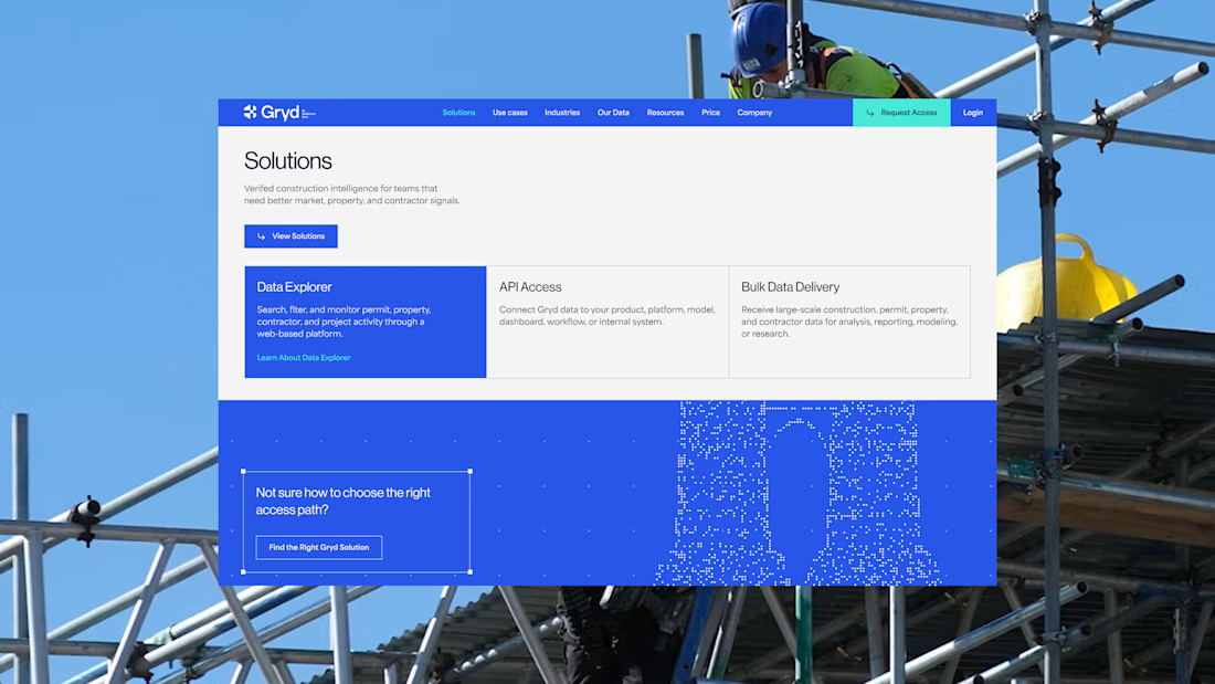
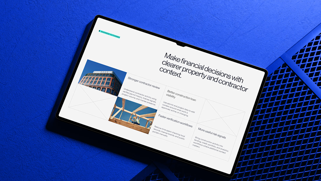
I'd been wanting to design something more tech-driven for a long time, and Gryd, a platform turning construction permit data into intelligence for insurers, lenders, and real estate teams, was exactly that.
Wireframes first, then UI across every page, fully responsive, with animation on the key screens, all built inside the brand the client had already set.
Case study's on my profile.

Clean design 😍