Precious Olaoluwa
I specialize in creating visually stunning website
Ready for work
Precious is ready for their next project!
Happy New Week! Let's make it a great one. ✨
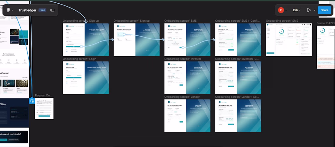
Just wrapped the onboarding flow for Trust Ledger, a fintech platform connecting SMEs, Investors, and Lenders in one seamless ecosystem.
The real challenge? One platform. Three completely different users. Every screen had to answer a...
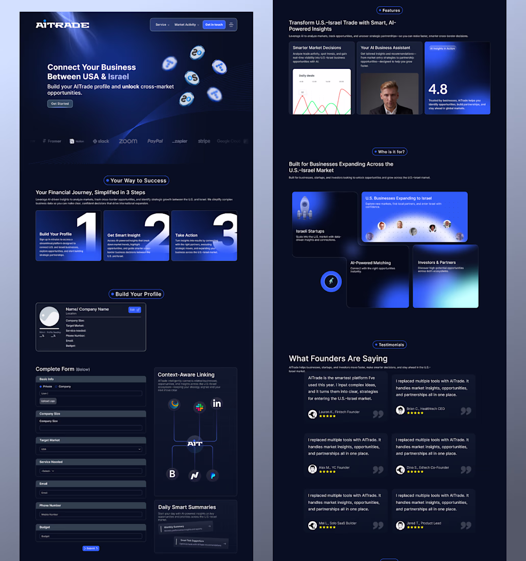
How do you make complex cross-border trade feel as simple as a local transaction?
That was the question at the heart of this project. When bridging two powerhouse markets like the US and Israel, the design can’t just look premium—it has to feel inevitable.
I started by stripping...
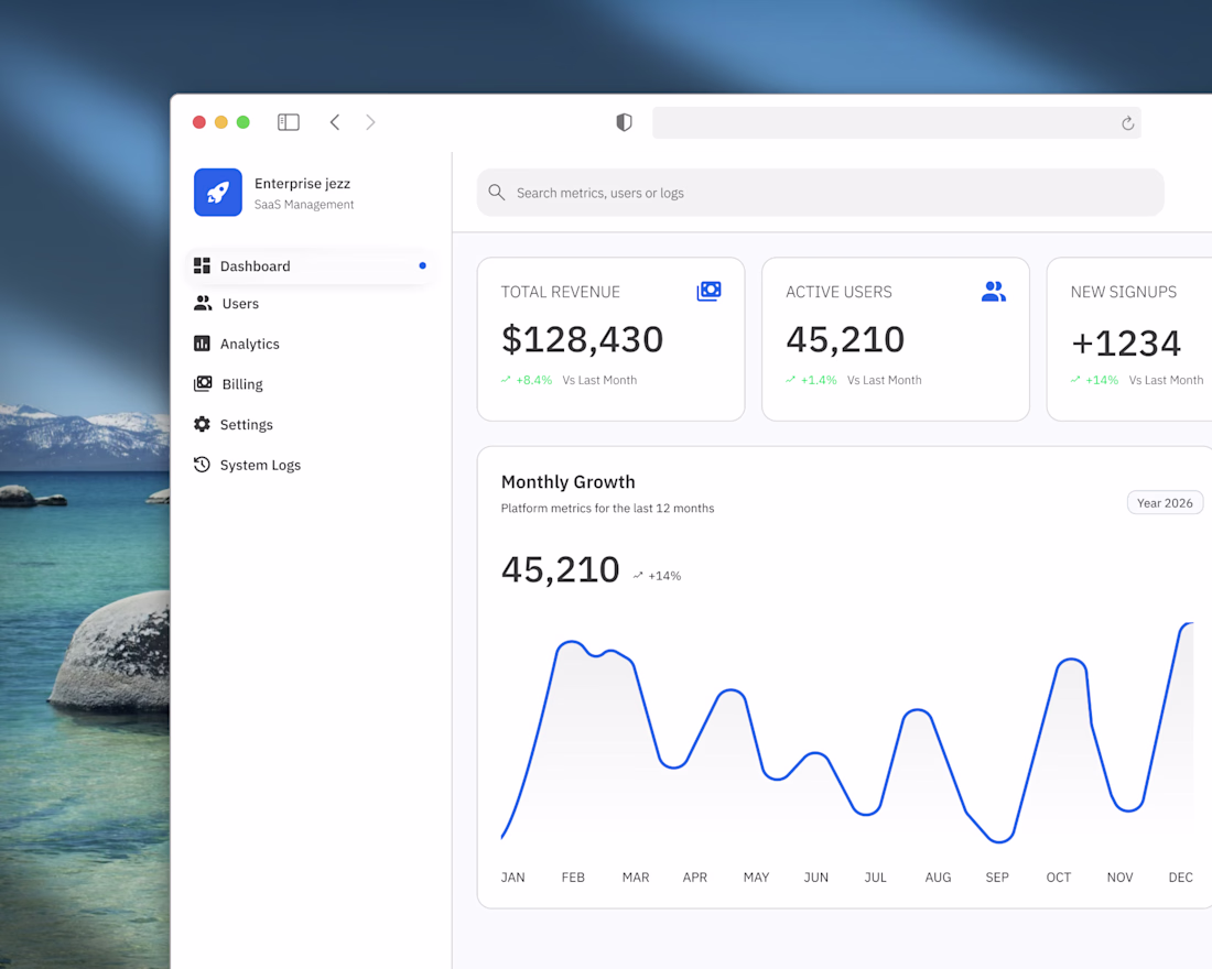
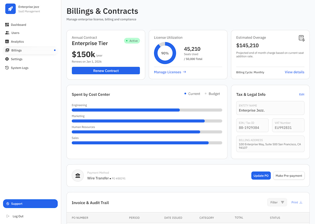
From Confusion to Compliance.
Billing at scale is a nightmare if the design is cluttered. For the Billings & Contracts view in Enterprise Jezz, I focused on reducing "Invoice Anxiety" by making the most critical financial data instantly scannable.
Here is the strategy behind the...
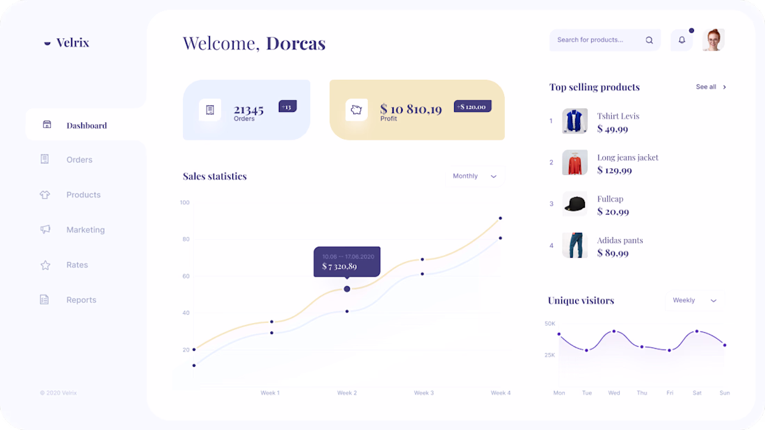
I saw this dashboard layout recently and had to replicate it to dissect its Information Architecture. Sometimes, the best way to sharpen your tools is to rebuild a world-class interface from scratch.
For this study, I focused on:
♣︎. Soft UI & Hierarchy: Using subtle shadows and...