The network for creativity
Join 1.25M professional creatives like you
Connect with clients, get discovered, and run your business 100% commission-free
Creatives on Contra have earned over $150M and we are just getting started
Back to feedPost
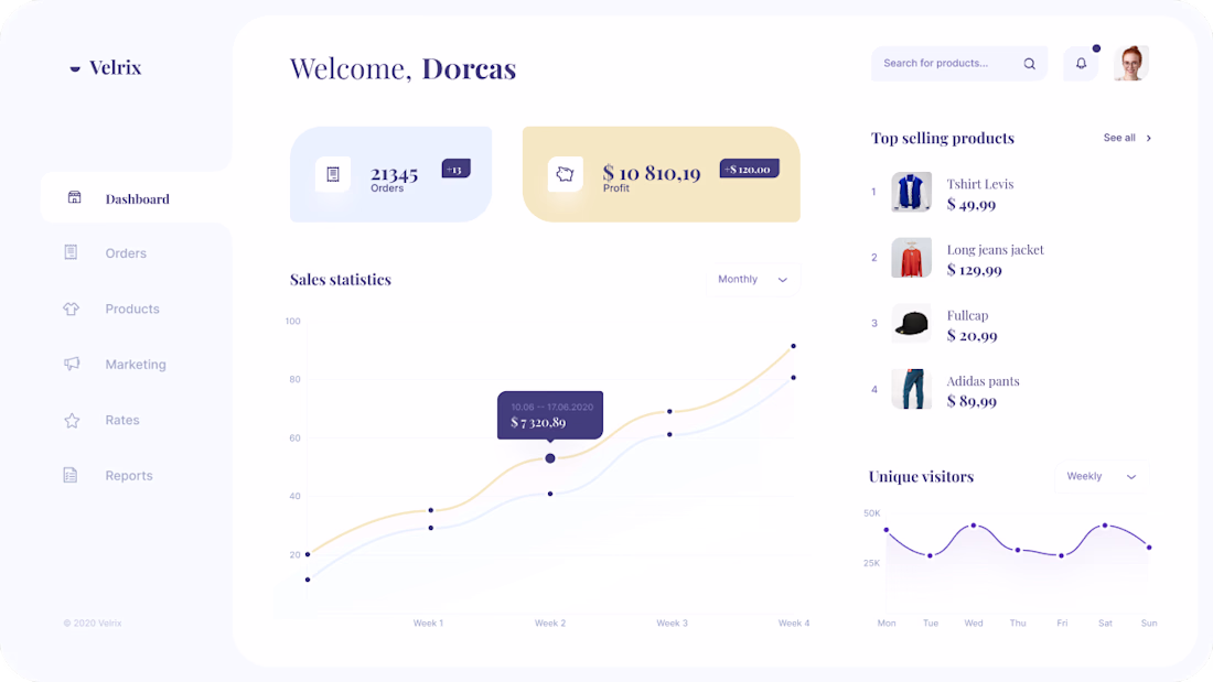
I saw this dashboard layout recently and had to replicate it to dissect its Information Architecture. Sometimes, the best way to sharpen your tools is to rebuild a world-class interface from scratch.
For this study, I focused on:
♣︎. Soft UI & Hierarchy: Using subtle shadows and pastels to guide the eye without the "Visual Noise" common in E-commerce dashboards.
♣︎. Micro-interactions: Analyzing the 'Sales Statistics' hover-states to see how data density can feel "lightweight."
♣︎. The 'Profit' Pulse: Notice how the primary metric (Profit) is isolated in a warmer tone to immediately separate it from general volume.
Replicating great design isn't just about pixels—it's about understanding the decisions behind them, Visual Harmony & Data Clarity.
#BuildInPublic #UIUX #DesignStudy #ProductDesigner #Figma
The network for creativity
Join 1.25M professional creatives like you
Connect with clients, get discovered, and run your business 100% commission-free
Creatives on Contra have earned over $150M and we are just getting started
Related posts
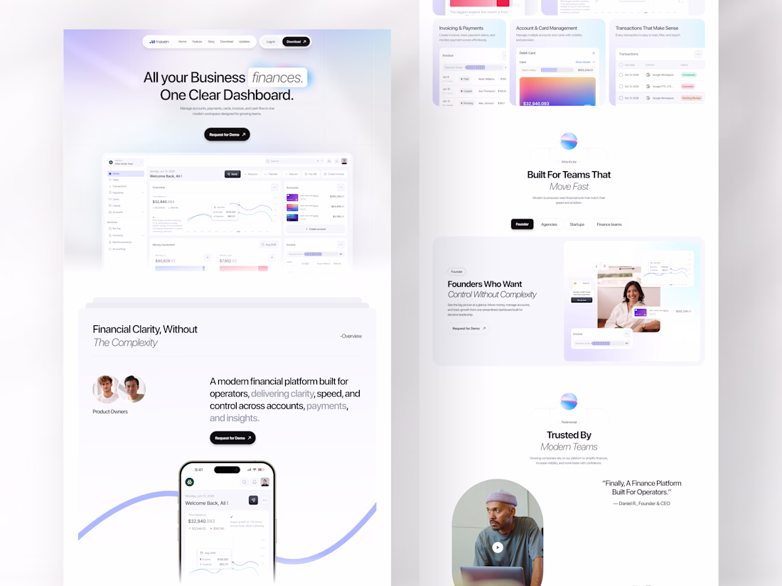
Every growing business has the same problem: finances spread across too many tools, too many tabs, and too much noise.
Maven was designed to end that. A finance SaaS landing page built for operators, founders, agencies, and startups who need one clear dashboard where accounts, payments, invoicing, card management, and cash flow all live together without fighting for attention.
All your business finances. One clear dashboard. The headline says everything, and the design proves it.
This is what a SaaS landing page looks like when it respects the intelligence of the people it's selling to.
Does this feel like a dashboard your finance team would actually trust? 👇
Tools: Figma , Jitter
#SaaSDesign #LandingPage #WebDesign #FintechUI #UIDesign #ContraFreelance #ProductDesign #DashboardDesign
Nice use of whitespace. It keeps everything focused.
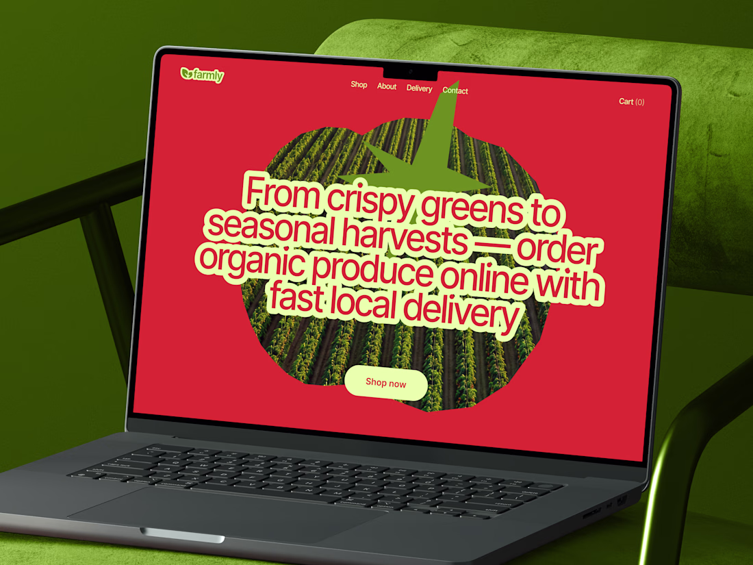
New concept of grocery store website. Excited to hear your feedback! 🚀
Such a vibrant and refreshing take on grocery e-commerce! The bold color choice, heavy typography, and clever tomato image mask create an incredibly memorable hero section. Love this! 🥦🍅
Working on A NEW PROJECT
So we are exploring the Hero Section, which of these will make you stay in the site and buy the product
- Static Hero
- Motion Hero
13 voted
34%
25 voted
66%
38 votes
Closed
For conversion, I'd vote static
Trending
Claude
Claude has entered the design space. How are you using Claude Design?
Contra University
Learn from expert creatives how to earn more using next-gen AI tools.
fifaworldcup2026
The World Cup is here and the whole world's watching. How are you designing for the world stage?
creativeaiflow
Creative AI workflows are evolving. What tools do you use, and what are their strengths and weaknesses?
freelancerlife
Freelancer life is wins, pivots, and everything in between. What’s yours right now?