The network for creativity
Join 1.25M professional creatives like you
Connect with clients, get discovered, and run your business 100% commission-free
Creatives on Contra have earned over $150M and we are just getting started
Back to feedPost


Post 2/3 for Forchetta 🍝 / Project Showcase / Creation of entire brand identity for Forchetta, an italian pasta company.
What do y'all think of this one? 🧐


forchetta looks amazing! the pasta shapes in the branding are genius. what was your fave part of this project?
Thanks Timothy!! I think creating the packaging was my fav, I haven't done so in a minute! 🔥


love the illustrations!!
Thanks Serena !!! ❤️🔥

This is amazing!...lovely piece
Thanks Abd! Appreciate it ✌🏼


Minimal and clean, love it
Thanks Giuseppe !!

love the work you did
Tysm Zaoui !! 🤩

love it! the illustrations are 🤌🏻✨
Thank youuu !! So glad you like the illutrations ❤️🔥🤞

Love the vibe😍
So glad you liike the vibe !! 🙌

This Forchetta branding is absolutely delicious! 🍝 The way you've captured Italian pasta culture through those bold illustrations is phenomenal. The contrast between the dark brown with red sun burst and the vibrant green bow-tie pasta is striking - each element tells a story....
Thanks Faith !! I appreciate it ! 🤞

Illustrations are great!
Yoo Thanks Sufyan !! 🤩


Really nice vibe with the illustrations!
Tysm Cam !! Really glad you enjoy the vibe :) 🤞

Appreciate it man !! For sure a fun project :) 🔥

Matches the vibe I would want while eating pasta
Ahahah so glad to hear Rishi !! thx ! 🙏


And now i'm in the mood for pasta lol thanks!
Ahahah glad to hear that man !! 😋

good work!
Thank youu Arshia !! 🤞

Love vibrant colors paired with illustrative style✨
TYSM Aish :) 🤞

Contra Artist Community 🎨✨🌍🔥
🙌

Thank you Daniella !! 🥹

Yayy Thank you Lynne ! So glad you are feeling the energy 😊

The sunburst behind the character does a lot of work here. It gives the pasta brand energy without crowding the illustration, and it should translate well to packaging and menus. Did you test the mark in a single colour for stamps and takeaway bags?
The network for creativity
Join 1.25M professional creatives like you
Connect with clients, get discovered, and run your business 100% commission-free
Creatives on Contra have earned over $150M and we are just getting started



Related posts

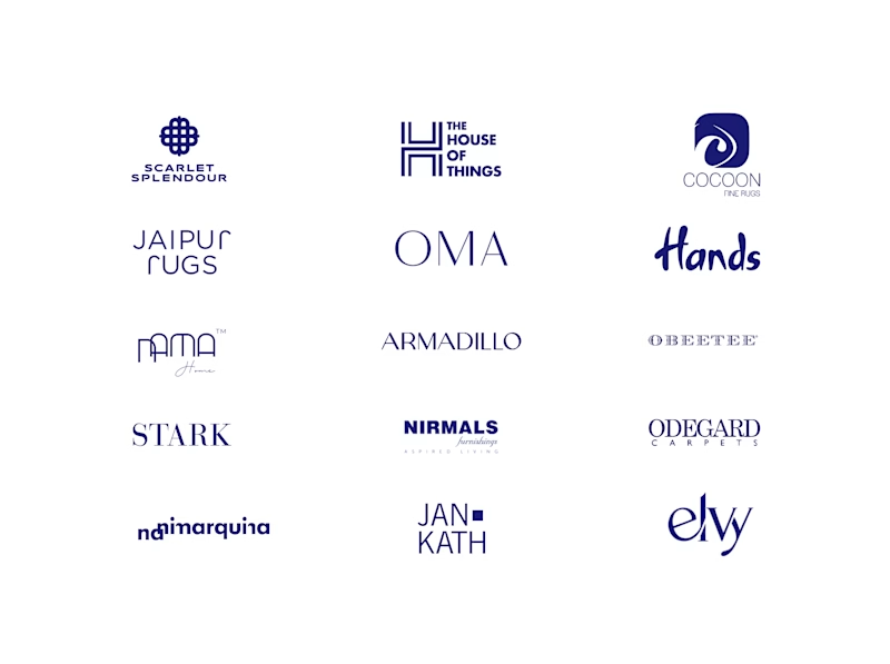
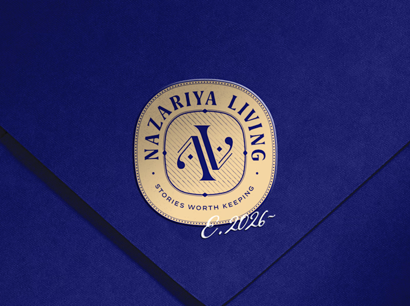
A little look at how Nazariya Living stands apart from its category.
On one side, familiar visual conventions. On the other, an identity with its own character, rooted in stories worth keeping.
We chose not to blend in. :)
Which side catches your eye?

3 voted
30%
7 voted
70%
10 votes
Closed

That side with all the competitor logos in one grid is the slide I'd steal for a client presentation. Nothing explains "why this direction" faster than showing the sea of sameness first. The navy seal wins easily after that.
Your competitors are a reference point, not a creative brief!!
For Nazariya Living, we started by studying the visual language of the premium carpet and home décor category. From logo styles to typography and overall aesthetics, we mapped the conventions that had become familiar across the market.
But understanding the category was only the starting point.
We wanted to build something that didn't just fit into the market, but brought a distinct point of view to it.
An identity rooted in storytelling, archival references and a visual language of its own.
Understand the category. Challenge the convention. Build something worth remembering.
That's how we approach branding for all of our clients.
Are you looking to build a brand that stands apart rather than blend in? Let's talk.


Challenge the convention is easy to say. Ignoring the carpet aisle's beige bible takes nerve.

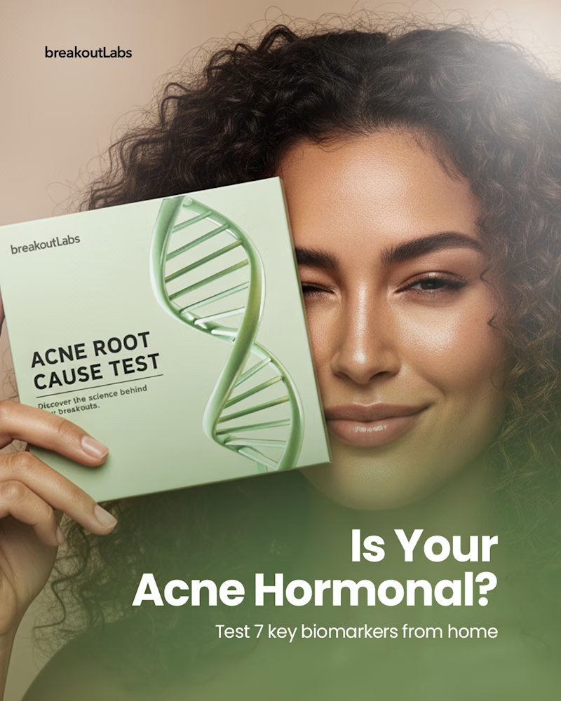
Same headline, same offer, two completely different approaches. Which one would make you stop and tap on an ad for a home hormone test?
Option A puts a real face behind the product.
Option B lets the product do all the talking.
Vote below and tell me why, I’m collecting honest feedback on what feels most trustworthy and clickable.

8 voted
89%
1 voted
11%
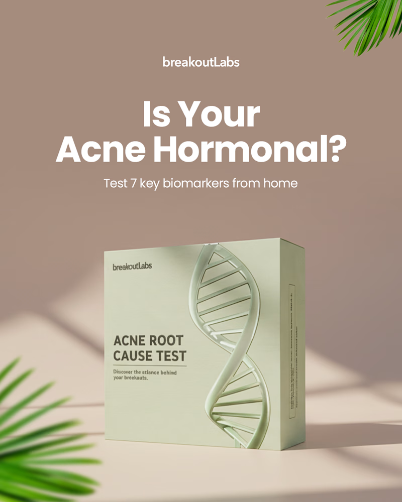
9 votes
Closed

Real Face for me. The model holding the box next to the headline feels more trustworthy, and her look leads straight to the question. The product only version reads like a catalog shot.