The network for creativity
Join 1.25M professional creatives like you
Connect with clients, get discovered, and run your business 100% commission-free
Creatives on Contra have earned over $150M and we are just getting started
Back to feedPost
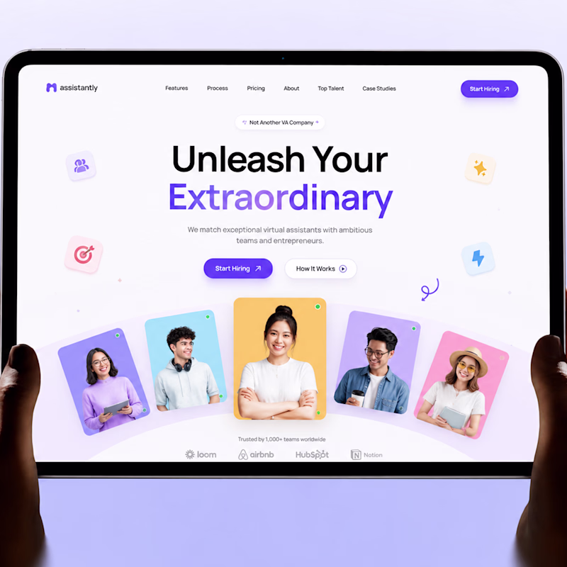
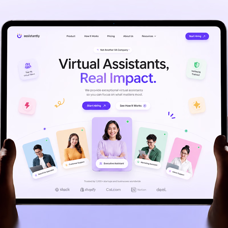
Taste Test
👀 Need your feedback!
If you landed on this page for the first time, which design would make you stay longer?
Left or 💜 Right?
Tell me your choice below!
52 voted
37%
89 voted
63%
141 votes
Closed
Right looks better to me
Left one is good.
Right one is more structured
Thank you 🔥
The Right version shows the intent with clarity.
Definitely leaning toward the left design variant.
🙌 🔥
The left. The Headline makes me stop and want to know more than the Right
Perfect 🙌
the thing that sells the most is simplicity, the left is more simple and hooking
nice work
Thank you 🙌
wow 🔥
Thank youuu🔥
the right one
Thank you 🔥
I think Right is better
Right one is the best
The right looks more okay to me 😊
The world unleash your extraordinary make me to think of my self first and make me want to unleashed it
Honestly right one looks good and well structured to me @Gopi UI/UX + AI
The right-side version looks better overall. The designations in the images are clearly defined, and the logos are displayed properly, making the design look more professional and well-presented.
I voted for Option 1. The additional breathing space (white space in the design) made it feel easier to scan and slightly more refined. Option 2 does a great job of drawing "attention" with the larger cards and icons , so I can see why it's leading. Interesting tradeoff between "visual calmness" and "engagement".
Right Looks Good!
Thank you 🙌
The right one looks better and clean.
Thank you 🙌
I agree — the left feels cleaner. The tags on the right compete with the secondary button and make the layout feel a bit busy.
Appreciate the feedback! 🙌
Really strong visual balance here, everything feels well structured.
Thank you! Really appreciate it. Glad the structure and visual balance are working well for you. 🙌
Definitely the right one!
Perfect 🚀
The Right layout looks polished and detailed. But the Left headline has stronger visual impact. 😊🔥
Thank you! 😊 The Right feels polished, but I agree the Left headline has stronger impact. 🔥
Liked them both honestly, both would do! 👍
Thank you! 🙌
the left, if everything on the hero is fighting for attention, its not a good UX
the right one
Left because my eyes were guided to the value proposition quickly and clearly.
Definitely 💯
Left design
Perfect 🙌
The network for creativity
Join 1.25M professional creatives like you
Connect with clients, get discovered, and run your business 100% commission-free
Creatives on Contra have earned over $150M and we are just getting started
Related posts
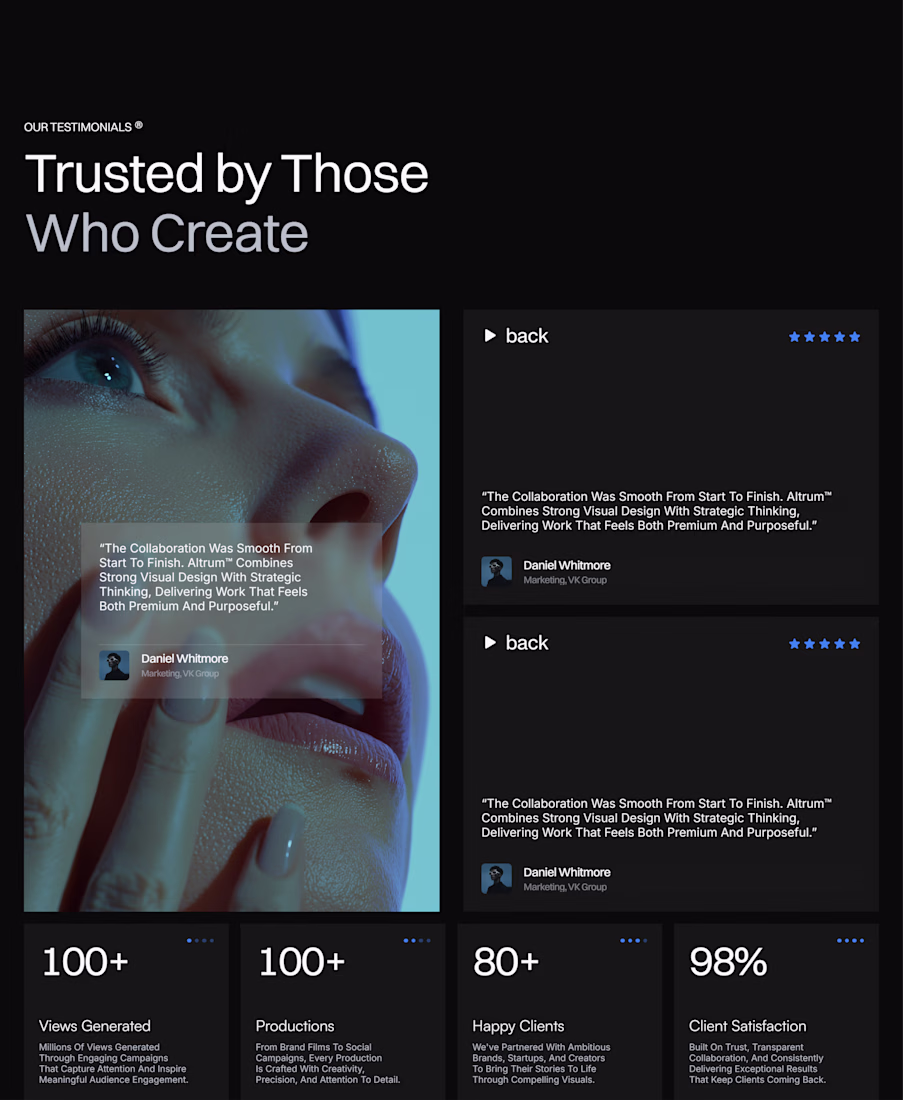
Currently refining the testimonial section for Playback Studio.
Focusing on clean layouts, stronger visual hierarchy, and making social proof feel as premium as the rest of the template. It's one of those sections that can quietly build a lot of trust when done right.
Slowly bringing everything together. Feedback is always welcome! ✨
How are you, everyone? I'm excited as we approach the final moment of the Envato Challenge. Are you? 😍
I present you with my entry for the challenge, feel free to share your feedback with me, and if you want, i can check out your entry too. Keep up the good work, and good luck 🫶
@Envato | AirReborn by Liberate - Product Promo
7Human by Design Keys
The Human Behind the AI
When people see an AI-generated commercial, it's easy to assume that AI did all the work. In reality, AI was only one of the tools I used. Every important creative decision—from the concept...
Wishing you luck
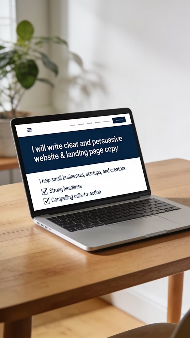
Title:
I will write clear and persuasive website & landing page copy
Description:
I help small businesses, startups, and creators get website and landing page copy that is clear, professional, and designed to convert visitors into customers.
What you get:
• Strong headlines that grab attention
• Clear and engaging section copy
• Compelling calls-to-action
• Natural, professional tone
• Revisions included
Perfect for:
• Homepages
• Landing pages
• About pages
• Service pages
I focus on simple, persuasive writing that helps your audience understand your offer and take action. No fluff — just effective words that work.
Send me a message with details about your business or page, and I’ll get started.
Trending
Claude
Claude has entered the design space. How are you using Claude Design?
Contra University
Learn from expert creatives how to earn more using next-gen AI tools.
creativeaiflow
Creative AI workflows are evolving. What tools do you use, and what are their strengths and weaknesses?
freelancerlife
Freelancer life is wins, pivots, and everything in between. What’s yours right now?