The network for creativity
Join 1.25M professional creatives like you
Connect with clients, get discovered, and run your business 100% commission-free
Creatives on Contra have earned over $150M and we are just getting started
Back to feedPost


Sure does it

Safe or bold, which one actually makes you stop scrolling? 🤔
Sans: the serif, tight tracking, one accent color playbook every skincare brand is running right now.
Bold: the same idea, redesigned with attitude. 💅
25 voted
32%
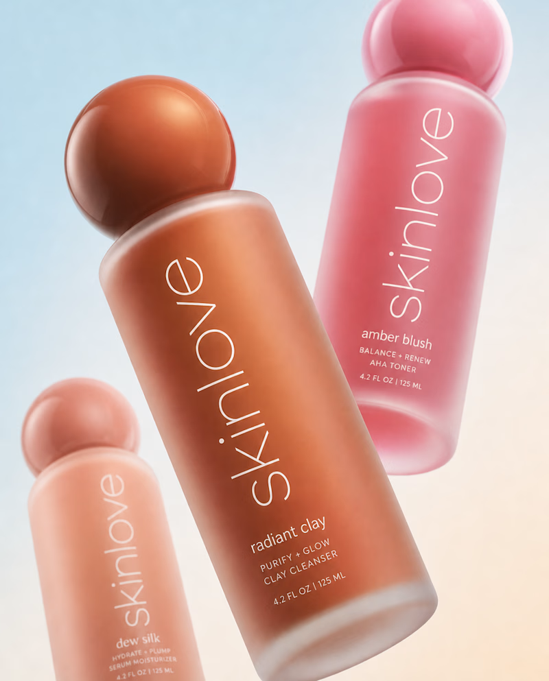
53 voted
68%
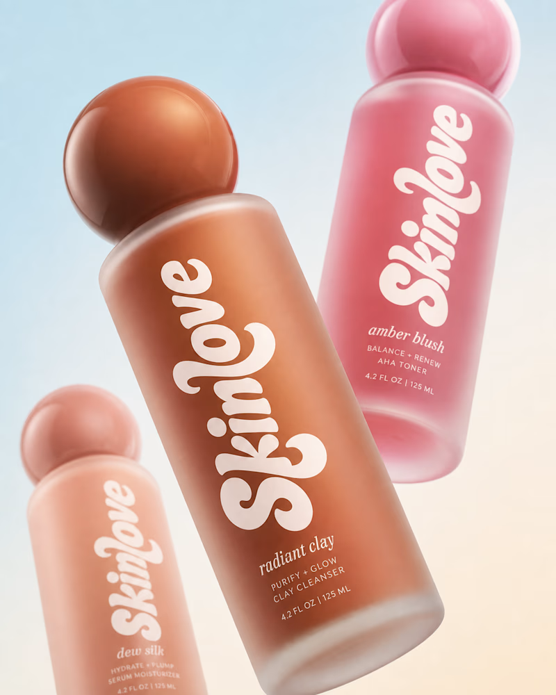
78 votes
Closed

Great work

Bold, no contest. Sans is the safe skincare playbook everyone runs, but that redrawn logotype has personality you'd actually reach for on a shelf. Same product, way more attitude. The 68 percent clearly agrees.
The network for creativity
Join 1.25M professional creatives like you
Connect with clients, get discovered, and run your business 100% commission-free
Creatives on Contra have earned over $150M and we are just getting started

Challenges
View all


Related posts

Client’s choice vs. Designer’s choice 👀
I’m currently working on a branding project for Massage & Mocktails — a concept built around couples learning massage together in a relaxed, social atmosphere.
These are two early, black & white directions from Stage 2 of my branding process, before moving into color, typography, and the full visual system.
The interesting part?
My client chose Concept 1. I chose Concept 2.
Now I’m curious what other creatives think.
Which direction would you choose — 1 or 2? And why?
Sometimes the most interesting part of branding is seeing how differently a client and a designer respond to the same brief.
21 voted
44%
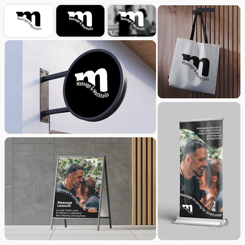
27 voted
56%
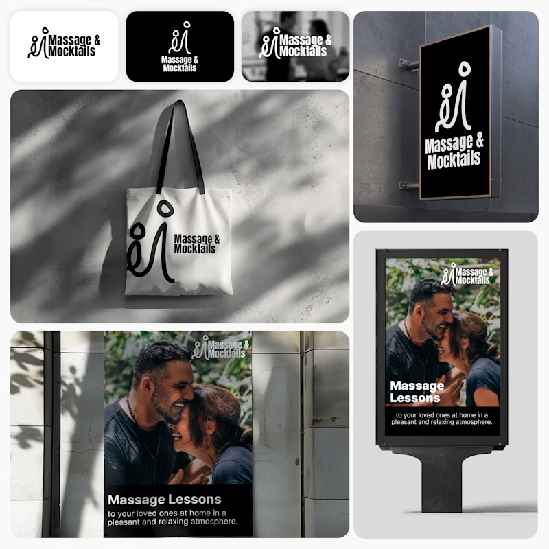
48 votes
Closed

Concept 2 for me. That interlocking figure mark reads as two people meeting, which is the actual brief here, so it gives you more to build a system on. Concept 1 is the safer, more literal pick, which is usually why clients reach for it.


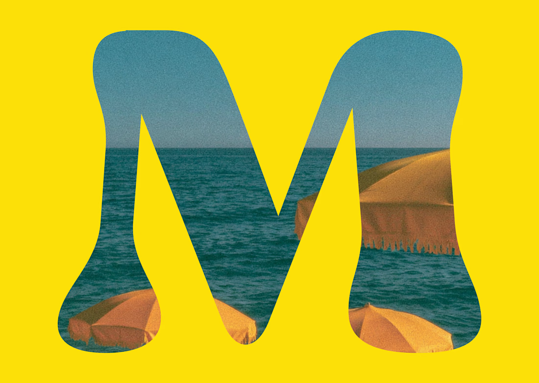
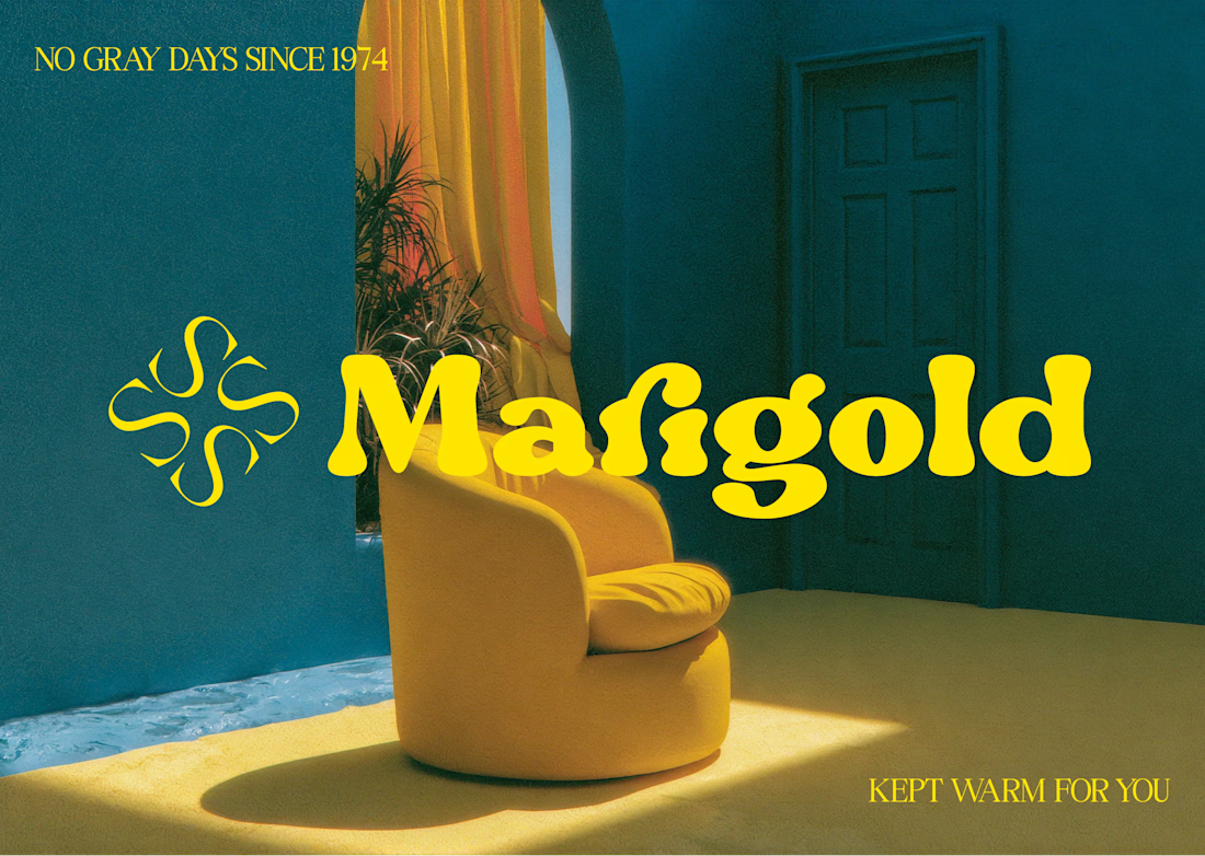
Marigold is a one day concept for envato's human by design challenge. i set the direction in real photography first then generated against that standard.





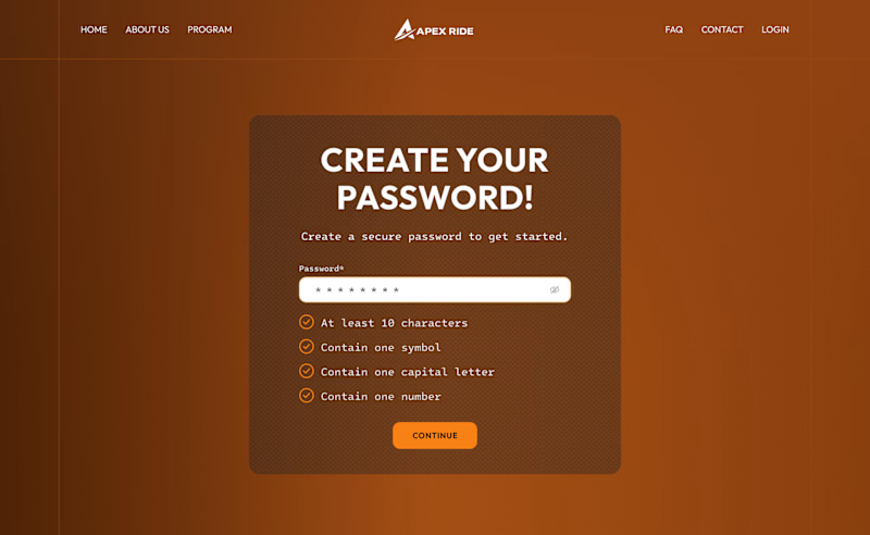
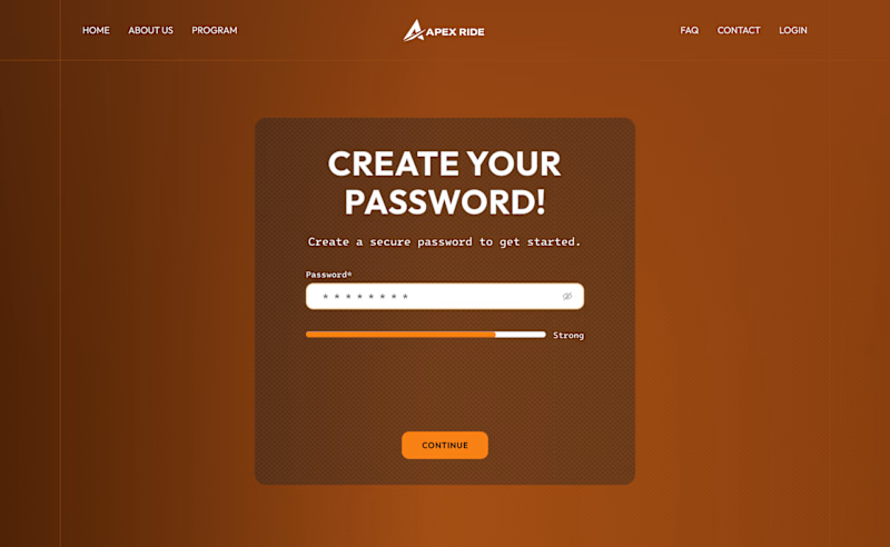
HOW MUCH GUIDANCE DOES A PASSWORD FIELD NEED?
For this desktop sign-up screen, I explored two ways to guide users while creating a password:
A - Detailed. A checklist displays every requirement and updates as the user types.
B - Minimal. A strength indicator provides quick feedback while keeping the interface cleaner.
The checklist offers more clarity, while the strength bar reduces visual noise.
Which approach would you choose - A or B?
39 voted
66%
20 voted
34%
59 votes
Closed

Detailed layout entails a guide to help users create strong passwords. Not everyone is good at crafting passwords, and this approach can makes them find it easy to remember.