The network for creativity
Join 1.25M professional creatives like you
Connect with clients, get discovered, and run your business 100% commission-free
Creatives on Contra have earned over $150M and we are just getting started
Back to feedPost
Taste Test


HOW MUCH GUIDANCE DOES A PASSWORD FIELD NEED?
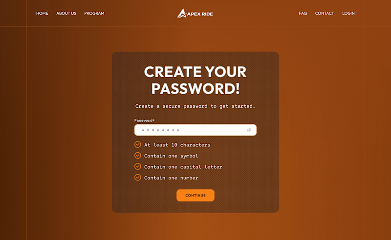
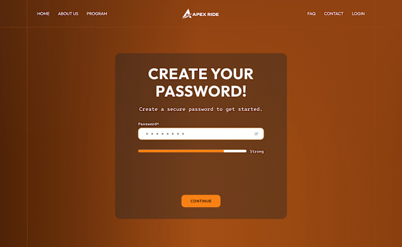
For this desktop sign-up screen, I explored two ways to guide users while creating a password:
A - Detailed. A checklist displays every requirement and updates as the user types.
B - Minimal. A strength indicator provides quick feedback while keeping the interface cleaner.
The checklist offers more clarity, while the strength bar reduces visual noise.
Which approach would you choose - A or B?
29 votes
Ends in 22h


The detailed checklist feels like the stronger default here because password rules are easy to forget; a compact strength bar could then become the progressive-disclosure layer once the basics are understood.

Detailed layout entails a guide to help users create strong passwords. Not everyone is good at crafting passwords, and this approach can makes them find it easy to remember.


Detailed works better

Detailed UI works best , users shouldn't have to guess the requirements needed to set up a password, with the requirement listed out it will be very easy for every user to set up password without any call back

Minimal everyday.

The detailed checklist helps new users a lot. It also helps people who are inexperienced or have little tech knowledge.

Detailed one
The network for creativity
Join 1.25M professional creatives like you
Connect with clients, get discovered, and run your business 100% commission-free
Creatives on Contra have earned over $150M and we are just getting started

Challenges
View all


Related posts

If your dashboard has to be beautiful OR instantly understandable, which one wins?
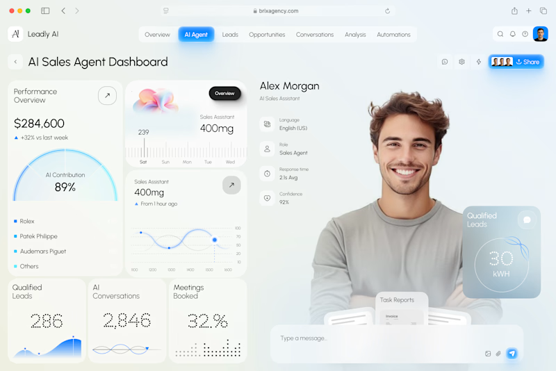
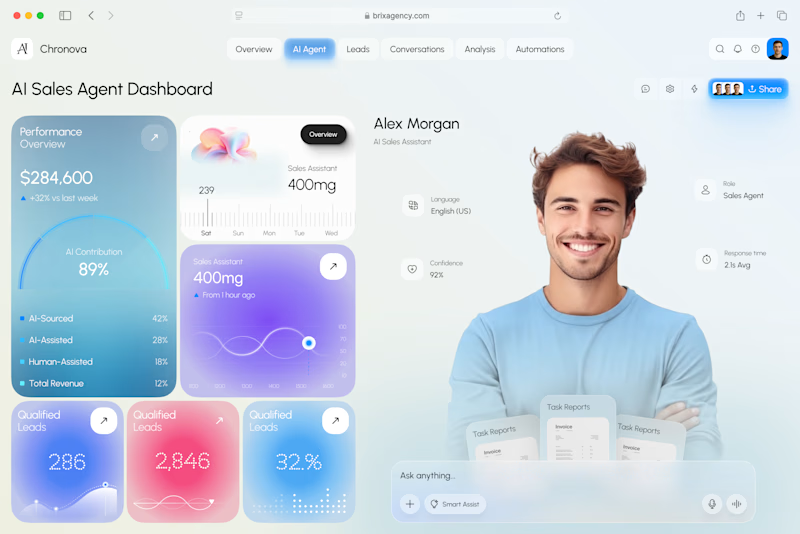
I designed two visual directions for the same AI Sales Agent dashboard.
Same product. Same data. Same core UX.
Only the visual language changed.
Poll options:
A — Clarity First
B — Energy First


30 voted
53%
27 voted
47%
57 votes
Closed
A clarity outstanding



A

For this project, the Contra community chose these colors and the concept featured in this post: https://on.contra.com/ppTKmT
Now we’re moving forward. In one of the two animations, we’re thinking of showing the frames more clearly and adding a methane gas effect, but the client disagreed with us, so we decided to let the Contra community decide.

21 voted
78%
6 voted
22%
27 votes
Closed

Option 1 For me