The network for creativity
Join 1.25M professional creatives like you
Connect with clients, get discovered, and run your business 100% commission-free
Creatives on Contra have earned over $150M and we are just getting started
Back to feedPost
Taste Test


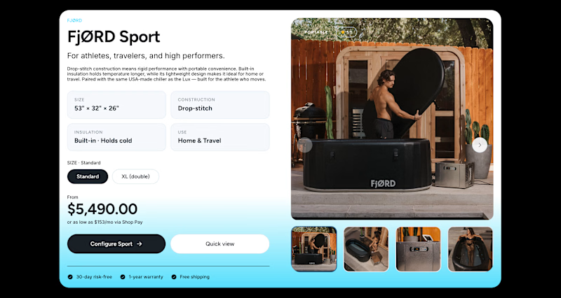
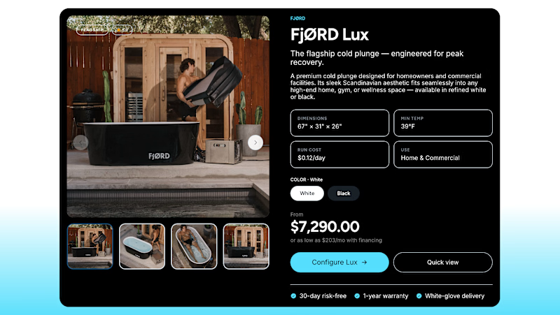


Awesome design !

One of the best designs I’ve seen today. Really solid work 👏 Aqua on Black creates such a sleek contrast transition into light mode.

A on B is making the information much easier to scan


I go for A on B

A on B looks better

I'd choose A on B

Dark hero / light body (the left one) for a product page specifically - price and add-to-cart sit on white, which is where the eye needs the most contrast. All-dark looks premium but it flattens the visual hierarchy between hero and CTA, so the two competing for attention end up reading as one block.

A on B


Aqua on Black for me. It creates stronger contrast and feels more premium, especially with the dark hero and footer direction.

The UI is visually appealing while keeping everything clean and easy to use. Good job!

A

how?
The network for creativity
Join 1.25M professional creatives like you
Connect with clients, get discovered, and run your business 100% commission-free
Creatives on Contra have earned over $150M and we are just getting started

Challenges
View all


Related posts

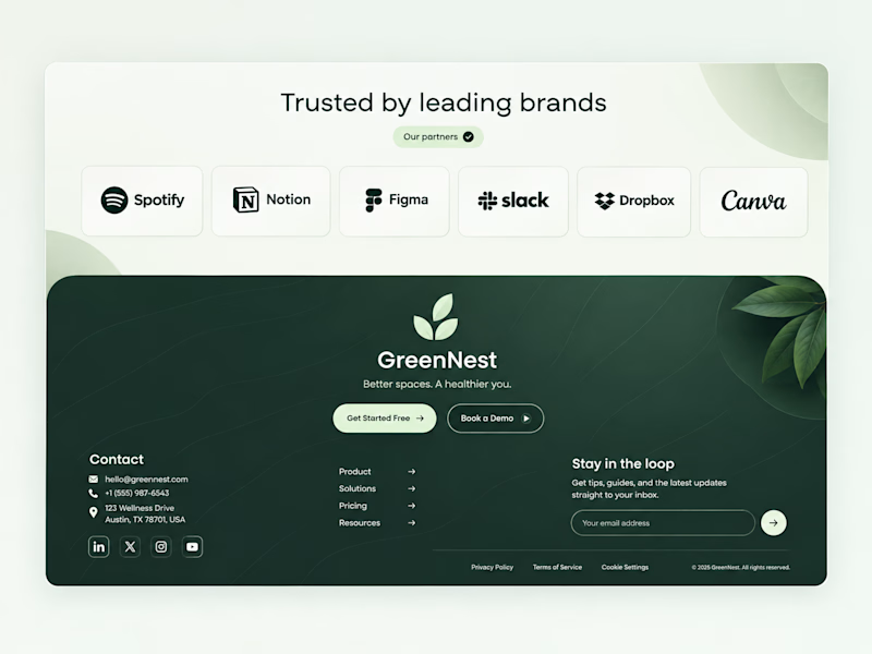
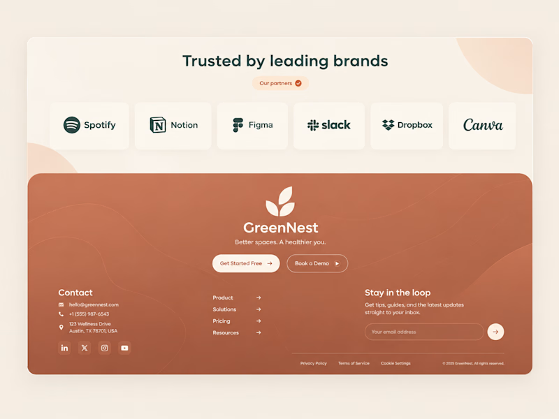
Both on-brand. Just two different sides of the same story.
Which color would make you trust "better spaces, a healthier you" more? 👇


44 voted
100%
0 voted
0%
44 votes
Closed


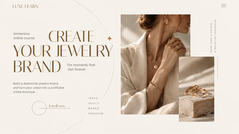
Same course. Same content. But two completely different feelings ✨
Which version would you choose?
27 voted
59%

19 voted
41%
46 votes
Closed

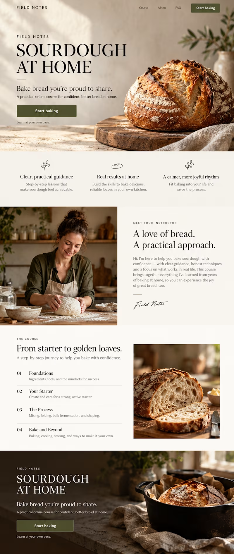
Option 2 is more practical ❤️❤️


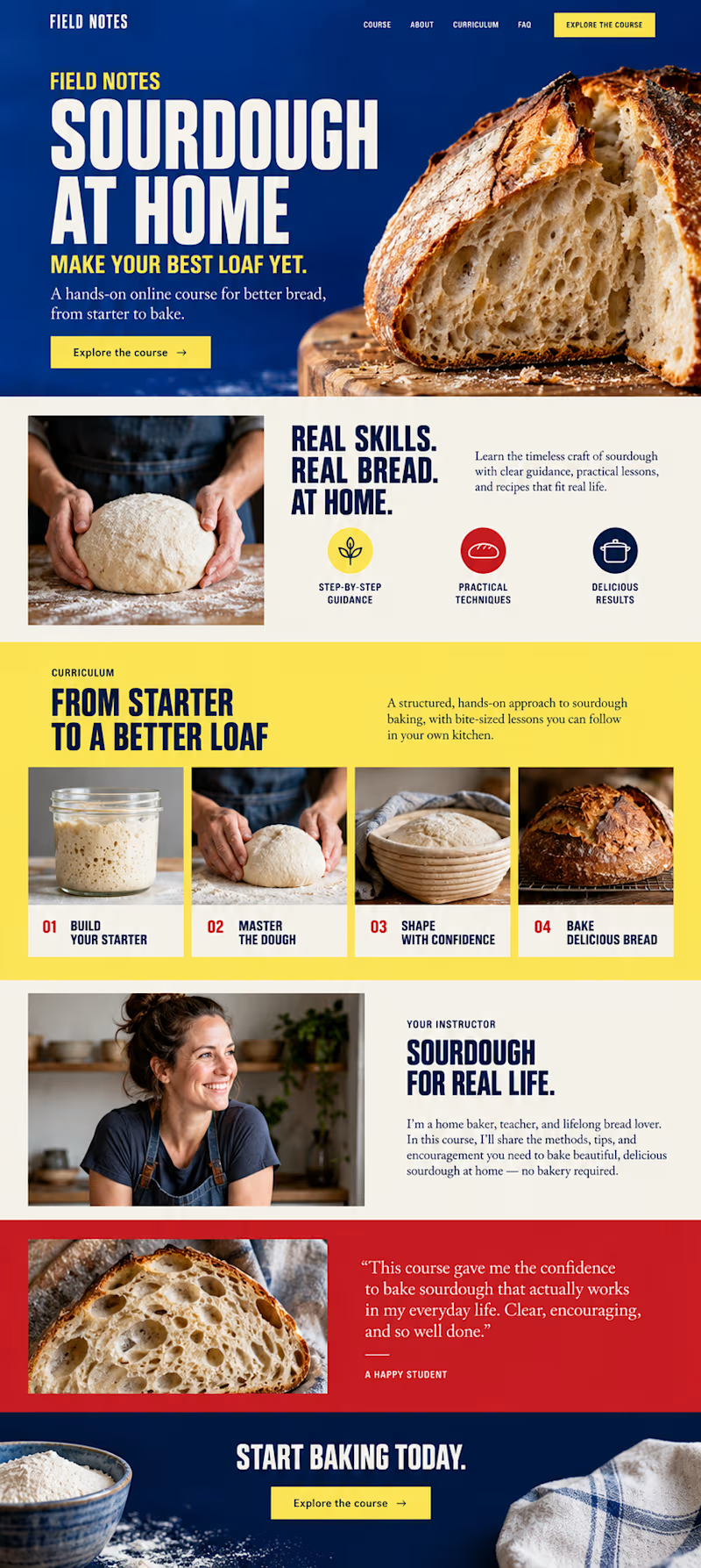
Which direction would you choose for a sourdough course sales page in Kajabi?

34 voted
59%
24 voted
41%
58 votes
Closed

B- Bold color is good