The network for creativity
Join 1.25M professional creatives like you
Connect with clients, get discovered, and run your business 100% commission-free
Creatives on Contra have earned over $150M and we are just getting started
Back to feedPost
Taste Test

Same content, different experience. A few thoughtful design choices can completely change how a presentation feels, flows, and communicates. Which version would you choose?

11 voted
31%
24 voted
69%
35 votes
Closed

cool

The second one!!


Vista 1 dope

Verde Vista 1 for me. The hand on that deep blue makes the data feel way more alive. Nice comparison!
Combined with a futuristic robotic arm. wow, what a new POV! Thanks man!

Option 1 is cool but everything is competing for attention equally so I'd go for option 2 🙌
Great POV! You only like the one that's highlighted, right?

Verde Vista look nice

visuals 2 are more facinating that 1
The Minimalism effect 🙌

Verde Vista 1 is more modern and futuristic specially with blue colors and robotic hand❤️
Great job Rasid🎉🎉🔥🔥
Appreciated it man!
Thank you bro❤️


I'm going with Verde Vista 1. The deeper blue and bolder geometry give the cover more presence, which makes the whole deck feel more premium.

Cool!!

Verde Vista 2. The shape adds depth without fighting the numbers on the slide.
The network for creativity
Join 1.25M professional creatives like you
Connect with clients, get discovered, and run your business 100% commission-free
Creatives on Contra have earned over $150M and we are just getting started








Related posts

Not every direction I create makes it to the final storyboard; here's one that didn't.
For a recent B2B SaaS intro video, I explored two very different illustration approaches before landing on the final style.
A: a friendly mascot character guiding viewers through dashboards and stats
B: minimal line-art, following one person's story instead of showing the product at all
Which one feels stronger to you as an intro, and why? Character design and personality, or the quieter, more narrative line-art approach?
6 voted
60%
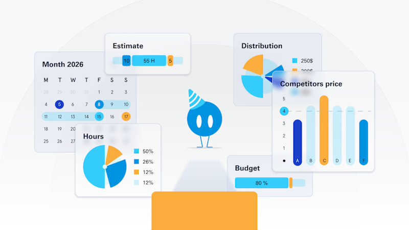
4 voted
40%
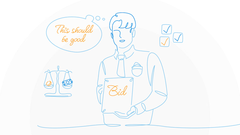
10 votes
Closed
A is stunning visuals shapes designs that's unbelievable 🔥🔥🔥🔥🔥
Great job Elvira❤️


Your Hero Section Has One Job: Be Clear.
You don’t need huge headlines or long explanations. You need the right image + short headline + clear offer.
For the first version, we worked on the branding, the image and the copy together, so at first glance it’s clear: this is a makeup course, and here’s what you’ll get.
The second version is still beautiful and still feels like beauty. But what are you actually getting? A makeup course? Products? A store? That’s the problem with a Hero that looks good but isn’t thought through.
Your first screen doesn’t need to say everything. It just needs to say the right thing.

22 voted
61%
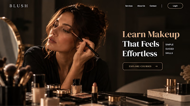
14 voted
39%
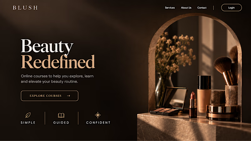
36 votes
Closed


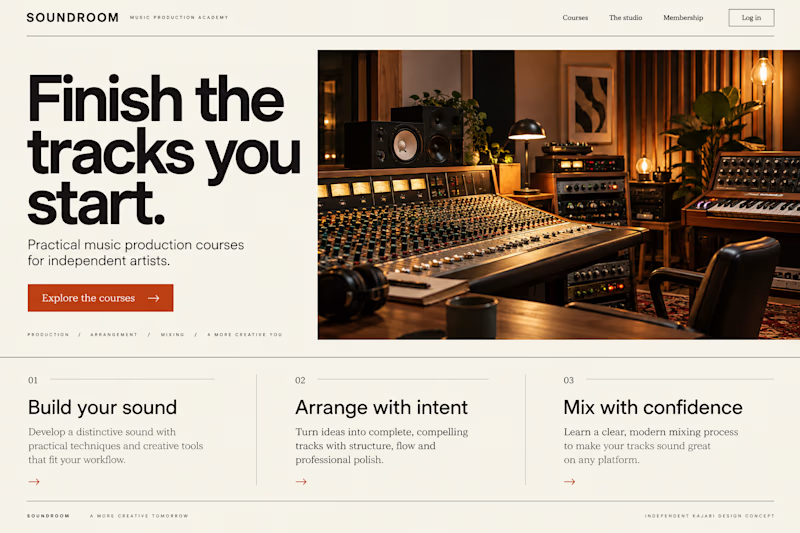
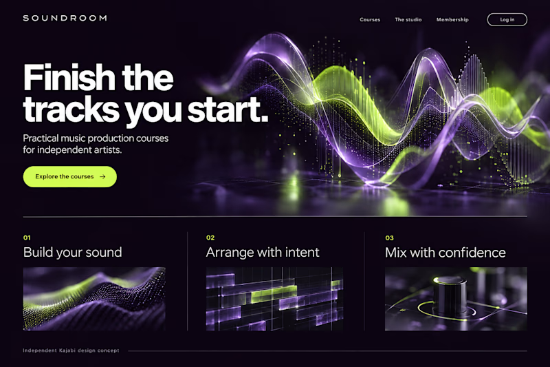
Which Kajabi music-course design makes you want to hit play?
Two original AI-generated website concepts for Soundroom, a fictional music-production academy. Analog Studio pairs warm recording-room imagery with cream and burnt orange. Digital Rhythm brings luminous waveforms, midnight plum and acid lime. Same course, two different first impressions.
Which direction would you choose?
13 voted
41%
19 voted
59%
32 votes
Closed