The network for creativity
Join 1.25M professional creatives like you
Connect with clients, get discovered, and run your business 100% commission-free
Creatives on Contra have earned over $150M and we are just getting started
Back to feedPost
Taste Test
Not every direction I create makes it to the final storyboard; here's one that didn't.
For a recent B2B SaaS intro video, I explored two very different illustration approaches before landing on the final style.
A: a friendly mascot character guiding viewers through dashboards and stats
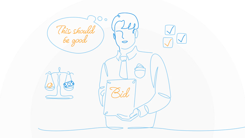
B: minimal line-art, following one person's story instead of showing the product at all
Which one feels stronger to you as an intro, and why? Character design and personality, or the quieter, more narrative line-art approach?
6 voted
60%

4 voted
40%
10 votes
Closed


Interesting, you might’ve guessed exactly what the client was thinking when they picked this version 😄

I think the option with the mascot is more appealing.
Love that perspective, thank you!

Wou amaizing
Thank you so much! ❤️

A is stunning visuals shapes designs that's unbelievable 🔥🔥🔥🔥🔥
Great job Elvira❤️
Thank you, Mostafa! ❤️ So glad you like it!
Pardon Elvira ❤️
The network for creativity
Join 1.25M professional creatives like you
Connect with clients, get discovered, and run your business 100% commission-free
Creatives on Contra have earned over $150M and we are just getting started







Related posts

The previous poll on this preloader had exactly 50-50 results between Horizontal gallery and Circle intro. Now I'm continuing with 2 other options. Which one is better? Check the live preview here
19 voted
53%
17 voted
47%
36 votes
Closed

Team mosaic!!

Same ending, different run-up. 1seconds or 2 for this Pletor.ai promo. What do you think?
27 voted
48%
29 voted
52%
56 votes
Closed

Number 2 looks more stunning

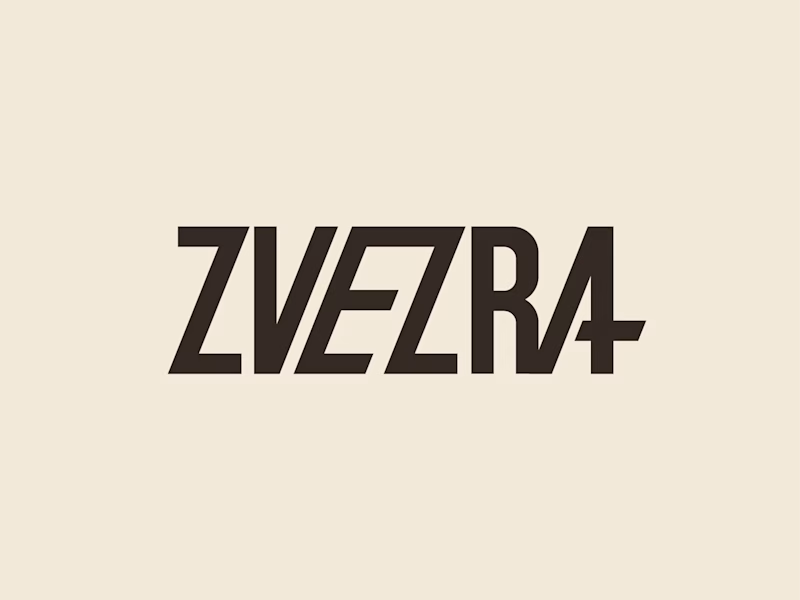
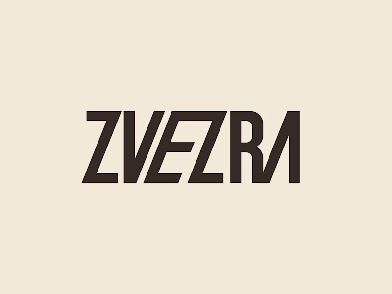
Which ZVEZRA logo direction do you prefer? 👀
I’ve been exploring two variations of the wordmark. Both follow the same visual direction, but each has its own character.
Vote below!
I’d love to hear your thoughts! 👇

39 voted
53%
34 voted
47%
73 votes
Closed

Option 1 for me, it has a bit more personality. Both are strong though, tough call