The network for creativity
Join 1.25M professional creatives like you
Connect with clients, get discovered, and run your business 100% commission-free
Creatives on Contra have earned over $150M and we are just getting started
Back to feedPost
Taste Test

If your dashboard has to be beautiful OR instantly understandable, which one wins?
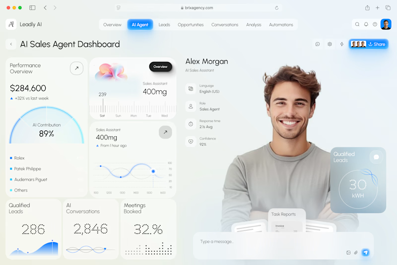
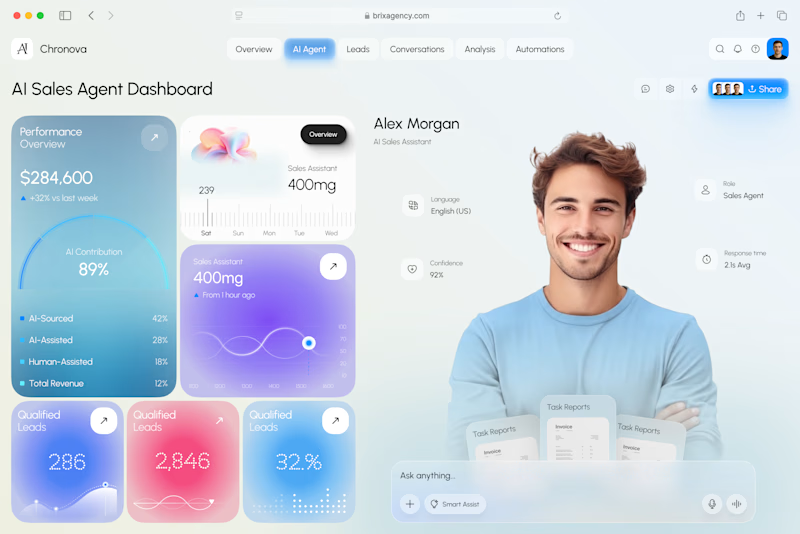
I designed two visual directions for the same AI Sales Agent dashboard.
Same product. Same data. Same core UX.
Only the visual language changed.
Poll options:
A — Clarity First
B — Energy First


30 voted
53%
27 voted
47%
57 votes
Closed

A for usability, B for personality. Tough choice

I’d pick A. The information hierarchy feels effortless.

Pro design 🤩


Energy is more distinct

Clarity first!

Both have insane UI, but the UX still feels behind. Users shouldn’t have to figure out where to go or what to do next. The product should guide them and surface the right actions at the right time.

A Clarity First. Dashboards need utility over visual noise. The heavy gradients in B make the metrics much harder to read at a glance.

Clarity always wins over energy for me.

Clarity is easier to read.


superb!

colors in B look more clean
Yess


Nice work as usual! Option B’s energetic visual language gives high-speed sales workflows such a modern pop.

A clarity outstanding

Going for A. Both are amazing

B is looking more cleaner, and it's easy to differentiate between the main content blocks, there is no mixing of content, easier to understand.


the big numbers in b sit on pink and purple tiles.. i had to squint at 2,846

In dashboard's clarity matters more then design.


really like your work and that kind of style! wow!
The network for creativity
Join 1.25M professional creatives like you
Connect with clients, get discovered, and run your business 100% commission-free
Creatives on Contra have earned over $150M and we are just getting started





Related posts

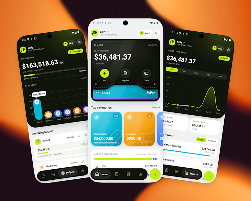
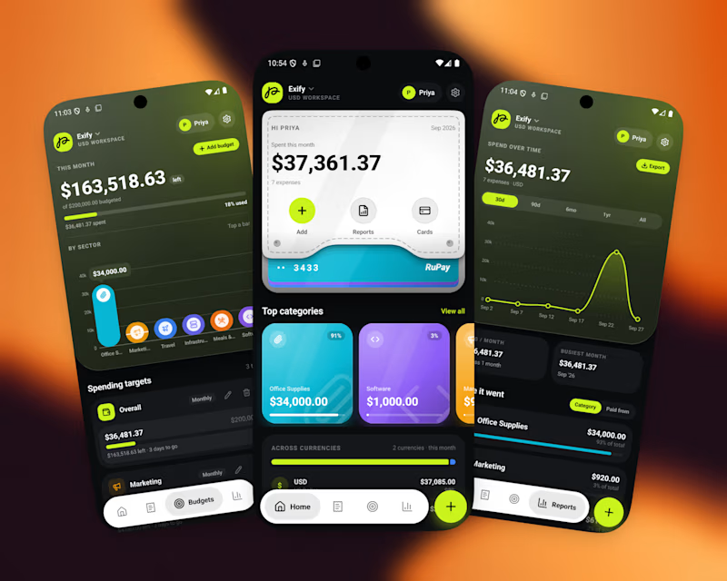
A great app should not just function, It should feel visually distinct
When the market is full of similar-looking products, design becomes part of the product’s well identity
For this finance project, we focused on a sleek UI, intuitive UX, and a visual language that doesn’t feel generic
Both dark and light modes were designed to feel equally intentional.
Which one do you prefer?
10 voted
56%
8 voted
44%
18 votes
Closed

I’d go with Light Mode. 👌 It feels fresh, clean, and the UI elements stand out beautifully against the background. Both are strong, though! 🔥

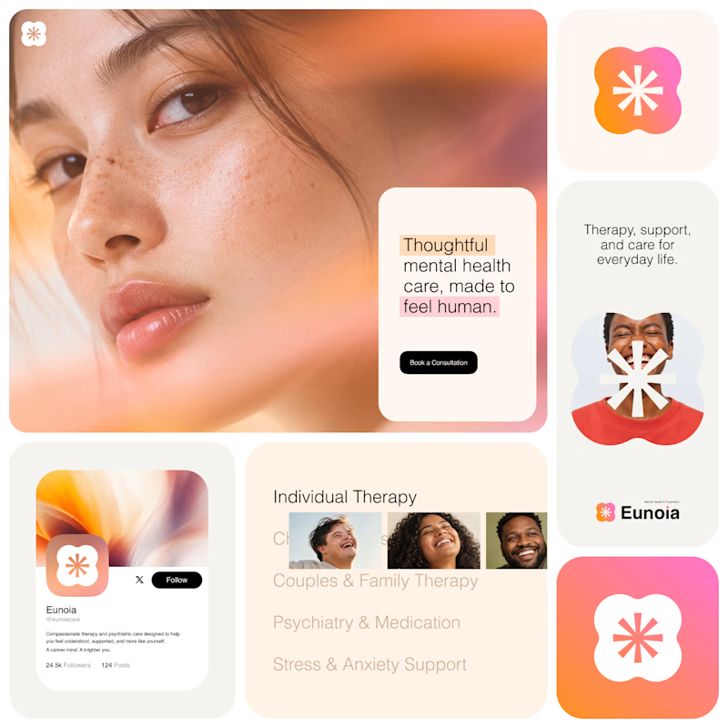
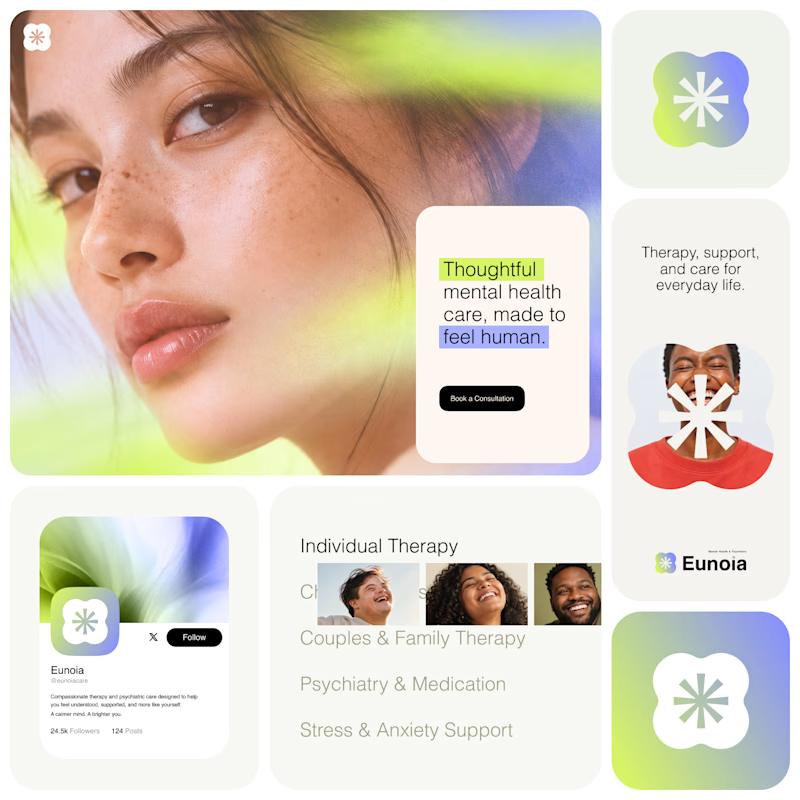
Exploring two visual directions for Eunoia, a mental health & psychiatry brand.
Direction 01 - Warm peach, orange and soft pink tones for a calm, human and comforting feel.
Direction 02 - Lime and periwinkle tones for a fresher, more optimistic and contemporary expression.
Same brand system. Different emotional energy.
32 voted
52%
29 voted
48%
61 votes
Closed

That's impactful, love to see fresh styles





🔥 🔥