The network for creativity
Join 1.25M professional creatives like you
Connect with clients, get discovered, and run your business 100% commission-free
Creatives on Contra have earned over $150M and we are just getting started
Back to feedPost
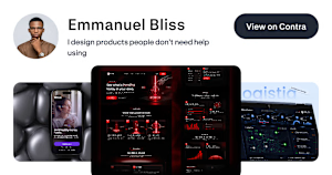
Taste Test

Text animation looks like a small detail, until you put a few versions side by side 👀
Which one works better for you, A or B?

24 votes
Ends in 19h

Appreciate it 🙏

B is cooler🔥
Thanks 👍

I prefer B the transition feels more smooth
Thanks, Isaac

Nice work!
Appreciate your comment, Madob

A looks great!!
Thanks a lot, Celia

B is way smooth

So true, timing and easing on text can completely change how a message lands. Fun to see them side by side like this.

I’d go with A! It feels more epic and energetic, and the glowing gradient really amplifies the impact of the word.

I'd love to see option B in action

The network for creativity
Join 1.25M professional creatives like you
Connect with clients, get discovered, and run your business 100% commission-free
Creatives on Contra have earned over $150M and we are just getting started



Related posts

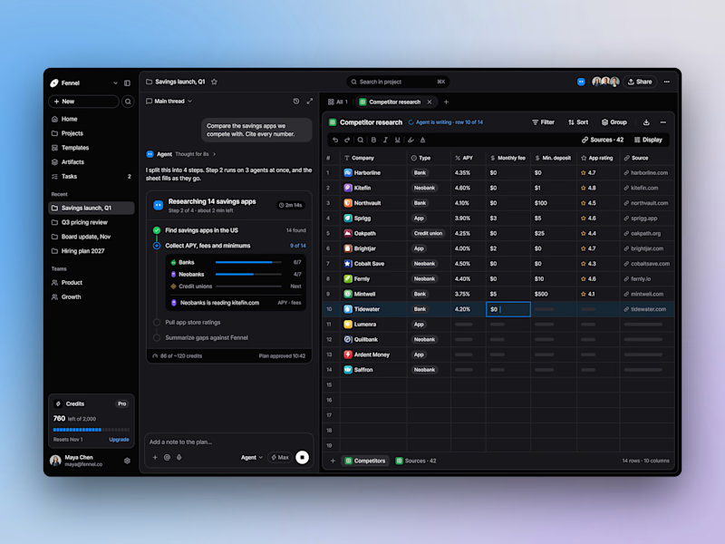
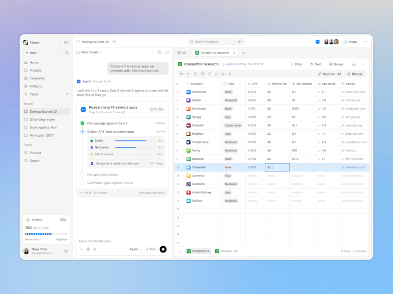
Designed an AI research workspace where the agent plans the work and fills a sheet with cited sources as it goes.
Same screen, two modes. Which one would you work in all day? 👀

13 voted
72%
5 voted
28%
18 votes
Closed

Keeping the research plan and cited results side by side is a useful way to make the agent’s work easier to inspect. I’d lean toward light mode for reading the table in daylight. How do you distinguish a verified source from one that still needs review?

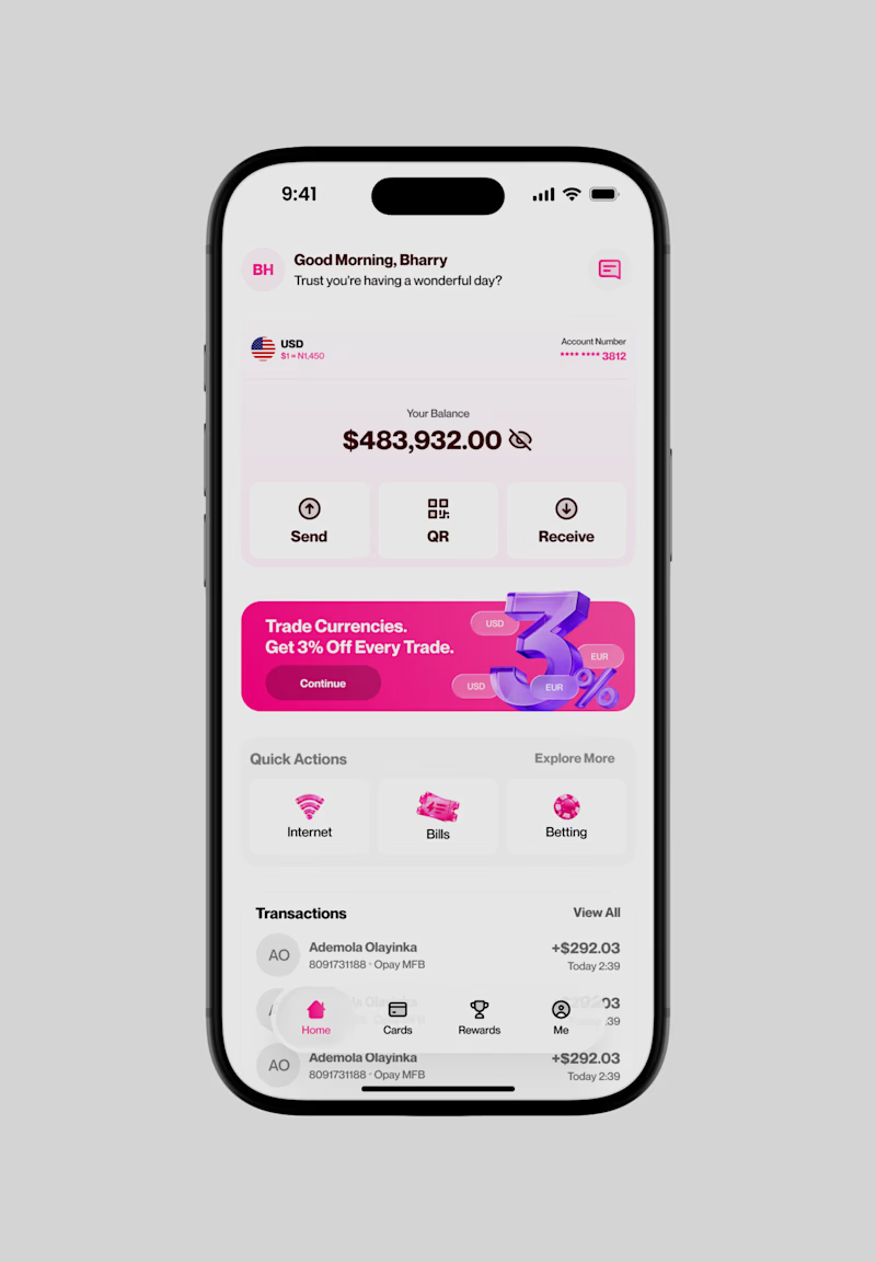
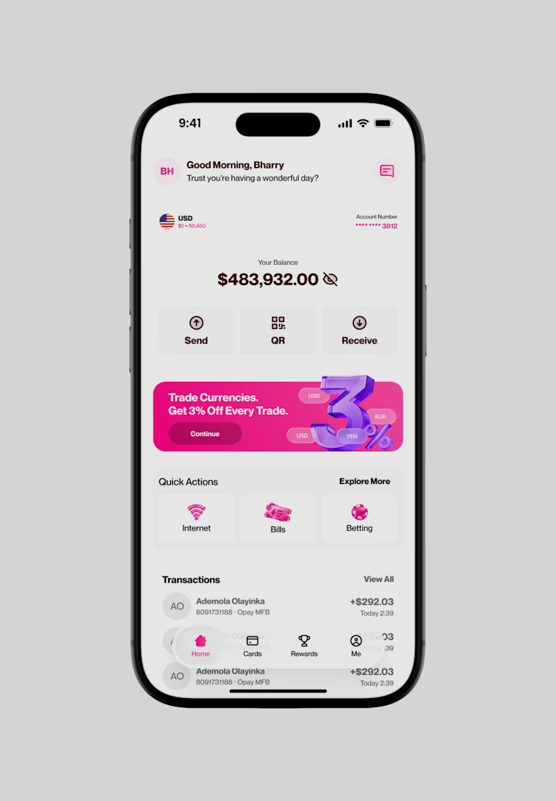
Been working on this fintech concept and I’m curious about one thing: which direction feels better?
A or B? 👀
Same product, slightly different visual approach. One has to go, and I want you to be the judge.
What's your pick?
6 voted
75%
2 voted
25%
8 votes
Closed

To be honest both of them are the same to me but they are great 🎉

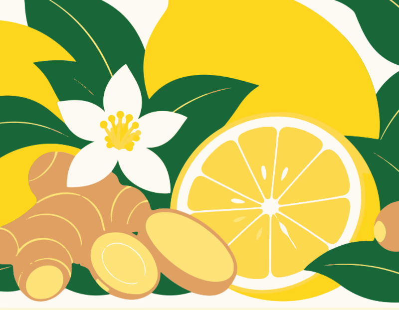
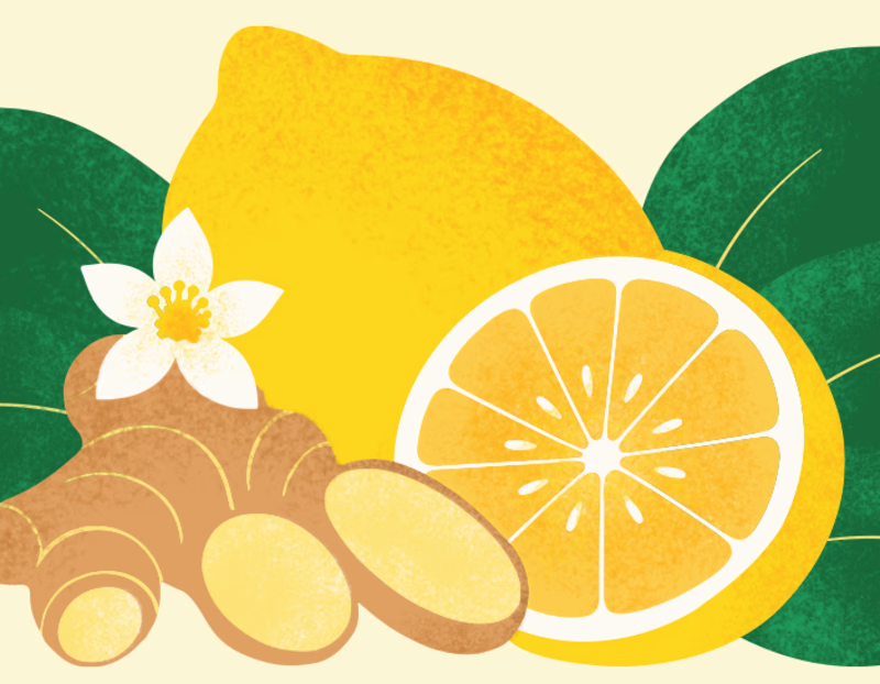
From AI-generated artwork to a more polished vector illustration.
I tested Ideogram Vector by generating an illustration for a lemon ginger tea packaging.
The raw output was a good starting point, but it still needed some work.
So I converted it into an editable SVG, refined the shapes, rearranged and resized the elements, and added a bit of texture to give the illustration more depth.
Here's a look at the before and after!
What do you think? 🍋

4 voted
9%
41 voted
91%
45 votes
Closed
After is absolutely better it focus on the main image🎉🎉