The network for creativity
Join 1.25M professional creatives like you
Connect with clients, get discovered, and run your business 100% commission-free
Creatives on Contra have earned over $150M and we are just getting started
Back to feedPost
Taste Test

A hero section design I did 5 years back in Sketch 💎
Are you on the dark or light side? 👀

25 voted
48%
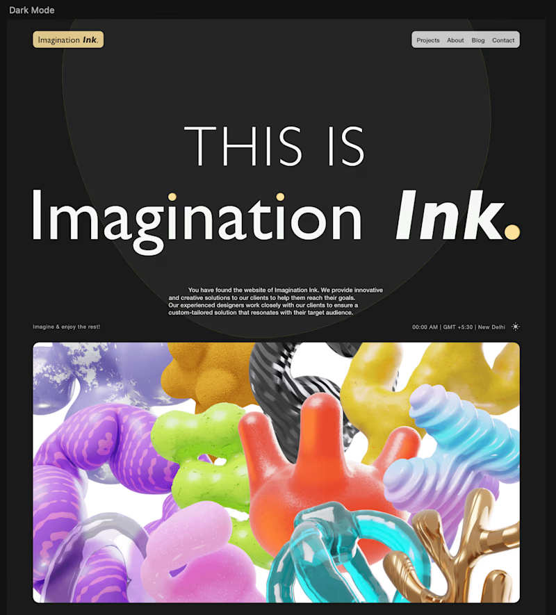
27 voted
52%
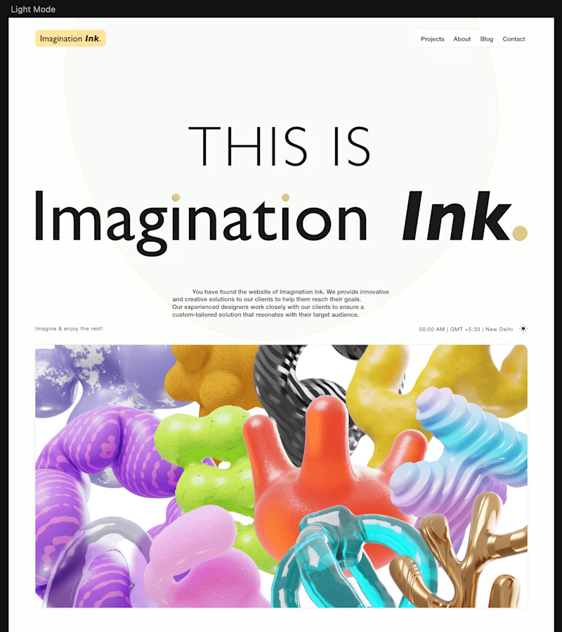
52 votes
Closed

Dark side for me, that white "Imagination Ink" wordmark just glows more against black, and the illustration colors pop harder too. Wild that this is 5 years old, it doesn't feel dated at all. What made you want to revisit it now, are you seeing this style trend back?
Thanks for your response. I just make some designs in between when I open Sketch so just found some of the old drafts and shared...

the light mode makes something about the work feel more alive, almost! tough to explain, but there's no battle with the backgrounds' contrasting–– just simplicity & clarity that makes the vibrance shine.

Dark mode


Dark is cool

Light mode

Will go with the Dark mode

Light one looks more good

All i see here is progress


Light mode

Lighter mode


Dark is more visually pleasing


Dark mode

I think the white version is easier on the eyes.

Great Design, personally for this I like white 🙌
The network for creativity
Join 1.25M professional creatives like you
Connect with clients, get discovered, and run your business 100% commission-free
Creatives on Contra have earned over $150M and we are just getting started
Trending
retrofuturism
Share your favorite designs from the past exploring the distant future. Or your own take on the aesthetic 🚀
halftone
Dots. Texture. Grain. Let's see your designs using the halftone technique.

Midjourney
Creatives are showing off what they're making with Midjourney.
colorgrade
Video editors sound off: How do you enhance the mood of your video in color grading?


Related posts


we are working on two framer templates in parallel
hero interaction magic ✨


Great work on animations

inkbleed effect design - dark or light mode?

75 voted
54%
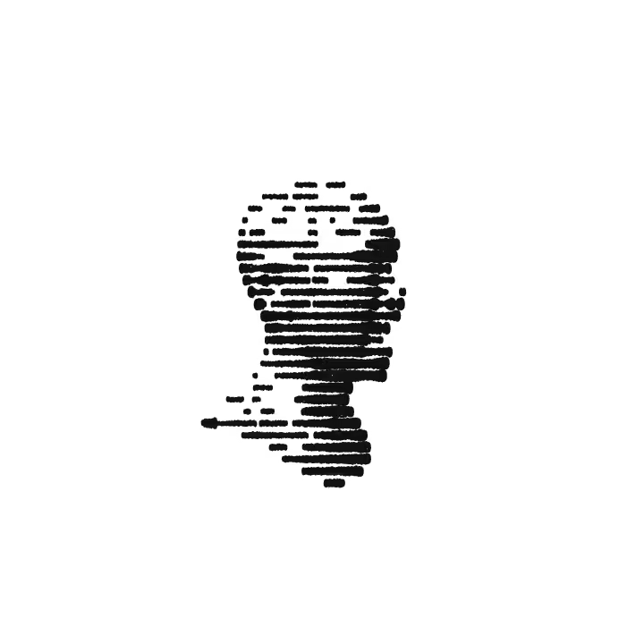
63 voted
46%
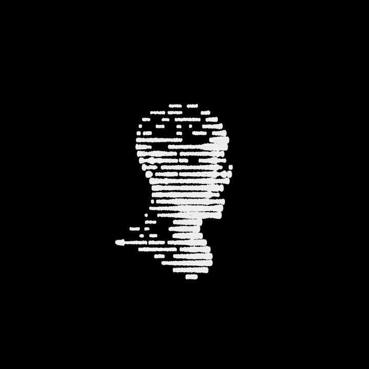
138 votes
Closed

Great work! I'm curious to know what tools you used to create this?


Cool illustration but the motion is really super creative. where did you create the motion?