The network for creativity
Join 1.25M professional creatives like you
Connect with clients, get discovered, and run your business 100% commission-free
Creatives on Contra have earned over $150M and we are just getting started
Back to feedPost
Taste Test

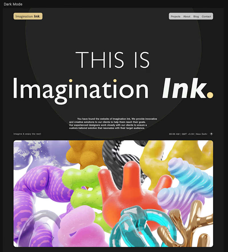
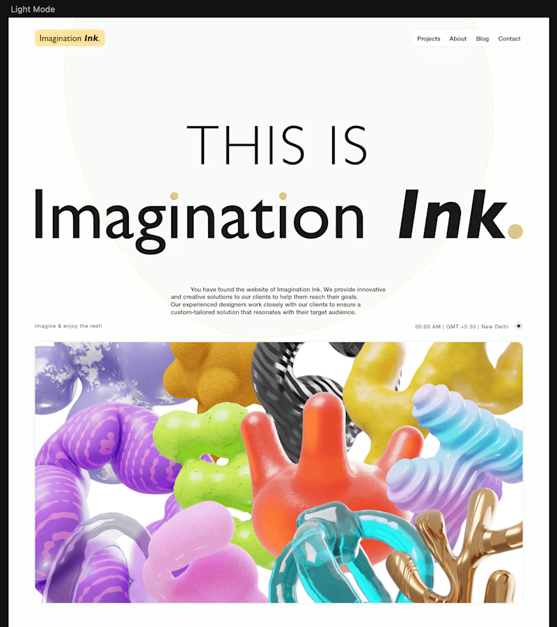
A hero section design I did 5 years back in Sketch 💎
Are you on the dark or light side? 👀

43 votes
Ends in 13h


Light mode

Dark side for me, that white "Imagination Ink" wordmark just glows more against black, and the illustration colors pop harder too. Wild that this is 5 years old, it doesn't feel dated at all. What made you want to revisit it now, are you seeing this style trend back?
Thanks for your response. I just make some designs in between when I open Sketch so just found some of the old drafts and shared...

the light mode makes something about the work feel more alive, almost! tough to explain, but there's no battle with the backgrounds' contrasting–– just simplicity & clarity that makes the vibrance shine.
Dark mode

Dark mode


Dark is cool

Light mode

Will go with the Dark mode

Both look great
Light one looks more good

All i see here is progress


I choose on Dark Mode

Lighter mode

Dark is more visually pleasing
The network for creativity
Join 1.25M professional creatives like you
Connect with clients, get discovered, and run your business 100% commission-free
Creatives on Contra have earned over $150M and we are just getting started
Related posts

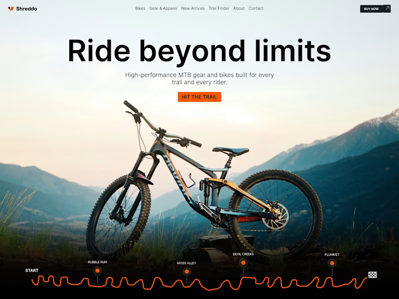
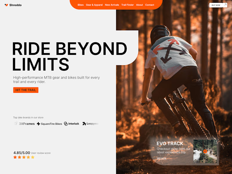
Another hero exploration, this time for an MTB store. I guess I should hit some trails soon. Which one gets your wheels turning, A or B? 🚵
70 voted
69%
32 voted
31%
102 votes
Closed


B. the action shot sells the ride not the bike and that's what an MTB buyer is actually shopping for. A is the cleaner product frame but it reads like a spec sheet, B reads like Saturday morning. keep A's layout discipline for the category pages



Nice concept

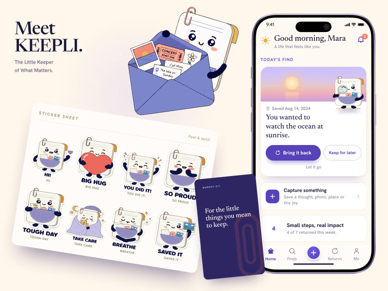
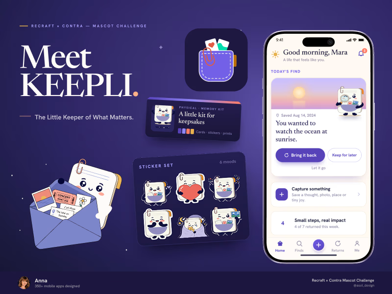
Which cover should lead my Recraft × Contra Mascot Challenge submission?
A.Light and product focused.
B.Dark, premium, and brand focused.
Same mascot system, different first impression.
Which one would you choose? A or B? 💜
🔗 Recraft project
https://www.recraft.ai/project/b4f3c24f-55fc-484a-899a-3fc98e389c6a
#recraftchallenge #mascotdesign #branddesign #mobileappdesign

58 voted
56%
46 voted
44%
104 votes
Closed
B, and the reason matters more than the vote. B opens with the title lockup and the mascot so the brand idea lands before the screens do, A opens with mockups and reads as one more app shot. The gallery is also full of light covers, so B wins the scroll before anyone reads a word








Trending

Claude
Claude has entered the design space. How are you using Claude Design?

Contra University
Learn from expert creatives how to earn more using next-gen AI tools.
fifaworldcup2026
The World Cup is here and the whole world's watching. How are you designing for the world stage?
creativeaiflow
Creative AI workflows are evolving. What tools do you use, and what are their strengths and weaknesses?
freelancerlife
Freelancer life is wins, pivots, and everything in between. What’s yours right now?