The network for creativity
Join 1.25M professional creatives like you
Connect with clients, get discovered, and run your business 100% commission-free
Creatives on Contra have earned over $150M and we are just getting started
Back to feedPost
Just launched an experience I’m actually proud of ✨
🏆 The project has been nominated on Awwwards - if it resonates with you, your support would mean a lot: 👉 https://www.awwwards.com/sites/assistantly
This wasn’t about designing “another website.” It was about solving a positioning problem - how do you transform a service into something that feels premium, productised, and desirable?
The answer wasn’t more content.
It was clarity through storytelling + interaction.
Every decision - from the 🦄 interactive unicorn hero to the scroll-driven team integration and dynamic layouts, was built to communicate one thing clearly: value.
Because at this level, design isn’t decor.
It’s how businesses are understood.


Looks Good

Thanks @Rasel Alam Jubayed

Amazing work Qaisar!!

hey good job


WOW! Nice animation and micro interactions

Really cool website 🚀
Thanks @Osama Boutata 🙌


NICE JOB

I am totally impressed, great work

Awesome work bro..

Wow Amazing Work


Amazing work👏🔥🔥
Thanks @Vipin Sakthi

I like the hero section interaction on hover.

good this

Elegant and modern design
Thanks @Yeasin Arafat

looks fantastic 👌

Next level work, man. Love it
Thanks @Saif Uddin 🙌

very cute interactions, Qaisar!

This is beautiful Qaisar

Now i think our job as webdesigner is tured in to animation designer
the live website is even more cool man love it was it build in webflow or custom coding ?
where is your youtube channel i want to learn those animation man


This is so great Brother. Amazing 🙌

It's a really cool website. I like it.

wow! wonderful !

the interaction is so good! 🙌

The result shows the effort.

Awesome!

Stunning!
Thanks @Taras Oliinyk


Amazing work! Thanks for sharing!

Perfection!
Thanks @Dana Kueker 🙌

Awesome design man


Great work Qaiser
The network for creativity
Join 1.25M professional creatives like you
Connect with clients, get discovered, and run your business 100% commission-free
Creatives on Contra have earned over $150M and we are just getting started



Related posts


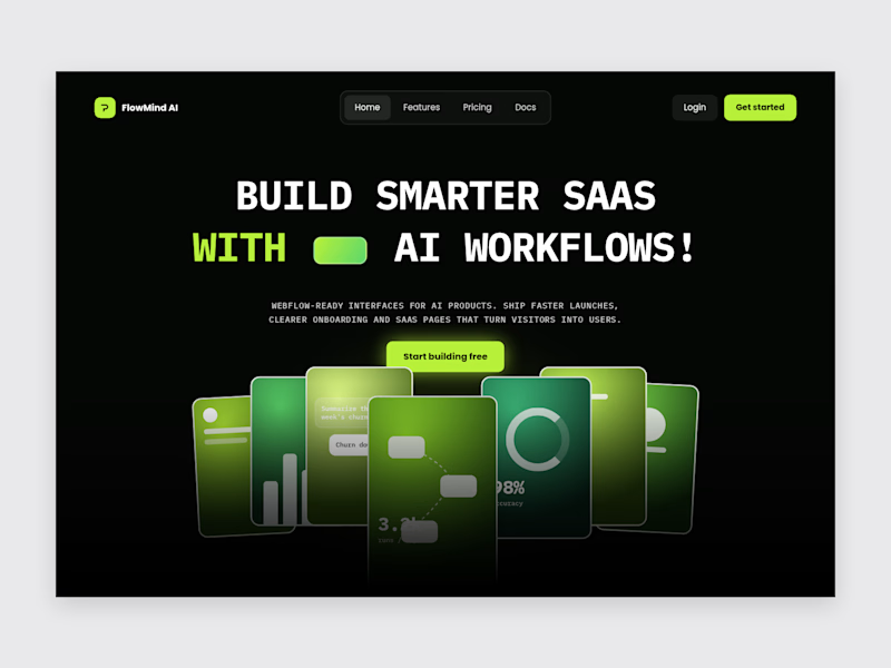
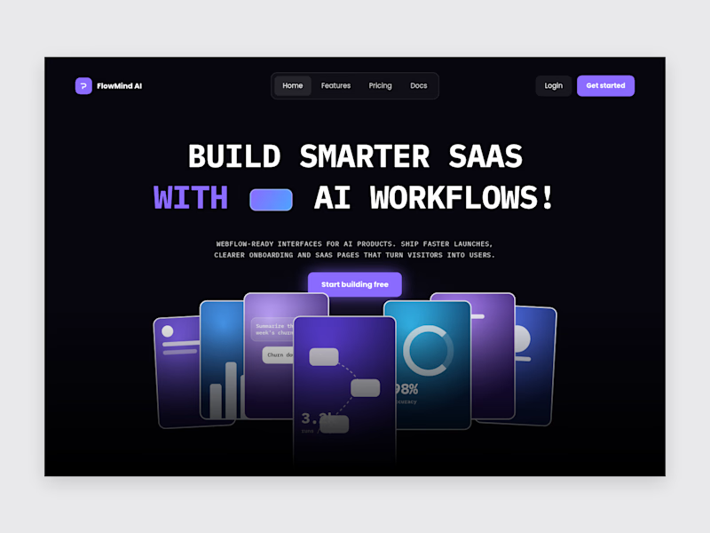

Violet/blue look pretty

Watch this website build itself.
The Kirkpatrick Bank homepage, replayed in about 9 seconds from the live site: wireframe, layout, content, live.
Kirkpatrick Bank is a privately owned bank that wanted a website as modern as its banking. I built it in Webflow from the approved design, page by page.
• Personal and business banking, home loans and investments, easy to compare
• Separate personal and business login entry points
• Webflow CMS for helpful videos, posts and mortgage lender profiles
What do you look for first on a bank's website?
Follow for more videos: instagram.com/sellwrightstudio · youtube.com/@sellwrightstudio

This is a great example of how thoughtful design can make digital products more engaging and enjoyable.

Zencastr came to us with a complex mix: they hosted their homepage on a custom server, blog on a separate platform and the rest of the pages on Webflow.
They had 3 days before the launch to tie it all together. This is their review:
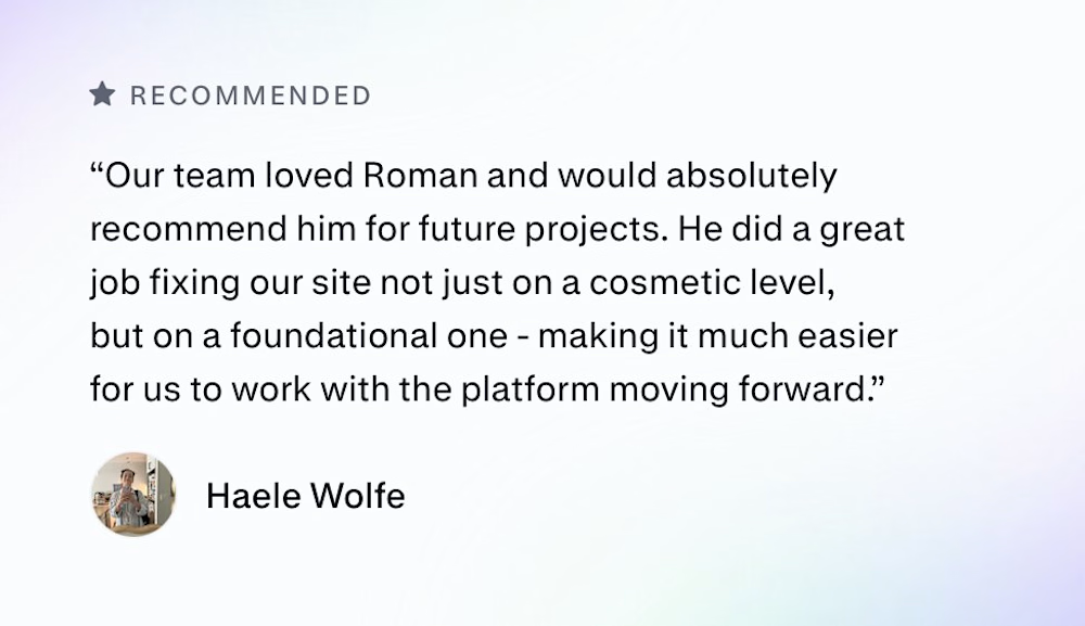

Three platforms behind one domain in three days is a real test. I'd guess the reverse proxy and keeping the nav and footer identical across all three took more care than any of the page building. Did you match the shared header in Webflow or pull it from one source?